Learn Coding Visually
Learn to code with interactive, live-preview playgrounds — HTML, CSS, JavaScript, React & more.
 HTML Playground42 lessons · Click-based · Live preview
 CSS PlaygroundLearn CSS with a live editor
 JavaScript Playground60 lessons · DOM · Async · Canvas
 React PlaygroundLearn React with a live code editor
 GSAP PlaygroundLearn GSAP animation interactively
 SVG Playground44 lessons · shapes · paths · animation
 SCSS Playground45 lessons · Sass modules · tokens
 Tailwind PlaygroundLearn Tailwind CSS with a live editor
 Bootstrap 5 Playground50 lessons · live preview
ECharts Candlestick with Volume Panel — Free Linked-Chart Snippet
ECharts Candlestick with Volume Panel · Charts · Plain HTML, CSS & JS · Live preview
What's included
Features
About this UI Snippet
ECharts Candlestick with Volume Panel — Two Charts, One Synced Zoom
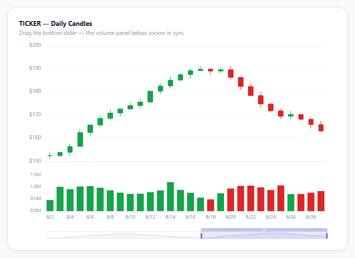
A price chart without volume is missing half the story — a big move on thin volume reads very differently from the same move on heavy volume. This snippet renders both as two panels in one ECharts instance, sharing a single x-axis and zoom control, which is the standard layout for any real trading interface.
Two grids in one option object
The grid array holds two entries — a tall one for the candles, a short one beneath it for volume bars — each with its own top/height. Every axis and series then references which grid it belongs to via gridIndex (defaulting to 0 for the candlestick's axes). This is how ECharts stacks two logically separate charts inside a single canvas and a single echarts.init call, instead of syncing two independent chart instances by hand.
One zoom control, two x-axes
The dataZoom entries list xAxisIndex: [0, 1], meaning a single slider (or scroll-zoom) drives both x-axes at once. Drag the slider and the candlestick panel and the volume panel scroll through exactly the same date range together — critical, since a volume bar that doesn't line up with its candle is worse than no volume chart at all.
axisPointer.link syncs the crosshair too
Beyond zoom, axisPointer: { link: [{ xAxisIndex: 'all' }] } keeps the hover crosshair aligned across both panels — move the mouse over the candlestick panel and the volume panel's crosshair tracks the same x position, so the tooltip (triggered by axis) can show both series' values for one date together.
Volume bars inherit the candle's color
Each volume bar's color is computed from that same day's close-vs-open, not set independently — ohlc[i][1] >= ohlc[i][0] ? UP : DOWN. That's what makes a quick glance at the volume panel alone tell you whether heavy days were up days or down days, without looking back up at the candles.
itemStyle.color0 is the "down" color
ECharts' candlestick series takes *two* colors per item style: color/borderColor for a close-above-open (bullish) candle, and color0/borderColor0 for a close-below-open (bearish) one — both are required, since a candlestick chart with only one color pair would be unable to show direction at all.
Reusing it
Swap the generated OHLC and volume arrays for real market data (from any exchange API returning daily bars), and the linked zoom, linked crosshair, and color-matched volume all keep working unchanged, since they're wired through axis and grid indices rather than any ticker-specific logic.
Build with AI
Build, Understand, Optimize, and Extend It With AI
You don't have to work out multi-panel axis linking from the ECharts docs alone. Paste this snippet's HTML, CSS, and JS into an AI coding assistant like Claude and ask it to explain exactly how the grid array and gridIndex properties stack two logically separate charts inside one canvas, and how dataZoom's xAxisIndex array and axisPointer.link keep the zoom range and hover crosshair synchronized between the price and volume panels. The same assistant can help optimize it — ask whether disabling animation (animation: false) is the right call for a chart this data-dense, and whether computing each volume bar's color from that day's own OHLC values inline is cleaner than precomputing a separate colors array. It's also useful for extending the effect: ask it to add a moving-average overlay line on the candlestick panel, a third linked panel for a technical indicator like RSI, or a way to switch the ticker and refetch new OHLC data without re-initializing the whole chart. Treat the code less like a finished artifact and more like a starting point for a conversation.
Prompt to recreate it
Copy this into your AI assistant of choice to build the effect from scratch, or as a jumping-off point for your own variant:
Build a candlestick price chart with a linked volume panel underneath using Apache ECharts (load echarts from a CDN, no other library), in plain HTML, CSS, and JavaScript.

Requirements:
- Generate or accept about 60 days of OHLC (open, high, low, close) price data plus a corresponding trading volume number for each day, with prices following a continuous path where each day's movement builds on the previous day's close (not fully independent random values each day).
- Render the OHLC data as a candlestick chart in the upper portion of the chart area, using one color for days that closed higher than they opened and a different color for days that closed lower than they opened.
- Render the volume data as a bar chart in a separate, shorter panel directly beneath the candlestick panel, within the same single chart instance (not a second separate chart), coloring each volume bar to match that same day's candle direction (up-color or down-color) rather than using one uniform color for all bars.
- Give both panels their own x-axis but link them so that a single zoom control (both a slider below the chart and scroll/pinch-to-zoom directly on the chart) changes the visible date range on both panels simultaneously and keeps every candle aligned with its own volume bar at any zoom level.
- Link the hover crosshair/axis pointer across both panels so that hovering over a point in either panel shows an aligned indicator at the same x position in the other panel too.
- Format the price axis labels with a currency symbol and the volume axis labels in abbreviated form (e.g. "1.2M" instead of "1200000").
- Keep the chart instance responsive to its container being resized by calling the chart's resize method whenever the container's size changes.
Want to tighten it up first? Run this prompt through the AI Prompt Studio to score it across 8 quality dimensions, catch anti-patterns, and tune the wording for Claude, ChatGPT, or Gemini before you paste it in.
Source Code
<div class="ecs-wrap">
  <div class="ecs-card">
    <div class="ecs-title">TICKER — Daily Candles</div>
    <div class="ecs-sub">Drag the bottom slider — the volume panel below zooms in sync</div>
    <div class="ecs-chart" id="ecsChart"></div>
  </div>
</div>*{box-sizing:border-box;margin:0;padding:0}
body{font-family:system-ui,-apple-system,sans-serif;background:#f8fafc;min-height:100vh;display:flex;align-items:center;justify-content:center;padding:24px}
.ecs-wrap{width:100%;max-width:680px}
.ecs-card{background:#fff;border-radius:16px;padding:22px;box-shadow:0 1px 8px rgba(0,0,0,.07);border:1px solid #e2e8f0}
.ecs-title{font-size:13px;font-weight:700;color:#0f172a}
.ecs-sub{font-size:11.5px;color:#94a3b8;margin-top:3px;margin-bottom:6px}
.ecs-chart{width:100%;height:400px}var el = document.getElementById('ecsChart');
var chart = echarts.init(el);
// Deterministic OHLC generator: each day's close becomes the next day's
// open-ish baseline plus a seeded wobble, which is what real prices do.
var days = [];
var ohlc = [];
var volumes = [];
var price = 148;
for (var i = 0; i < 60; i++) {
var d = new Date(2026, 6, 1);
d.setDate(d.getDate() + i);
days.push((d.getMonth() + 1) + '/' + d.getDate());
var wave = Math.sin(i / 5) * 3.2 + Math.sin(i / 1.7) * 1.4;
var open = price;
var close = Math.max(40, open + wave + (i % 7 === 0 ? 2.5 : -0.3));
var high = Math.max(open, close) + Math.abs(Math.sin(i * 2.1)) * 1.6;
var low = Math.min(open, close) - Math.abs(Math.cos(i * 1.3)) * 1.6;
ohlc.push([Number(open.toFixed(2)), Number(close.toFixed(2)), Number(low.toFixed(2)), Number(high.toFixed(2))]);
volumes.push(Math.round(400000 + Math.abs(wave) * 180000 + (i % 11 === 0 ? 300000 : 0)));
price = close;
}
var UP = '#16a34a';
var DOWN = '#dc2626';
var option = {
animation: false,
axisPointer: { link: [{ xAxisIndex: 'all' }] },
tooltip: {
trigger: 'axis',
backgroundColor: '#0f172a',
borderWidth: 0,
textStyle: { color: '#fff', fontSize: 12 },
},
grid: [
{ left: 52, right: 20, top: 12, height: '58%' },
{ left: 52, right: 20, top: '68%', height: '18%' },
],
xAxis: [
{ type: 'category', data: days, boundaryGap: true, axisLine: { lineStyle: { color: '#e2e8f0' } }, axisLabel: { show: false }, axisTick: { show: false } },
{ type: 'category', gridIndex: 1, data: days, boundaryGap: true, axisLine: { lineStyle: { color: '#e2e8f0' } }, axisLabel: { color: '#94a3b8', fontSize: 9 }, axisTick: { show: false } },
],
yAxis: [
{ scale: true, axisLabel: { color: '#94a3b8', fontSize: 10, formatter: '${value}' }, splitLine: { lineStyle: { color: '#f1f5f9' } } },
{ gridIndex: 1, splitNumber: 2, axisLabel: { color: '#94a3b8', fontSize: 9, formatter: function (v) { return (v / 1e6).toFixed(1) + 'M'; } }, splitLine: { show: false } },
],
dataZoom: [
{ type: 'inside', xAxisIndex: [0, 1], start: 55, end: 100 },
{ type: 'slider', xAxisIndex: [0, 1], start: 55, end: 100, bottom: 4, height: 18,
borderColor: '#e2e8f0', fillerColor: 'rgba(99,102,241,.15)', handleStyle: { color: '#6366f1' }, textStyle: { color: '#94a3b8', fontSize: 9 } },
],
series: [
{
type: 'candlestick',
data: ohlc,
itemStyle: { color: UP, color0: DOWN, borderColor: UP, borderColor0: DOWN },
},
{
type: 'bar',
xAxisIndex: 1,
yAxisIndex: 1,
data: volumes.map(function (v, i) { return { value: v, itemStyle: { color: ohlc[i][1] >= ohlc[i][0] ? UP : DOWN } }; }),
},
],
};
chart.setOption(option);
var ro = new ResizeObserver(function () { chart.resize(); });
ro.observe(el);Step by step
How to Use
- 1Add the ECharts CDNLoad echarts.min.js before the snippet's JS runs.
- 2Paste HTML, CSS, and JSSixty days of candles render above a matching volume panel.
- 3Drag the sliderBoth panels zoom to the same date range together.
- 4Hover a candleA synced crosshair appears in the volume panel below it.
- 5Read the volume colorsGreen bars are up days, red bars are down days.
- 6Compare a big move to its volumeSee whether a price swing had heavy or thin volume behind it.
Real-world uses
Common Use Cases
Got questions?
Frequently Asked Questions
The grid option is an array with two entries — one tall region for the candlesticks, one short region beneath it for volume — each given its own top and height. Every axis and series is then assigned to one of those grids via gridIndex (0 is the default candlestick grid, 1 is the volume grid), which is how ECharts renders what looks like two charts from a single option object and a single echarts.init call.
Both dataZoom entries specify xAxisIndex: [0, 1], meaning a single zoom control (whether the slider or scroll-inside) applies to both x-axes simultaneously rather than just the one it visually sits under. Dragging the slider moves the visible date range on both the candlestick and volume x-axes together, keeping every candle aligned with its own volume bar at all zoom levels.
Candlestick series (and, by extension, any related coloring) distinguish bullish days (close at or above open) from bearish days (close below open) using two separate color properties: color/borderColor for bullish, color0/borderColor0 for bearish. The volume bars reuse this same up/down logic per day by comparing that day's own open and close values, coloring each bar to match its candle rather than using one fixed color for all volume.
dataZoom controls which range of dates is visible; axisPointer.link controls the hover crosshair, keeping it aligned to the same x position across both grids when you move your mouse over either panel. Without it, hovering the candlestick panel would show a crosshair only there, leaving the volume panel with no indication of which date the tooltip is currently describing.
Fetch or compute your OHLC and volume arrays outside the chart option, initialize the chart once against a container ref, and call setOption with fresh series data whenever a new bar arrives (for streaming data) or the selected ticker changes. Dispose the instance on unmount and keep the ResizeObserver pattern, since a two-panel layout is especially sensitive to needing an explicit resize call when its container changes size.