Source Code
<div class="cr-grid" id="crGrid">
  <article class="cr-card" style="--c1:#6366f1;--c2:#22d3ee">
    <canvas class="cr-canvas"></canvas>
    <div class="cr-face"><span class="cr-icon">⚡</span></div>
    <div class="cr-hover"><h3>Fast</h3><p>Edge-deployed, sub-50ms responses worldwide.</p></div>
  </article>
  <article class="cr-card" style="--c1:#ec4899;--c2:#f59e0b">
    <canvas class="cr-canvas"></canvas>
    <div class="cr-face"><span class="cr-icon">🛡</span></div>
    <div class="cr-hover"><h3>Secure</h3><p>End-to-end encryption with zero-knowledge storage.</p></div>
  </article>
  <article class="cr-card" style="--c1:#34d399;--c2:#10b981">
    <canvas class="cr-canvas"></canvas>
    <div class="cr-face"><span class="cr-icon">∞</span></div>
    <div class="cr-hover"><h3>Scalable</h3><p>Autoscale from zero to millions without a config.</p></div>
  </article>
</div>*{box-sizing:border-box;margin:0;padding:0}
body{font-family:system-ui,-apple-system,sans-serif;background:#06060d;color:#fff;display:flex;justify-content:center;align-items:center;min-height:100vh;padding:24px}
.cr-grid{display:grid;grid-template-columns:repeat(3,1fr);gap:16px;width:100%;max-width:760px}
.cr-card{position:relative;aspect-ratio:4/5;border-radius:18px;border:1px solid #1f1f33;background:#0c0c18;overflow:hidden;cursor:pointer}
.cr-canvas{position:absolute;inset:0;width:100%;height:100%;opacity:0;transition:opacity .3s}
.cr-card:hover .cr-canvas{opacity:1}
.cr-face{position:absolute;inset:0;z-index:1;display:flex;align-items:center;justify-content:center;transition:opacity .3s}
.cr-card:hover .cr-face{opacity:0}
.cr-icon{width:60px;height:60px;border-radius:16px;background:#15152a;border:1px solid #2a2a44;display:flex;align-items:center;justify-content:center;font-size:28px}
.cr-hover{position:absolute;inset:0;z-index:2;display:flex;flex-direction:column;justify-content:flex-end;gap:6px;padding:22px;opacity:0;transform:translateY(10px);transition:opacity .35s,transform .35s}
.cr-card:hover .cr-hover{opacity:1;transform:none}
.cr-hover h3{font-size:22px;font-weight:800}
.cr-hover p{font-size:13px;color:rgba(255,255,255,.8);line-height:1.5}
@media(max-width:620px){.cr-grid{grid-template-columns:1fr}.cr-card{aspect-ratio:16/7}}var cards = Array.prototype.slice.call(document.querySelectorAll('.cr-card'));
cards.forEach(function (card) {
var canvas = card.querySelector('.cr-canvas');
var ctx = canvas.getContext('2d');
var cs = getComputedStyle(card);
var colors = [cs.getPropertyValue('--c1').trim(), cs.getPropertyValue('--c2').trim()];
var dots = [], raf = null, gap = 14, dpr = Math.min(devicePixelRatio || 1, 2);
function build() {
var w = canvas.clientWidth, h = canvas.clientHeight;
canvas.width = w * dpr; canvas.height = h * dpr;
ctx.setTransform(dpr, 0, 0, dpr, 0, 0);
dots = [];
for (var y = gap / 2; y < h; y += gap) {
for (var x = gap / 2; x < w; x += gap) {
dots.push({ x: x, y: y, c: colors[Math.floor(Math.random() * 2)],
// each dot has its own delay so the matrix fills in organically
delay: Math.random() * 600, t0: 0 });
}
}
}
function draw(now) {
var w = canvas.clientWidth, h = canvas.clientHeight;
ctx.clearRect(0, 0, w, h);
dots.forEach(function (d) {
var p = Math.max(0, Math.min(1, (now - d.t0 - d.delay) / 400));
if (p <= 0) return;
ctx.globalAlpha = p * 0.9;
ctx.fillStyle = d.c;
ctx.fillRect(d.x - 1, d.y - 1, 2, 2);
});
raf = requestAnimationFrame(draw);
}
card.addEventListener('pointerenter', function () {
var start = performance.now();
dots.forEach(function (d) { d.t0 = start; });
if (!raf) raf = requestAnimationFrame(draw);
});
card.addEventListener('pointerleave', function () {
cancelAnimationFrame(raf); raf = null;
ctx.clearRect(0, 0, canvas.clientWidth, canvas.clientHeight);
});
build();
window.addEventListener('resize', build);
});Learn Coding Visually
Learn to code with interactive, live-preview playgrounds — HTML, CSS, JavaScript, React & more.
 HTML Playground42 lessons · Click-based · Live preview
 CSS PlaygroundLearn CSS with a live editor
 JavaScript Playground60 lessons · DOM · Async · Canvas
 React PlaygroundLearn React with a live code editor
 GSAP PlaygroundLearn GSAP animation interactively
 SVG Playground44 lessons · shapes · paths · animation
 SCSS Playground45 lessons · Sass modules · tokens
 Tailwind PlaygroundLearn Tailwind CSS with a live editor
 Bootstrap 5 Playground50 lessons · live preview
Dot Reveal Card — Free HTML CSS JS Canvas Hover Snippet
Dot Reveal Card · Scroll · Plain HTML, CSS & JS · Live preview
What's included
Features
About this UI Snippet
Dot Reveal Card — Staggered Canvas Dot Matrix on Hover
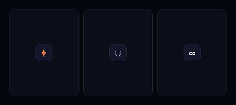
The dot-reveal card is the feature-grid interaction where hovering a card paints a matrix of tiny colored dots across it — each dot fading in on its own slight delay so the pattern materializes organically — while the resting icon dissolves into a heading and description. This snippet builds it with plain HTML, CSS, and a per-card HTML <canvas> driven by vanilla JavaScript.
A dot grid on canvas
Each card has its own <canvas> sized to the card with devicePixelRatio scaling (capped at 2) so the dots stay crisp on retina screens. On build, a double loop walks the canvas every gap pixels and creates a dot record at each position, assigning it one of the card's two theme colors (read from the --c1/--c2 CSS variables) at random. Storing dots as data — position, color, and timing — lets the animation be a simple replay over that array.
Staggered, organic fill-in
If every dot appeared at once, the reveal would look like a flat overlay flicking on. Instead, each dot gets a random delay up to 600ms. When you hover, all dots record the same start time t0, and each dot's fade progress is (now - t0 - delay) / 400 clamped to 0–1. Because the delays are random, dots wink on in a scattered order over roughly a second, so the matrix appears to assemble itself — the detail that makes it feel alive rather than mechanical.
The animation loop, started on demand
The requestAnimationFrame loop only runs while you're hovering. On pointerenter it stamps every dot's start time and kicks off the loop; on pointerleave it cancels the frame and clears the canvas. Running the loop on demand — not continuously for every card on the page — keeps a grid of these cards cheap, since idle cards do zero work.
Layered content transitions
Three stacked layers compose the card: the canvas at the back (fading in via CSS opacity on hover), the resting icon face in the middle (fading out), and the hover content on top (sliding up and in). The canvas opacity transition and the dot animation overlap, so the dots both fade in as a layer and individually stagger — a subtle double reveal. The heading and copy rise into place once the icon clears.
Why a canvas here
Hundreds of dots as DOM elements would be heavy and awkward to animate individually. A single canvas per card draws them all in one paint per frame, with per-dot alpha controlled in code, which is far more efficient and gives precise control over the stagger timing that CSS alone couldn't easily express.
Customizing it
Change gap for a denser or sparser matrix, adjust the 600ms delay spread and 400ms fade for a faster or slower assembly, set each card's --c1/--c2 to theme its dots, or change the dot size in fillRect. The grid collapses to a single column on narrow screens. Pair it with a glare card or a wobble card for a varied feature section.
Build with AI
Build, Understand, Optimize, and Extend It With AI
Rather than eyeballing the stagger timing, paste this snippet's HTML, CSS, and JS into an AI coding assistant like Claude and ask it to explain exactly how the per-dot random delay combined with a shared start timestamp produces the organic fill-in effect, or why the requestAnimationFrame loop is started and cancelled on pointerenter/pointerleave rather than running continuously for every card. The same assistant can help optimize it — ask whether rebuilding the entire dots array on every window resize event is expensive for a grid with many cards, and whether that resize handler should be debounced. It's also a good partner for extending the effect: ask it to make the dot color read from a data attribute so cards can be recolored without touching CSS variables, add a second reveal pattern (e.g. a wave sweeping left to right instead of random stagger), or make the dot grid density responsive to the card's actual size rather than a fixed gap. Treat the code less like a finished artifact and more like a starting point for a conversation.
Prompt to recreate it
Copy this into your AI assistant of choice to build the effect from scratch, or as a jumping-off point for your own variant:
Build a "dot matrix reveal" hover effect for feature cards in plain HTML, CSS, and JavaScript using the Canvas 2D API — no libraries, no WebGL.

Requirements:
- Each card must have its own dedicated canvas element sized to exactly match the card and scaled for devicePixelRatio (capped at 2) so dots stay sharp on high-density displays, positioned absolutely behind the card's content.
- On build, populate a data array of dot objects by walking the canvas area on a fixed pixel gap in both directions, assigning each dot a position, a color chosen from the card's own theme colors (read from CSS custom properties via getComputedStyle, not hardcoded), and a random delay value up to some maximum (e.g. 600ms).
- On pointer enter, record a single shared start timestamp on every dot in that card's array, then begin a requestAnimationFrame loop that computes each dot's fade-in progress as a function of elapsed time minus that dot's individual random delay, clamped between 0 and 1, and paints only the dots with positive progress at that alpha.
- On pointer leave, cancel that card's animation frame and clear its canvas — the loop must not keep running for cards the user isn't currently hovering.
- Layer three visual states on top of each other with CSS transitions: a resting icon/face that fades out on hover, the canvas dot matrix that fades in via opacity, and a hover content panel (heading and description) that slides up and fades in — all driven by a single hover state on the card.
- Rebuild each card's dot grid on window resize so the pattern still fills the canvas correctly if the card's size changes.
Want to tighten it up first? Run this prompt through the AI Prompt Studio to score it across 8 quality dimensions, catch anti-patterns, and tune the wording for Claude, ChatGPT, or Gemini before you paste it in.
Step by step
How to Use
- 1Paste HTML, CSS, and JSThree feature cards render, each showing an icon at rest.
- 2Hover a cardA matrix of colored dots fades in across the canvas.
- 3Watch the staggerDots wink on in a scattered order, assembling the pattern.
- 4See the contentThe icon dissolves and a heading and copy rise in.
- 5Theme the dotsSet each card's --c1 and --c2 colors.
- 6Tune the matrixAdjust the gap, delay spread, and fade duration.
Real-world uses
Common Use Cases
Got questions?
Frequently Asked Questions
Each dot is assigned a random delay up to 600ms. On hover, every dot records the same start time, and its fade progress is (now - start - delay) / 400 clamped to 0–1. Because the delays differ, dots wink on in a scattered order over about a second, so the matrix appears to assemble itself rather than flicking on as a flat layer.
A dense dot matrix would be hundreds of DOM nodes, which is heavy to create and animate individually. One canvas per card draws every dot in a single paint per frame, with per-dot alpha controlled in code. That's far more efficient and gives precise control over the stagger timing that CSS alone couldn't easily express.
No. The requestAnimationFrame loop starts on pointerenter and is cancelled on pointerleave, which also clears the canvas. Idle cards do zero work, so a whole grid of these cards stays cheap — only the card you're actively hovering animates.
Each card sets two CSS custom properties, --c1 and --c2. The script reads them with getComputedStyle and assigns each dot one of the two colors at random, so a card's dot matrix matches its theme. Change those variables per card to recolor the reveal without touching the JavaScript.
Render the cards and use a ref to each canvas. In a mount effect per card, build the dot array and wire pointerenter/pointerleave to start and stop the rAF loop, cancelling on unmount. Keep dots and the frame id in refs, not state. The CSS layer transitions port directly; in Tailwind, position the canvas absolute inset-0 behind the content layers.