Learn Coding Visually
Learn to code with interactive, live-preview playgrounds — HTML, CSS, JavaScript, React & more.
 HTML Playground42 lessons · Click-based · Live preview
 CSS PlaygroundLearn CSS with a live editor
 JavaScript Playground60 lessons · DOM · Async · Canvas
 React PlaygroundLearn React with a live code editor
 GSAP PlaygroundLearn GSAP animation interactively
 SVG Playground44 lessons · shapes · paths · animation
 SCSS Playground45 lessons · Sass modules · tokens
 Tailwind PlaygroundLearn Tailwind CSS with a live editor
 Bootstrap 5 Playground50 lessons · live preview
Beeswarm Plot Chart — Collision-Free Dot Distribution SVG
Beeswarm Plot Chart · Charts · Plain HTML, CSS & JS · Live preview
What's included
Features
About this UI Snippet
Beeswarm Plot Chart — Greedy Collision-Avoidance Layout for One-Dot-Per-Data-Point Distributions
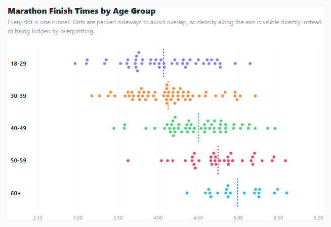
A scatter plot along a single axis runs into a hard visual problem the moment two values land close together: the dots overlap and hide each other, silently erasing the very density information the chart exists to show. A beeswarm plot solves this by nudging each dot sideways, perpendicular to the axis, just enough to avoid touching its neighbors — every individual data point stays visible as its own circle, and the resulting cluster width becomes a direct, honest visual encoding of how many points fall near that value. This snippet renders five marathon age-group finish-time distributions this way, with the swarm positions computed by a real collision-avoidance algorithm rather than a canned layout.
Why this needs an actual layout algorithm, not just a formula
Unlike a bar or line chart, where every mark's position follows directly from a value and a scale, a beeswarm's *y*-offset for any given dot depends on every other dot already placed near it on the x-axis — there is no closed-form formula, only an iterative placement process. layoutSwarm() implements a greedy version of that process: points are sorted by their x position first, so the algorithm always considers dots left to right, then each point is tested at its lane's center y; if that position collides with any already-placed point within DIAMETER distance, it steps outward in alternating directions (dir *= -1) — first slightly above center, then slightly below, then further above, and so on — until it finds a position with no collision.
Collision distance, not just x-difference
The collision check computes real 2D Euclidean distance (Math.sqrt(dx*dx + dy*dy)) between a candidate point and every already-placed point, not just how close their x-values are. This matters because two points can have very different x positions yet still be close enough on the combined x/y plane to visually collide once one of them has already been offset vertically — checking true distance, rather than only x-proximity, is what keeps the packing visually correct rather than merely "close enough."
A safety valve against infinite packing
In a genuinely dense cluster, there may not be room within a lane to place every point without overlap no matter how far the algorithm searches. Each lane defines a laneLimit — a maximum vertical offset from center — and once a point's search offset exceeds it, the algorithm accepts that position and moves on rather than searching forever. This trades a small amount of overlap in the very densest regions for a layout that always terminates in a bounded number of steps.
Reading a mean line against the swarm itself
A dashed vertical line marks each group's arithmetic mean directly through its lane. Because the dots themselves are still individually visible, that mean line can be read *against* the actual spread of raw points around it — whether the mean sits in the thick of a dense cluster or off to one side of a skewed distribution — a comparison a single summary statistic alone could never show.
Build with AI
Build, Understand, Optimize, and Extend It With AI
Paste this snippet's HTML, CSS, and JS into an AI coding assistant like Claude and ask it to explain exactly how the greedy collision-avoidance algorithm decides where to place each point, why it sorts points by x position before placing them, and what the laneLimit safety valve is protecting against in a very dense cluster. It's also a good candidate for extension — ask it to add a toggle between separate per-group lanes and one combined swarm with color-coded groups, animate points settling into position with a staggered transition when the dataset changes, or optimize the collision check with a spatial index (like a grid or k-d tree) so the layout stays fast on datasets with several thousand points.
Prompt to recreate it
Copy this into your AI assistant of choice to build the effect from scratch, or as a jumping-off point for your own variant:
Build a beeswarm plot chart in plain HTML, CSS, and JavaScript using inline SVG created with createElementNS — no charting library, no canvas.

Requirements:
- For at least four groups of raw numeric sample data, position each group's points along a shared x-axis scale, arranged in horizontal lanes (one lane per group) stacked vertically.
- Implement a real collision-avoidance placement algorithm (not a random jitter): sort each group's points by their x position, then for each point in order, try placing it at its lane's vertical center first; if that position is within a minimum distance of any already-placed point in the same lane (checked using true 2D Euclidean distance between the candidate position and each placed point, not just difference in x), search alternating positions above and below center in expanding steps until a collision-free position is found.
- Include a safety limit on how far a point may be pushed from its lane's center; if the collision-free search would exceed that limit, accept the current position anyway rather than searching indefinitely, so the algorithm always terminates in a bounded number of steps even for a very dense cluster of points.
- Draw each point as a small SVG circle in its group's color, individually hoverable with a tooltip showing its exact underlying value.
- Draw a dashed vertical line through each lane at that group's mean value, positioned using the same x-axis scale as the points themselves.
- Draw a shared x-axis with gridlines and labeled tick values beneath the lanes, plus a text label naming each group to the left of its lane.
- Include a data-generation helper using a Box-Muller transform to produce realistic pseudo-random sample data per group with a configurable mean, spread, and sample count, for demonstration purposes.
Want to tighten it up first? Run this prompt through the AI Prompt Studio to score it across 8 quality dimensions, catch anti-patterns, and tune the wording for Claude, ChatGPT, or Gemini before you paste it in.
Source Code
<div class="app">
  <div class="card">
    <div class="card-header">
      <h3>Marathon Finish Times by Age Group</h3>
      <p class="sub">Every dot is one runner. Dots are packed sideways to avoid overlap, so density along the axis is visible directly instead of being hidden by overplotting.</p>
    </div>
    <div class="chart-wrap">
      <svg id="swarm" viewBox="0 0 640 380" xmlns="http://www.w3.org/2000/svg"></svg>
    </div>
    <div class="swarm-tooltip" id="swarmTip"></div>
  </div>
</div>
* { margin: 0; padding: 0; box-sizing: border-box; }
body { background: #f8fafc; font-family: system-ui, sans-serif; min-height: 100vh; display: flex; align-items: center; justify-content: center; padding: 20px; }
.app { width: 100%; max-width: 680px; }
.card { background: #fff; border: 1px solid #e2e8f0; border-radius: 16px; padding: 22px; box-shadow: 0 12px 30px rgba(30,41,59,0.06); position: relative; }
.card-header { margin-bottom: 8px; }
h3 { font-size: 16px; font-weight: 800; color: #1e293b; }
.sub { font-size: 12px; color: #94a3b8; margin-top: 3px; line-height: 1.5; }
#swarm { width: 100%; display: block; overflow: visible; }
.swarm-grid { stroke: #f1f5f9; stroke-width: 1; }
.swarm-axis-label { font-size: 10.5px; fill: #94a3b8; text-anchor: middle; }
.swarm-group-label { font-size: 11.5px; font-weight: 700; fill: #1e293b; text-anchor: start; }
.swarm-mean-line { stroke-width: 2; stroke-dasharray: 3 3; }
.swarm-dot { stroke: #fff; stroke-width: 1; cursor: pointer; transition: r .1s, opacity .1s; }
.swarm-dot:hover { stroke: #1e293b; stroke-width: 1.5; }
.swarm-tooltip {
position: absolute; pointer-events: none; background: #1e293b; color: #fff; font-size: 11.5px;
padding: 6px 10px; border-radius: 7px; opacity: 0; transition: opacity .1s; transform: translate(-50%, -130%);
white-space: nowrap; z-index: 10;
}
.swarm-tooltip.show { opacity: 1; }const svg = document.getElementById('swarm');
const card = document.querySelector('.card');
const tip = document.getElementById('swarmTip');
const NS = 'http://www.w3.org/2000/svg';
const GROUPS = [
{ name: '18-29', color: '#6366f1', mean: 245, spread: 32, n: 46 },
{ name: '30-39', color: '#f97316', mean: 252, spread: 28, n: 58 },
{ name: '40-49', color: '#22c55e', mean: 263, spread: 30, n: 52 },
{ name: '50-59', color: '#e11d48', mean: 281, spread: 26, n: 34 },
{ name: '60+', color: '#0ea5e9', mean: 305, spread: 24, n: 20 },
];
function genValues(mean, spread, n) {
const out = [];
for (let i = 0; i < n; i++) {
let u = 0, v = 0;
while (u === 0) u = Math.random();
while (v === 0) v = Math.random();
const g = Math.sqrt(-2 * Math.log(u)) * Math.cos(2 * Math.PI * v);
out.push(Math.max(150, mean + g * spread));
}
return out;
}
function el(tag, attrs) {
const e = document.createElementNS(NS, tag);
Object.entries(attrs).forEach(([k, v]) => e.setAttribute(k, v));
return e;
}
const W = 640, H = 380;
const PAD_L = 60, PAD_R = 20, PAD_T = 16, PAD_B = 40;
const innerW = W - PAD_L - PAD_R;
const laneH = (H - PAD_T - PAD_B) / GROUPS.length;
const allValues = GROUPS.flatMap(g => genValues(g.mean, g.spread, g.n));
const xMin = Math.floor(Math.min(...allValues) / 10) * 10 - 10;
const xMax = Math.ceil(Math.max(...allValues) / 10) * 10 + 10;
function xPos(v) { return PAD_L + ((v - xMin) / (xMax - xMin)) * innerW; }
const RADIUS = 3.4;
const DIAMETER = RADIUS * 2 + 0.6;
// Greedy collision-avoidance swarm layout: sort points by x, then for each point try the lane
// center first and alternate outward (above/below) in small steps until no overlap remains
// with any already-placed neighbor within reach on the x-axis.
function layoutSwarm(values, laneCenter, laneLimit) {
const placed = [];
const sorted = values.map((v, i) => ({ v, x: xPos(v), i })).sort((a, b) => a.x - b.x);
sorted.forEach(point => {
let y = laneCenter;
let step = 0;
let dir = 1;
while (true) {
const collides = placed.some(p => {
const dx = p.x - point.x;
const dy = p.y - y;
return Math.sqrt(dx * dx + dy * dy) < DIAMETER;
});
if (!collides) break;
step += 1;
dir *= -1;
const offset = Math.ceil(step / 2) * DIAMETER * dir;
y = laneCenter + offset;
if (Math.abs(offset) > laneLimit) { y = laneCenter + offset; break; } // let it overflow rather than loop forever
}
point.y = y;
placed.push(point);
});
return sorted;
}
function draw() {
svg.innerHTML = '';
for (let v = xMin; v <= xMax; v += 30) {
const x = xPos(v);
svg.appendChild(el('line', { class: 'swarm-grid', x1: x, y1: PAD_T, x2: x, y2: H - PAD_B }));
const label = el('text', { class: 'swarm-axis-label', x, y: H - PAD_B + 20 });
const mins = Math.floor(v / 60), secs = v % 60;
label.textContent = mins + ':' + String(secs).padStart(2, '0');
svg.appendChild(label);
}
GROUPS.forEach((group, gi) => {
const laneCenter = PAD_T + laneH * (gi + 0.5);
const laneLimit = laneH * 0.42;
const values = genValues(group.mean, group.spread, group.n);
const points = layoutSwarm(values, laneCenter, laneLimit);
const mean = values.reduce((a, b) => a + b, 0) / values.length;
svg.appendChild(el('line', {
class: 'swarm-mean-line', x1: xPos(mean), y1: laneCenter - laneH * 0.46,
x2: xPos(mean), y2: laneCenter + laneH * 0.46, stroke: group.color,
}));
points.forEach(p => {
const dot = el('circle', { class: 'swarm-dot', cx: p.x, cy: p.y, r: RADIUS, fill: group.color, 'fill-opacity': '0.82' });
dot.addEventListener('mousemove', e => showTip(e, group.name, p.v));
dot.addEventListener('mouseleave', hideTip);
svg.appendChild(dot);
});
const label = el('text', { class: 'swarm-group-label', x: 6, y: laneCenter + 4 });
label.textContent = group.name;
svg.appendChild(label);
});
}
function showTip(e, name, v) {
const mins = Math.floor(v / 60), secs = Math.round(v % 60);
tip.textContent = name + ' \u00b7 ' + mins + ':' + String(secs).padStart(2, '0');
const rect = card.getBoundingClientRect();
tip.style.left = (e.clientX - rect.left) + 'px';
tip.style.top = (e.clientY - rect.top) + 'px';
tip.classList.add('show');
}
function hideTip() { tip.classList.remove('show'); }
draw();Step by step
How to Use
- 1Read cluster width as densityWhere a lane's dots bunch wide (top to bottom), many runners finished near that time; where dots stay near the center line, times were more spread out or sparse.
- 2Hover any dotHover a single dot to see a tooltip with its exact group and finish time — every dot is one real data point, not an aggregate.
- 3Compare the dashed mean linesEach lane's dashed vertical line marks that group's average finish time — compare it against the visible spread of dots around it.
- 4Swap in real dataReplace the genValues() calls in the GROUPS array with your own raw arrays of numeric values — layoutSwarm() works on any array directly.
- 5Adjust dot size and spacingChange the RADIUS constant in the JS panel — a smaller radius lets more points pack into the same lane before the laneLimit safety valve engages.
- 6Widen or narrow the lanesAdjust laneH (derived from the SVG height and group count) or laneLimit's multiplier to control how far dots are allowed to spread vertically.
Real-world uses
Common Use Cases
Got questions?
Frequently Asked Questions
Each point is placed by a greedy algorithm that first tries the lane's vertical center, then checks the true 2D distance to every already-placed point near it on the x-axis. If that distance is smaller than the dot diameter (a collision), the algorithm tries a slightly different vertical offset, alternating above and below center in expanding steps, until it finds a position with no collision.
Processing points left to right means every collision check only ever needs to consider points that have already been placed and committed to a final position — there is no need to revisit or shift earlier points once a later one is placed, which keeps the algorithm a single pass rather than requiring iterative relaxation.
Each lane defines a maximum vertical offset (laneLimit). If a point's search for a collision-free position would exceed that limit, the algorithm accepts the current position anyway and moves on, accepting a small amount of visual overlap in the very densest regions rather than searching indefinitely or growing the lane without bound.
A jitter plot adds a small random vertical offset to each point purely to reduce visual overlap, with no guarantee that any two points won't still collide. A beeswarm plot computes each point's offset deliberately through collision detection, so points pack as tightly as possible without touching, which produces a more accurate visual read of local density.
Yes — replace the genValues() call for any group in the GROUPS array with your own array of raw numeric values. The layoutSwarm() function works directly on any array of numbers regardless of how it was produced.
Yes. Use the JSX, Vue, Angular, or Tailwind export buttons on this page. In React, run layoutSwarm() per group during render (memoized with useMemo, since it is roughly O(n squared) in the worst case for a dense cluster) and render the resulting circles from the computed positions.