Source Code
<div class="app">
  <div class="card">
    <div class="card-header">
      <h3>Traffic Sources, Last 12 Months</h3>
      <p class="sub">A stacked area chart with a centered "wiggle" baseline instead of a flat zero line — the flowing shape emphasizes change in each source's share over time.</p>
    </div>
    <div class="chart-wrap">
      <svg id="stream" viewBox="0 0 640 360" xmlns="http://www.w3.org/2000/svg"></svg>
    </div>
    <div class="legend" id="legend"></div>
  </div>
</div>
* { margin: 0; padding: 0; box-sizing: border-box; }
body { background: #f8fafc; font-family: system-ui, sans-serif; min-height: 100vh; display: flex; align-items: center; justify-content: center; padding: 20px; }
.app { width: 100%; max-width: 680px; }
.card { background: #fff; border: 1px solid #e2e8f0; border-radius: 16px; padding: 22px; box-shadow: 0 12px 30px rgba(30,41,59,0.06); }
.card-header { margin-bottom: 8px; }
h3 { font-size: 16px; font-weight: 800; color: #1e293b; }
.sub { font-size: 12px; color: #94a3b8; margin-top: 3px; line-height: 1.5; }
#stream { width: 100%; display: block; overflow: visible; }
.stream-band { stroke: #fff; stroke-width: 1; transition: opacity .15s; cursor: pointer; }
.stream-band.dim { opacity: 0.18; }
.stream-month-label { font-size: 9.5px; fill: #94a3b8; text-anchor: middle; }
.legend { display: flex; flex-wrap: wrap; gap: 14px; margin-top: 14px; padding-top: 14px; border-top: 1px solid #f1f5f9; }
.legend-item { display: flex; align-items: center; gap: 6px; font-size: 12px; color: #475569; cursor: pointer; user-select: none; }
.legend-swatch { width: 10px; height: 10px; border-radius: 3px; flex-shrink: 0; }
.legend-item.dim { opacity: 0.35; }const svg = document.getElementById('stream');
const legendEl = document.getElementById('legend');
const NS = 'http://www.w3.org/2000/svg';
const MONTH_LABELS = ['Sep','Oct','Nov','Dec','Jan','Feb','Mar','Apr','May','Jun','Jul','Aug'];
const SERIES = [
{ name: 'Organic', color: '#6366f1', base: 38, amp: 10, phase: 0.2 },
{ name: 'Paid', color: '#f97316', base: 24, amp: 14, phase: 1.4 },
{ name: 'Social', color: '#22c55e', base: 18, amp: 8, phase: 3.0 },
{ name: 'Referral', color: '#e11d48', base: 12, amp: 6, phase: 4.2 },
{ name: 'Direct', color: '#0ea5e9', base: 15, amp: 5, phase: 2.1 },
];
const N = MONTH_LABELS.length;
// Synthetic monthly values per series: a base level plus a smooth sine wiggle plus mild noise.
function buildSeries() {
return SERIES.map(s => {
const values = [];
for (let i = 0; i < N; i++) {
const wave = Math.sin(i / N * Math.PI * 2 + s.phase) * s.amp;
const noise = (Math.sin(i * 12.9898 + s.phase * 7.233) * 43758.5453 % 1) * 4;
values.push(Math.max(2, s.base + wave + noise));
}
return { ...s, values };
});
}
const series = buildSeries();
// Stack order (bottom to top in the visual stack) alternates outward from a middle-weighted series
// so the largest bands sit toward the center — this is the classic "inside-out" streamgraph ordering.
const order = [...series].sort((a, b) => avgOf(b) - avgOf(a));
function avgOf(s) { return s.values.reduce((a, b) => a + b, 0) / s.values.length; }
const stackOrder = [];
order.forEach((s, i) => { if (i % 2 === 0) stackOrder.push(s); else stackOrder.unshift(s); });
function el(tag, attrs) {
const e = document.createElementNS(NS, tag);
Object.entries(attrs).forEach(([k, v]) => e.setAttribute(k, v));
return e;
}
const W = 640, H = 360;
const PAD_L = 20, PAD_R = 20, PAD_T = 20, PAD_B = 34;
const innerW = W - PAD_L - PAD_R;
const innerH = H - PAD_T - PAD_B;
function xPos(i) { return PAD_L + (i / (N - 1)) * innerW; }
// Compute per-time-step stacked tops/bottoms with a centered (silhouette) baseline so the
// whole shape floats around the vertical middle instead of stacking up from a flat zero line.
const totals = [];
for (let i = 0; i < N; i++) {
totals.push(stackOrder.reduce((sum, s) => sum + s.values[i], 0));
}
const maxTotal = Math.max(...totals);
const scale = (innerH * 0.92) / maxTotal;
const bands = stackOrder.map(() => ({ top: [], bottom: [] }));
for (let i = 0; i < N; i++) {
let cursor = -totals[i] * scale / 2; // start at the centered baseline for this time step
stackOrder.forEach((s, si) => {
const h = s.values[i] * scale;
bands[si].bottom[i] = cursor;
cursor += h;
bands[si].top[i] = cursor;
});
}
// Smooth a polyline into a soft path using quadratic bezier segments through midpoints,
// avoiding a dependency on any curve-interpolation library.
function smoothPath(points) {
if (points.length < 2) return '';
let d = `M ${points[0][0]},${points[0][1]}`;
for (let i = 0; i < points.length - 1; i++) {
const [x0, y0] = points[i];
const [x1, y1] = points[i + 1];
const mx = (x0 + x1) / 2, my = (y0 + y1) / 2;
d += ` Q ${x0},${y0} ${mx},${my}`;
}
const last = points[points.length - 1];
d += ` L ${last[0]},${last[1]}`;
return d;
}
let activeIndex = null;
function draw() {
svg.innerHTML = '';
const cy = PAD_T + innerH / 2;
stackOrder.forEach((s, si) => {
const topPts = bands[si].top.map((y, i) => [xPos(i), cy + y]);
const bottomPts = bands[si].bottom.map((y, i) => [xPos(i), cy + y]).reverse();
const topPath = smoothPath(topPts);
const bottomPath = smoothPath(bottomPts);
const d = `${topPath} ${bottomPath.replace('M', 'L')} Z`;
const path = el('path', { class: 'stream-band', d, fill: s.color });
path.dataset.name = s.name;
const title = el('title', {});
title.textContent = `${s.name}: avg ${Math.round(avgOf(s))}% share`;
path.appendChild(title);
path.addEventListener('mouseenter', () => setActive(s.name));
path.addEventListener('mouseleave', () => setActive(null));
svg.appendChild(path);
});
for (let i = 0; i < N; i += 1) {
const label = el('text', { class: 'stream-month-label', x: xPos(i), y: H - 10 });
label.textContent = MONTH_LABELS[i];
svg.appendChild(label);
}
renderLegend();
}
function renderLegend() {
legendEl.innerHTML = '';
series.forEach(s => {
const item = document.createElement('div');
item.className = 'legend-item';
item.dataset.name = s.name;
item.innerHTML = `<span class="legend-swatch" style="background:${s.color}"></span>${s.name}`;
item.addEventListener('mouseenter', () => setActive(s.name));
item.addEventListener('mouseleave', () => setActive(null));
legendEl.appendChild(item);
});
}
function setActive(name) {
activeIndex = name;
document.querySelectorAll('.stream-band').forEach(p => {
p.classList.toggle('dim', !!name && p.dataset.name !== name);
});
document.querySelectorAll('.legend-item').forEach(item => {
item.classList.toggle('dim', !!name && item.dataset.name !== name);
});
}
draw();Learn Coding Visually
Learn to code with interactive, live-preview playgrounds — HTML, CSS, JavaScript, React & more.
 HTML Playground42 lessons · Click-based · Live preview
 CSS PlaygroundLearn CSS with a live editor
 JavaScript Playground60 lessons · DOM · Async · Canvas
 React PlaygroundLearn React with a live code editor
 GSAP PlaygroundLearn GSAP animation interactively
 SVG Playground44 lessons · shapes · paths · animation
 SCSS Playground45 lessons · Sass modules · tokens
 Tailwind PlaygroundLearn Tailwind CSS with a live editor
 Bootstrap 5 Playground50 lessons · live preview
Streamgraph Chart — Centered Wiggle Stacked Area SVG
Streamgraph Chart · Charts · Plain HTML, CSS & JS · Live preview
What's included
Features
About this UI Snippet
Streamgraph Chart — Centered Wiggle Baseline & Inside-Out Stack Ordering in Hand-Drawn SVG
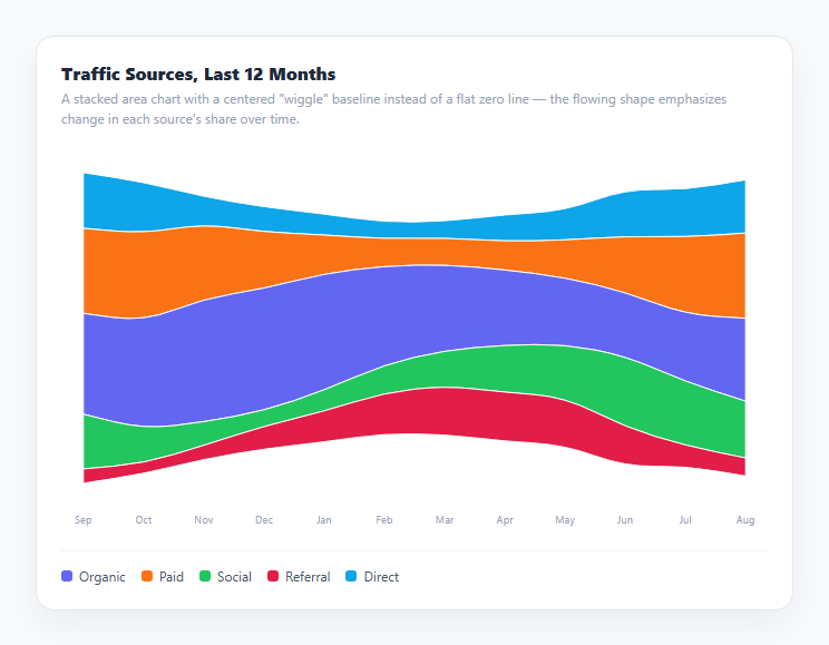
A streamgraph is a stacked area chart that has been recentered around a floating middle baseline instead of a flat zero line, producing an organic, flowing river-like shape rather than rigid stacked blocks. This snippet renders five synthetic traffic-source series across twelve months as a streamgraph, computing the centered stack and smoothed band outlines entirely from scratch in inline SVG — no stacked area chart library, no D3.
Why a centered baseline changes what the shape communicates
An ordinary stacked area chart accumulates every series upward from y = 0, which makes the *total* easy to read but makes an individual series' own ups and downs hard to see once it's buried in the middle of the stack — a shrinking band surrounded by growing ones can look deceptively flat. A streamgraph instead computes, for every time step, cursor = -total[i] * scale / 2 as the starting point, centering the *entire stack* around the vertical middle rather than the bottom edge. Every band's thickness at any x position still represents its value exactly like before, but the whole ribbon now visibly drifts, swells, and narrows as a connected organic form, which is what makes relative change between series easier to perceive at a glance.
Inside-out ordering keeps the widest bands in the middle
The stacking order itself matters for how calm the resulting silhouette looks. This snippet sorts series by their average value, then alternately pushes each one to the front or the back of a stackOrder array (i % 2 === 0 pushes, otherwise unshifts) — the classic "inside-out" ordering used by most streamgraph implementations, which places the largest-average series toward the visual center and the smallest toward the outer edges. Without this step, a chart stacked in an arbitrary or alphabetical order tends to look far more jagged, since large and small bands end up interleaved unpredictably.
Smoothing without a curve-interpolation library
Charting libraries typically offer a named curve type (curveBasis, curveCardinal) for this look. This snippet instead builds smoothPath() directly: for each pair of adjacent points, it draws a quadratic Bézier curve (Q) from the current point toward the midpoint between it and the next point, which is a simple, dependency-free way to round off the sharp corners a raw polyline would otherwise have between monthly data points, producing the soft, flowing edges characteristic of the streamgraph look.
One path per band, hover to isolate
Each series renders as a single closed SVG <path> — its smoothed top edge followed by its smoothed bottom edge reversed, closing into one shape — filled with that series' color. Hovering either a band or its legend entry dims every other band via a shared setActive() function, so a viewer can trace one series' contribution through the flowing stack without the surrounding bands visually competing for attention.
Build with AI
Build, Understand, Optimize, and Extend It With AI
Paste this snippet's HTML, CSS, and JS into an AI coding assistant like Claude and ask it to explain exactly how centering the stack around a floating baseline differs mathematically from a normal bottom-up stacked area chart, and why the inside-out ordering (placing higher-average series toward the center) produces a calmer silhouette than an arbitrary stacking order. It's also a good candidate for extension — ask it to add a click-to-pin interaction that keeps one band isolated after the mouse leaves, animate the transition when swapping in a new dataset so bands morph smoothly rather than snapping, or replace the quadratic-bezier smoothing with a proper Catmull-Rom-to-bezier conversion for an even softer curve through the exact data points.
Prompt to recreate it
Copy this into your AI assistant of choice to build the effect from scratch, or as a jumping-off point for your own variant:
Build a streamgraph chart in plain HTML, CSS, and JavaScript using inline SVG created with createElementNS — no charting library, no canvas.

Requirements:
- At least five time-series categories, each with a numeric value at every one of at least ten shared time steps (months). Generate realistic synthetic values per category (e.g. a base level plus a smooth periodic wave plus a small amount of noise) if no real dataset is supplied.
- Implement centered "wiggle" stacking: at each time step, compute a starting offset equal to negative half of that time step's total across all series, then stack every series' band upward from that shared centered offset — rather than stacking upward from a flat zero baseline like an ordinary stacked area chart.
- Implement inside-out stack ordering: sort the series by their average value, then build a final stacking order by alternately placing each series toward the front or the back of the order, so higher-average series end up positioned toward the visual center of the stack.
- Smooth each band's top and bottom edges using quadratic Bézier curve segments between consecutive points (drawing each curve toward the midpoint of each adjacent point pair) rather than straight polylines, and close each band into one filled SVG path combining its smoothed top edge and its smoothed, reversed bottom edge.
- Add hover interactivity: hovering a band, or hovering a corresponding legend entry, must dim every other band (and every other legend entry) so the hovered series' shape is easy to isolate and trace through the whole time range.
- Include a legend with a color swatch per series, and label the x-axis with the time step names beneath the chart.
Want to tighten it up first? Run this prompt through the AI Prompt Studio to score it across 8 quality dimensions, catch anti-patterns, and tune the wording for Claude, ChatGPT, or Gemini before you paste it in.
Step by step
How to Use
- 1Read a band's thickness over timeAt any x position, a band's vertical thickness represents that series' value at that time step — exactly like a normal stacked area chart, just recentered.
- 2Hover a band or legend entryHovering isolates one series by dimming every other band, making it easy to trace a single series' shape through the flowing stack.
- 3Compare relative movementBecause the whole stack floats around a centered baseline, a series swelling or narrowing is visible as motion in the ribbon shape itself, not just a subtle shift buried inside a flat-bottomed stack.
- 4Swap in real dataReplace the SERIES array's base/amp/phase values (or the buildSeries() function entirely) with your own real time-series values per category.
- 5Adjust the smoothingEdit smoothPath() in the JS panel — using a different midpoint fraction or a cubic Bézier instead of quadratic changes how tightly the bands hug the raw data points.
- 6Change the stack orderEdit the inside-out sort/alternate logic that builds stackOrder to try a different visual arrangement of which series sits toward the center.
Real-world uses
Common Use Cases
Got questions?
Frequently Asked Questions
A regular stacked area chart accumulates every series upward from a flat y = 0 baseline. A streamgraph instead centers the entire stack around the vertical middle at every time step, computing each band's starting position as negative half of that time step's total. The band thicknesses represent the same values either way, but the centered version produces a flowing, organic shape rather than blocks stacked from a fixed floor.
It refers to sorting series by their average value and then alternately placing each one toward the front or back of the stacking order, so the series with the largest average values end up positioned toward the visual center of the stack and the smallest toward the outer edges. This produces a noticeably calmer, more balanced silhouette than stacking series in an arbitrary or alphabetical order.
smoothPath() walks each band's array of points and, between every consecutive pair, draws a quadratic Bézier curve command (Q) toward the midpoint of that pair rather than a straight line — a simple, dependency-free technique that rounds off the sharp corners a raw polyline would otherwise have at each data point.
A closed path — the smoothed top edge followed by the smoothed bottom edge in reverse, then closed with Z — is what lets the band be filled as one solid colored shape. Drawing the top and bottom as two open, unfilled lines would only show outlines, not the solid ribbon that makes a streamgraph readable.
Yes — replace buildSeries() entirely, or just the values array on each entry in SERIES, with your own real per-time-step numeric values. Everything downstream (stacking, centering, smoothing, rendering) works on whatever values array each series provides.
Yes. Use the JSX, Vue, Angular, or Tailwind export buttons on this page. In React, compute the stacking and smoothed path strings during render (memoized with useMemo, since recomputation is proportional to series count times time steps) and render the resulting paths from state.