You Might Also Like
Learn Coding Visually
Learn to code with interactive, live-preview playgrounds — HTML, CSS, JavaScript, React & more.
 HTML Playground42 lessons · Click-based · Live preview
 CSS PlaygroundLearn CSS with a live editor
 JavaScript Playground60 lessons · DOM · Async · Canvas
 React PlaygroundLearn React with a live code editor
 GSAP PlaygroundLearn GSAP animation interactively
 SVG Playground44 lessons · shapes · paths · animation
 SCSS Playground45 lessons · Sass modules · tokens
 Tailwind PlaygroundLearn Tailwind CSS with a live editor
 Bootstrap 5 Playground50 lessons · live preview
Stacked Bar Chart — HTML CSS JS Snippet
Stacked Bar Chart · Charts · Plain HTML, CSS & JS · Live preview
What's included
Features
build maps each v value to value / max × H pixels, so every column shares one scale and is directly comparable.flex-direction: column-reverse stack, so the first series anchors the bottom and series pile up in order.scaleY from a bottom origin and staggered delays — proportions stay intact and it exports cleanly.offsetLeft + offsetWidth / 2 and translateX(-50%).SERIES array, so colours and names stay in sync with the bars automatically.DATA and SERIES drive the segments, legend, and tooltips — change one array, everything follows.filter: brightness so it is clear which bar the tooltip refers to.About this UI Snippet
Stacked Bar Chart — Multi-Series Segments, Hover Breakdown Tooltip & Staggered Grow-In
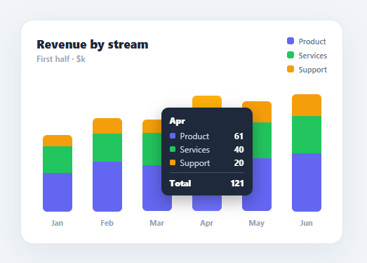
A stacked bar chart shows both the total of each category and how that total breaks down into parts — revenue by stream, traffic by source, hours by project. It is the right chart when the composition matters as much as the magnitude. This snippet builds one from a plain data array in HTML, CSS, and vanilla JavaScript: proportional stacked segments per column, an auto-generated legend, a hover tooltip with the per-series breakdown and total, and a staggered grow-in animation.
Data-driven stacking
build reads a DATA array where each entry has a label and a v array of per-series values, and a SERIES array defining each series' name and colour. It finds the maximum column total across the dataset, then for each column maps every series value to a pixel height (value / max × H) and emits a coloured segment. The segments live in a column-reverse flex stack so the first series sits at the bottom and they pile upward in series order. Because heights are derived from one shared max, every column is on the same scale and comparable at a glance.
Compositor-smooth grow-in
Each stack animates up with a sb-grow keyframe using transform: scaleY from a bottom origin, with a per-column animation-delay so the bars rise left to right. Scaling the whole stack (rather than animating each segment's height) keeps the proportions intact during the animation and runs on the GPU — and, importantly, a transform-based animation survives the Tailwind/React export cleanly, where animating raw height would not.
Hover tooltip with full breakdown
Hovering a column shows a dark tooltip listing each series with its colour swatch and value, plus the column total — the detail a stacked chart needs, since you cannot read individual segment values precisely off the axis. The tooltip is positioned by reading the hovered column's offsetLeft + offsetWidth / 2 and centring over it with a translateX(-50%), so it tracks whichever bar you are on. The hovered column brightens slightly for feedback.
Auto-generated legend
The legend is built from the SERIES array, so adding or recolouring a series updates the chart, the segments, and the legend together from one source of truth. There is nothing to keep in sync by hand.
Swap the DATA and SERIES arrays for your real figures and the chart redraws. Pair this with a bar chart for single-series data, an area chart for trends over time, or a metric card grid for headline KPIs.
Build with AI
Build, Understand, Optimize, and Extend It With AI
You don't need to work out the column-reverse stacking or the transform-based grow-in by hand. Paste this snippet's HTML, CSS, and JS into an AI coding assistant like Claude and ask it to explain exactly why the segments live in a flex-direction column-reverse container rather than being absolutely positioned, or why scaling the whole stack with a bottom-anchored transform keeps segment proportions intact during the entrance animation in a way that animating each segment's height individually would not. The same assistant can help optimize it, for example checking whether computing the shared max total on every build call matters if DATA changes frequently, or whether the tooltip's offsetLeft-based positioning breaks if the chart is inside a scrolled or transformed ancestor. It's also useful for extending the feature: ask it to add a 100%-stacked percentage mode, add a toggle between stacked and grouped rendering, or make the bars keyboard-navigable with arrow keys for accessibility. Treat the code less like a finished artifact and more like a starting point for a conversation.
Prompt to recreate it
Copy this into your AI assistant of choice to build the effect from scratch, or as a jumping-off point for your own variant:
Build a multi-series stacked bar chart in plain HTML, CSS, and JavaScript, no charting library.

Requirements:
- Accept a DATA array of objects, each with a label and a values array, plus a SERIES array defining each series' name and color (in the same order as the values array), and generate both the bars and a legend entirely from these two arrays.
- Compute the maximum column total (the sum of one column's values, not a single series' maximum) across the whole dataset, and scale every segment's pixel height as that segment's value divided by the shared maximum, times a fixed chart height, so all columns are on one common, comparable scale.
- Stack the segments within each column using a flex container set to column-reverse (not absolute positioning per segment), so the first series in the array anchors at the bottom and subsequent series pile upward in array order.
- Animate each column's entire stack growing in on load using a CSS keyframe that scales the whole stack vertically from a bottom transform-origin, with a per-column animation-delay that increases left to right so the bars rise in a staggered sequence rather than all at once.
- On hovering a column, show a tooltip listing every series' name, color swatch, and exact value for that column plus the column's total, positioned horizontally centered over the hovered column by reading its offset position and width, and visually highlight the hovered column (for example via a brightness filter) so it's clear which bar the tooltip belongs to.
- Ensure changing the SERIES array's colors or names, or the DATA array's values, requires no other code changes — the legend, segments, and tooltip must all read from these two arrays as the single source of truth.
Want to tighten it up first? Run this prompt through the AI Prompt Studio to score it across 8 quality dimensions, catch anti-patterns, and tune the wording for Claude, ChatGPT, or Gemini before you paste it in.
Step by step
How to Use
- 1Paste HTML, CSS, and JSA "Revenue by stream" card appears; six stacked bars (Jan–Jun) grow up from the baseline with a legend of three series.
- 2Read the compositionEach bar stacks Product, Services, and Support segments, so you see both the monthly total and its breakdown.
- 3Hover a barA tooltip shows each series with its value and the column total, positioned centred over the bar you are on.
- 4Watch the staggerOn load the bars rise left to right via a scaleY animation, drawing the eye across the time axis.
- 5Recolour or add a seriesEdit the
SERIESarray — the legend, segments, and tooltip all update from it. - 6Plug in your dataReplace
DATAwith your own{ label, v: [...] }entries; heights auto-scale to the largest column total.
Real-world uses
Common Use Cases
Got questions?
Frequently Asked Questions
Replace the DATA array with your entries ({ label, v: [series1, series2, ...] }) and the SERIES array with your series names and colours — keep the v order matching SERIES. build recomputes the max column total and rescales every segment, so the chart adapts to any values and any number of columns or series.
For grouped (side-by-side) bars, render each series as its own thin bar within the column instead of stacking them, scaling by the max single value rather than the max total. Many dashboards offer a toggle: keep both render paths and swap based on a button, since stacked answers "what's the composition" and grouped answers "how do series compare".
Scale each segment by its share of that column's own total instead of the global max: value / columnTotal × H, so every bar fills the full height and shows proportions rather than absolute magnitude. This is ideal when you care about mix shift over time, not raw totals.
The bars are decorative <div>s, so expose the data textually: add an aria-label to each column summarising it ("June: Product 70, Services 44, Support 26, total 140"), give the chart a role="img" with an overall label, and consider an off-screen data table for screen-reader users. Ensure series are distinguishable beyond colour (the legend and tooltip provide names).
In React, compute the segment heights with useMemo from your data and render columns/segments as styled <div>s; hold the hovered index in useState for the tooltip — no manual DOM building. In Vue, use v-for with :style and a ref for the hovered column. In Angular, *ngFor with [style.height]. The scaleY keyframe and stacking CSS port unchanged.