Learn Coding Visually
Learn to code with interactive, live-preview playgrounds — HTML, CSS, JavaScript, React & more.
 HTML Playground42 lessons · Click-based · Live preview
 CSS PlaygroundLearn CSS with a live editor
 JavaScript Playground60 lessons · DOM · Async · Canvas
 React PlaygroundLearn React with a live code editor
 GSAP PlaygroundLearn GSAP animation interactively
 SVG Playground44 lessons · shapes · paths · animation
 SCSS Playground45 lessons · Sass modules · tokens
 Tailwind PlaygroundLearn Tailwind CSS with a live editor
 Bootstrap 5 Playground50 lessons · live preview
Wind Rose Chart — Free HTML CSS JS Snippet
Wind Rose Chart · Charts · Plain HTML, CSS & JS · Live preview
What's included
Features
About this UI Snippet
Wind Rose Chart — Stacked Radial Wedges by Compass Direction & Speed Band
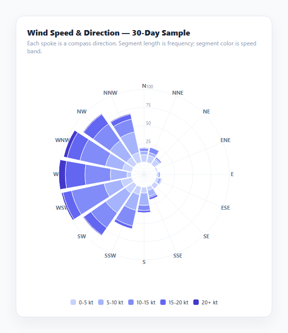
A wind rose is a specialized polar chart used in meteorology to show two things about wind at once: how often it blows from each compass direction, and how fast it typically blows from that direction. Sixteen spokes radiate from the center, one per compass point (N, NNE, NE, and so on), and each spoke's length encodes how frequently wind was observed from that direction — while the spoke itself is subdivided into colored segments representing how much of that frequency fell into each speed band, from calm to strong. This snippet renders one entirely from raw synthesized observation data with hand-written SVG, no charting library, and is structurally distinct from a plain Polar Area Chart because every wedge is itself a *stacked* bar in polar space rather than a single flat radius.
Why this differs from a polar area chart
A standard polar area chart maps one value to each spoke's length. A wind rose maps a whole *distribution* to each spoke — the direction's total frequency is split across speed bands and stacked outward from the center, so the chart simultaneously answers "how often does wind come from the northwest" and "when it does, how strong is it usually." wedgePath() draws each stacked segment as its own annular wedge, with rCursor tracked per-direction so each band's inner radius picks up exactly where the previous band's outer radius left off — the polar-coordinate equivalent of a stacked bar chart's running total.
Synthesizing directionally realistic sample data
genData() does not pick random values independently per direction; it simulates 720 individual hourly wind observations (30 days), each with a direction drawn from a wrapped Gaussian centered on a "prevailing" westerly direction and a speed that is systematically higher near that same prevailing direction and lower further from it. This produces a dataset with the kind of directional skew and speed correlation real wind-rose data actually has — a single dominant lobe with realistic spread — rather than sixteen independent random numbers that would never resemble genuine meteorological data.
Wedge geometry with an inner radius hole
Every segment is built as a proper polar annular wedge via wedgePath(cx, cy, rInner, rOuter, startDeg, endDeg), which draws an SVG arc path along the outer radius, a straight line down to the inner radius, and a second arc back along the inner radius to close the shape. A small fixed R_MIN inner radius keeps every spoke's innermost segment from starting at a single point at the center, matching how printed wind roses always leave a small open hub in the middle rather than converging every wedge to a point.
A small angular gap for spoke separation
Each wedge is inset by a small pad value in degrees on both edges before the arc is drawn, so adjacent direction wedges never touch — a small but important detail, since without it, sixteen abutting wedges of similar color read as one continuous ring rather than sixteen distinct directional slices.
Concentric frequency rings as the radial scale
Faint concentric circles behind the wedges, each labeled with the frequency value it represents, give the radial axis a readable scale — computed by dividing the maximum observed direction total into four even rings, exactly analogous to horizontal gridlines on a standard bar chart's value axis, just wrapped into a circle.
Build with AI
Build, Understand, Optimize, and Extend It With AI
Paste this snippet's HTML, CSS, and JS into an AI coding assistant like Claude and ask it to explain exactly how wedgePath() draws a stacked annular segment using two SVG arc commands and a connecting line, and how rCursor tracks the running stacked radius per direction the same way a stacked bar chart tracks a running stacked height. It's also a good candidate for extension — ask it to add a toggle between a "frequency" view (current) and a "calm percentage" center annotation, animate the wedges growing outward from the center on load, or add a direction-filter feature that dims every spoke except the one hovered or clicked.
Prompt to recreate it
Copy this into your AI assistant of choice to build the effect from scratch, or as a jumping-off point for your own variant:
Build a wind rose chart in plain HTML, CSS, and JavaScript using inline SVG created with createElementNS — no charting library, no canvas.

Requirements:
- Represent wind observation data as counts broken down by 16 compass directions (N, NNE, NE, ENE, E, ESE, SE, SSE, S, SSW, SW, WSW, W, WNW, NW, NNW) and a small number of speed bands (e.g. five bands from calm to strong).
- Include a data-generation function that simulates several hundred individual wind observations, each with a randomly drawn direction correlated around one "prevailing" direction (not uniform random) and a speed that is systematically higher near that prevailing direction, so the resulting dataset has a realistic dominant directional lobe.
- For each of the 16 directions, draw a radial spoke as a stack of annular polar wedges — one wedge per speed band present in that direction — where each wedge's inner radius equals the previous band's outer radius (a running stacked radius per direction, analogous to a stacked bar chart's running stacked height), and the outer radius is proportional to that band's observation count relative to the busiest direction's total.
- Give every wedge a small inner-radius floor so wedges start from a small open hub at the center rather than converging to a single point, and leave a small angular gap between adjacent direction wedges so they never visually merge.
- Draw labeled concentric circles behind the wedges representing evenly-spaced frequency values, computed from the actual maximum direction total in the dataset, to serve as a readable radial scale.
- Label each of the 16 spokes with its compass direction abbreviation just outside the outermost ring.
- Add a native tooltip (or equivalent) on each wedge segment reporting its direction, speed band, and observation count.
- Render a separate color-coded legend below the chart mapping each speed band to its wedge color.
Want to tighten it up first? Run this prompt through the AI Prompt Studio to score it across 8 quality dimensions, catch anti-patterns, and tune the wording for Claude, ChatGPT, or Gemini before you paste it in.
Step by step
How to Use
- 1Read spoke length as frequencyA longer spoke in a given compass direction means wind was observed from that direction more often.
- 2Read segment color as speed bandEach stacked segment within a spoke is colored by how fast the wind was blowing during those observations — check the legend below the chart.
- 3Find the prevailing directionThe longest overall spoke (here, roughly west) shows the dominant wind direction across the sample period.
- 4Hover any segment for exact countsA native SVG tooltip reports the direction, speed band, and observation count for that specific wedge segment.
- 5Swap in real observation dataReplace genData() with your own array of [direction][speedBand] observation counts, keeping the same 16-direction x 5-band shape.
- 6Adjust the speed bandsEdit the SPEED_BANDS array to change the number, labels, or color of speed categories — the chart rebuilds around whatever bands you define.
Real-world uses
Common Use Cases
Got questions?
Frequently Asked Questions
A polar area chart maps one value to each spoke's length. A wind rose maps a full distribution to each spoke: the direction's total frequency is split into speed bands and drawn as stacked annular wedges outward from the center, so each spoke shows both how often and how strongly wind blew from that direction.
genData() simulates 720 individual hourly wind observations. Each observation's direction is drawn from a wrapped Gaussian distribution centered on a prevailing westerly direction, and its speed is generated with a base value that decreases with angular distance from that prevailing direction plus Gaussian noise — producing directionally realistic, correlated sample data instead of independent random values per direction.
It is a fixed minimum radius that every spoke's wedges start from, leaving a small open hub at the chart's center instead of every wedge converging to a single point — matching the visual convention of printed meteorological wind roses.
Replace the genData() function with your own logic that returns a 2D array shaped [direction][speedBand], where each entry is the observation count for that direction and speed band combination — the same shape genData() already produces, so no other code needs to change.
Yes — edit the DIRECTIONS array (commonly 8, 16, or 32 directions in real wind roses) and the SPEED_BANDS array (label and color per band). Both wedgePath() and the ring/spoke drawing logic use these arrays' lengths directly rather than hardcoded counts.
The pad value in wedgePath() insets each wedge's start and end angle by a small amount before drawing the arc, so neighboring direction wedges never touch. Without this gap, wedges of similar color at adjacent directions would visually blur into one continuous ring instead of reading as sixteen distinct directional slices.