Learn Coding Visually
Learn to code with interactive, live-preview playgrounds — HTML, CSS, JavaScript, React & more.
 HTML Playground42 lessons · Click-based · Live preview
 CSS PlaygroundLearn CSS with a live editor
 JavaScript Playground60 lessons · DOM · Async · Canvas
 React PlaygroundLearn React with a live code editor
 GSAP PlaygroundLearn GSAP animation interactively
 SVG Playground44 lessons · shapes · paths · animation
 SCSS Playground45 lessons · Sass modules · tokens
 Tailwind PlaygroundLearn Tailwind CSS with a live editor
 Bootstrap 5 Playground50 lessons · live preview
Master-Detail Split Navigation — Free HTML CSS JS Snippet
Master-Detail Split Navigation · Navigation · Plain HTML, CSS & JS · Live preview
What's included
Features
About this UI Snippet
Master-Detail Split Navigation — Responsive Two-Pane List and Detail Layout
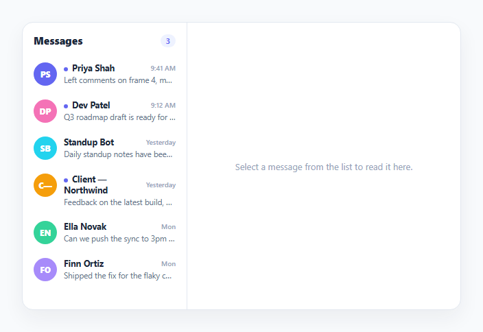
Master-detail (also called list-detail) is the navigation pattern behind email clients, messaging apps, and settings screens: a list of items sits in one pane, and selecting an item shows its full content in an adjacent pane — both visible simultaneously on wide screens. The pattern only becomes interesting on small screens, where there isn't room for two panes side by side, and the interaction has to fall back to a single pane that shows the list first and slides in the detail on selection. This snippet implements both behaviors from one shared DOM and state model, switching purely via CSS media query and one toggled class — not two separate implementations.
One shared data model drives both panes
MESSAGES is the single source of truth; renderList() and renderDetail() both read from it and from the shared activeId. Selecting a message calls selectMessage(id), which updates activeId, marks the message read, and re-renders both panes — there is no separate mobile-only or desktop-only state, which is what keeps the two responsive behaviors from ever drifting out of sync with each other.
Desktop: both panes always visible
At the default (wide) layout, .md-shell is a two-column CSS grid — the list pane at a fixed width, the detail pane filling the rest. Both are always rendered and visible; clicking a list item simply swaps which message's content appears in the already-visible detail pane, with the newly active row highlighted via the .active class.
Mobile: an absolutely-positioned sliding single pane
Below the 560px breakpoint, the media query repositions both .md-list and .md-detail to the same grid cell using position: absolute; inset: 0, so only one is visually on top at a time, and each has a CSS transition on transform. The detail pane starts pre-positioned at translateX(100%) (off-screen to the right); toggling the single .md-showing-detail class on the shell slides the list pane out to -100% and the detail pane in to 0 simultaneously — a coordinated slide driven by one class toggle rather than two independent animations that could fall out of sync.
A back button that only exists where it's needed
The back button is present in the markup for every screen size but stays display: none until the same 560px media query flips it to display: flex — there is no JavaScript check for screen width; the button's visibility itself is a pure CSS responsive concern, while its click handler (removing .md-showing-detail) works identically whether or not the button happens to be visible at the current viewport width.
Read-state tracking independent of selection
A readIds Set tracks which messages have been opened, decoupled from activeId — so a message correctly stays marked as read (no unread dot, no unread-count contribution) even after a different message becomes the active selection, rather than "read" incorrectly meaning "currently selected."
Build with AI
Build, Understand, Optimize, and Extend It With AI
Paste this snippet's HTML, CSS, and JS into an AI coding assistant like Claude and ask it to explain exactly how the single .md-showing-detail class toggle drives two coordinated CSS transforms at once, and why keeping one shared data model and selection state (rather than separate mobile/desktop logic) is what keeps the two responsive layouts from ever falling out of sync. It's also a good candidate for extension — ask it to add swipe-to-go-back gesture support on the mobile detail pane (similar to the Edge Swipe Back Navigation snippet), add keyboard arrow-key navigation through the list, or persist the read/unread state to localStorage so it survives a page reload.
Prompt to recreate it
Copy this into your AI assistant of choice to build the effect from scratch, or as a jumping-off point for your own variant:
Build a responsive master-detail (list-detail) navigation layout in plain HTML, CSS, and JavaScript — no libraries or frameworks.

Requirements:
- A single shared data array of list items (e.g. messages, each with an id, name, short preview text, and full body text), rendered into a list pane on the left and, once selected, into a detail pane on the right — both panes reading from the same array and the same "currently selected id" state.
- On wide viewports, both panes must be visible simultaneously as a two-column layout, with the currently selected list item visually highlighted and the detail pane showing its full content beside the list.
- Below a defined breakpoint (e.g. 560px), the layout must collapse to a single visible pane at a time: the list shows first, and selecting an item slides the detail pane in over the list using CSS transform transitions on absolutely-positioned panes, driven by toggling exactly one CSS class on a shared container — do not duplicate rendering logic or state between the desktop and mobile behavior.
- Include a back button that is only visually shown below that same breakpoint (via CSS, not JavaScript viewport checks) and, when clicked, removes the toggled class to slide the list pane back into view.
- Track which items have been "read" (opened) independently from which item is currently selected, using a persistent set of read IDs, and reflect that in a live unread-count badge and per-item unread indicator.
- Show a clear empty state in the detail pane before any item has been selected.
Want to tighten it up first? Run this prompt through the AI Prompt Studio to score it across 8 quality dimensions, catch anti-patterns, and tune the wording for Claude, ChatGPT, or Gemini before you paste it in.
Step by step
How to Use
- 1Click a message in the listThe full message loads into the detail pane. On desktop this happens beside the list; both panes stay visible.
- 2Shrink the preview below ~560pxThe layout collapses to a single pane. Selecting a message now slides the detail pane in over the list.
- 3Use the back button on mobileThe back button (hidden on desktop, visible only below the breakpoint) slides the list pane back into view.
- 4Watch the unread count and dotSelecting an unread message marks it read immediately — the header count and the item's unread dot both update.
- 5Change the breakpointEdit the max-width value in the CSS media query to control at what viewport width the layout switches from two-pane to sliding single-pane.
- 6Swap in your own list dataReplace the MESSAGES array with your own items — renderList() and renderDetail() work with any array sharing the same id/name/preview/body shape.
Real-world uses
Common Use Cases
Got questions?
Frequently Asked Questions
A single CSS media query at max-width: 560px repositions both .md-list and .md-detail to the same grid cell using position: absolute; inset: 0, and gives each a transform transition. No JavaScript checks the viewport width — the responsive switch is handled entirely by CSS, while the JS state (which message is active) stays identical at every screen size.
The detail pane starts pre-positioned off-screen at translateX(100%). Selecting a message adds a single .md-showing-detail class to the shell, and CSS rules scoped to that class slide the list pane to translateX(-100%) and the detail pane to translateX(0) at the same time, both animated by the same transition duration for a coordinated slide.
Its visibility (display: none by default, display: flex only within the same media query used for the pane-sliding layout) is a pure CSS responsive concern. Keeping one element and one click handler for every screen size is simpler and less error-prone than conditionally rendering different markup per viewport in JavaScript.
A readIds Set records every message ID that has been opened, independent of activeId (the currently displayed message). This means a message correctly remains marked as read after the user selects a different message — read state is a property of the message itself, not of whatever happens to be currently selected.
Edit the max-width: 560px value in the CSS media query. Everything else — the JS state model, the slide transition, the back button visibility — is driven by that same breakpoint automatically.
Yes conceptually, by extending the same pattern: add a third absolutely-positioned pane and a second toggled class for the next drill-down level, sliding each new pane in over the previous one using the identical transform-transition technique already used between the list and detail panes.