Learn Coding Visually
Learn to code with interactive, live-preview playgrounds — HTML, CSS, JavaScript, React & more.
 HTML Playground42 lessons · Click-based · Live preview
 CSS PlaygroundLearn CSS with a live editor
 JavaScript Playground60 lessons · DOM · Async · Canvas
 React PlaygroundLearn React with a live code editor
 GSAP PlaygroundLearn GSAP animation interactively
 SVG Playground44 lessons · shapes · paths · animation
 SCSS Playground45 lessons · Sass modules · tokens
 Tailwind PlaygroundLearn Tailwind CSS with a live editor
 Bootstrap 5 Playground50 lessons · live preview
Violin Plot Chart — Free HTML CSS JS Snippet
Violin Plot Chart · Charts · Plain HTML, CSS & JS · Live preview
What's included
Features
About this UI Snippet
Violin Plot Chart — Kernel Density Estimation and Embedded Box Plot in Hand-Drawn SVG
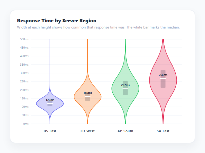
A violin plot shows the full shape of a numeric distribution for each group, not just a handful of summary numbers — the width of the "violin" at any height represents how common values near that height actually were in the underlying data. This snippet renders four such shapes for simulated server response-time samples across regions, computing every curve directly from raw data with a kernel density estimate (KDE), and overlays a compact quartile box and median line inside each violin for a quick numeric read alongside the full shape.
Why a violin plot beats a bar of averages
A bar chart of average response time per region collapses an entire distribution — which might be tightly clustered, widely spread, or skewed with a long tail of slow outliers — into one number, hiding exactly the information that matters for diagnosing performance issues. A box plot improves on this by showing quartiles and a median, but still only draws a handful of summary lines. A violin plot shows the *entire* density curve, so a bimodal distribution (two separate clusters of typical values), a long tail, or a sharp single peak are all immediately visible as shape differences, not just numbers a viewer has to interpret.
Kernel density estimation from raw samples
kde(samples, points, bandwidth) computes, for each candidate value along the y-axis, a smoothed estimate of how densely the raw samples cluster near that value. For every point being evaluated, it sums a Gaussian kernel (Math.exp(-0.5 * u * u), the bell-curve shape) centered on every individual sample, where u is the distance from the evaluation point to that sample scaled by the bandwidth, then normalizes the sum by the sample count and bandwidth so the result behaves like a proper probability density. A larger bandwidth smooths the curve more aggressively (blurring together nearby bumps); a smaller one hugs the raw data more tightly and can look noisier. The bandwidth here is derived per-group from that group's own value range ((max - min) / 9), so groups with wider spreads automatically get proportionally wider smoothing.
Turning a density curve into a symmetric violin outline
For each group, the code evaluates kde() at 60 evenly-spaced y-values spanning the shared y-axis range, then for each evaluated point computes a horizontal half-width proportional to that point's density relative to the group's own peak density (density[i] / maxDensity). Mirroring that half-width to the left and right of the group's center x-position, at every y-value, produces two point lists; joining the left list top-to-bottom, then the reversed right list bottom-to-top, and closing the path, draws one continuous, symmetric outline — the classic violin silhouette — as a single SVG <path> with fill-opacity for a soft, layered look.
Overlaying a box plot for exact quartiles
Because a density curve alone doesn't make it easy to read exact numbers, a small rectangle and a bold median line are drawn on top of each violin. quantile(sorted, q) implements linear-interpolation quantile calculation on the group's pre-sorted sample array — finding the fractional index for a given quantile q and interpolating between the two nearest actual samples — to compute the 25th percentile (q1), 75th percentile (q3), and 50th percentile (the median). The rectangle spans from q1 to q3 (the interquartile range, where the middle 50% of samples fall), and a short bold horizontal bar marks the exact median position, giving a precise numeric anchor inside the more qualitative violin shape.
Simulated data via a Box-Muller transform
Because the chart needs realistic-looking distributions rather than a flat uniform spread to be meaningful, gen() generates each group's 260 samples using a Box-Muller transform (Math.sqrt(-2 * ln(u)) * cos(2π * v) from two uniform random numbers u and v) to produce approximately normally-distributed random values, then adds a positive skew term so the resulting distribution has a realistic long tail toward slower response times, matching the shape real latency data usually takes.
Build with AI
Build, Understand, Optimize, and Extend It With AI
Paste this snippet's HTML, CSS, and JS into an AI coding assistant like Claude and ask it to explain exactly how the Gaussian kernel inside kde() turns discrete raw samples into a smooth density curve, and how the bandwidth parameter trades off smoothness against fidelity to the raw data. It's also a good candidate for extension — ask it to add a toggle between separate violins per group and mirrored split-violins comparing two conditions side by side within one shape, overlay the individual raw sample points as a jittered strip alongside the density curve, or compute bandwidth automatically per group using a standard rule like Silverman's rule of thumb instead of the fixed range-based heuristic used here.
Prompt to recreate it
Copy this into your AI assistant of choice to build the effect from scratch, or as a jumping-off point for your own variant:
Build a violin plot chart in plain HTML, CSS, and JavaScript using inline SVG created with createElementNS — no charting library, no canvas.

Requirements:
- Implement a kernel density estimation function that takes a raw array of numeric samples, an array of evaluation points, and a bandwidth, and returns an estimated density value at each evaluation point using a Gaussian kernel summed across all samples and normalized by sample count and bandwidth.
- Implement a quantile function that computes any percentile (e.g. 0.25, 0.5, 0.75) from a sorted numeric array using linear interpolation between the two nearest actual values, not simple nearest-value lookup.
- For each of several groups of raw sample data, evaluate the density function at many evenly-spaced points spanning a shared y-axis range, convert each density value into a horizontal half-width scaled relative to that group's own peak density, and build one closed, symmetric SVG path by mirroring those widths to the left and right of the group's center x-position across all evaluated heights — producing the classic violin silhouette.
- Overlay a small shaded rectangle spanning each group's interquartile range (25th to 75th percentile, from the quantile function) and a bold horizontal bar marking the exact median, positioned inside each violin shape.
- Draw a shared y-axis with gridlines and labels so violin widths and vertical positions are directly comparable across all groups, plus a text label naming each group beneath its violin.
- Add a native tooltip (or equivalent) on each violin reporting its exact computed median and interquartile range values.
- Include a data-generation helper using a Box-Muller transform to produce realistic pseudo-random sample data with a configurable mean, spread, and skew for demonstration purposes.
Want to tighten it up first? Run this prompt through the AI Prompt Studio to score it across 8 quality dimensions, catch anti-patterns, and tune the wording for Claude, ChatGPT, or Gemini before you paste it in.
Step by step
How to Use
- 1Read the width at any heightAt any y-axis value, a violin's horizontal width shows how common response times near that value were — wider means more samples landed there.
- 2Find the median and IQRThe bold white bar marks the exact median from quantile(samples, 0.5); the shaded rectangle behind it spans the interquartile range from the 25th to 75th percentile.
- 3Compare shapes across groupsCompare how tight, wide, or skewed each region's violin is — a region with a long lower tail has more consistently fast responses than one with a wide, evenly-spread shape.
- 4Hover a violin for exact numbersHover any violin body to see a native tooltip reporting its exact median and interquartile range in milliseconds.
- 5Swap in real dataReplace the gen() calls in the GROUPS array with your own raw sample arrays — any array of numeric values works directly with kde() and quantile().
- 6Tune the smoothingAdjust the bandwidth formula in the draw() loop — a larger divisor produces a smoother, less detailed curve; a smaller one hugs the raw data more tightly.
Real-world uses
Common Use Cases
Got questions?
Frequently Asked Questions
kde() evaluates a Gaussian kernel density estimate at 60 points spanning the y-axis range for each group's raw samples, producing a smoothed density value at each height. Those density values are converted to horizontal half-widths (scaled relative to that group's own peak density) and mirrored left and right of the group's center, then joined into one closed SVG path.
Bandwidth controls how much the kernel density estimate smooths the raw data — larger values blur nearby clusters together into one smoother bump, smaller values hug the raw samples more tightly and can look spikier or noisier. This snippet derives it per group as roughly one-ninth of that group's own value range, so wider-spread groups get proportionally more smoothing automatically.
The shaded rectangle spans the interquartile range — from the 25th percentile to the 75th percentile, computed by quantile() with linear interpolation — meaning the middle 50% of that group's samples fall inside it. The bold bar marks the exact median (50th percentile) position.
gen() uses a Box-Muller transform to convert pairs of uniform random numbers into approximately normally-distributed values, then adds a proportional positive-skew term so the resulting samples have a realistic long tail toward higher (slower) values, similar to how real latency data typically distributes.
A box plot shows only five summary numbers (minimum, first quartile, median, third quartile, maximum) as straight lines and a rectangle. A violin plot shows those same summary numbers as an overlay but also draws the complete estimated density curve, so shape differences like bimodal distributions or asymmetric tails remain visible instead of being compressed into a handful of lines.
Yes. Use the JSX, Vue, Angular, or Tailwind export buttons on this page. In React, run kde() and quantile() over your data during render (or memoize them with useMemo since KDE is O(samples × points)) and build the SVG path string the same way from the results.