Source Code
<div class="app">
  <div class="card">
    <div class="card-header">
      <h3>Daily High Temperature by Month</h3>
      <p class="sub">Each row is a smoothed distribution of daily highs for that month. Overlapping curves reveal the seasonal shift at a glance.</p>
    </div>
    <div class="chart-wrap">
      <svg id="ridge" viewBox="0 0 620 460" xmlns="http://www.w3.org/2000/svg"></svg>
    </div>
  </div>
</div>
* { margin: 0; padding: 0; box-sizing: border-box; }
body { background: #f8fafc; font-family: system-ui, sans-serif; min-height: 100vh; display: flex; align-items: center; justify-content: center; padding: 20px; }
.app { width: 100%; max-width: 660px; }
.card { background: #fff; border: 1px solid #e2e8f0; border-radius: 16px; padding: 22px; box-shadow: 0 12px 30px rgba(30,41,59,0.06); }
.card-header { margin-bottom: 6px; }
h3 { font-size: 16px; font-weight: 800; color: #1e293b; }
.sub { font-size: 12px; color: #94a3b8; margin-top: 3px; }
#ridge { width: 100%; display: block; overflow: visible; }
.ridge-axis-label { font-size: 10px; fill: #94a3b8; }
.ridge-x-label { text-anchor: middle; font-weight: 700; }
.ridge-month-label { font-size: 11.5px; font-weight: 700; fill: #1e293b; text-anchor: end; }
.ridge-curve { stroke-width: 1.5; transition: opacity .15s; cursor: pointer; }
.ridge-curve:hover { opacity: 1 !important; }
.ridge-baseline { stroke: #e2e8f0; stroke-width: 1; }
.ridge-peak-label { font-size: 9.5px; fill: #fff; font-weight: 700; text-anchor: middle; opacity: 0; transition: opacity .15s; pointer-events: none; }const svg = document.getElementById('ridge');
const NS = 'http://www.w3.org/2000/svg';
const MONTHS = [
{ name: 'Dec', mean: 42, spread: 9 },
{ name: 'Nov', mean: 51, spread: 8 },
{ name: 'Oct', mean: 62, spread: 7 },
{ name: 'Sep', mean: 72, spread: 6 },
{ name: 'Aug', mean: 84, spread: 5 },
{ name: 'Jul', mean: 87, spread: 4 },
{ name: 'Jun', mean: 81, spread: 6 },
{ name: 'May', mean: 71, spread: 7 },
{ name: 'Apr', mean: 61, spread: 8 },
{ name: 'Mar', mean: 53, spread: 9 },
{ name: 'Feb', mean: 45, spread: 9 },
{ name: 'Jan', mean: 40, spread: 9 },
];
function genSamples(mean, spread, n) {
const out = [];
for (let i = 0; i < n; i++) {
let u = 0, v = 0;
while (u === 0) u = Math.random();
while (v === 0) v = Math.random();
const g = Math.sqrt(-2 * Math.log(u)) * Math.cos(2 * Math.PI * v);
out.push(mean + g * spread);
}
return out;
}
function kde(samples, points, bandwidth) {
return points.map(x => {
let sum = 0;
for (const s of samples) {
const u = (x - s) / bandwidth;
sum += Math.exp(-0.5 * u * u);
}
return sum / (samples.length * bandwidth * Math.sqrt(2 * Math.PI));
});
}
function el(tag, attrs) {
const e = document.createElementNS(NS, tag);
Object.entries(attrs).forEach(([k, v]) => e.setAttribute(k, v));
return e;
}
const W = 620, H = 460;
const PAD_L = 54, PAD_R = 20, PAD_T = 14, PAD_B = 34;
const innerW = W - PAD_L - PAD_R;
const rowH = (H - PAD_T - PAD_B) / MONTHS.length;
const overlap = 2.1; // how many rows tall each curve's peak is allowed to rise into the row above
const xMin = 20, xMax = 100;
function xPos(v) { return PAD_L + ((v - xMin) / (xMax - xMin)) * innerW; }
const colorFor = i => {
const t = i / (MONTHS.length - 1);
const hue = 220 - t * 200; // indigo (cold) through orange to red (hot), reversed since Jan is warming again at both ends
return `hsl(${(220 - t * 260 + 360) % 360}, 72%, ${52 + t * 6}%)`;
};
function draw() {
svg.innerHTML = '';
for (let v = xMin; v <= xMax; v += 20) {
const x = xPos(v);
const label = el('text', { class: 'ridge-axis-label ridge-x-label', x, y: H - PAD_B + 20 });
label.textContent = v + '\u00b0F';
svg.appendChild(label);
}
// Draw back-to-front (Dec at back/top of array renders first) so nearer rows overlap the far ones, like a mountain ridge.
MONTHS.forEach((month, i) => {
const baseline = PAD_T + rowH * (i + 1);
svg.appendChild(el('line', {
class: 'ridge-baseline', x1: PAD_L, y1: baseline, x2: PAD_L + innerW, y2: baseline,
}));
const samples = genSamples(month.mean, month.spread, 220);
const points = [];
const step = (xMax - xMin) / 80;
for (let v = xMin; v <= xMax; v += step) points.push(v);
const density = kde(samples, points, month.spread / 2.2);
const maxDensity = Math.max(...density);
const rowRise = rowH * overlap;
let peakX = points[0], peakY = 0;
const top = points.map((v, idx) => {
const h = (density[idx] / maxDensity) * rowRise;
if (h > peakY) { peakY = h; peakX = v; }
return `${xPos(v)},${baseline - h}`;
});
const outline = `M ${xPos(xMin)},${baseline} L ${top.join(' L ')} L ${xPos(xMax)},${baseline} Z`;
const color = colorFor(i);
const path = el('path', {
class: 'ridge-curve', d: outline, fill: color, 'fill-opacity': '0.82', stroke: color,
});
const title = el('title', {});
title.textContent = `${month.name}: peak near ${Math.round(peakX)}\u00b0F`;
path.appendChild(title);
svg.appendChild(path);
const monthLabel = el('text', { class: 'ridge-month-label', x: PAD_L - 10, y: baseline - 2 });
monthLabel.textContent = month.name;
svg.appendChild(monthLabel);
});
}
draw();Learn Coding Visually
Learn to code with interactive, live-preview playgrounds — HTML, CSS, JavaScript, React & more.
 HTML Playground42 lessons · Click-based · Live preview
 CSS PlaygroundLearn CSS with a live editor
 JavaScript Playground60 lessons · DOM · Async · Canvas
 React PlaygroundLearn React with a live code editor
 GSAP PlaygroundLearn GSAP animation interactively
 SVG Playground44 lessons · shapes · paths · animation
 SCSS Playground45 lessons · Sass modules · tokens
 Tailwind PlaygroundLearn Tailwind CSS with a live editor
 Bootstrap 5 Playground50 lessons · live preview
Ridgeline Plot Chart — Stacked Overlapping Density Curves
Ridgeline Plot Chart · Charts · Plain HTML, CSS & JS · Live preview
What's included
Features
About this UI Snippet
Ridgeline Plot Chart — Overlapping KDE Density Curves for Comparing Many Distributions at Once
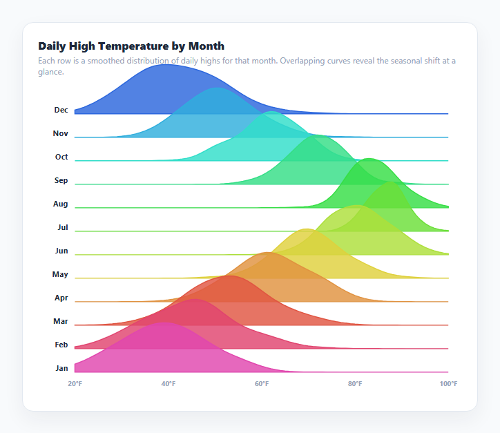
A ridgeline plot — also called a joyplot, after the Joy Division album cover that popularized the look — stacks many distribution curves in a row, each one slightly overlapping the row above it, so a viewer can compare how a shape shifts across dozens of categories in one compact chart instead of scrolling through dozens of separate small charts. This snippet renders twelve months of simulated daily-high-temperature distributions this way, computing every curve from raw sample data with a Gaussian kernel density estimate (KDE), the same statistical technique behind the Violin Plot Chart — but arranged as stacked overlapping rows instead of mirrored side-by-side shapes.
Twelve rows sharing one baseline grid
The chart divides its vertical space into twelve equal-height rows, one per month, each with its own horizontal baseline. Rather than confining a month's curve to its own row height, rowRise = rowH * overlap lets a curve's peak rise up to roughly two rows tall — which is precisely what makes it a *ridgeline* rather than a plain stacked bar of separate charts: a tall, narrow July peak visually climbs into the empty space above June's baseline, creating the signature overlapping-mountain-range silhouette.
Kernel density estimation, exactly as in a violin plot
kde(samples, points, bandwidth) sums a Gaussian bell-curve kernel centered on every raw sample, evaluated at many points along the shared x-axis, then normalizes by sample count and bandwidth — the identical technique used to build a violin's outline, just rendered as one one-sided curve per row instead of a mirrored pair. genSamples() produces each month's 220 raw values with a Box-Muller transform around that month's mean and spread, so warmer, more variable months (like the shoulder seasons) visibly produce wider, flatter curves than tighter summer or winter peaks.
Why draw order matters here specifically
Every row's filled curve is drawn as an opaque-ish SVG <path>, and later-drawn shapes paint on top of earlier ones in SVG's natural document order. The months are iterated in the array order they are defined (December at the back, January at the front), so each subsequent row's curve visually occludes the tail end of the row drawn immediately before it wherever they overlap — this is what produces the "peeking out from behind" ridge effect rather than curves simply floating with no depth relationship to their neighbors.
A shared x-axis is what makes comparison meaningful
Every row's density curve is evaluated over the identical xMin–xMax temperature range and positioned with the same xPos() scale function, so a peak's horizontal position is directly comparable across every row — sliding rightward from January through July and back again traces the seasonal cycle as a continuous visual wave down the whole chart, which is the entire point of putting these twelve distributions in one figure instead of twelve separate ones.
Per-row color as a second visual encoding
Each row's fill color is computed by colorFor(i), sweeping through a hue range so cooler months render in cooler blues and warmer months in warmer oranges — reinforcing the same seasonal signal the curve's horizontal position already shows, so the color and the shape agree rather than fighting each other for attention.
Build with AI
Build, Understand, Optimize, and Extend It With AI
Paste this snippet's HTML, CSS, and JS into an AI coding assistant like Claude and ask it to explain exactly how the overlap ratio and SVG draw order combine to produce the signature "mountain ridge" silhouette, and how that differs from simply stacking separate small charts vertically. It's also a good candidate for extension — ask it to add a hover state that dims every row except the one under the cursor, add real axis gridlines behind the ridges instead of only per-row baselines, or compute each row's bandwidth automatically with a standard rule like Silverman's rule of thumb instead of the fixed spread-based heuristic used here.
Prompt to recreate it
Copy this into your AI assistant of choice to build the effect from scratch, or as a jumping-off point for your own variant:
Build a ridgeline plot (joyplot) chart in plain HTML, CSS, and JavaScript using inline SVG created with createElementNS — no charting library, no canvas.

Requirements:
- Implement a kernel density estimation function that takes a raw array of numeric samples, an array of evaluation points, and a bandwidth, and returns an estimated density value at each evaluation point using a Gaussian kernel summed across all samples and normalized by sample count and bandwidth.
- For at least ten ordered categories (e.g. months of the year), generate or accept raw sample data per category and evaluate the density function at many evenly-spaced points spanning one shared x-axis range used by every category.
- Lay out the categories as stacked horizontal rows, each with its own baseline, but allow each row's density curve to rise in height beyond its own row's vertical allotment (e.g. up to twice the row height) so a tall peak visually overlaps into the space belonging to the row drawn immediately before it — producing the classic overlapping ridgeline silhouette rather than separated, non-overlapping small multiples.
- Fill each row's curve as a closed, opaque SVG path from its baseline up through the density curve and back, and ensure rows are drawn in an order such that each subsequent row's shape visually occludes the tail of the row before it wherever they overlap.
- Draw a shared x-axis with labeled tick values beneath the whole stack, plus a text label naming each row's category to its left.
- Use a distinct fill color per row (e.g. a hue gradient across the ordered categories) so color reinforces whatever trend the shifting peak positions already show.
- Add a native tooltip (or equivalent) on each row's curve reporting its approximate peak value.
- Include a data-generation helper using a Box-Muller transform to produce realistic pseudo-random sample data per category with a configurable mean and spread, for demonstration purposes.
Want to tighten it up first? Run this prompt through the AI Prompt Studio to score it across 8 quality dimensions, catch anti-patterns, and tune the wording for Claude, ChatGPT, or Gemini before you paste it in.
Step by step
How to Use
- 1Read the horizontal positionEach curve's peak position along the x-axis shows that month's most common daily high temperature.
- 2Read the curve widthA wider, flatter curve means daily highs varied more that month; a tall, narrow curve means temperatures were unusually consistent.
- 3Follow the overlap top to bottomScan from December (top) to January (bottom, wrapping) to see the whole seasonal temperature cycle as one continuous wave.
- 4Hover any curve for its peak valueHover a ridge to see a native tooltip reporting that month's approximate peak temperature.
- 5Swap in real dataReplace genSamples() calls in the MONTHS array with your own raw sample arrays for each category — any array of numeric values works directly with kde().
- 6Adjust the overlap amountChange the overlap constant in the JS panel — a larger value lets tall peaks climb further into the rows above, a smaller value keeps rows more separated.
Real-world uses
Common Use Cases
Got questions?
Frequently Asked Questions
Both use kernel density estimation to draw a smoothed distribution shape from raw samples. A violin plot mirrors that shape left and right of a central axis for one group at a time, arranged side by side. A ridgeline plot draws only one side of the shape per group and stacks many groups as overlapping horizontal rows, which scales to far more categories in the same space and emphasizes how the shape changes across an ordered sequence.
Each row's density curve is allowed a maximum height (rowRise) larger than that row's own baseline-to-baseline spacing, controlled by the overlap constant. A tall peak therefore draws above the row's own baseline and up into the empty space belonging to the row before it, and because later rows are drawn after earlier ones in SVG document order, the later row's filled shape occludes whatever it overlaps.
SVG paints elements in the order they appear in the document, with later elements appearing on top of earlier ones wherever they overlap. Because ridgeline rows are designed to overlap on purpose, the iteration order of the MONTHS array directly determines which row appears to sit "in front of" its neighbor — reversing that order would flip which curves appear to occlude which.
Each month's bandwidth is derived from that month's own spread value (spread / 2.2), so months simulated with more day-to-day temperature variance automatically get a proportionally smoother, wider curve rather than every row sharing one fixed smoothing amount.
Yes — replace the genSamples() call for any month in the MONTHS array with your own array of raw numeric values (e.g. actual recorded daily highs for that month across several years). The kde() function works directly on any array of numbers regardless of how it was produced.
Yes. Use the JSX, Vue, Angular, or Tailwind export buttons on this page. In React, compute kde() per row during render (memoized with useMemo since it is O(samples × points) per row) and build each row's SVG path string from the results the same way.