Learn Coding Visually
Learn to code with interactive, live-preview playgrounds — HTML, CSS, JavaScript, React & more.
 HTML Playground42 lessons · Click-based · Live preview
 CSS PlaygroundLearn CSS with a live editor
 JavaScript Playground60 lessons · DOM · Async · Canvas
 React PlaygroundLearn React with a live code editor
 GSAP PlaygroundLearn GSAP animation interactively
 SVG Playground44 lessons · shapes · paths · animation
 SCSS Playground45 lessons · Sass modules · tokens
 Tailwind PlaygroundLearn Tailwind CSS with a live editor
 Bootstrap 5 Playground50 lessons · live preview
Parallel Coordinates Chart — Free HTML CSS JS Snippet
Parallel Coordinates Chart · Charts · Plain HTML, CSS & JS · Live preview
What's included
Features
About this UI Snippet
Parallel Coordinates Chart — Multi-Dimensional Comparison with Per-Axis Normalization and Hover Isolation
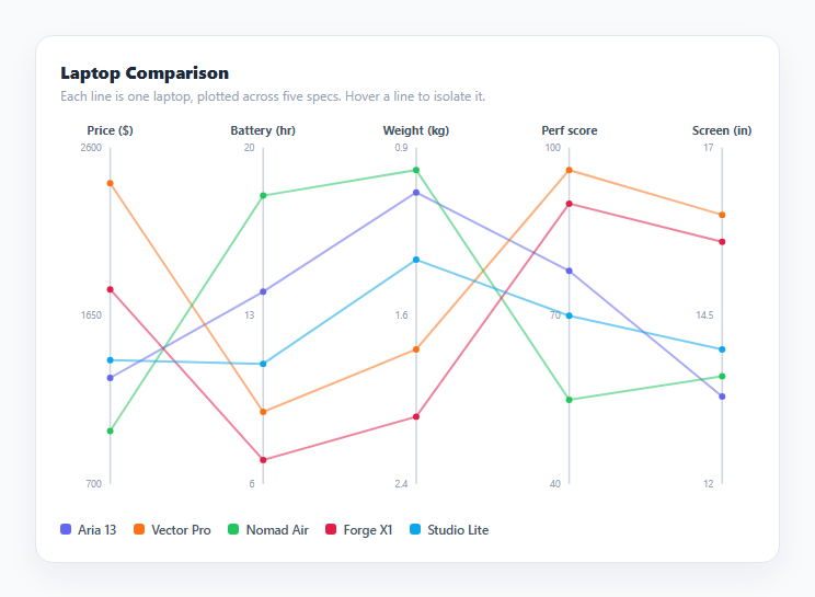
A parallel coordinates chart plots several numeric dimensions as vertical axes placed side by side, and represents each data row as a single polyline that crosses every axis at its corresponding value. Unlike a scatter plot, which can only show two (or with size and color, four) dimensions at once, a parallel coordinates chart scales to many more dimensions in one static view — this snippet compares five laptop specs (price, battery life, weight, performance score, and screen size) across five products using nothing but hand-drawn inline SVG and vanilla JavaScript.
Independent scales per axis via min-max normalization
Each axis in AXES defines its own min and max — price ranges from 700 to 2600 dollars while screen size ranges from 12 to 17 inches, wildly different scales that would be meaningless plotted against a single shared y-axis. normalize(axis, value) converts any raw value into a 0-to-1 fraction of that axis's own range: (value - axis.min) / (axis.max - axis.min), clamped to [0, 1] in case a data point falls outside the configured bounds. valueY() then maps that 0-to-1 fraction onto the chart's actual pixel height, so every axis independently spans the same vertical pixel range regardless of its real-world units — this is what makes wildly different metrics visually comparable side by side.
Handling axes where "lower is better"
Weight is configured with invert: true, because for weight (unlike performance or battery life) a lower value is the more desirable one. normalize() checks this flag and flips the fraction (1 - t) before it's used, so the top of the weight axis always represents the *lightest* laptop rather than the heaviest — keeping the visual convention "up is good" consistent across every axis even though the underlying numeric direction differs per metric. draw()'s tick-label loop performs the same inversion in reverse when computing which raw value to print at each gridline position, so the printed numbers stay correct regardless of the flag.
Building each row's polyline
buildPath(row) walks the AXES array once per data row, computing an SVG path command for each axis in order — M (move-to) for the first point and L (line-to) for every subsequent one — using axisX(i) for the horizontal position (axes are evenly spaced by index) and valueY(axis, row[axis.key]) for the vertical position on that axis. The resulting path string, like M 46 120 L 195 80 L 344 210 ..., is assigned directly to an SVG <path>'s d attribute, producing one continuous line per data row that crosses every axis exactly once.
Hover-to-isolate interaction
With five overlapping semi-transparent lines, picking out one specific item's path across all axes is hard by eye alone. Each <path> and its matching legend entry share a mouseenter/mouseleave pair wired to a shared setActive(name) function: when a name is active, every other line and its axis dots gain a .dim class (dropping opacity to near-zero) while the hovered line gains .active (full opacity, thicker stroke), and the matching legend swatch highlights too. This turns an otherwise noisy tangle of lines into a chart where any single item's full profile across all five dimensions can be traced instantly by hovering either its line or its legend entry.
Per-axis tick labels and vertex tooltips
Three tick labels (min, midpoint, max) are printed beside each axis by reversing the normalization math for t = 0, 0.5, 1, so the actual units (dollars, hours, kilograms, and so on) stay readable next to each axis rather than requiring a separate legend for scale. Every vertex on every line additionally carries a small <circle> marker with a native SVG <title> tooltip reporting the exact row name, axis label, and value on hover, giving precise numbers on demand without cluttering the chart by default.
Build with AI
Build, Understand, Optimize, and Extend It With AI
Paste this snippet's HTML, CSS, and JS into an AI coding assistant like Claude and ask it to explain exactly how normalize() and the invert flag work together to keep "up is good" consistent across axes with opposite real-world directions, and why buildPath() uses a single SVG path per row instead of separate line segments between each pair of axes. It's also a good candidate for extension — ask it to add draggable axis reordering so users can rearrange which dimension comes next to which, brushing (click-and-drag a range on one axis to filter which lines stay fully visible), or a color scale driven by one of the data dimensions itself instead of a fixed per-row color.
Prompt to recreate it
Copy this into your AI assistant of choice to build the effect from scratch, or as a jumping-off point for your own variant:
Build a parallel coordinates chart in plain HTML, CSS, and JavaScript using inline SVG created with createElementNS — no charting library.

Requirements:
- Define a configurable array of axes, each with a label, a data key, a minimum value, a maximum value, and an optional flag indicating that a lower value should be treated as "better" (i.e. plotted toward the top of that axis instead of the bottom).
- Define a configurable array of data rows, each with a name, a color, and a numeric value for every axis's data key.
- Space the axes evenly across the chart width as vertical lines, and independently normalize each axis's values to the same pixel height range using that axis's own min and max, respecting its invert flag when computing pixel position — so axes with completely different units and ranges are still visually comparable.
- Draw one continuous SVG path per data row that connects a point on every axis, in axis order, at that row's normalized value for that axis, plus a small circle marker at every point with a native title tooltip reporting the exact row name, axis label, and value.
- Print three tick labels per axis (minimum, midpoint, and maximum) in each axis's real units, correctly reversed for any axis using the invert flag.
- Add a hover interaction (on both the chart lines and a text legend) that dims every non-matching row's line and point markers while keeping the hovered row's line and markers at full opacity and a thicker stroke, so a single row's profile across all axes can be traced clearly even with several overlapping lines.
Want to tighten it up first? Run this prompt through the AI Prompt Studio to score it across 8 quality dimensions, catch anti-patterns, and tune the wording for Claude, ChatGPT, or Gemini before you paste it in.
Step by step
How to Use
- 1Read the axes left to rightEach vertical axis is one dimension (price, battery, weight, and so on), independently scaled between its own configured min and max via normalize().
- 2Trace a single item's lineEach colored polyline is one item, crossing every axis at that item's value for that dimension, connected in order by buildPath().
- 3Hover a line or legend entry to isolate itsetActive(name) dims every other line and its axis dots while highlighting the hovered item's full profile, making it easy to trace one item across all dimensions.
- 4Check exact valuesHover any small vertex dot to see a native tooltip with the exact row name, axis label, and value at that point.
- 5Edit the axes and dataUpdate the AXES array (key, label, min, max, and an optional invert flag) and the ROWS array of data objects to chart your own items and dimensions.
- 6Add or remove dimensionsAdd another object to AXES with a matching key present on every ROWS entry — axisX() automatically spaces however many axes are defined evenly across the chart width.
Real-world uses
Common Use Cases
Got questions?
Frequently Asked Questions
Every axis independently normalizes its own values to a 0-to-1 fraction using that axis's own configured min and max via normalize(), then maps that fraction onto the same pixel height for every axis via valueY(). The real units never need to match between axes because the pixel positions are always computed relative to each axis's own range.
When invert is true, normalize() computes 1 minus the usual fraction before converting it to a pixel position, and the tick-label calculation performs the same reversal when deciding which raw number to print at each gridline. This keeps "up on the chart" consistently meaning "the better value" even for metrics like weight where a lower number is preferable.
Every path element and legend entry share a single setActive(name) function wired to their mouseenter/mouseleave events. It toggles a .dim class (near-zero opacity) on every non-matching line, dot, and legend swatch, and an .active class (full opacity, thicker stroke) on the matching line, purely through CSS class toggling.
Yes. axisX() spaces however many entries exist in the AXES array evenly across the available chart width automatically, and draw() loops over however many rows exist in ROWS — just add more objects to either array with the required key, label, min, and max fields (and matching data keys on each row).
A single path per row (built by buildPath() with one M command and subsequent L commands) is one continuous SVG element with one set of hover listeners and one stroke, which is simpler to isolate and style than managing N-1 separate line segments per row and keeping their hover states synchronized.
Yes. Use the JSX, Vue, Angular, or Tailwind export buttons on this page. In React, recompute buildPath() for each row from your data array during render and manage the currently-hovered row name in a piece of state instead of toggling classList directly.