Source Code
<section class="rbg-hero" id="rbgHero">
  <div class="rbg-layer rbg-layer-active" data-bg="1"></div>
  <div class="rbg-layer" data-bg="2"></div>
  <div class="rbg-layer" data-bg="3"></div>
  <div class="rbg-layer" data-bg="4"></div>
  <div class="rbg-scrim"></div>

  <div class="rbg-content">
    <span class="rbg-eyebrow">Destinations, reimagined</span>
    <h1 class="rbg-h1">Wherever you're<br>going, go further</h1>
    <p class="rbg-sub">Curated stays across four continents. Every place, one booking flow.</p>
    <a href="#" class="rbg-cta">Explore destinations</a>
  </div>

  <div class="rbg-dots" id="rbgDots">
    <button class="rbg-dot rbg-dot-active" data-index="0" aria-label="Show slide 1"></button>
    <button class="rbg-dot" data-index="1" aria-label="Show slide 2"></button>
    <button class="rbg-dot" data-index="2" aria-label="Show slide 3"></button>
    <button class="rbg-dot" data-index="3" aria-label="Show slide 4"></button>
  </div>
</section>*{box-sizing:border-box;margin:0;padding:0}
body{font-family:system-ui,-apple-system,sans-serif;background:#0b0b0f;color:#fff}
.rbg-hero{position:relative;min-height:100vh;display:flex;align-items:center;justify-content:center;overflow:hidden}
.rbg-layer{position:absolute;inset:0;opacity:0;transition:opacity 1.4s ease;background-size:cover}
.rbg-layer-active{opacity:1}
.rbg-layer[data-bg="1"]{background:linear-gradient(135deg,#0f2027,#203a43 50%,#2c5364)}
.rbg-layer[data-bg="2"]{background:linear-gradient(135deg,#3a1c71,#d76d77 55%,#ffaf7b)}
.rbg-layer[data-bg="3"]{background:linear-gradient(135deg,#134e5e,#71b280)}
.rbg-layer[data-bg="4"]{background:linear-gradient(135deg,#1e3c72,#2a5298 60%,#7303c0)}
.rbg-scrim{position:absolute;inset:0;background:linear-gradient(180deg,rgba(0,0,0,.35),rgba(0,0,0,.55));z-index:1}
.rbg-content{position:relative;z-index:2;text-align:center;display:flex;flex-direction:column;align-items:center;gap:16px;padding:24px;max-width:640px}
.rbg-eyebrow{font-size:12px;font-weight:700;letter-spacing:.1em;text-transform:uppercase;color:#fde68a}
.rbg-h1{font-size:clamp(32px,6vw,60px);font-weight:800;line-height:1.1;letter-spacing:-.02em;text-shadow:0 4px 24px rgba(0,0,0,.3)}
.rbg-sub{font-size:16px;color:#e2e8f0;line-height:1.7;max-width:460px}
.rbg-cta{margin-top:6px;background:#fff;color:#1a1a1a;font-weight:700;font-size:15px;padding:13px 28px;border-radius:9px;text-decoration:none;transition:transform .15s}
.rbg-cta:hover{transform:translateY(-2px)}
.rbg-dots{position:absolute;bottom:32px;left:50%;transform:translateX(-50%);z-index:2;display:flex;gap:10px}
.rbg-dot{width:9px;height:9px;border-radius:50%;background:rgba(255,255,255,.35);border:none;cursor:pointer;padding:0;transition:background .2s,transform .2s}
.rbg-dot-active{background:#fff;transform:scale(1.25)}// Real cross-fading background carousel: a timer advances the active layer, and dots reflect + control real state.
const layers = Array.from(document.querySelectorAll('.rbg-layer'));
const dots = Array.from(document.querySelectorAll('.rbg-dot'));
const hero = document.getElementById('rbgHero');
const INTERVAL_MS = 4200;
let activeIndex = 0;
let timerId = null;
function goTo(index) {
layers[activeIndex].classList.remove('rbg-layer-active');
dots[activeIndex].classList.remove('rbg-dot-active');
activeIndex = (index + layers.length) % layers.length;
layers[activeIndex].classList.add('rbg-layer-active');
dots[activeIndex].classList.add('rbg-dot-active');
}
function next() {
goTo(activeIndex + 1);
}
function startTimer() {
clearInterval(timerId);
timerId = setInterval(next, INTERVAL_MS);
}
dots.forEach((dot) => {
dot.addEventListener('click', () => {
const index = parseInt(dot.dataset.index, 10);
goTo(index);
startTimer(); // restart the cycle so manual selection doesn't get overridden a moment later
});
});
// Pause the rotation while the hero isn't visible, so it doesn't burn cycles off-screen.
if ('IntersectionObserver' in window) {
const observer = new IntersectionObserver((entries) => {
entries.forEach((entry) => {
if (entry.isIntersecting) startTimer();
else clearInterval(timerId);
});
}, { threshold: 0.1 });
observer.observe(hero);
} else {
startTimer();
}Learn Coding Visually
Learn to code with interactive, live-preview playgrounds — HTML, CSS, JavaScript, React & more.
 HTML Playground42 lessons · Click-based · Live preview
 CSS PlaygroundLearn CSS with a live editor
 JavaScript Playground60 lessons · DOM · Async · Canvas
 React PlaygroundLearn React with a live code editor
 GSAP PlaygroundLearn GSAP animation interactively
 SVG Playground44 lessons · shapes · paths · animation
 SCSS Playground45 lessons · Sass modules · tokens
 Tailwind PlaygroundLearn Tailwind CSS with a live editor
 Bootstrap 5 Playground50 lessons · live preview
Hero with Auto-Rotating Background Carousel — Free HTML CSS JS Snippet
Hero with Auto-Rotating Background Carousel · Heroes · Plain HTML, CSS & JS · Live preview
What's included
Features
About this UI Snippet
Hero with Auto-Rotating Background Carousel — Timed Cross-Fade with Clickable Dots
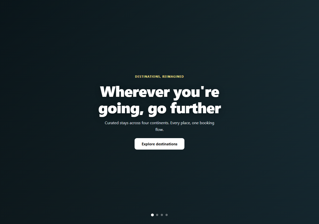
Travel, hospitality, and real-estate hero sections often need to show range — multiple destinations or properties — without a full image slider UI competing with the headline. This snippet keeps the headline and CTA fixed in place while four full-bleed background layers cross-fade on a real timer beneath them, with indicator dots that both reflect and control the current slide.
Stacked layers, not a sliding track
All four .rbg-layer elements are absolutely positioned and stacked directly on top of each other (position: absolute; inset: 0) rather than laid out side-by-side in a scrolling track. Only the active layer has opacity: 1; every other layer sits at opacity: 0 beneath it. Switching slides means toggling one class on the outgoing layer and one on the incoming layer — the CSS transition: opacity 1.4s handles the actual cross-fade, so the "animation" is really just two class toggles plus a CSS transition, kept simple and GPU-cheap.
A real timer driving real state
activeIndex is a genuine piece of JavaScript state, advanced by setInterval(next, 4200). goTo(index) removes the active classes from the current layer and dot, computes the next index with a modulo wrap (so it cycles 0→1→2→3→0 forever), and adds the active classes to the new layer and dot — headline and CTA in .rbg-content are never touched, since they sit in a separate z-index: 2 layer above the scrim.
Dots that are real controls, not just indicators
Each dot is a <button> with a data-index; clicking one calls goTo() directly with that index — so a visitor can jump straight to slide 3 rather than waiting for the auto-rotation to arrive there. Critically, the click handler also calls startTimer() again, which clears and re-creates the interval — without this, a manual click would still get silently overridden by an in-flight timer a moment later, which is the classic bug in hand-rolled carousels.
Pausing when off-screen
An IntersectionObserver on the hero section starts the interval when the hero is visible and clears it when it scrolls out of view — so the carousel isn't burning timer cycles (and the associated reflows/repaints) on a hero the visitor has already scrolled past.
A scrim for guaranteed text contrast
A fixed .rbg-scrim gradient sits above all four background layers but below the content, so headline legibility never depends on which background happens to be active — it's darkened consistently regardless of the underlying gradient's brightness.
Customizing it
Swap the CSS gradients for real background-image photos, adjust INTERVAL_MS, or add/remove layers and dots in matching pairs (the JS reads both lists by index, so counts must stay equal). Pair it with video bg hero for a single moving background instead, or portfolio hero for a static alternative.
Build with AI
Build, Understand, Optimize, and Extend It With AI
Rather than debugging a flaky hand-rolled carousel from scratch, paste this snippet's HTML, CSS, and JS into an AI coding assistant like Claude and ask it to explain why the dot click handler calls startTimer() again after goTo() — and what visible bug would appear if that line were removed. The same assistant can help you harden the pattern further — ask whether the IntersectionObserver threshold of 0.1 is right for a very tall hero versus a short one, or whether the interval should also pause on document.hidden via the Page Visibility API for a backgrounded browser tab, not just an off-screen scroll position. It's also useful for extending the carousel: ask it to add swipe-gesture support for touch devices, preload real photographic background-image URLs before they become active to avoid a flash of unstyled background, or add a subtle Ken Burns zoom to the active layer while it's displayed. Treat the code less like a finished artifact and more like a starting point for a conversation.
Prompt to recreate it
Copy this into your AI assistant of choice to build the effect from scratch, or as a jumping-off point for your own variant:
Build a hero section in plain HTML, CSS, and vanilla JavaScript with a full-bleed background that auto-rotates between multiple backgrounds on a timer, with fixed headline/CTA content on top and clickable indicator dots (no library, no CDN, no image slider plugin).

Requirements:
- Four background layer elements stacked directly on top of each other with absolute positioning filling the hero, each with a distinct CSS gradient background, where only one layer is visible (opacity 1) at a time and the rest sit at opacity 0 — switching the active layer must be a CSS opacity transition, not a sliding/translating track.
- A fixed content block (eyebrow label, headline, subheading, CTA button) that sits above the background layers via z-index and never itself fades, moves, or changes as the background rotates, plus a semi-transparent scrim layer between the backgrounds and the content to guarantee text contrast regardless of which background is active.
- A JavaScript-driven rotation: a real numeric "active index" state variable advanced on a setInterval timer (roughly every 4 seconds), wrapping from the last slide back to the first via modulo arithmetic, toggling an "active" class on both the outgoing and incoming background layer.
- A row of clickable dot buttons, one per background slide, where the active dot is visually distinguished, and clicking any dot immediately jumps the carousel to that slide AND restarts the auto-rotation timer from that point (so a manual click isn't silently overridden by the previous timer's schedule a moment later).
- Use an IntersectionObserver to pause the auto-rotation timer when the hero scrolls out of the viewport and resume it when the hero scrolls back into view, with a simple fallback that just starts the timer immediately if IntersectionObserver isn't supported.
Want to tighten it up first? Run this prompt through the AI Prompt Studio to score it across 8 quality dimensions, catch anti-patterns, and tune the wording for Claude, ChatGPT, or Gemini before you paste it in.
Step by step
How to Use
- 1Paste HTML, CSS, and JSThe first background is active; rotation starts automatically.
- 2Watch it cross-fadeEvery 4.2s the active layer and dot advance, wrapping after the last slide.
- 3Click a dot directlyJumps to that slide immediately and restarts the auto-rotation timer.
- 4Scroll the hero out of viewThe IntersectionObserver pauses the interval until it's visible again.
- 5Swap gradients for real photosReplace each .rbg-layer's background with background-image + cover.
- 6Add a fifth slideAdd matching .rbg-layer and .rbg-dot elements — indices must line up.
Real-world uses
Common Use Cases
Got questions?
Frequently Asked Questions
A cross-fade. All background layers are stacked directly on top of each other with position: absolute; inset: 0, and only the active one has opacity: 1. Switching slides toggles the active class on the outgoing and incoming layers, and the CSS opacity transition handles the visual fade — nothing physically slides or translates.
goTo() jumps immediately to the clicked slide's index, and the click handler also calls startTimer() again, which clears the existing interval and creates a fresh one. This matters because without restarting the timer, the in-flight interval from before the click would still fire on its old schedule and could immediately override the slide you just manually selected.
No — an IntersectionObserver watches the hero section and calls clearInterval() when it's no longer intersecting the viewport, then calls startTimer() again once it re-enters view. This avoids burning timer cycles and layout work on a background rotation the visitor isn't currently looking at.
Replace each .rbg-layer[data-bg="N"] rule's background value with background-image: url(...); background-size: cover; background-position: center — the opacity-based cross-fade logic in the JavaScript is completely independent of what's rendered inside each layer, so no JS changes are needed.
Add a fifth .rbg-layer div with a matching data-bg value and CSS background rule, and a fifth .rbg-dot button with data-index="4" and an aria-label. Since the JavaScript reads both the .rbg-layer and .rbg-dot node lists by array index and computes wraparound with layers.length, both counts must stay equal but no other logic changes are required.