Source Code
<div class="scene">
  <div class="clock">
    <div class="face">
      <div class="center"></div>
      <div class="hand hour"   id="hour"></div>
      <div class="hand minute" id="minute"></div>
      <div class="hand second" id="second"></div>
      <div class="tick-wrap" id="ticks"></div>
    </div>
  </div>
  <div class="digital" id="digital"></div>
  <div class="date-str" id="date-str"></div>
</div>
* { box-sizing: border-box; margin: 0; padding: 0; }
body { font-family: system-ui, sans-serif; background: #0f172a; display: flex; align-items: center; justify-content: center; min-height: 100vh; }
.scene { display: flex; flex-direction: column; align-items: center; gap: 20px; }
.clock { width: 200px; height: 200px; position: relative; }
.face {
width: 100%; height: 100%; border-radius: 50%;
background: linear-gradient(135deg,#1e293b,#0f172a);
border: 2px solid #334155;
box-shadow: 0 0 0 6px #1e293b, 0 0 0 7px #334155, 0 20px 60px rgba(0,0,0,0.5), inset 0 2px 6px rgba(0,0,0,0.4);
position: relative;
}
.center { position: absolute; width: 8px; height: 8px; background: #6366f1; border-radius: 50%; top: 50%; left: 50%; transform: translate(-50%,-50%); z-index: 10; box-shadow: 0 0 8px rgba(99,102,241,0.6); }
.hand { position: absolute; bottom: 50%; left: 50%; transform-origin: bottom center; border-radius: 4px; }
.hand.hour { width: 4px; height: 50px; background: #f1f5f9; margin-left: -2px; }
.hand.minute { width: 3px; height: 68px; background: #94a3b8; margin-left: -1.5px; }
.hand.second { width: 1.5px; height: 74px; background: #6366f1; margin-left: -0.75px; box-shadow: 0 0 6px rgba(99,102,241,0.8); }
.tick { position: absolute; width: 2px; background: #334155; transform-origin: bottom center; left: 50%; bottom: 50%; }
.digital { font-family: 'Courier New', monospace; font-size: 22px; font-weight: 700; color: #6366f1; letter-spacing: 3px; text-shadow: 0 0 16px rgba(99,102,241,0.5); }
.date-str { font-size: 12px; color: #475569; letter-spacing: 1px; }// Build tick marks
const tickWrap = document.getElementById('ticks');
for (let i = 0; i < 60; i++) {
const tick = document.createElement('div');
tick.className = 'tick';
const isMajor = i % 5 === 0;
tick.style.cssText = `height:${isMajor?14:7}px;background:${isMajor?'#64748b':'#334155'};width:${isMajor?2:1}px;margin-left:${isMajor?-1:-0.5}px;transform:rotate(${i*6}deg) translateY(-${100-4}px)`;
tickWrap.appendChild(tick);
}
function tick() {
const now = new Date();
const h = now.getHours(), m = now.getMinutes(), s = now.getSeconds(), ms = now.getMilliseconds();
const sDeg = (s + ms/1000) * 6;
const mDeg = (m + s/60) * 6;
const hDeg = ((h % 12) + m/60) * 30;
document.getElementById('second').style.transform = `rotate(${sDeg}deg)`;
document.getElementById('minute').style.transform = `rotate(${mDeg}deg)`;
document.getElementById('hour').style.transform = `rotate(${hDeg}deg)`;
const fmt = n => String(n).padStart(2,'0');
document.getElementById('digital').textContent = `${fmt(h)}:${fmt(m)}:${fmt(s)}`;
document.getElementById('date-str').textContent = now.toLocaleDateString('en-US',{weekday:'long',month:'long',day:'numeric'});
requestAnimationFrame(tick);
}
tick();Learn Coding Visually
Learn to code with interactive, live-preview playgrounds — HTML, CSS, JavaScript, React & more.
 HTML Playground42 lessons · Click-based · Live preview
 CSS PlaygroundLearn CSS with a live editor
 JavaScript Playground60 lessons · DOM · Async · Canvas
 React PlaygroundLearn React with a live code editor
 GSAP PlaygroundLearn GSAP animation interactively
 SVG Playground44 lessons · shapes · paths · animation
 SCSS Playground45 lessons · Sass modules · tokens
 Tailwind PlaygroundLearn Tailwind CSS with a live editor
 Bootstrap 5 Playground50 lessons · live preview
Analog Clock — Free HTML CSS JS Snippet
Analog Clock · Animations · Plain HTML, CSS & JS · Live preview
What's included
Features
About this UI Snippet
Analog Clock — Tick Marks via rotate(), Smooth Real-Time Hands & requestAnimationFrame
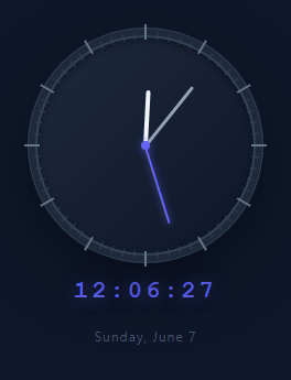
An analog clock built with HTML, CSS, and JavaScript displays the current time using rotating hands on a circular face — no SVG, no canvas, no external libraries. For digital alternatives, see the multi-timezone world clock and the precision stopwatch. Every element is a plain HTML div styled and positioned purely with CSS transforms. This makes the code transparent and educational: you can inspect every piece, understand exactly how it works, and adapt it to any design system.
How the tick marks are built
The JavaScript for loop runs 60 iterations. Each iteration creates a div with class tick and positions it at the clock center using position: absolute. The key technique is transform: rotate(i * 6deg) — since a circle has 360 degrees and 60 ticks, each tick is spaced 6 degrees apart. The tick div has transform-origin: bottom center so the rotation pivots around the clock center rather than the tick's own center. A translateY then pushes the top of the tick outward to the edge of the face. Every 5th tick (i % 5 === 0) uses larger dimensions for the hour-position major tick.
The rotation math for each hand
The tick() function reads new Date() and extracts hours, minutes, seconds, and milliseconds. Each hand's rotation is calculated from multiple time units to produce smooth continuous motion: the second hand uses (s + ms/1000) * 6 so it sweeps between seconds rather than jumping; the minute hand uses (m + s/60) * 6 so it advances continuously rather than jumping each minute; the hour hand uses ((h % 12) + m/60) * 30 so it moves gradually across the full 30 degrees between each hour mark. These rotations are written directly as inline transform: rotate(Xdeg) on each hand element.
requestAnimationFrame for maximum smoothness
The clock updates via requestAnimationFrame(tick) at the end of each tick() call, running at the display's native frame rate (typically 60fps or 120fps). The millisecond component of the time ensures the second hand sweeps continuously rather than ticking in 1-second jumps, resulting in a genuinely smooth analog motion.
The digital readout and date display
Below the clock face, a monospace digital time readout mirrors the analog display in HH:MM:SS format with a glowing text-shadow effect. A date string below shows the full weekday, month, and day, generated via Date.toLocaleDateString() with locale options.
Dark concentric face rings
The clock face uses box-shadow with multiple layers — an outer ring, a subtle border, and a deep inner shadow — to create a layered metallic bezel effect without any additional HTML elements. The center dot uses a box-shadow glow to match the second hand's indigo accent colour.
Build with AI
Build, Understand, Optimize, and Extend It With AI
You don't have to work through the rotation formulas by hand — paste this snippet's HTML, CSS, and JS into an AI coding assistant like Claude and ask it to explain exactly why the minute hand's rotation formula includes a fractional s/60 term and the hour hand's includes m/60, and what the clock would visually do wrong if those fractional terms were removed. The same assistant is useful for optimizing it — asking whether recalculating and reassigning all three hand transforms every single animation frame is wasteful compared to only updating when the displayed second actually changes. It's just as good for extending the clock: ask it to add draggable hands for a clock-reading teaching tool, render multiple instances as a world-clock row using timezone offsets, or add a chime sound effect triggered exactly on the hour. Treat the code less like a finished artifact and more like a starting point for a conversation.
Prompt to recreate it
Copy this into your AI assistant of choice to build the effect from scratch, or as a jumping-off point for your own variant:
Build a real-time "analog clock" in plain HTML, CSS, and JavaScript — no canvas, no SVG, no libraries, using only absolutely-positioned divs and CSS transforms.

Requirements:
- A circular clock face containing a center dot, three hand elements (hour, minute, second) of different lengths and thicknesses, and 60 tick marks generated by a JavaScript loop.
- Each tick mark must be an absolutely positioned div centered at the clock's middle, with transform-origin set to the bottom-center of the tick so rotating it pivots around the clock's center rather than the tick's own center, rotated by exactly index times 6 degrees (60 ticks over 360 degrees), then pushed outward toward the rim using a translateY on top of the rotation. Every 5th tick (marking the hour positions) must be visually larger/thicker than the other minute ticks, generated by the same loop with a conditional.
- Each hand must also use transform-origin at its base (the clock center) so that rotating it sweeps it around the face like a real clock hand, with its rotation angle set directly via inline transform: rotate(...) driven by JavaScript, not a CSS animation.
- Compute each hand's angle every frame from the current Date object using fractional math so the motion is continuously smooth rather than jumping in whole-unit steps: the second hand's angle must include the millisecond component, the minute hand's angle must include a fractional contribution from the current seconds, and the hour hand's angle must include a fractional contribution from the current minutes.
- Drive the whole update loop with requestAnimationFrame (not setInterval), recalculating and reapplying all three hand rotations plus a digital HH:MM:SS readout and a full date string on every frame.
- Style the face with a layered box-shadow (multiple rings/depths) to create a bezel effect without adding any extra DOM elements for it.
Want to tighten it up first? Run this prompt through the AI Prompt Studio to score it across 8 quality dimensions, catch anti-patterns, and tune the wording for Claude, ChatGPT, or Gemini before you paste it in.
Step by step
How to Use
- 1Preview the live analog clockThe clock immediately shows the current local time with the second hand sweeping smoothly via requestAnimationFrame, the minute hand advancing continuously, and the hour hand creeping between hour markers. The digital readout and date string update below the face.
- 2Change the clock face and hand coloursIn the CSS panel, update the .face background gradient for the dial colour, change .hand.second background from #6366f1 to your accent colour, and adjust .hand.hour and .hand.minute for light or dark theme variants.
- 3Show a specific timezone's timeIn the JS tick() function, replace 'new Date()' with an offset calculation: const now = new Date(Date.now() + offsetMs) where offsetMs is the target timezone's offset from UTC in milliseconds. For Tokyo (UTC+9): offsetMs = (9 * 60 + new Date().getTimezoneOffset()) * 60000.
- 4Add hour number labels inside the clock faceIn the tick-building loop, add a condition for major ticks: if (isMajor) create a label div, set its textContent to (i/5) || 12, and position it at a fixed radius from center using the same rotate + translate technique as the tick marks.
- 5Show a fixed design time for screenshots or mockupsReplace the new Date() call in tick() with a hardcoded date: const now = new Date(); now.setHours(10, 10, 30, 0); This shows 10:10 — the classic watch-advertisement time that frames both hands symmetrically for an aesthetically pleasing presentation.
- 6Export as a standalone component for your projectClick 'HTML' for a self-contained file, 'JSX' for a React component with useEffect managing the requestAnimationFrame loop and cleanup on unmount, or 'Tailwind' for a styled React component using Tailwind utility classes.
Real-world uses
Common Use Cases
Got questions?
Frequently Asked Questions
Each tick div is created with position: absolute and centered in the clock face parent. The CSS transform: rotate(i * 6deg) pivots each tick around the parent's center because the tick has transform-origin set to 'bottom center' — the bottom of the tick (at the clock center) becomes the pivot point. After rotation, a negative translateY value moves the tick outward toward the clock edge. The distance controls how close to the rim the ticks appear. Every 5th tick (i % 5 === 0) gets greater height to mark the hour positions — the same loop, just with conditional sizing applied via ternary expressions in the tick's inline styles.
Each hand's rotation formula includes a fractional contribution from smaller time units. The minute hand rotation is (m + s/60) * 6 degrees: as seconds increment from 0 to 59, the s/60 term goes from 0 to ~0.983, advancing the minute hand smoothly across its 6-degree arc. The hour hand uses ((h % 12) + m/60) * 30: the m/60 term advances it continuously through the 30-degree arc between hour markers over 60 minutes. The second hand uses (s + ms/1000) * 6, and combined with requestAnimationFrame's 60fps updates, it produces genuinely smooth sweeping motion rather than a tick every second.
JavaScript's Date object always reflects local system time. To show a different timezone, calculate the offset difference in milliseconds. For a target timezone at UTC+9 (Tokyo) from a UTC+0 (London) browser: const tokyoOffsetMs = 9 * 60 * 60 * 1000; const localOffsetMs = new Date().getTimezoneOffset() * 60000; const now = new Date(Date.now() + tokyoOffsetMs + localOffsetMs). For a robust, DST-aware approach, use Intl.DateTimeFormat to extract the exact hours, minutes, and seconds for an IANA timezone name like 'Asia/Tokyo', bypassing manual offset calculations entirely.
In a React component, start the requestAnimationFrame loop inside a useEffect hook and store the animation frame ID in a ref. The cleanup function returned from useEffect calls cancelAnimationFrame with the stored ID, stopping the loop when the component unmounts. This prevents memory leaks and stale updates: useEffect(() => { let frameId; const loop = () => { updateClock(); frameId = requestAnimationFrame(loop); }; frameId = requestAnimationFrame(loop); return () => cancelAnimationFrame(frameId); }, []). The click on the JSX export button generates this pattern automatically.