Source Code
<div class="fd-stage">
  <p class="fd-hint">Hover any card — the rest of the grid dims and blurs slightly to focus attention</p>
  <div class="fd-grid" id="fdGrid">
    <div class="fd-card"><span class="fd-icon">⚡</span><h3>Fast by default</h3><p>Sub-100ms responses across every region.</p></div>
    <div class="fd-card"><span class="fd-icon">🔒</span><h3>Secure at rest</h3><p>AES-256 encryption on every stored byte.</p></div>
    <div class="fd-card"><span class="fd-icon">📈</span><h3>Scales with you</h3><p>From ten users to ten million, no rewrite.</p></div>
    <div class="fd-card"><span class="fd-icon">🧩</span><h3>Composable</h3><p>Small primitives that combine into anything.</p></div>
    <div class="fd-card"><span class="fd-icon">🌍</span><h3>Global edge</h3><p>Deployed to 34 regions out of the box.</p></div>
    <div class="fd-card"><span class="fd-icon">🛠️</span><h3>Open API</h3><p>Every feature is available as a typed endpoint.</p></div>
  </div>
</div>
* { box-sizing: border-box; margin: 0; padding: 0; }
body { font-family: system-ui, sans-serif; background: #0a0e17; display: flex; align-items: center; justify-content: center; min-height: 100vh; }
.fd-stage { display: flex; flex-direction: column; align-items: center; gap: 26px; padding: 24px; }
.fd-hint { font-size: 13px; color: #64748b; text-align: center; max-width: 380px; }
.fd-grid {
display: grid;
grid-template-columns: repeat(3, 180px);
gap: 16px;
}
@media (max-width: 640px) { .fd-grid { grid-template-columns: repeat(2, 1fr); } }
.fd-card {
padding: 20px 18px;
border-radius: 16px;
background: #121826;
border: 1px solid #1f2937;
transition: opacity 0.3s ease, filter 0.3s ease, transform 0.3s cubic-bezier(0.4,0,0.2,1), border-color 0.3s;
cursor: default;
}
.fd-icon { font-size: 22px; display: block; margin-bottom: 10px; }
.fd-card h3 { font-size: 14.5px; font-weight: 700; color: #f1f5f9; margin-bottom: 6px; }
.fd-card p { font-size: 12.5px; color: #8b93a7; line-height: 1.5; }
/* Applied via JS to every card except the one currently hovered. */
.fd-grid.fd-active .fd-card:not(.fd-focused) {
opacity: 0.4;
filter: blur(1.5px) saturate(0.7);
transform: scale(0.97);
}
.fd-grid.fd-active .fd-focused {
border-color: #6366f1;
transform: scale(1.035);
box-shadow: 0 16px 40px -12px rgba(99,102,241,0.35);
}// Hovering one card in the grid dims, desaturates, and slightly blurs every
// OTHER card via a shared parent class plus a per-card focused marker, so the
// grid reads as one connected group reacting to attention rather than each
// card having an isolated, independent :hover state.
var grid = document.getElementById('fdGrid');
var cards = Array.prototype.slice.call(grid.querySelectorAll('.fd-card'));
cards.forEach(function (card) {
card.addEventListener('mouseenter', function () {
grid.classList.add('fd-active');
cards.forEach(function (c) { c.classList.toggle('fd-focused', c === card); });
});
});
grid.addEventListener('mouseleave', function () {
grid.classList.remove('fd-active');
cards.forEach(function (c) { c.classList.remove('fd-focused'); });
});Learn Coding Visually
Learn to code with interactive, live-preview playgrounds — HTML, CSS, JavaScript, React & more.
 HTML Playground42 lessons · Click-based · Live preview
 CSS PlaygroundLearn CSS with a live editor
 JavaScript Playground60 lessons · DOM · Async · Canvas
 React PlaygroundLearn React with a live code editor
 GSAP PlaygroundLearn GSAP animation interactively
 SVG Playground44 lessons · shapes · paths · animation
 SCSS Playground45 lessons · Sass modules · tokens
 Tailwind PlaygroundLearn Tailwind CSS with a live editor
 Bootstrap 5 Playground50 lessons · live preview
Card Grid Hover Focus Dim — Sibling Blur Snippet
Card Grid Hover Focus Dim · Animations · Plain HTML, CSS & JS · Live preview
What's included
Features
About this UI Snippet
Card Grid Hover Focus Dim — Whole-Grid Sibling Dim Driven by a Single Focused Card
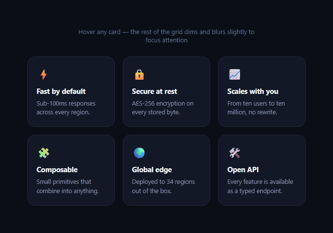
A plain :hover on a card grid only ever affects the card the cursor is directly over — every sibling card stays fully visible, unaware anything happened. This effect instead treats the entire grid as one connected surface: hovering any single card dims, slightly desaturates, and softly blurs every other card at once, while the hovered card lifts and gains a colored border, pulling all visual attention onto it. It's the same "spotlight the one, recede the rest" idea used in feature grids on sites like Linear and Stripe.
Why the state lives on the grid, not per-card
Rather than giving every card its own isolated :hover rule, the JS adds an .fd-active class to the shared .fd-grid container the moment any card is entered, and a .fd-focused class to that one specific card. The CSS selector .fd-grid.fd-active .fd-card:not(.fd-focused) then targets every sibling that is NOT the focused card — this is what makes the dimming apply to the whole group simultaneously rather than needing a separate rule per card-pair combination.
Toggling the focused card
On every card's mouseenter, cards.forEach(c => c.classList.toggle('fd-focused', c === card)) runs a single pass that adds .fd-focused to the entered card and removes it from every other card in one loop — so moving directly from one card to an adjacent one (without the cursor leaving the grid) instantly reassigns which card is exempt from the dim treatment.
The dimmed-sibling treatment
Non-focused siblings get three coordinated CSS changes: opacity: 0.4 for the recede, filter: blur(1.5px) saturate(0.7) for a subtle depth-of-field feel without making the text fully illegible, and transform: scale(0.97) so they visually shrink back, reinforcing that they're no longer the subject of attention.
The focused card's own lift
The focused card itself doesn't dim — it scales up slightly (scale(1.035)), gains an indigo border-color, and picks up a colored box-shadow, all transitioning with the same 0.3s timing as the dimmed siblings so the whole grid's state change reads as one coordinated motion rather than two unrelated animations running independently.
Clean reset on `mouseleave`
A single mouseleave listener on the grid container (not on each card) removes .fd-active from the grid and .fd-focused from every card, restoring the whole grid to its neutral state the moment the cursor leaves the grid area entirely — moving between cards inside the grid never triggers this reset, only exiting the grid does.
Build with AI
Build, Understand, Optimize, and Extend It With AI
You don't have to work out the selector logic from scratch. Paste this snippet's HTML, CSS, and JS into an AI coding assistant like Claude and ask it to explain exactly why the dim state lives on a shared grid-level class combined with a single per-card "focused" marker, rather than giving each card its own independent :hover rule that somehow reaches its siblings. The same assistant can help optimize it — for instance asking whether the classList.toggle loop across every card on every mouseenter is efficient enough for a grid with fifty or more cards, or whether it should be simplified. It's also useful for extending the effect: ask it to make the dim intensity fade in gradually based on distance from the focused card rather than a flat value for all siblings, add keyboard focus support so tabbing through cards produces the same focus-dim effect, or combine this with a cursor-tracking spotlight glow on the focused card itself. Treat the code less like a finished artifact and more like a starting point for a conversation.
Prompt to recreate it
Copy this into your AI assistant of choice to build the effect from scratch, or as a jumping-off point for your own variant:
Build a "card grid hover focus dim" effect in plain HTML, CSS, and JavaScript with no libraries.

Requirements:
- A responsive grid of at least six cards, each with an icon, a heading, and a short description.
- Hovering any single card must visually dim, slightly desaturate, blur, and shrink EVERY OTHER card in the grid simultaneously, while the hovered card itself lifts (scales up slightly) and gains a distinct border/shadow treatment — implement the dimmed-sibling styling using a single shared CSS selector driven by a class on the grid container plus a marker class on the one focused card, not a separate hover rule written per card.
- Moving the cursor directly from one card to an adjacent card (without the cursor ever leaving the grid container) must reassign the focus to the new card smoothly, with no flicker back to the fully-neutral un-dimmed state in between.
- The dim/reset state must only fully clear when the cursor leaves the entire grid container, not when it moves between individual cards inside it — implement this via a single mouseleave listener on the grid container itself, not per-card mouseleave listeners.
- All visual transitions (opacity, blur, saturation, scale, border, shadow) must be driven purely by CSS transitions triggered by class toggles — no JavaScript animation loop and no per-frame style writes.
- The card-selection logic must be written so that adding or removing cards from the HTML requires no changes to the JavaScript (query them dynamically rather than hardcoding a fixed count or fixed element references).
Want to tighten it up first? Run this prompt through the AI Prompt Studio to score it across 8 quality dimensions, catch anti-patterns, and tune the wording for Claude, ChatGPT, or Gemini before you paste it in.
Step by step
How to Use
- 1Hover any cardMove your cursor over one card — every other card in the grid dims, softens, and slightly shrinks while the hovered card lifts forward.
- 2Move directly to an adjacent cardSlide the cursor to a neighboring card without leaving the grid — the focus reassigns instantly to the new card.
- 3Move the cursor off the grid entirelyLeave the whole grid and every card returns to its neutral, undimmed state together.
- 4Adjust the dim intensityIn the CSS panel, change the opacity, blur, and saturate values on the .fd-grid.fd-active .fd-card:not(.fd-focused) rule.
- 5Change the focused card treatmentEdit the border-color, scale, and box-shadow on .fd-grid.fd-active .fd-focused to match your brand color.
- 6Export in your formatClick "HTML" for a standalone file, "JSX" for a React component, or "Tailwind" for a React + Tailwind version.
Real-world uses
Common Use Cases
Got questions?
Frequently Asked Questions
A per-card :hover rule can only ever style the card the cursor is directly over — it has no way to reach into sibling elements. By adding a class to the shared grid container plus a single "focused" marker on one card, one CSS selector (.fd-grid.fd-active .fd-card:not(.fd-focused)) can target every OTHER card at once.
Each card's mouseenter handler runs a full pass over all cards, toggling .fd-focused on based on cards.forEach(c => c.classList.toggle('fd-focused', c === card)). Moving directly between adjacent cards (without the cursor leaving the grid) reassigns the focused class in one step, so the transition is smooth with no flicker back to the neutral state.
Opacity alone can look like the cards are simply fading, which reads as less intentional. Adding a slight blur and reduced saturation together produces a soft depth-of-field quality, similar to a camera focusing on the foreground, that better communicates "these are receding from focus" rather than "these are disabled."
No. The reset (removing .fd-active and .fd-focused) only happens on the grid container's own mouseleave event, which fires only when the cursor exits the entire grid area — not when it moves from one card to another within the grid.
Yes. The JS queries all .fd-card elements inside the grid dynamically with querySelectorAll, so adding or removing cards in the HTML requires no changes to the JavaScript.
Yes. Click "JSX" for a React component. Track a single hoveredIndex state on the parent, and derive each card's className from whether its own index matches — React's conditional class rendering maps directly onto the same .fd-active / .fd-focused pattern.