More Cards Snippets
Spotlight Hover Card — Cursor Glow HTML CSS JS
Spotlight Hover Card · Cards · Plain HTML, CSS & JS · Live preview
What's included
Features
About this UI Snippet
Spotlight Hover Card — Cursor-Following Radial Glow with Illuminated Border
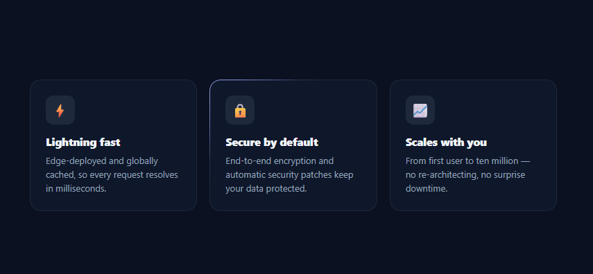
The spotlight card — a dark card that lights up with a soft radial glow tracking your cursor, its border illuminating where the light falls — is one of the most-requested modern UI effects, popularized by sites like Aceternity and Vercel. It looks expensive but is built from a radial gradient and two CSS custom properties. This snippet recreates it in plain HTML, CSS, and vanilla JavaScript, across a responsive grid of cards.
The glow is a gradient positioned by CSS variables
The core trick is simple: each card has a background: radial-gradient(... at var(--mx) var(--my) ...), and a tiny pointermove listener updates those --mx / --my variables to the cursor's position relative to the card. Because the gradient's center is bound to the variables, the glow follows the pointer with no per-frame canvas drawing or heavy JavaScript — the browser repaints the gradient natively. This is the whole effect in one idea: move the gradient's origin to wherever the mouse is.
An illuminated border, not just a fill
The polished version of this effect lights up the card's *edge* where the cursor is near, like light catching a rim. That's done with a second radial gradient on a ::before pseudo-element, clipped to just a 1px border using the CSS mask trick: two stacked masks (content-box and full) composited with xor / exclude punch out the interior, leaving only the border painted by the gradient. The result is a glowing border segment that brightens nearest the cursor — the detail that separates a flat hover tint from the premium spotlight look.
One listener drives every card
A single pointermove listener on the grid updates all cards at once, each computing its own cursor-relative coordinates from its getBoundingClientRect(). This means as the cursor sweeps across the grid, every card's glow tracks correctly, and the card directly under the pointer lights up most while neighbors catch a softer edge — exactly the multi-card spotlight behavior. Using pointermove (rather than mousemove) also covers pen and touch input on devices that support hover.
Hover-gated for performance and correctness
The glow and border are at opacity: 0 by default and fade in only on :hover, so cards sit calm until you interact, and the gradient repaint cost is only paid for hovered cards. On touch-only devices with no hover, the cards simply render as clean static cards — graceful degradation with no broken state, since the effect is a pure enhancement.
Layering done right
Getting the stack order correct is the fiddly part: the glow sits behind the content (z-index: -1), the inner body has its own solid background so the glow only shows at the padded edge (creating the gradient-border illusion), and the illuminated ::before border sits above with pointer-events: none so it never intercepts clicks. This snippet wires that layering so you can drop in your own card content without fighting the effect.
Why CSS variables over canvas
You could draw this with canvas or WebGL, but binding a gradient to CSS custom properties is dramatically simpler, fully responsive, accessible (the content is real DOM, not pixels), and costs almost nothing — the browser's compositor handles the gradient. It also re-themes trivially: change the glow colors and radius and it fits any palette.
Step by step
How to Use
- 1Paste HTML, CSS, and JSA grid of three dark feature cards renders. Move your cursor over them to see the spotlight effect.
- 2Hover a cardA soft radial glow appears under your cursor and the card's border illuminates where the light falls.
- 3Sweep across the gridMove between cards — each one's glow tracks the cursor, with the hovered card lighting up most.
- 4Add your own cardsDuplicate a .spc-card block with your icon, title, and text — the effect applies automatically.
- 5Recolor the glowChange the rgba colors and the circle radius in the radial-gradient rules to match your brand.
- 6Use on a real sectionDrop the grid into a features or pricing section on a dark background for a premium hover feel.
Real-world uses
Common Use Cases
Got questions?
Frequently Asked Questions
The card's background is a radial-gradient whose center is set to var(--mx) var(--my). A single pointermove listener updates those CSS custom properties to the cursor's position relative to each card (from getBoundingClientRect). Because the gradient origin is bound to the variables, the browser repaints the glow natively as they change — no canvas, no requestAnimationFrame loop, just two variable writes per move.
A ::before pseudo-element holds a second radial gradient, and a CSS mask clips it to only the 1px border: stacking a content-box mask and a full mask and compositing them with xor (mask-composite: exclude) punches out the interior, leaving just the border painted. The gradient then brightens the border segment nearest the cursor, creating the rim-light effect.
Touch devices generally have no hover, so the glow doesn't activate — the cards render as clean static cards, which is correct since the spotlight is a hover enhancement, not core content. pointermove also covers pen/stylus and any device that does report hover. No broken state results on touch-only screens.
Edit the rgba() colors and the circle radius in the two radial-gradient declarations (the .spc-glow fill and the ::before border). A larger radius spreads the light further; brighter/more-opaque colors intensify it. Keep the inner .spc-body background solid so the fill glow only shows at the padded edge as a gradient border.
In React, attach an onPointerMove handler that sets the --mx/--my style on each card (via refs or by setting them on a container and reading per-card offsets); in Vue, use @pointermove with style bindings; in Angular, use (pointermove) with Renderer2.setStyle. The CSS does all the visual work — only the variable-updating listener moves into the framework.
Spotlight Hover Card — Export as HTML, React, Vue, Angular & Tailwind
<!DOCTYPE html>
<html lang="en">
<head>
<meta charset="UTF-8" />
<meta name="viewport" content="width=device-width, initial-scale=1.0" />
<title>Spotlight Hover Card</title>
<style>
*{box-sizing:border-box;margin:0;padding:0}
body{font-family:system-ui,-apple-system,sans-serif;background:#0b1120;min-height:100vh;display:flex;align-items:center;justify-content:center;padding:40px 24px}
.spc-grid{display:grid;grid-template-columns:repeat(auto-fit,minmax(220px,1fr));gap:18px;max-width:760px;width:100%}
.spc-card{position:relative;border-radius:16px;padding:1px;background:#1e293b;overflow:hidden;isolation:isolate}
/* The glow is a radial gradient positioned at the cursor via CSS variables. */
.spc-glow{position:absolute;inset:0;border-radius:16px;opacity:0;transition:opacity .3s;
background:radial-gradient(220px circle at var(--mx,50%) var(--my,50%),rgba(129,140,248,.5),transparent 65%);z-index:-1}
.spc-card:hover .spc-glow{opacity:1}
/* A second, sharper glow forms the illuminated border. */
.spc-card::before{content:'';position:absolute;inset:0;border-radius:16px;padding:1px;opacity:0;transition:opacity .3s;
background:radial-gradient(180px circle at var(--mx,50%) var(--my,50%),rgba(165,180,252,.8),transparent 60%);
-webkit-mask:linear-gradient(#000 0 0) content-box,linear-gradient(#000 0 0);-webkit-mask-composite:xor;mask-composite:exclude;z-index:1;pointer-events:none}
.spc-card:hover::before{opacity:1}
.spc-body{position:relative;background:#0f172a;border-radius:15px;padding:22px;height:100%;z-index:0}
.spc-ico{display:inline-flex;align-items:center;justify-content:center;width:42px;height:42px;border-radius:11px;background:#1e293b;font-size:20px;margin-bottom:14px}
.spc-card h3{font-size:15.5px;font-weight:800;color:#f1f5f9;margin-bottom:7px}
.spc-card p{font-size:13px;color:#94a3b8;line-height:1.55}
</style>
</head>
<body>
<div class="spc-grid" id="spcGrid">
<article class="spc-card">
<div class="spc-glow"></div>
<div class="spc-body">
<span class="spc-ico">⚡</span>
<h3>Lightning fast</h3>
<p>Edge-deployed and globally cached, so every request resolves in milliseconds.</p>
</div>
</article>
<article class="spc-card">
<div class="spc-glow"></div>
<div class="spc-body">
<span class="spc-ico">🔒</span>
<h3>Secure by default</h3>
<p>End-to-end encryption and automatic security patches keep your data protected.</p>
</div>
</article>
<article class="spc-card">
<div class="spc-glow"></div>
<div class="spc-body">
<span class="spc-ico">📈</span>
<h3>Scales with you</h3>
<p>From first user to ten million — no re-architecting, no surprise downtime.</p>
</div>
</article>
</div>
<script>
var grid = document.getElementById('spcGrid');
var cards = Array.prototype.slice.call(grid.querySelectorAll('.spc-card'));
// Update each card's --mx/--my custom properties to the cursor position so the
// radial-gradient glow follows the pointer. Coordinates are relative to the card.
grid.addEventListener('pointermove', function (e) {
cards.forEach(function (card) {
var r = card.getBoundingClientRect();
card.style.setProperty('--mx', (e.clientX - r.left) + 'px');
card.style.setProperty('--my', (e.clientY - r.top) + 'px');
});
});
</script>
</body>
</html><!DOCTYPE html>
<html lang="en">
<head>
<meta charset="UTF-8" />
<meta name="viewport" content="width=device-width, initial-scale=1.0" />
<title>Spotlight Hover Card</title>
<!-- Tailwind CSS v3+ — arbitrary value classes (e.g. bg-[#0f172a]) are valid -->
<script src="https://cdn.tailwindcss.com"></script>
<style>
* {
box-sizing:border-box;margin:0;padding:0
}
body {
font-family:system-ui,-apple-system,sans-serif;background:#0b1120;min-height:100vh;display:flex;align-items:center;justify-content:center;padding:40px 24px
}
.spc-card:hover .spc-glow {
opacity:1
}
.spc-card::before {
content:'';position:absolute;inset:0;border-radius:16px;padding:1px;opacity:0;transition:opacity .3s;
background:radial-gradient(180px circle at var(--mx,50%) var(--my,50%),rgba(165,180,252,.8),transparent 60%);
-webkit-mask:linear-gradient(#000 0 0) content-box,linear-gradient(#000 0 0);-webkit-mask-composite:xor;mask-composite:exclude;z-index:1;pointer-events:none
}
.spc-card:hover::before {
opacity:1
}
.spc-card h3 {
font-size:15.5px;font-weight:800;color:#f1f5f9;margin-bottom:7px
}
.spc-card p {
font-size:13px;color:#94a3b8;line-height:1.55
}
</style>
</head>
<body>
<div class="grid grid-cols-[repeat(auto-fit,minmax(220px,1fr))] gap-[18px] max-w-[760px] w-full" id="spcGrid">
<article class="spc-card relative rounded-2xl p-px bg-[#1e293b] overflow-hidden [isolation:isolate]">
<div class="spc-glow absolute inset-0 rounded-2xl opacity-0 [transition:opacity_.3s] [background:radial-gradient(220px_circle_at_var(--mx,50%)_var(--my,50%),rgba(129,140,248,.5),transparent_65%)] z-[-1]"></div>
<div class="relative bg-[#0f172a] rounded-[15px] p-[22px] h-full z-0">
<span class="inline-flex items-center justify-center w-[42px] h-[42px] rounded-[11px] bg-[#1e293b] text-xl mb-3.5">⚡</span>
<h3>Lightning fast</h3>
<p>Edge-deployed and globally cached, so every request resolves in milliseconds.</p>
</div>
</article>
<article class="spc-card relative rounded-2xl p-px bg-[#1e293b] overflow-hidden [isolation:isolate]">
<div class="spc-glow absolute inset-0 rounded-2xl opacity-0 [transition:opacity_.3s] [background:radial-gradient(220px_circle_at_var(--mx,50%)_var(--my,50%),rgba(129,140,248,.5),transparent_65%)] z-[-1]"></div>
<div class="relative bg-[#0f172a] rounded-[15px] p-[22px] h-full z-0">
<span class="inline-flex items-center justify-center w-[42px] h-[42px] rounded-[11px] bg-[#1e293b] text-xl mb-3.5">🔒</span>
<h3>Secure by default</h3>
<p>End-to-end encryption and automatic security patches keep your data protected.</p>
</div>
</article>
<article class="spc-card relative rounded-2xl p-px bg-[#1e293b] overflow-hidden [isolation:isolate]">
<div class="spc-glow absolute inset-0 rounded-2xl opacity-0 [transition:opacity_.3s] [background:radial-gradient(220px_circle_at_var(--mx,50%)_var(--my,50%),rgba(129,140,248,.5),transparent_65%)] z-[-1]"></div>
<div class="relative bg-[#0f172a] rounded-[15px] p-[22px] h-full z-0">
<span class="inline-flex items-center justify-center w-[42px] h-[42px] rounded-[11px] bg-[#1e293b] text-xl mb-3.5">📈</span>
<h3>Scales with you</h3>
<p>From first user to ten million — no re-architecting, no surprise downtime.</p>
</div>
</article>
</div>
<script>
var grid = document.getElementById('spcGrid');
var cards = Array.prototype.slice.call(grid.querySelectorAll('.spc-card'));
// Update each card's --mx/--my custom properties to the cursor position so the
// radial-gradient glow follows the pointer. Coordinates are relative to the card.
grid.addEventListener('pointermove', function (e) {
cards.forEach(function (card) {
var r = card.getBoundingClientRect();
card.style.setProperty('--mx', (e.clientX - r.left) + 'px');
card.style.setProperty('--my', (e.clientY - r.top) + 'px');
});
});
</script>
</body>
</html>import React, { useEffect } from 'react';
// CSS — optionally move to SpotlightHoverCard.module.css
const css = `
*{box-sizing:border-box;margin:0;padding:0}
body{font-family:system-ui,-apple-system,sans-serif;background:#0b1120;min-height:100vh;display:flex;align-items:center;justify-content:center;padding:40px 24px}
.spc-grid{display:grid;grid-template-columns:repeat(auto-fit,minmax(220px,1fr));gap:18px;max-width:760px;width:100%}
.spc-card{position:relative;border-radius:16px;padding:1px;background:#1e293b;overflow:hidden;isolation:isolate}
/* The glow is a radial gradient positioned at the cursor via CSS variables. */
.spc-glow{position:absolute;inset:0;border-radius:16px;opacity:0;transition:opacity .3s;
background:radial-gradient(220px circle at var(--mx,50%) var(--my,50%),rgba(129,140,248,.5),transparent 65%);z-index:-1}
.spc-card:hover .spc-glow{opacity:1}
/* A second, sharper glow forms the illuminated border. */
.spc-card::before{content:'';position:absolute;inset:0;border-radius:16px;padding:1px;opacity:0;transition:opacity .3s;
background:radial-gradient(180px circle at var(--mx,50%) var(--my,50%),rgba(165,180,252,.8),transparent 60%);
-webkit-mask:linear-gradient(#000 0 0) content-box,linear-gradient(#000 0 0);-webkit-mask-composite:xor;mask-composite:exclude;z-index:1;pointer-events:none}
.spc-card:hover::before{opacity:1}
.spc-body{position:relative;background:#0f172a;border-radius:15px;padding:22px;height:100%;z-index:0}
.spc-ico{display:inline-flex;align-items:center;justify-content:center;width:42px;height:42px;border-radius:11px;background:#1e293b;font-size:20px;margin-bottom:14px}
.spc-card h3{font-size:15.5px;font-weight:800;color:#f1f5f9;margin-bottom:7px}
.spc-card p{font-size:13px;color:#94a3b8;line-height:1.55}
`;
export default function SpotlightHoverCard() {
// Auto-generated escape hatch: the original snippet's vanilla JS runs once
// after mount and queries the rendered DOM. For idiomatic React, lift this
// into state + handlers.
useEffect(() => {
const _listeners = [];
const _originalAddEventListener = EventTarget.prototype.addEventListener;
EventTarget.prototype.addEventListener = function(type, listener, options) {
_listeners.push({ target: this, type, listener, options });
return _originalAddEventListener.call(this, type, listener, options);
};
var grid = document.getElementById('spcGrid');
var cards = Array.prototype.slice.call(grid.querySelectorAll('.spc-card'));
// Update each card's --mx/--my custom properties to the cursor position so the
// radial-gradient glow follows the pointer. Coordinates are relative to the card.
grid.addEventListener('pointermove', function (e) {
cards.forEach(function (card) {
var r = card.getBoundingClientRect();
card.style.setProperty('--mx', (e.clientX - r.left) + 'px');
card.style.setProperty('--my', (e.clientY - r.top) + 'px');
});
});
// Cleanup: restore addEventListener and remove all listeners
return () => {
EventTarget.prototype.addEventListener = _originalAddEventListener;
for (const { target, type, listener, options } of _listeners) {
target.removeEventListener(type, listener, options);
}
};
}, []);
return (
<>
<style>{css}</style>
<div className="spc-grid" id="spcGrid">
<article className="spc-card">
<div className="spc-glow"></div>
<div className="spc-body">
<span className="spc-ico">⚡</span>
<h3>Lightning fast</h3>
<p>Edge-deployed and globally cached, so every request resolves in milliseconds.</p>
</div>
</article>
<article className="spc-card">
<div className="spc-glow"></div>
<div className="spc-body">
<span className="spc-ico">🔒</span>
<h3>Secure by default</h3>
<p>End-to-end encryption and automatic security patches keep your data protected.</p>
</div>
</article>
<article className="spc-card">
<div className="spc-glow"></div>
<div className="spc-body">
<span className="spc-ico">📈</span>
<h3>Scales with you</h3>
<p>From first user to ten million — no re-architecting, no surprise downtime.</p>
</div>
</article>
</div>
</>
);
}import React, { useEffect } from 'react';
// Requires Tailwind CSS v3+ — https://tailwindcss.com/docs/installation
// Arbitrary value classes (e.g. bg-[#0f172a]) are valid Tailwind v3+
export default function SpotlightHoverCard() {
// Auto-generated escape hatch: the original snippet's vanilla JS runs once
// after mount and queries the rendered DOM. For idiomatic React, lift this
// into state + handlers.
useEffect(() => {
const _listeners = [];
const _originalAddEventListener = EventTarget.prototype.addEventListener;
EventTarget.prototype.addEventListener = function(type, listener, options) {
_listeners.push({ target: this, type, listener, options });
return _originalAddEventListener.call(this, type, listener, options);
};
var grid = document.getElementById('spcGrid');
var cards = Array.prototype.slice.call(grid.querySelectorAll('.spc-card'));
// Update each card's --mx/--my custom properties to the cursor position so the
// radial-gradient glow follows the pointer. Coordinates are relative to the card.
grid.addEventListener('pointermove', function (e) {
cards.forEach(function (card) {
var r = card.getBoundingClientRect();
card.style.setProperty('--mx', (e.clientX - r.left) + 'px');
card.style.setProperty('--my', (e.clientY - r.top) + 'px');
});
});
// Cleanup: restore addEventListener and remove all listeners
return () => {
EventTarget.prototype.addEventListener = _originalAddEventListener;
for (const { target, type, listener, options } of _listeners) {
target.removeEventListener(type, listener, options);
}
};
}, []);
return (
<>
<style>{`
* {
box-sizing:border-box;margin:0;padding:0
}
body {
font-family:system-ui,-apple-system,sans-serif;background:#0b1120;min-height:100vh;display:flex;align-items:center;justify-content:center;padding:40px 24px
}
.spc-card:hover .spc-glow {
opacity:1
}
.spc-card::before {
content:'';position:absolute;inset:0;border-radius:16px;padding:1px;opacity:0;transition:opacity .3s;
background:radial-gradient(180px circle at var(--mx,50%) var(--my,50%),rgba(165,180,252,.8),transparent 60%);
-webkit-mask:linear-gradient(#000 0 0) content-box,linear-gradient(#000 0 0);-webkit-mask-composite:xor;mask-composite:exclude;z-index:1;pointer-events:none
}
.spc-card:hover::before {
opacity:1
}
.spc-card h3 {
font-size:15.5px;font-weight:800;color:#f1f5f9;margin-bottom:7px
}
.spc-card p {
font-size:13px;color:#94a3b8;line-height:1.55
}
`}</style>
<div className="grid grid-cols-[repeat(auto-fit,minmax(220px,1fr))] gap-[18px] max-w-[760px] w-full" id="spcGrid">
<article className="spc-card relative rounded-2xl p-px bg-[#1e293b] overflow-hidden [isolation:isolate]">
<div className="spc-glow absolute inset-0 rounded-2xl opacity-0 [transition:opacity_.3s] [background:radial-gradient(220px_circle_at_var(--mx,50%)_var(--my,50%),rgba(129,140,248,.5),transparent_65%)] z-[-1]"></div>
<div className="relative bg-[#0f172a] rounded-[15px] p-[22px] h-full z-0">
<span className="inline-flex items-center justify-center w-[42px] h-[42px] rounded-[11px] bg-[#1e293b] text-xl mb-3.5">⚡</span>
<h3>Lightning fast</h3>
<p>Edge-deployed and globally cached, so every request resolves in milliseconds.</p>
</div>
</article>
<article className="spc-card relative rounded-2xl p-px bg-[#1e293b] overflow-hidden [isolation:isolate]">
<div className="spc-glow absolute inset-0 rounded-2xl opacity-0 [transition:opacity_.3s] [background:radial-gradient(220px_circle_at_var(--mx,50%)_var(--my,50%),rgba(129,140,248,.5),transparent_65%)] z-[-1]"></div>
<div className="relative bg-[#0f172a] rounded-[15px] p-[22px] h-full z-0">
<span className="inline-flex items-center justify-center w-[42px] h-[42px] rounded-[11px] bg-[#1e293b] text-xl mb-3.5">🔒</span>
<h3>Secure by default</h3>
<p>End-to-end encryption and automatic security patches keep your data protected.</p>
</div>
</article>
<article className="spc-card relative rounded-2xl p-px bg-[#1e293b] overflow-hidden [isolation:isolate]">
<div className="spc-glow absolute inset-0 rounded-2xl opacity-0 [transition:opacity_.3s] [background:radial-gradient(220px_circle_at_var(--mx,50%)_var(--my,50%),rgba(129,140,248,.5),transparent_65%)] z-[-1]"></div>
<div className="relative bg-[#0f172a] rounded-[15px] p-[22px] h-full z-0">
<span className="inline-flex items-center justify-center w-[42px] h-[42px] rounded-[11px] bg-[#1e293b] text-xl mb-3.5">📈</span>
<h3>Scales with you</h3>
<p>From first user to ten million — no re-architecting, no surprise downtime.</p>
</div>
</article>
</div>
</>
);
}<template>
<div class="spc-grid" id="spcGrid">
<article class="spc-card">
<div class="spc-glow"></div>
<div class="spc-body">
<span class="spc-ico">⚡</span>
<h3>Lightning fast</h3>
<p>Edge-deployed and globally cached, so every request resolves in milliseconds.</p>
</div>
</article>
<article class="spc-card">
<div class="spc-glow"></div>
<div class="spc-body">
<span class="spc-ico">🔒</span>
<h3>Secure by default</h3>
<p>End-to-end encryption and automatic security patches keep your data protected.</p>
</div>
</article>
<article class="spc-card">
<div class="spc-glow"></div>
<div class="spc-body">
<span class="spc-ico">📈</span>
<h3>Scales with you</h3>
<p>From first user to ten million — no re-architecting, no surprise downtime.</p>
</div>
</article>
</div>
</template>
<script setup>
import { onMounted } from 'vue';
let grid;
let cards;
onMounted(() => {
grid = document.getElementById('spcGrid');
cards = Array.prototype.slice.call(grid.querySelectorAll('.spc-card'));
// Update each card's --mx/--my custom properties to the cursor position so the
// radial-gradient glow follows the pointer. Coordinates are relative to the card.
grid.addEventListener('pointermove', function (e) {
cards.forEach(function (card) {
var r = card.getBoundingClientRect();
card.style.setProperty('--mx', (e.clientX - r.left) + 'px');
card.style.setProperty('--my', (e.clientY - r.top) + 'px');
});
});
});
</script>
<style scoped>
*{box-sizing:border-box;margin:0;padding:0}
body{font-family:system-ui,-apple-system,sans-serif;background:#0b1120;min-height:100vh;display:flex;align-items:center;justify-content:center;padding:40px 24px}
.spc-grid{display:grid;grid-template-columns:repeat(auto-fit,minmax(220px,1fr));gap:18px;max-width:760px;width:100%}
.spc-card{position:relative;border-radius:16px;padding:1px;background:#1e293b;overflow:hidden;isolation:isolate}
/* The glow is a radial gradient positioned at the cursor via CSS variables. */
.spc-glow{position:absolute;inset:0;border-radius:16px;opacity:0;transition:opacity .3s;
background:radial-gradient(220px circle at var(--mx,50%) var(--my,50%),rgba(129,140,248,.5),transparent 65%);z-index:-1}
.spc-card:hover .spc-glow{opacity:1}
/* A second, sharper glow forms the illuminated border. */
.spc-card::before{content:'';position:absolute;inset:0;border-radius:16px;padding:1px;opacity:0;transition:opacity .3s;
background:radial-gradient(180px circle at var(--mx,50%) var(--my,50%),rgba(165,180,252,.8),transparent 60%);
-webkit-mask:linear-gradient(#000 0 0) content-box,linear-gradient(#000 0 0);-webkit-mask-composite:xor;mask-composite:exclude;z-index:1;pointer-events:none}
.spc-card:hover::before{opacity:1}
.spc-body{position:relative;background:#0f172a;border-radius:15px;padding:22px;height:100%;z-index:0}
.spc-ico{display:inline-flex;align-items:center;justify-content:center;width:42px;height:42px;border-radius:11px;background:#1e293b;font-size:20px;margin-bottom:14px}
.spc-card h3{font-size:15.5px;font-weight:800;color:#f1f5f9;margin-bottom:7px}
.spc-card p{font-size:13px;color:#94a3b8;line-height:1.55}
</style>// @ts-nocheck
// Note: vanilla JS DOM manipulation is preserved as-is inside ngAfterViewInit().
// For idiomatic Angular, replace document.getElementById() with @ViewChild() refs
// and move state into component properties with two-way binding.
import { Component, AfterViewInit, ViewEncapsulation } from '@angular/core';
import { CommonModule } from '@angular/common';
@Component({
selector: 'app-spotlight-hover-card',
standalone: true,
imports: [CommonModule],
encapsulation: ViewEncapsulation.None,
template: `
<div class="spc-grid" id="spcGrid">
<article class="spc-card">
<div class="spc-glow"></div>
<div class="spc-body">
<span class="spc-ico">⚡</span>
<h3>Lightning fast</h3>
<p>Edge-deployed and globally cached, so every request resolves in milliseconds.</p>
</div>
</article>
<article class="spc-card">
<div class="spc-glow"></div>
<div class="spc-body">
<span class="spc-ico">🔒</span>
<h3>Secure by default</h3>
<p>End-to-end encryption and automatic security patches keep your data protected.</p>
</div>
</article>
<article class="spc-card">
<div class="spc-glow"></div>
<div class="spc-body">
<span class="spc-ico">📈</span>
<h3>Scales with you</h3>
<p>From first user to ten million — no re-architecting, no surprise downtime.</p>
</div>
</article>
</div>
`,
styles: [`
*{box-sizing:border-box;margin:0;padding:0}
body{font-family:system-ui,-apple-system,sans-serif;background:#0b1120;min-height:100vh;display:flex;align-items:center;justify-content:center;padding:40px 24px}
.spc-grid{display:grid;grid-template-columns:repeat(auto-fit,minmax(220px,1fr));gap:18px;max-width:760px;width:100%}
.spc-card{position:relative;border-radius:16px;padding:1px;background:#1e293b;overflow:hidden;isolation:isolate}
/* The glow is a radial gradient positioned at the cursor via CSS variables. */
.spc-glow{position:absolute;inset:0;border-radius:16px;opacity:0;transition:opacity .3s;
background:radial-gradient(220px circle at var(--mx,50%) var(--my,50%),rgba(129,140,248,.5),transparent 65%);z-index:-1}
.spc-card:hover .spc-glow{opacity:1}
/* A second, sharper glow forms the illuminated border. */
.spc-card::before{content:'';position:absolute;inset:0;border-radius:16px;padding:1px;opacity:0;transition:opacity .3s;
background:radial-gradient(180px circle at var(--mx,50%) var(--my,50%),rgba(165,180,252,.8),transparent 60%);
-webkit-mask:linear-gradient(#000 0 0) content-box,linear-gradient(#000 0 0);-webkit-mask-composite:xor;mask-composite:exclude;z-index:1;pointer-events:none}
.spc-card:hover::before{opacity:1}
.spc-body{position:relative;background:#0f172a;border-radius:15px;padding:22px;height:100%;z-index:0}
.spc-ico{display:inline-flex;align-items:center;justify-content:center;width:42px;height:42px;border-radius:11px;background:#1e293b;font-size:20px;margin-bottom:14px}
.spc-card h3{font-size:15.5px;font-weight:800;color:#f1f5f9;margin-bottom:7px}
.spc-card p{font-size:13px;color:#94a3b8;line-height:1.55}
`]
})
export class SpotlightHoverCardComponent implements AfterViewInit {
ngAfterViewInit(): void {
var grid = document.getElementById('spcGrid');
var cards = Array.prototype.slice.call(grid.querySelectorAll('.spc-card'));
// Update each card's --mx/--my custom properties to the cursor position so the
// radial-gradient glow follows the pointer. Coordinates are relative to the card.
grid.addEventListener('pointermove', function (e) {
cards.forEach(function (card) {
var r = card.getBoundingClientRect();
card.style.setProperty('--mx', (e.clientX - r.left) + 'px');
card.style.setProperty('--my', (e.clientY - r.top) + 'px');
});
});
}
}