Source Code
<div class="sg-card">
  <div class="sg-stage"><div class="sg-box" id="sgBox"></div></div>
  <div class="sg-controls">
    <label class="sg-ctrl">Offset X <span id="sgxV">0</span><input type="range" id="sgx" min="-40" max="40" value="0"></label>
    <label class="sg-ctrl">Offset Y <span id="sgyV">12</span><input type="range" id="sgy" min="-40" max="40" value="12"></label>
    <label class="sg-ctrl">Blur <span id="sgbV">28</span><input type="range" id="sgb" min="0" max="80" value="28"></label>
    <label class="sg-ctrl">Spread <span id="sgsV">-6</span><input type="range" id="sgs" min="-30" max="30" value="-6"></label>
    <label class="sg-ctrl sg-wide">Opacity <span id="sgoV">0.25</span><input type="range" id="sgo" min="0" max="100" value="25"></label>
    <div class="sg-extra">
      <label class="sg-color">Color <input type="color" id="sgcol" value="#0f172a"></label>
      <label class="sg-inset"><input type="checkbox" id="sgInset"> Inset</label>
    </div>
  </div>
  <code class="sg-css" id="sgCss"></code>
</div>*{box-sizing:border-box;margin:0;padding:0}
body{font-family:system-ui,-apple-system,sans-serif;background:#f1f5f9;color:#0f172a;display:flex;justify-content:center;padding:30px 18px}
.sg-card{background:#fff;border:1px solid #e2e8f0;border-radius:16px;padding:18px;width:100%;max-width:400px;box-shadow:0 12px 34px -22px rgba(0,0,0,.25)}
.sg-stage{height:170px;border-radius:12px;background:repeating-linear-gradient(45deg,#f8fafc,#f8fafc 10px,#f1f5f9 10px,#f1f5f9 20px);display:flex;align-items:center;justify-content:center;margin-bottom:16px}
.sg-box{width:96px;height:96px;border-radius:16px;background:#fff;border:1px solid #e2e8f0}
.sg-controls{display:grid;grid-template-columns:1fr 1fr;gap:11px 14px;margin-bottom:14px}
.sg-ctrl{font-size:11px;font-weight:700;color:#64748b;display:flex;flex-direction:column;gap:4px;text-transform:uppercase;letter-spacing:.04em}
.sg-ctrl span{color:#0f172a;font-size:12px}
.sg-ctrl input{accent-color:#6366f1}
.sg-wide{grid-column:1 / -1}
.sg-extra{grid-column:1 / -1;display:flex;align-items:center;justify-content:space-between;gap:12px}
.sg-color,.sg-inset{display:flex;align-items:center;gap:7px;font-size:12px;font-weight:600;color:#475569}
.sg-color input{width:30px;height:26px;border:none;background:none;padding:0;cursor:pointer}
.sg-inset input{width:16px;height:16px;accent-color:#6366f1}
.sg-css{display:block;background:#0f172a;border-radius:8px;padding:10px 12px;font-family:ui-monospace,monospace;font-size:11.5px;color:#7dd3fc;cursor:pointer;word-break:break-all;line-height:1.5}var box = document.getElementById('sgBox');
var cssEl = document.getElementById('sgCss');
var ids = ['x','y','b','s','o'];
var inputs = { x:document.getElementById('sgx'), y:document.getElementById('sgy'), b:document.getElementById('sgb'), s:document.getElementById('sgs'), o:document.getElementById('sgo') };
var vals = { x:document.getElementById('sgxV'), y:document.getElementById('sgyV'), b:document.getElementById('sgbV'), s:document.getElementById('sgsV'), o:document.getElementById('sgoV') };
var col = document.getElementById('sgcol');
var inset = document.getElementById('sgInset');
function hexToRgb(hex) { var n = parseInt(hex.slice(1), 16); return [(n >> 16) & 255, (n >> 8) & 255, n & 255]; }
function update() {
var x = +inputs.x.value, y = +inputs.y.value, b = +inputs.b.value, s = +inputs.s.value;
var o = +inputs.o.value / 100;
vals.x.textContent = x; vals.y.textContent = y; vals.b.textContent = b; vals.s.textContent = s; vals.o.textContent = o.toFixed(2);
var rgb = hexToRgb(col.value);
var rgba = 'rgba(' + rgb[0] + ', ' + rgb[1] + ', ' + rgb[2] + ', ' + o + ')';
var shadow = (inset.checked ? 'inset ' : '') + x + 'px ' + y + 'px ' + b + 'px ' + s + 'px ' + rgba;
box.style.boxShadow = shadow;
cssEl.textContent = 'box-shadow: ' + shadow + ';';
}
ids.forEach(function (k) { inputs[k].addEventListener('input', update); });
col.addEventListener('input', update);
inset.addEventListener('change', update);
cssEl.addEventListener('click', function () { navigator.clipboard && navigator.clipboard.writeText(cssEl.textContent); });
update();Learn Coding Visually
Learn to code with interactive, live-preview playgrounds — HTML, CSS, JavaScript, React & more.
 HTML Playground42 lessons · Click-based · Live preview
 CSS PlaygroundLearn CSS with a live editor
 JavaScript Playground60 lessons · DOM · Async · Canvas
 React PlaygroundLearn React with a live code editor
 GSAP PlaygroundLearn GSAP animation interactively
 SVG Playground44 lessons · shapes · paths · animation
 SCSS Playground45 lessons · Sass modules · tokens
 Tailwind PlaygroundLearn Tailwind CSS with a live editor
 Bootstrap 5 Playground50 lessons · live preview
Box Shadow Generator — Live CSS box-shadow Builder
Box Shadow Generator · Forms · Plain HTML, CSS & JS · Live preview
What's included
Features
About this UI Snippet
Box Shadow Generator — Visual CSS box-shadow Builder with Live Preview
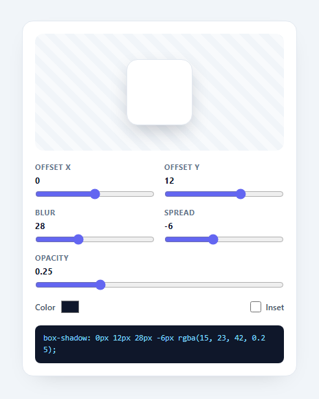
A box-shadow generator lets you dial in a CSS box-shadow with sliders and instantly see and copy the result — far faster than guessing pixel values by hand. This snippet builds a complete one with offset, blur, spread, colour, opacity, and inset controls over a live preview, in plain HTML, CSS, and vanilla JavaScript.
Every parameter of box-shadow, mapped to a control
CSS box-shadow is offset-x offset-y blur spread color, optionally inset. Each gets its own control: range sliders for the four lengths (with negative offsets and spread allowed), a colour picker, an opacity slider, and an inset checkbox. As you move any of them the preview box updates in real time, so you feel the effect of, say, a negative spread tightening the shadow, rather than reading about it.
Colour and opacity, combined correctly
People think of a shadow as "this colour at this opacity," but CSS wants a single colour value. The generator converts the chosen hex to RGB and combines it with the opacity slider into an rgba(…) string, so you tune hue and transparency independently and get valid CSS out. This is the detail that makes shadows look natural — soft dark shadows are usually a low-opacity near-black, not a grey.
A checkerboard stage
The preview sits on a subtle striped stage so the shadow is visible whether it's light or dark, and the box itself is neutral white with a hairline border so the shadow reads clearly. Inset shadows render inside the box, demonstrating the difference live.
Copyable, paste-ready output
The full box-shadow: …; declaration updates on every change and copies to the clipboard on click — including the inset keyword and the assembled rgba colour — so you go straight from tweaking to pasting into your stylesheet. No mental arithmetic, no trial-and-error reloads.
Self-contained and extensible
It's a single update() function reading the controls and writing the preview and output, with no dependencies. You can extend it to stack multiple shadows (comma-separated) or add presets, but as-is it's a clean, practical reference for the box-shadow generator pattern every CSS toolkit ships.
Build with AI
Build, Understand, Optimize, and Extend It With AI
You don't need to work out the hex-to-rgba conversion or the shadow-string assembly by hand. Paste this snippet's HTML, CSS, and JS into an AI coding assistant like Claude and ask it to explain exactly how hexToRgb extracts each color channel with bitwise shifts and masks, or why the opacity slider is divided by 100 before being combined into the rgba string. The same assistant can help optimize it, for example checking whether calling update() on every single input event across five sliders plus the color and inset controls is doing any redundant work that could be batched. It's also useful for extending the feature: ask it to support stacking multiple comma-separated shadows for layered depth, add named presets like "soft," "hard," and "neumorphic," or generate the equivalent Tailwind arbitrary shadow value alongside the raw CSS. Treat the code less like a finished artifact and more like a starting point for a conversation.
Prompt to recreate it
Copy this into your AI assistant of choice to build the effect from scratch, or as a jumping-off point for your own variant:
Build a live CSS box-shadow generator in plain HTML, CSS, and JavaScript, no framework, no libraries.

Requirements:
- Range sliders for offset-x, offset-y, blur, and spread, all of which must allow negative values (not just zero to positive), plus a separate opacity slider from 0 to 100.
- A native color input for the shadow color and a checkbox for the inset keyword.
- Write a single function that converts the chosen hex color string to its red, green, and blue integer channels using bitwise operations (parse the hex to a number, then shift and mask each byte), not a string-splitting approach.
- Combine that RGB triple with the opacity slider (divided by 100) into a single valid rgba(...) color string, and assemble the full box-shadow value in the exact CSS order: optional inset keyword, offset-x, offset-y, blur, spread, then the rgba color.
- Apply the assembled value live to a preview box's boxShadow style on every slider, color, and checkbox change, so the visual result updates in real time with no lag or debounce.
- Display the exact box-shadow: ...; declaration as copyable text, and make clicking it copy the text to the clipboard using the Clipboard API.
- Render the preview box on a subtly striped or checkerboard background so the shadow remains visible regardless of whether it is light or dark colored.
Want to tighten it up first? Run this prompt through the AI Prompt Studio to score it across 8 quality dimensions, catch anti-patterns, and tune the wording for Claude, ChatGPT, or Gemini before you paste it in.
Step by step
How to Use
- 1Paste HTML, CSS, and JSA shadow generator renders with a live preview box.
- 2Adjust the slidersSet offset X/Y, blur, and spread; the preview updates live.
- 3Pick color and opacityChoose a hue and transparency — combined into rgba for you.
- 4Toggle insetSwitch between an outer and inner shadow.
- 5Copy the CSSClick the output to copy the box-shadow declaration.
- 6Tune to tasteSoft shadows are usually low-opacity near-black.
Real-world uses
Common Use Cases
Got questions?
Frequently Asked Questions
Offset X and Y move the shadow horizontally and vertically (negative values move it left/up). Blur softens the edge — higher is fuzzier. Spread grows or shrinks the shadow before blurring; a negative spread pulls it in, which is the trick behind subtle, tight shadows. The generator lets you feel each of these live rather than guessing values.
CSS box-shadow takes a single color value, but designers think in terms of a color plus a transparency. The generator converts your chosen hex to RGB and merges it with the opacity slider into an rgba() string, so you can adjust hue and alpha independently and still get one valid value. Most natural shadows are a low-opacity near-black rather than an opaque grey.
Tick the inset checkbox. That prepends the inset keyword to the box-shadow, which renders the shadow inside the element instead of outside — useful for pressed buttons, inputs, and neumorphic effects. The preview updates immediately so you can see the inner shadow as you tune the same offset, blur, and spread controls.
CSS supports comma-separated shadows for layered depth, and you can extend this generator to manage a list of shadow objects and join their strings with commas. As shipped it builds a single shadow, which covers most needs; adding a "layers" array and an add/remove UI turns it into a multi-shadow editor without changing the core math.
Hold the shadow parameters in state and compute the box-shadow string as a derived value bound to the preview's style and the output. Two-way bind each slider, the color input, and the inset checkbox to state. Copy via the Clipboard API. Tailwind users can map common results to shadow utilities, or keep the generated value as an arbitrary property.