Source Code
<div class="pf-stage">
  <div class="pf-book" id="pfBook">
    <div class="pf-spine"></div>
    <div class="pf-pages" id="pfPages"></div>
  </div>
  <div class="pf-controls">
    <button type="button" class="pf-btn" id="pfPrev" aria-label="Previous page">‹</button>
    <span class="pf-count" id="pfCount"></span>
    <button type="button" class="pf-btn" id="pfNext" aria-label="Next page">›</button>
  </div>
</div>*{box-sizing:border-box;margin:0;padding:0}
body{font-family:system-ui,-apple-system,sans-serif;background:#1e293b;min-height:100vh;display:flex;align-items:center;justify-content:center;padding:24px}
.pf-stage{display:flex;flex-direction:column;align-items:center;gap:22px}
.pf-book{position:relative;width:240px;height:300px;perspective:1600px}
.pf-spine{position:absolute;left:0;top:0;bottom:0;width:6px;background:linear-gradient(90deg,#0f172a,#334155);border-radius:4px 0 0 4px;z-index:30}
.pf-pages{position:relative;width:100%;height:100%;transform-style:preserve-3d}
.pf-page{position:absolute;inset:0;left:6px;width:calc(100% - 6px);background:#fff;border-radius:0 8px 8px 0;
transform-origin:left center;transform-style:preserve-3d;backface-visibility:hidden;
transition:transform .7s cubic-bezier(.4,0,.2,1);box-shadow:0 8px 30px rgba(0,0,0,.3);
padding:26px 22px;display:flex;flex-direction:column}
.pf-page.pf-flipped{transform:rotateY(-180deg)}
.pf-pnum{font-size:11px;font-weight:700;color:#94a3b8;margin-bottom:14px}
.pf-page h4{font-size:17px;font-weight:800;color:#0f172a;margin-bottom:10px}
.pf-page p{font-size:13px;color:#475569;line-height:1.6}
/* A soft gradient near the spine sells the page curve. */
.pf-page::before{content:'';position:absolute;left:0;top:0;bottom:0;width:24px;background:linear-gradient(90deg,rgba(15,23,42,.10),transparent);pointer-events:none}
.pf-controls{display:flex;align-items:center;gap:16px}
.pf-btn{width:40px;height:40px;border-radius:50%;border:none;background:#6366f1;color:#fff;font-size:20px;cursor:pointer;transition:background .15s,transform .1s}
.pf-btn:hover:not(:disabled){background:#4f46e5}
.pf-btn:active:not(:disabled){transform:scale(.92)}
.pf-btn:disabled{opacity:.35;cursor:default}
.pf-count{color:#cbd5e1;font-size:13px;font-weight:700;min-width:54px;text-align:center}var PAGES = [
{ title: 'Chapter 1', text: 'The animation runs entirely on CSS 3D transforms — each page rotates around its spine edge.' },
{ title: 'Chapter 2', text: 'backface-visibility hides the reverse of each page, so you never see mirrored text through the paper.' },
{ title: 'Chapter 3', text: 'z-index is updated per flip so the turning page always sits above its neighbours.' },
{ title: 'Chapter 4', text: 'Stacking the pages with the first on top reproduces a real book that you read front to back.' },
{ title: 'The End', text: 'Flip back any time — the same transform reverses smoothly.' },
];
var pagesEl = document.getElementById('pfPages');
var prevBtn = document.getElementById('pfPrev');
var nextBtn = document.getElementById('pfNext');
var flipped = 0; // how many pages have been turned
// Render pages in reverse so the first page sits on top of the stack.
pagesEl.innerHTML = PAGES.map(function (p, i) {
return '<div class="pf-page" data-i="' + i + '" style="z-index:' + (PAGES.length - i) + '">' +
'<div class="pf-pnum">Page ' + (i + 1) + '</div><h4>' + p.title + '</h4><p>' + p.text + '</p></div>';
}).join('');
var pages = Array.prototype.slice.call(pagesEl.querySelectorAll('.pf-page'));
function update() {
pages.forEach(function (pg, i) {
var isFlipped = i < flipped;
pg.classList.toggle('pf-flipped', isFlipped);
// Flipped pages drop behind; the current page stays on top.
pg.style.zIndex = isFlipped ? i : (PAGES.length - i);
});
prevBtn.disabled = flipped === 0;
nextBtn.disabled = flipped >= PAGES.length;
document.getElementById('pfCount').textContent = Math.min(flipped + 1, PAGES.length) + ' / ' + PAGES.length;
}
nextBtn.addEventListener('click', function () { if (flipped < PAGES.length) { flipped++; update(); } });
prevBtn.addEventListener('click', function () { if (flipped > 0) { flipped--; update(); } });
// Click the book itself to turn the page forward.
pagesEl.addEventListener('click', function () { if (flipped < PAGES.length) { flipped++; update(); } });
update();Learn Coding Visually
Learn to code with interactive, live-preview playgrounds — HTML, CSS, JavaScript, React & more.
 HTML Playground42 lessons · Click-based · Live preview
 CSS PlaygroundLearn CSS with a live editor
 JavaScript Playground60 lessons · DOM · Async · Canvas
 React PlaygroundLearn React with a live code editor
 GSAP PlaygroundLearn GSAP animation interactively
 SVG Playground44 lessons · shapes · paths · animation
 SCSS Playground45 lessons · Sass modules · tokens
 Tailwind PlaygroundLearn Tailwind CSS with a live editor
 Bootstrap 5 Playground50 lessons · live preview
Page Flip — CSS 3D Book Page Turn HTML CSS JS
Page Flip · Animations · Plain HTML, CSS & JS · Live preview
What's included
Features
About this UI Snippet
Page Flip — CSS 3D Book Where Pages Turn Around the Spine
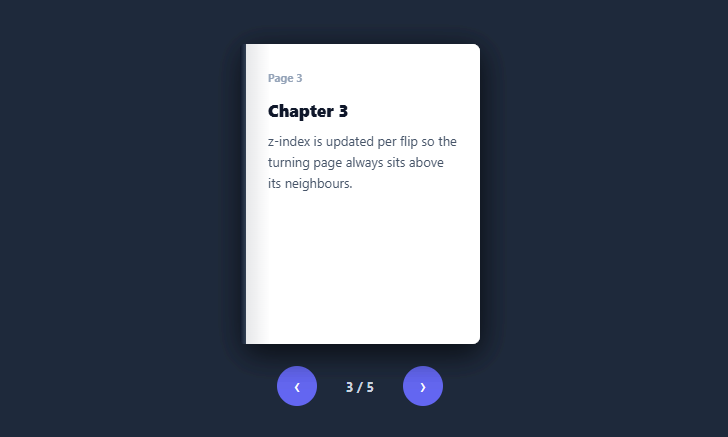
A page-flip turns a stack of panels into a book whose pages rotate around the spine when you advance — a tactile, skeuomorphic way to present sequential content like a guide, a story, or a photo book. This snippet builds it with pure CSS 3D transforms and a little vanilla JavaScript for navigation, no library and no images.
Pages rotate around the spine edge
Each page is absolutely stacked and given transform-origin: left center, so rotating it with rotateY(-180deg) swings it around its left (spine) edge like a real page turning. A perspective on the book and transform-style: preserve-3d on the stack make the rotation read as genuine depth rather than a flat flip. A CSS transition animates the turn, so each flip is a smooth half-circle swing.
backface-visibility hides the reverse
Without backface-visibility: hidden, you'd see each page's content mirrored through the paper as it passes 90° — the text reversed and backwards. Hiding the backface means a turning page shows nothing on its reverse, which is what real (opaque) paper does. This single property is the difference between a convincing page turn and a broken-looking flip, the same trick behind flip cards and coins.
z-index managed per flip
The subtle but essential detail is stacking order. Pages render with the first on top (descending z-index), so the book reads front-to-back. As pages flip, their z-index is updated: turned pages drop behind while the current page stays on top — so the page mid-turn always sits above its neighbours and lands correctly on the "left" side of the book. Getting this z-index bookkeeping right is what stops pages from clipping through each other during the animation.
Forward, back, and click-to-turn
Next and Previous buttons turn pages in either direction (disabled at the first and last), a counter shows the position, and clicking the book itself advances — the natural gesture. All of it derives from one flipped count through update(), so the visuals, z-index, and controls stay consistent. Flipping back reverses the same transform smoothly.
Drop-in and adaptable
Pages come from a PAGES array, so it's content-driven — put chapters, onboarding steps, a lookbook, or a photo album in the pages. Restyle the paper, spine, and size to taste. It's a complete, dependency-free reference for CSS 3D page-turn mechanics: spine-edge rotation, backface hiding, and per-flip stacking.
Why CSS transforms instead of canvas
Many page-turn effects on the web reach for canvas or WebGL to draw a curling, paper-bend mesh, trading simplicity for vertex math and per-frame redraws. This snippet stays on the CSS transform pipeline instead — rotateY runs on the compositor thread, so the flip stays smooth even on low-end devices, and the whole effect is under a hundred lines of CSS with zero canvas redraw cost. The trade-off is a rigid page rather than a curling one: there's no paper-bend simulation, only spine rotation. For book-like UIs — FAQs, slideshows, manuals — a rigid flip reads just as convincingly and ships with far less code. The perspective: 1600px on .pf-book and the .7s cubic-bezier(.4,0,.2,1) transition were tuned so the turn looks weighty rather than rushed; a tighter perspective value exaggerates the 3D distortion near the spine, while a much larger one flattens the rotation toward a parallel-projection flip with little visible depth.
Build with AI
Build, Understand, Optimize, and Extend It With AI
You don't have to visualize the 3D stacking order in your head. Paste this snippet's HTML, CSS, and JS into an AI coding assistant like Claude and ask it to walk through exactly why update recomputes each page's z-index every time flipped changes, and what would visually break if that per-flip z-index bookkeeping were removed while pages still rotated with rotateY. The same assistant can help you optimize it, for example asking whether keeping every page fully in the DOM at once (rather than lazily rendering only nearby pages) is worth the tradeoff once a book grows to hundreds of pages. It's also useful for extending the effect: ask it to add a subtle drag-to-flip gesture using pointer events instead of only button clicks, curve the page edge with an extra transform during the rotation for a less rigid look, or support two-page spreads that flip together. Treat the code less like a finished artifact and more like a starting point for a conversation.
Prompt to recreate it
Copy this into your AI assistant of choice to build the effect from scratch, or as a jumping-off point for your own variant:
Build a "page flip" book effect in plain HTML, CSS, and JavaScript using CSS 3D transforms — no canvas, no WebGL, no page-curl library.

Requirements:
- A stack of absolutely positioned page elements inside a container with CSS perspective set, and preserve-3d on the stack so rotations show real depth.
- Every page must have transform-origin set to the left edge (the spine) and backface-visibility hidden, so rotating a page swings it around its left edge like a real page turning and its reverse side is never visible showing mirrored content.
- Flipping a page forward must apply a rotateY transform of negative 180 degrees via a CSS transition (not a JS-driven animation loop), so the turn animates smoothly as a half-circle swing.
- Track how many pages have been turned as a single count variable. On every change to that count, recompute every page's z-index: pages already turned must drop behind (low z-index), pages not yet turned keep a descending z-index so the first untouched page stays on top, ensuring the currently turning page is never visually clipped by its neighbors.
- Provide a Next button, a Previous button, and clicking the book itself to advance, all driving the same single count variable, with Next/Previous disabling appropriately at the first and last page.
- Render the pages' content (title and body text) from a plain JavaScript array of objects rather than hardcoding each page's markup, and show a "page X of Y" counter that updates as pages turn.
Want to tighten it up first? Run this prompt through the AI Prompt Studio to score it across 8 quality dimensions, catch anti-patterns, and tune the wording for Claude, ChatGPT, or Gemini before you paste it in.
Step by step
How to Use
- 1Paste HTML, CSS, and JSA small book renders with stacked pages and prev/next controls.
- 2Turn pagesClick Next (or the book) to flip a page around the spine; Previous flips back.
- 3Watch the positionThe counter shows the current page out of the total.
- 4Swap in your contentReplace the PAGES array with your own { title, text } (or richer markup).
- 5Resize the bookChange the .pf-book width/height (and perspective) to fit your layout.
- 6Restyle itAdjust the paper colour, spine, and shadows to match your theme.
Real-world uses
Common Use Cases
Got questions?
Frequently Asked Questions
Each page has transform-origin: left center, so when it's rotated with rotateY(-180deg) it pivots around its left edge — the spine — swinging across like a real page rather than spinning about its centre. A perspective on the book and preserve-3d on the page stack give the rotation real depth, and a CSS transition animates the half-circle turn smoothly.
As a page rotates past 90°, its back faces you. Without backface-visibility: hidden, the browser shows the page's content mirrored through the back — reversed, backwards text — which looks broken. Hiding the backface makes the reverse of a turning page render as nothing, mimicking opaque paper. It's the same essential property used in flip cards and coin flips.
Pages start with the first on top via descending z-index, so the book reads front-to-back. On each flip, update() recomputes z-index: already-turned pages drop to low z-index (behind), while un-turned pages keep high z-index, and the page currently turning stays above its neighbours. Without this per-flip bookkeeping, pages would clip through each other mid-turn or land in the wrong order.
Yes. Each page is a normal flex container, so you can put headings, paragraphs, images, or any markup inside. For a two-page-spread look you'd render left and right halves; for image pages, drop an <img> in. Keep heavy content reasonable since all pages are in the DOM at once, but for a typical book of a few dozen pages it's fine.
Render pages from an array and hold the flipped count in state; derive each page's flipped class and z-index from it. In React use useState; in Vue a ref with computed classes; in Angular a property with class/style bindings. The 3D transform CSS and z-index logic are framework-agnostic — only the flipped state and click handlers move into the framework.