Source Code
<section class="mg-stage" id="mgStage">
  <div class="mg-grid" id="mgGrid"></div>
  <div class="mg-caption">Move your cursor — nearby dots are pulled toward it</div>
</section>*{box-sizing:border-box;margin:0;padding:0}
body{font-family:system-ui,-apple-system,sans-serif;background:#06060e;color:#fff}
.mg-stage{position:relative;min-height:100vh;display:flex;flex-direction:column;align-items:center;justify-content:center;overflow:hidden}
.mg-grid{display:grid;gap:0}
.mg-cell{display:flex;align-items:center;justify-content:center}
.mg-dot{width:6px;height:6px;border-radius:50%;background:#2a2a48;will-change:transform;transition:background .3s}
.mg-caption{position:absolute;bottom:40px;font-size:13px;color:#55556e;letter-spacing:.03em;pointer-events:none}var grid = document.getElementById('mgGrid');
var stage = document.getElementById('mgStage');
var CELL = 40, RADIUS = 130, PULL = 0.42;
var cols, rows, dots = [];
function buildGrid() {
cols = Math.floor(Math.min(window.innerWidth, 760) / CELL);
rows = Math.floor(Math.min(window.innerHeight, 560) / CELL);
grid.style.gridTemplateColumns = 'repeat(' + cols + ',' + CELL + 'px)';
grid.innerHTML = '';
dots = [];
for (var i = 0; i < cols * rows; i++) {
var cell = document.createElement('div');
cell.className = 'mg-cell';
cell.style.height = CELL + 'px';
var dot = document.createElement('div');
dot.className = 'mg-dot';
cell.appendChild(dot);
grid.appendChild(cell);
dots.push(dot);
}
}
buildGrid();
window.addEventListener('resize', buildGrid);
var mx = -9999, my = -9999;
stage.addEventListener('pointermove', function (e) { mx = e.clientX; my = e.clientY; });
stage.addEventListener('pointerleave', function () { mx = my = -9999; });
function loop() {
for (var i = 0; i < dots.length; i++) {
var dot = dots[i];
var r = dot.getBoundingClientRect();
var dx = mx - (r.left + 3), dy = my - (r.top + 3);
var dist = Math.sqrt(dx * dx + dy * dy);
if (dist < RADIUS) {
// Closer dots are pulled harder (falloff toward the edge of the radius).
var force = (1 - dist / RADIUS) * PULL;
dot.style.transform = 'translate(' + (dx * force) + 'px,' + (dy * force) + 'px)';
dot.style.background = '#6366f1';
} else {
dot.style.transform = '';
dot.style.background = '';
}
}
requestAnimationFrame(loop);
}
requestAnimationFrame(loop);Learn Coding Visually
Learn to code with interactive, live-preview playgrounds — HTML, CSS, JavaScript, React & more.
 HTML Playground42 lessons · Click-based · Live preview
 CSS PlaygroundLearn CSS with a live editor
 JavaScript Playground60 lessons · DOM · Async · Canvas
 React PlaygroundLearn React with a live code editor
 GSAP PlaygroundLearn GSAP animation interactively
 SVG Playground44 lessons · shapes · paths · animation
 SCSS Playground45 lessons · Sass modules · tokens
 Tailwind PlaygroundLearn Tailwind CSS with a live editor
 Bootstrap 5 Playground50 lessons · live preview
Magnetic Grid — Free HTML CSS JS Cursor Attraction Snippet
Magnetic Grid · Animations · Plain HTML, CSS & JS · Live preview
What's included
Features
About this UI Snippet
Magnetic Grid — Dots Pulled Toward the Cursor With Falloff
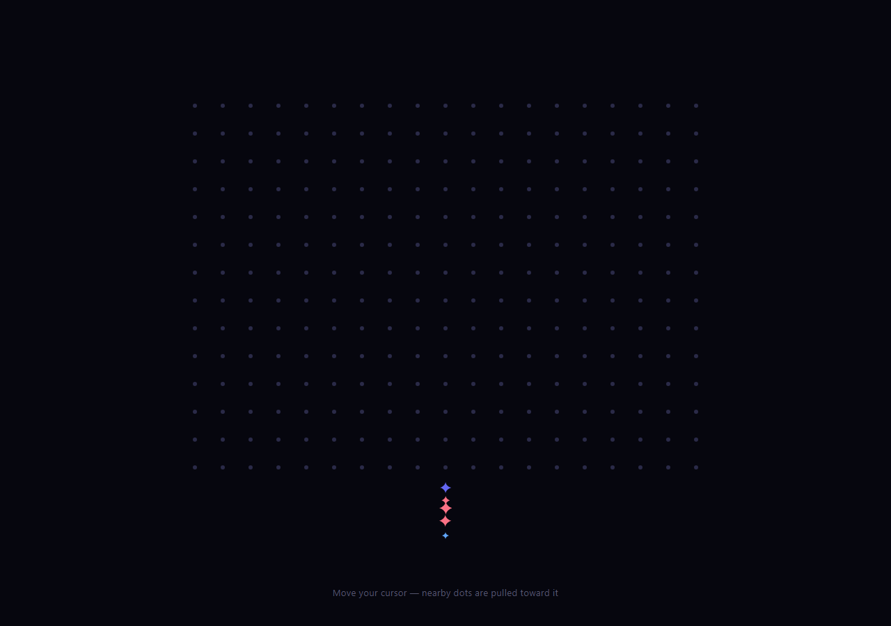
The magnetic grid is the tactile backdrop where a field of evenly-spaced dots reacts to your cursor like iron filings to a magnet: dots within a radius are pulled toward the pointer and tinted, with the pull strongest right under the cursor and fading to nothing at the edge of its influence. This snippet builds it with plain HTML, CSS, and one vanilla JavaScript animation loop.
Building the dot field
JavaScript fills a CSS grid with cells sized to a CELL constant, each holding a small dot, and computes how many columns and rows fit the available space. The dots are stored in a flat array for fast iteration. Generating the grid in code means resizing is trivial — a resize listener rebuilds the field to fit the new viewport — and the density is controlled by a single number.
Distance-based magnetic pull
The heart of the effect is the per-frame loop. For each dot, it measures the vector from the dot's center to the cursor (dx, dy) and the distance between them. If the dot is within RADIUS (130px), it's displaced toward the cursor by translate(dx * force, dy * force). The crucial detail is the falloff: force = (1 - dist / RADIUS) * PULL, so a dot directly under the cursor gets the full pull while a dot at the edge of the radius gets nearly zero. This gradient of force is what makes it look like a smooth magnetic field rather than a hard on/off zone.
Color as a second cue
Dots inside the radius also switch from the muted base color to the accent, with a CSS transition on background so they fade in and out of the highlight. The color change makes the magnet's area of influence visible even where the displacement is subtle, reinforcing the sense of a field moving with your cursor.
One loop for the whole grid
A single requestAnimationFrame loop updates every dot each frame by reading the latest pointer position from two variables set in pointermove. Keeping the pointer position in shared variables (rather than doing work inside the move handler) means the move handler is nearly free and all the math happens in one place at the display's refresh rate. When the pointer leaves, the position is parked far off-screen so every dot relaxes back to rest.
Why transform, not layout
Dots are displaced with transform: translate, which the GPU handles without triggering layout or paint, and they carry will-change: transform. That's what lets hundreds of dots move every frame smoothly — animating left/top instead would thrash layout and stutter.
Customizing it
Change CELL for a denser or sparser field, RADIUS for a bigger or smaller magnet, and PULL for a stronger or gentler attraction. Recolor the accent, or invert the force sign to make dots flee the cursor instead. Swap dots for small icons or characters. Pair it with a background boxes hero or a text generate headline for an interactive section.
Build with AI
Build, Understand, Optimize, and Extend It With AI
You do not have to work out why this scales to hundreds of dots by reading it once. Paste this snippet's HTML, CSS, and JS into an AI coding assistant like Claude and ask it to explain exactly why the loop() function calls dot.getBoundingClientRect() on every single dot every single frame, and whether that repeated layout read is the actual performance bottleneck compared to the transform writes themselves. The same assistant can help optimize it, for instance asking whether caching each dot's rest position once (instead of calling getBoundingClientRect in the hot loop) would let the grid scale to a much denser field without dropping frames. It is also useful for extending the effect: ask it to make the color shift interpolate smoothly with distance instead of snapping at the RADIUS boundary, add a click ripple that temporarily overrides the magnetic pull, or make the grid respond to multiple simultaneous touch points on mobile. Treat the code less like a finished artifact and more like a starting point for a conversation.
Prompt to recreate it
Copy this into your AI assistant of choice to build the effect from scratch, or as a jumping-off point for your own variant:
Build a "magnetic dot grid" background effect in plain HTML, CSS, and JavaScript with no libraries.

Requirements:
- Generate a grid of small dot elements entirely in JavaScript from a cell-size constant, computing how many columns and rows fit the current viewport (capped to a reasonable maximum), and store every dot element in a flat array for iteration.
- Rebuild the entire grid on window resize so it always fits the current viewport dimensions.
- Track the pointer position by only writing to two shared variables on pointermove (do no per-dot work inside the move handler itself), and reset those variables to a far off-screen value on pointerleave so every dot relaxes back to rest when the pointer exits.
- Run exactly one requestAnimationFrame loop that, every frame, iterates every dot, computes the vector and distance from that dot's position to the current pointer position, and if within a defined radius constant, displaces the dot toward the pointer using CSS transform: translate with a magnitude that falls off smoothly from full strength at zero distance to near-zero at the radius edge (not a hard on/off cutoff).
- Dots within the radius must also visually tint to an accent color (via a CSS transition on background-color, not an instant snap), while dots outside the radius must revert to their default muted color and zero transform.
- All per-frame displacement must be applied via the transform property (never left/top or margin), and the dots should carry will-change: transform so the browser can composite the motion on the GPU without triggering layout.
Want to tighten it up first? Run this prompt through the AI Prompt Studio to score it across 8 quality dimensions, catch anti-patterns, and tune the wording for Claude, ChatGPT, or Gemini before you paste it in.
Step by step
How to Use
- 1Paste HTML, CSS, and JSA field of evenly spaced dots fills the stage.
- 2Move your cursorNearby dots are pulled toward it and tint to the accent.
- 3Watch the falloffDots closest to the cursor move most; distant ones barely.
- 4Move the pointer awayDots relax smoothly back to their grid positions.
- 5Resize the windowThe grid rebuilds to fit the new space.
- 6Tune the magnetAdjust CELL, RADIUS, and PULL constants.
Real-world uses
Common Use Cases
Got questions?
Frequently Asked Questions
Each frame, the loop measures the vector from each dot's center to the cursor and the distance between them. If the dot is within the radius, it's displaced by translate(dx * force, dy * force) toward the pointer. So dots move along the line to the cursor, which reads as magnetic attraction.
The force has a falloff: force = (1 - dist / radius) * PULL. A dot directly under the cursor gets the full pull, while one at the edge of the radius gets nearly zero. That gradient of displacement makes the influence fade out smoothly toward the edge, like a real field, rather than dots snapping at a hard boundary.
transform: translate is composited on the GPU without triggering layout or paint, and the dots carry will-change: transform. That lets hundreds of dots update every frame smoothly. Animating left/top would force layout recalculation each frame and stutter, especially on a dense grid.
No. The move handler only stores the cursor x and y in two variables; all the per-dot math happens once per frame in the single requestAnimationFrame loop. This keeps the handler nearly free and centralizes the work at the display's refresh rate. On pointerleave the position is parked off-screen so every dot relaxes back.
Build the dot field from a sized array and keep the pointer position and the dot elements in refs. Run the rAF loop and the resize/rebuild in a mount effect with cleanup that cancels the frame on unmount. Avoid putting per-frame transforms in state. The CSS ports directly; in Tailwind, lay out the grid with grid utilities and apply transforms inline from the loop.