Source Code
<div class="cm-stage">
  <p class="cm-hint">Move your cursor across the photo — a circular window reveals the alternate version underneath</p>
  <div class="cm-frame" id="cmFrame">
    <div class="cm-base" aria-hidden="true"></div>
    <div class="cm-mask" id="cmMask" aria-hidden="true"></div>
    <span class="cm-tag cm-tag-day">Day</span>
    <span class="cm-tag cm-tag-night">Night</span>
  </div>
</div>
* { box-sizing: border-box; margin: 0; padding: 0; }
body { font-family: system-ui, sans-serif; background: #0a0a14; display: flex; align-items: center; justify-content: center; min-height: 100vh; }
.cm-stage { display: flex; flex-direction: column; align-items: center; gap: 24px; padding: 24px; }
.cm-hint { font-size: 13px; color: #64748b; text-align: center; max-width: 360px; }
.cm-frame {
position: relative;
width: min(480px, 90vw);
height: 320px;
border-radius: 20px;
overflow: hidden;
cursor: none;
border: 1px solid #26263f;
}
.cm-base, .cm-mask {
position: absolute;
inset: 0;
}
/* "Day" layer — always fully visible underneath. */
.cm-base {
background: linear-gradient(160deg, #7dd3fc 0%, #38bdf8 35%, #fbbf24 70%, #fb923c 100%);
}
.cm-base::after {
content: '';
position: absolute; inset: 0;
background:
radial-gradient(circle 40px at 75% 25%, #fff8, transparent 70%),
linear-gradient(0deg, #0ea5e955 0%, transparent 40%);
}
/* "Night" layer — only visible through the circular mask that follows the cursor. */
.cm-mask {
background: linear-gradient(160deg, #0f172a 0%, #1e1b4b 45%, #312e81 100%);
-webkit-mask-image: radial-gradient(circle 90px at var(--cm-x, -200px) var(--cm-y, -200px), #000 98%, transparent 100%);
mask-image: radial-gradient(circle 90px at var(--cm-x, -200px) var(--cm-y, -200px), #000 98%, transparent 100%);
transition: -webkit-mask-image 0.02s linear;
}
.cm-mask::after {
content: '';
position: absolute; inset: 0;
background-image:
radial-gradient(2px 2px at 20% 30%, #fff, transparent),
radial-gradient(2px 2px at 60% 15%, #fff, transparent),
radial-gradient(1.5px 1.5px at 80% 40%, #fff, transparent),
radial-gradient(1.5px 1.5px at 35% 65%, #fff, transparent),
radial-gradient(2px 2px at 90% 70%, #fff, transparent),
radial-gradient(1.5px 1.5px at 10% 80%, #fff, transparent);
opacity: 0.8;
}
.cm-tag {
position: absolute;
top: 14px;
font-size: 11px; font-weight: 800; letter-spacing: 0.06em; text-transform: uppercase;
background: rgba(0,0,0,0.45); color: #fff;
padding: 5px 10px; border-radius: 999px;
pointer-events: none;
}
.cm-tag-day { left: 14px; }
.cm-tag-night { right: 14px; }// A circular CSS mask-image is repositioned every mousemove via CSS custom
// properties, so the "night" layer only shows through a small circular
// window that follows the cursor exactly — like a flashlight revealing a
// second image underneath the first, rather than a text/color spotlight.
var frame = document.getElementById('cmFrame');
var mask = document.getElementById('cmMask');
function setSpot(x, y) {
frame.style.setProperty('--cm-x', x + 'px');
frame.style.setProperty('--cm-y', y + 'px');
mask.style.setProperty('--cm-x', x + 'px');
mask.style.setProperty('--cm-y', y + 'px');
}
frame.addEventListener('mousemove', function (e) {
var rect = frame.getBoundingClientRect();
setSpot(e.clientX - rect.left, e.clientY - rect.top);
});
frame.addEventListener('mouseleave', function () {
setSpot(-200, -200); // move the window fully off-frame
});
frame.addEventListener('touchmove', function (e) {
var t = e.touches[0];
if (!t) return;
var rect = frame.getBoundingClientRect();
setSpot(t.clientX - rect.left, t.clientY - rect.top);
}, { passive: true });Learn Coding Visually
Learn to code with interactive, live-preview playgrounds — HTML, CSS, JavaScript, React & more.
 HTML Playground42 lessons · Click-based · Live preview
 CSS PlaygroundLearn CSS with a live editor
 JavaScript Playground60 lessons · DOM · Async · Canvas
 React PlaygroundLearn React with a live code editor
 GSAP PlaygroundLearn GSAP animation interactively
 SVG Playground44 lessons · shapes · paths · animation
 SCSS Playground45 lessons · Sass modules · tokens
 Tailwind PlaygroundLearn Tailwind CSS with a live editor
 Bootstrap 5 Playground50 lessons · live preview
Cursor Circle Image Reveal — CSS Mask Hover Snippet
Cursor Circle Image Reveal · Animations · Plain HTML, CSS & JS · Live preview
What's included
Features
About this UI Snippet
Cursor Circle Image Reveal — CSS mask-image radial-gradient Following the Cursor
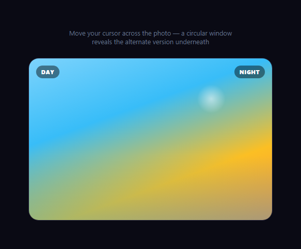
This effect stacks two full-size image layers and cuts a small circular window through the top layer that follows the cursor, so moving the mouse feels like sliding a flashlight or magnifying glass across the surface, exposing the second layer underneath only where the circle currently sits. It's a different interaction from cursor spotlight reveal, which dims and lights up text on a single layer — here two entirely different visuals (day and night versions of the same scene) exist simultaneously, and the cursor decides which one is visible at each point.
The two-layer stack
.cm-base is the bottom layer and is always fully visible — think of it as the "default" image. .cm-mask sits directly on top at the same size (position: absolute; inset: 0) holding the alternate visual, but with a CSS mask-image applied that hides all of it except a small circle.
The circular mask
The mask is a radial-gradient(circle 90px at var(--cm-x, -200px) var(--cm-y, -200px), #000 98%, transparent 100%) used as mask-image (and -webkit-mask-image for Safari). Wherever the gradient is opaque black, the layer beneath shows through; wherever it fades to transparent, that part of the top layer is invisible, letting the base layer beneath show instead. Because the gradient's center position is driven entirely by two CSS custom properties, moving those properties is all it takes to move the visible window.
Tracking the cursor
A single mousemove listener on the frame computes the cursor's position relative to the frame with getBoundingClientRect(), then calls setSpot(x, y), which writes --cm-x and --cm-y via style.setProperty. Because these are plain CSS custom properties read directly inside the radial-gradient() function, the browser's own compositor updates the mask position — there's no JavaScript recalculating gradients or repainting canvases on every frame, keeping the effect smooth even on modest hardware.
Off-frame reset
On mouseleave, setSpot(-200, -200) moves the circular window's center far outside the visible frame, so the mask closes to fully hide the alternate layer again without any special-case CSS — the same radial-gradient math simply places the circle where nothing is visible.
Touch support
A parallel touchmove listener reads e.touches[0] and applies the same relative-position math, so dragging a finger across the frame on mobile reveals the layer underneath exactly like a mouse would.
Adapting it to real photography
Swap the two gradient-based .cm-base/.cm-mask backgrounds for background-image: url(...) pointing at your own day/night, before/after, or sketch/final image pairs — the masking mechanism itself doesn't care what's underneath, only that both layers are the same size and positioned identically.
Build with AI
Build, Understand, Optimize, and Extend It With AI
You don't have to work out the masking mechanics alone. Paste this snippet's HTML, CSS, and JS into an AI coding assistant like Claude and ask it to explain exactly why the reveal is implemented as a CSS mask-image radial-gradient positioned by custom properties, instead of a canvas element clipped with a circular path, and what the tradeoffs are between the two approaches. The same assistant can help optimize it — for instance asking whether the redundant .style.setProperty calls on both frame and mask elements could be consolidated, or whether -webkit-mask-image alone is sufficient given current browser support. It's also useful for extending the effect: ask it to make the reveal circle grow on mousedown for a "zoom in" feel, add a soft drop shadow that moves with the circle to fake depth, or swap the circular mask for a custom SVG shape mask for a non-circular reveal window. Treat the code less like a finished artifact and more like a starting point for a conversation.
Prompt to recreate it
Copy this into your AI assistant of choice to build the effect from scratch, or as a jumping-off point for your own variant:
Build a "cursor circle image reveal" hover effect in plain HTML, CSS, and JavaScript with no canvas and no libraries.

Requirements:
- Two full-size layers stacked directly on top of each other inside a fixed-size frame, each showing a visually distinct background (for this demo, use CSS gradients standing in for two different photographs, such as a "day" scene and a "night" scene of the same view).
- The top layer must only be visible through a small circular window that follows the cursor, implemented using the CSS mask-image property with a radial-gradient — not a canvas element, not clip-path, and not an SVG clipPath.
- The radial-gradient's center position must be controlled by CSS custom properties (e.g. --x and --y) rather than rebuilding the entire gradient string in JavaScript on every mouse move.
- On mousemove over the frame, compute the cursor's position relative to the frame (not the viewport) using getBoundingClientRect, and update the two custom properties to move the circular window to that position.
- On mouseleave, move the circular window's position far outside the frame bounds so the top layer is fully hidden again, without needing separate show/hide CSS classes.
- Add equivalent touchmove support so dragging a finger across the frame on a touch device produces the same reveal behavior as a mouse.
- Make the reveal circle's radius and the softness of its edge easily adjustable via the gradient's size and color-stop percentages.
Want to tighten it up first? Run this prompt through the AI Prompt Studio to score it across 8 quality dimensions, catch anti-patterns, and tune the wording for Claude, ChatGPT, or Gemini before you paste it in.
Step by step
How to Use
- 1Move the cursor over the frameDrag your cursor across the image area — a circular window follows it, revealing the night-sky layer underneath the day layer.
- 2Leave the frameMove the cursor off the frame and the window closes, hiding the alternate layer completely again.
- 3Swap in real imagesReplace the .cm-base and .cm-mask backgrounds with background-image: url(your-image.jpg) for real before/after photography.
- 4Resize the reveal windowChange the 90px radius value inside the radial-gradient() in the .cm-mask mask-image rule.
- 5Soften or harden the edgeAdjust the 98% / 100% gradient stops — closer together gives a crisp circle edge, farther apart gives a soft feathered edge.
- 6Export in your formatClick "HTML" for a standalone file, "JSX" for a React component, or "Tailwind" for a React + Tailwind version.
Real-world uses
Common Use Cases
Got questions?
Frequently Asked Questions
A CSS mask-image on the top layer is a radial-gradient centered at a position controlled by two custom properties (--cm-x, --cm-y). Wherever the gradient is opaque, the top layer shows; wherever it fades to transparent, the layer beneath shows through instead. Moving the custom properties moves the visible circle.
Writing to two custom properties via style.setProperty lets the browser's compositor handle repositioning the existing gradient efficiently. Rebuilding and reassigning the full mask-image string on every mousemove would work too, but is unnecessary string work compared to updating two numeric properties.
Yes. Replace the background (and remove the ::after decorative layers) on .cm-base and .cm-mask with background-image: url(...) pointing at two same-size images — the masking logic is unaffected by what image is underneath.
Change the 90px value inside radial-gradient(circle 90px at ...) in the .cm-mask mask-image (and -webkit-mask-image) rule.
Yes. A touchmove listener reads the first active touch point and applies the same relative-position calculation as the mouse handler, so dragging a finger reveals the layer underneath.
Yes. Click "JSX" for a React component. Track the frame with a ref, compute the relative position inside onMouseMove using getBoundingClientRect, and call ref.current.style.setProperty directly for both custom properties to avoid state-driven re-renders on every move.