You Might Also Like
Learn Coding Visually
Learn to code with interactive, live-preview playgrounds — HTML, CSS, JavaScript, React & more.
 HTML Playground42 lessons · Click-based · Live preview
 CSS PlaygroundLearn CSS with a live editor
 JavaScript Playground60 lessons · DOM · Async · Canvas
 React PlaygroundLearn React with a live code editor
 GSAP PlaygroundLearn GSAP animation interactively
 SVG Playground44 lessons · shapes · paths · animation
 SCSS Playground45 lessons · Sass modules · tokens
 Tailwind PlaygroundLearn Tailwind CSS with a live editor
 Bootstrap 5 Playground50 lessons · live preview
Cursor Spotlight Reveal — Free CSS Mask Follow-the-Cursor Snippet
Cursor Spotlight Reveal · Animations · Plain HTML, CSS & JS · Live preview
What's included
Features
About this UI Snippet
Cursor Spotlight Reveal — A CSS Mask That Follows the Cursor
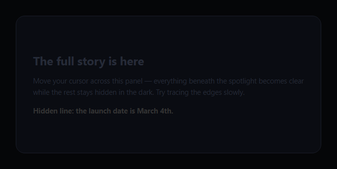
Two identical copies of the same content are stacked — one dim and always visible, one bright and hidden behind a circular CSS mask — so that only the area directly under the cursor reveals the vivid version underneath, like a flashlight sweeping a dark room. This snippet uses mask-image: radial-gradient(...) positioned by real mousemove coordinates, not a static hover effect.
Two stacked layers, one masked
The panel contains a .csr-dim layer (muted colors, always fully visible) and an identical .csr-lit layer (vivid colors, gradient text) positioned exactly on top of it with position: absolute; inset: 0. Because the content is duplicated rather than toggled, there is no flash or reflow when the mask moves — the bright version is always rendered, just clipped to a small circle by the mask.
The mask is a positioned radial-gradient
mask-image: radial-gradient(circle 120px at var(--csr-x) var(--csr-y), #000 55%, transparent 100%) draws a circle whose center comes from two CSS custom properties. A radial-gradient used as a mask makes its opaque stops (black, by mask convention) show the masked element and its transparent stops hide it — so the #000 55%, transparent 100% stop pair creates a solid spotlight core that feathers to nothing at its edge, rather than a hard-edged circle.
Real mousemove drives the mask, not a hover state
Every mousemove over the panel computes the cursor's position relative to the panel with getBoundingClientRect() and writes it straight into --csr-x/--csr-y via style.setProperty. Because the mask's at position references those same custom properties, the browser recomputes the gradient's center on every event — the spotlight is following the literal cursor coordinate every frame, not playing a fixed animation triggered by a hover class.
Leaving and touch
mouseleave resets the custom properties to an off-panel coordinate, so the spotlight disappears cleanly rather than freezing at its last position. A parallel touchmove/touchend pair gives the same behavior for a finger dragging across the panel on touch devices, since there is no persistent hover state to fall back on there.
Customizing it
Change the spotlight radius (both the circle 120px in CSS and nothing else needs to change, since JS only ever sets the center), swap the feather stop percentages for a harder or softer edge, or reveal an image instead of text. Pair it with a custom cursor for a themed pointer, or cursor text for a cursor-following label alongside the spotlight.
Build with AI
Build, Understand, Optimize, and Extend It With AI
You don't have to work out the mask-image gradient syntax from scratch. Paste this snippet's HTML, CSS, and JS into an AI coding assistant like Claude and ask it to explain exactly how a radial-gradient used as a mask-image treats its opaque stops as "show this content" and its transparent stops as "hide this content," and why writing the cursor position into CSS custom properties on every mousemove — rather than updating inline style.background directly — is a clean way to keep the gradient definition in CSS while still driving its position from JavaScript. The same assistant can help optimize it, for instance asking whether setting custom properties on every single mousemove event could be throttled with requestAnimationFrame for very high-frequency pointer input without making the spotlight feel laggy. It's also useful for extending the effect: ask it to add a soft trailing glow that lags slightly behind the spotlight's exact position, make the spotlight radius pulse subtly, or reveal an image gallery instead of text underneath the mask. Treat the code less like a finished artifact and more like a starting point for a conversation.
Prompt to recreate it
Copy this into your AI assistant of choice to build the effect from scratch, or as a jumping-off point for your own variant:
Build a "cursor spotlight reveal" panel in plain HTML, CSS, and JavaScript using a CSS mask-image that tracks the real cursor position — no canvas, no image-based cutouts.

Requirements:
- Two absolutely-positioned, fully-overlapping layers with identical content inside a relatively-positioned panel: a "dim" layer using muted/low-contrast colors that is always fully visible, and a "lit" layer using vivid colors that has a CSS mask-image applied to it.
- The lit layer's mask-image must be a radial-gradient shaped like circle <radius>px at var(--x) var(--y), with an opaque stop (e.g. #000) covering most of the circle's radius and fading to transparent at the outer edge, so the revealed area has a soft feathered edge rather than a hard circular cutoff. Reference two CSS custom properties for the gradient's center position rather than hardcoded coordinates.
- On mousemove over the panel, compute the cursor's position relative to the panel using the panel's getBoundingClientRect() (not raw viewport coordinates, since the panel may not be at the top-left of the page), and write that x/y directly into the two CSS custom properties via element.style.setProperty so the mask-image's center genuinely updates in real time as the cursor moves — this must be driven by the actual mousemove coordinate stream, not a fixed hover-triggered CSS transition or animation.
- On mouseleave, reset the custom properties to a position far outside the panel's bounds so the spotlight visibly retreats off the visible area rather than freezing at its last position.
- Add equivalent touchmove and touchend handlers using the first entry in event.touches so the same spotlight effect works by dragging a finger across the panel on a touch device, since touch has no persistent hover state.
- Ensure moving the mask never causes any visible flash, layout shift, or content re-render — only the mask's gradient position should change from frame to frame.
Want to tighten it up first? Run this prompt through the AI Prompt Studio to score it across 8 quality dimensions, catch anti-patterns, and tune the wording for Claude, ChatGPT, or Gemini before you paste it in.
Step by step
How to Use
- 1Paste HTML, CSS, and JSA dark panel renders with dim, barely-legible text.
- 2Move the cursor over the panelA circular spotlight reveals vivid text wherever it goes.
- 3Move the cursor awayThe spotlight fades off-panel and the text dims again.
- 4Drag a finger on touchThe same spotlight follows a finger instead of a mouse.
- 5Resize the spotlightChange the circle radius in the mask-image gradient.
- 6Swap the contentReplace the duplicated text with any bright/dim pair.
Real-world uses
Common Use Cases
Got questions?
Frequently Asked Questions
A mousemove listener on the panel computes the cursor's position relative to the panel using getBoundingClientRect(), then writes that x and y straight into two CSS custom properties via style.setProperty. The mask-image's radial-gradient references those same custom properties as its center point, so the browser recomputes the gradient's position on every mousemove event — the mask genuinely tracks the live cursor coordinate rather than playing a fixed hover animation.
A dim, always-visible layer sits behind an identical bright layer that has the CSS mask applied. Because both layers render continuously and only the top layer is clipped by the mask, moving the spotlight never causes a flash, reflow, or content swap — it simply reveals more or less of the already-rendered bright layer beneath the mask's opaque area.
mask-image: radial-gradient(circle 120px at X Y, #000 55%, transparent 100%) draws a circle 120px in radius; opaque (black) up to 55% of that radius, then fading to fully transparent by 100%. Since mask opacity follows the gradient's own alpha/lightness, that stop pair produces a solid spotlight core with a soft feathered edge rather than a hard-edged circle. Moving the 55% stop closer to 100% sharpens the edge; moving it toward 0% softens it further.
Yes — a parallel touchmove listener reads the first active touch point and writes the same custom properties the mouse handler does, so dragging a finger across the panel moves the spotlight identically. A touchend handler resets the mask off-panel, mirroring the mouseleave behavior, since touch has no hover state to fall back on.
Attach the mousemove/mouseleave (and touchmove/touchend) listeners to the panel's ref in a mount effect, and set the CSS custom properties directly via ref.current.style.setProperty rather than through component state, since updating on every mousemove through state would cause excessive re-renders. Clean up the listeners on unmount.