Learn Coding Visually
Learn to code with interactive, live-preview playgrounds — HTML, CSS, JavaScript, React & more.
 HTML Playground42 lessons · Click-based · Live preview
 CSS PlaygroundLearn CSS with a live editor
 JavaScript Playground60 lessons · DOM · Async · Canvas
 React PlaygroundLearn React with a live code editor
 GSAP PlaygroundLearn GSAP animation interactively
 SVG Playground44 lessons · shapes · paths · animation
 SCSS Playground45 lessons · Sass modules · tokens
 Tailwind PlaygroundLearn Tailwind CSS with a live editor
 Bootstrap 5 Playground50 lessons · live preview
Sticky Sidebar — position:sticky Sidebar HTML CSS JS
Sticky Sidebar · Layouts · Plain HTML, CSS & JS · Live preview
What's included
Features
About this UI Snippet
Sticky Sidebar — A position:sticky Aside with Scroll-Spy Table of Contents
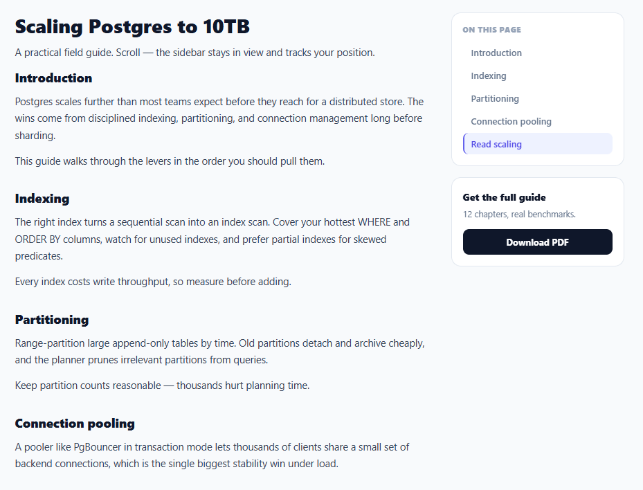
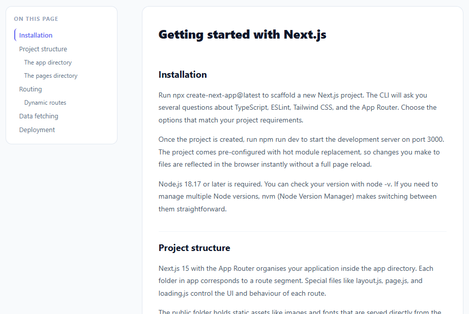
A sticky sidebar — one that scrolls with the page until it reaches the top, then stays pinned while the main content keeps moving — is the standard layout for documentation, long articles, and product pages. This snippet builds it with modern position: sticky (no scroll-listener hacks) and adds a table of contents that highlights the section you're currently reading, in plain HTML, CSS, and vanilla JavaScript.
Sticky with one CSS property
The sidebar column (.ss-aside) is set to position: sticky; top: 20px. That's the entire mechanism: the column scrolls normally until its top hits 20px from the viewport top, then it sticks there while the rest of the page scrolls past — and unsticks naturally when its container scrolls away. position: sticky replaced the old approach of listening to scroll and toggling position: fixed with manual offset math; it's smoother, jank-free, and a fraction of the code. The key requirement is that the sticky element's parent be tall enough to scroll within, which the grid layout provides.
Grid layout with top alignment
The page is a two-column grid (1fr 250px) with align-items: start, which is essential: without it, grid would stretch the sidebar column to the full height of the main content, and a sticky child can't stick inside a parent that's exactly as tall as the scroll area. Starting the items at the top lets the sidebar column be only as tall as its content, giving the sticky wrapper room to travel.
Scroll-spy with IntersectionObserver
The table of contents highlights the active section using an IntersectionObserver rather than scroll-position math. Each section is observed with a rootMargin that defines a "reading band" near the top of the viewport (-20% 0px -70% 0px); whichever section enters that band becomes active, and its TOC link lights up. Using IntersectionObserver is both more efficient (the browser does the work, off the main thread) and more accurate than computing offsets on every scroll event — the modern way to build scroll-spy.
Smooth in-page navigation
Clicking a TOC link smooth-scrolls to its section with scrollIntoView({ behavior: 'smooth' }), and scroll-margin-top on each section ensures the heading lands below the sticky offset rather than flush against the top. Together with the active-link highlight, the TOC both navigates and orients.
Responsive collapse
On narrow screens the grid collapses to one column, the sidebar becomes static (un-sticky), and the secondary CTA card hides — because a sticky sidebar makes no sense in a single-column phone layout. This keeps the reading experience clean on mobile while delivering the full sticky-and-spy behaviour on wider screens. It's a complete, drop-in reference for the sticky-sidebar pattern behind every docs site.
Build with AI
Build, Understand, Optimize, and Extend It With AI
You don't have to puzzle out why the sidebar sometimes refuses to stick by trial and error. Paste this snippet's HTML, CSS, and JS into an AI coding assistant like Claude and ask it to explain exactly why align-items: start on the grid is required for position: sticky to have room to travel, and how the rootMargin string of -20% 0px -70% 0px on the IntersectionObserver defines the reading band that decides which TOC link lights up. The same assistant can help optimize it — for instance whether observing many small sections is cheaper than one observer per section, or whether the smooth-scroll click handler should account for the sticky top offset more precisely. It's also useful for extending the pattern: ask it to add a progress indicator that fills each TOC link as its section is read, support nested sub-headings in the TOC, or make the CTA card sticky-within-sticky so it stacks below the TOC once both are visible. Treat the code less like a finished artifact and more like a starting point for a conversation.
Prompt to recreate it
Copy this into your AI assistant of choice to build the effect from scratch, or as a jumping-off point for your own variant:
Build a two-column content layout with a sticky sidebar and scroll-spy table of contents in plain HTML, CSS, and JavaScript using only position: sticky and IntersectionObserver — no scroll-event listener, no fixed-position math.

Requirements:
- A CSS grid layout with a wide main content column and a narrower sidebar column, using align-items: start on the grid container so the sidebar column is only as tall as its own content rather than stretching to match the main column's height.
- The sidebar itself must use position: sticky with a top offset in pixels, relying entirely on native sticky behavior — no JavaScript toggling a fixed class based on scroll position.
- The main content must be split into multiple named sections (each with an id matching a table-of-contents link's href), and each section needs a scroll-margin-top so that scrolling to it does not tuck its heading under the sticky sidebar's top offset.
- Build a table of contents list of anchor links, one per section, and create a single IntersectionObserver (not one per link) that watches all sections with a rootMargin defining a thin horizontal reading band near the top of the viewport, so whichever section's heading currently crosses that band gets its corresponding TOC link marked active.
- Clicking a TOC link must smooth-scroll to its section using scrollIntoView with behavior smooth, preventing the default instant jump.
- On narrow viewports, collapse the grid to a single column and switch the sidebar back to static positioning, hiding any secondary sidebar content that only makes sense in the two-column desktop layout.
Want to tighten it up first? Run this prompt through the AI Prompt Studio to score it across 8 quality dimensions, catch anti-patterns, and tune the wording for Claude, ChatGPT, or Gemini before you paste it in.
Source Code
<div class="ss-page">
  <div class="ss-layout">
    <main class="ss-main">
      <h1>Scaling Postgres to 10TB</h1>
      <p class="ss-lead">A practical field guide. Scroll — the sidebar stays in view and tracks your position.</p>
      <section id="intro"><h2>Introduction</h2><p>Postgres scales further than most teams expect before they reach for a distributed store. The wins come from disciplined indexing, partitioning, and connection management long before sharding.</p><p>This guide walks through the levers in the order you should pull them.</p></section>
      <section id="indexing"><h2>Indexing</h2><p>The right index turns a sequential scan into an index scan. Cover your hottest WHERE and ORDER BY columns, watch for unused indexes, and prefer partial indexes for skewed predicates.</p><p>Every index costs write throughput, so measure before adding.</p></section>
      <section id="partitioning"><h2>Partitioning</h2><p>Range-partition large append-only tables by time. Old partitions detach and archive cheaply, and the planner prunes irrelevant partitions from queries.</p><p>Keep partition counts reasonable — thousands hurt planning time.</p></section>
      <section id="pooling"><h2>Connection pooling</h2><p>A pooler like PgBouncer in transaction mode lets thousands of clients share a small set of backend connections, which is the single biggest stability win under load.</p></section>
      <section id="scaling"><h2>Read scaling</h2><p>Stream to read replicas and route read-only traffic to them. Reserve the primary for writes and read-after-write consistency needs.</p><p>That's the playbook — in order.</p></section>
    </main>
    <aside class="ss-aside">
      <div class="ss-stick">
        <div class="ss-card">
          <h4>On this page</h4>
          <nav class="ss-toc" id="ssToc">
            <a href="#intro">Introduction</a>
            <a href="#indexing">Indexing</a>
            <a href="#partitioning">Partitioning</a>
            <a href="#pooling">Connection pooling</a>
            <a href="#scaling">Read scaling</a>
          </nav>
        </div>
        <div class="ss-card ss-cta"><strong>Get the full guide</strong><p>12 chapters, real benchmarks.</p><button type="button">Download PDF</button></div>
      </div>
    </aside>
  </div>
</div>*{box-sizing:border-box;margin:0;padding:0}
body{font-family:system-ui,-apple-system,sans-serif;background:#f8fafc;color:#0f172a}
.ss-page{max-width:920px;margin:0 auto;padding:32px 20px}
.ss-layout{display:grid;grid-template-columns:1fr 250px;gap:36px;align-items:start}
.ss-main h1{font-size:28px;font-weight:800;margin-bottom:8px}
.ss-lead{font-size:14px;color:#64748b;margin-bottom:26px;line-height:1.6}
.ss-main section{margin-bottom:30px;scroll-margin-top:20px}
.ss-main h2{font-size:18px;font-weight:800;margin-bottom:10px}
.ss-main p{font-size:14.5px;color:#334155;line-height:1.7;margin-bottom:12px}
/* The whole sidebar column sticks once it reaches the top offset.
sticky lives on the grid item (.ss-aside); align-items:start on the grid
keeps it content-height so it has room to travel inside the tall row. */
.ss-aside{position:sticky;top:20px;align-self:start}
.ss-stick{display:flex;flex-direction:column;gap:16px}
.ss-card{background:#fff;border:1px solid #e2e8f0;border-radius:14px;padding:16px}
.ss-card h4{font-size:11px;font-weight:800;text-transform:uppercase;letter-spacing:.04em;color:#94a3b8;margin-bottom:10px}
.ss-toc{display:flex;flex-direction:column;gap:2px}
.ss-toc a{text-decoration:none;color:#64748b;font-size:13px;font-weight:600;padding:7px 10px;border-radius:8px;border-left:2px solid transparent;transition:color .15s,background .15s,border-color .15s}
.ss-toc a:hover{color:#0f172a;background:#f8fafc}
.ss-toc a.ss-active{color:#4f46e5;background:#eef2ff;border-left-color:#6366f1}
.ss-cta strong{font-size:14px;font-weight:800}
.ss-cta p{font-size:12.5px;color:#64748b;margin:6px 0 12px;line-height:1.5}
.ss-cta button{width:100%;background:#0f172a;color:#fff;border:none;border-radius:9px;padding:10px;font-size:13px;font-weight:700;cursor:pointer;font-family:inherit}
@media (max-width:720px){
.ss-layout{grid-template-columns:1fr}
.ss-aside{position:static}
.ss-cta{display:none}
}var links = Array.prototype.slice.call(document.querySelectorAll('.ss-toc a'));
var sections = links.map(function (a) { return document.querySelector(a.getAttribute('href')); });
// Highlight the TOC link for whichever section is currently in view.
var observer = new IntersectionObserver(function (entries) {
entries.forEach(function (entry) {
if (entry.isIntersecting) {
var i = sections.indexOf(entry.target);
links.forEach(function (l) { l.classList.remove('ss-active'); });
if (links[i]) links[i].classList.add('ss-active');
}
});
}, { rootMargin: '-20% 0px -70% 0px' });
sections.forEach(function (s) { if (s) observer.observe(s); });
// Smooth-scroll for the in-page links.
links.forEach(function (a) {
a.addEventListener('click', function (e) {
var target = document.querySelector(a.getAttribute('href'));
if (target) { e.preventDefault(); target.scrollIntoView({ behavior: 'smooth' }); }
});
});Step by step
How to Use
- 1Paste HTML, CSS, and JSAn article renders with a sidebar containing a table of contents and a CTA card.
- 2Scroll the pageThe sidebar follows until it reaches the top, then stays pinned while the article scrolls.
- 3Watch the active linkThe TOC highlights whichever section is currently in your reading band.
- 4Click a TOC linkIt smooth-scrolls to that section, landing the heading below the sticky offset.
- 5Resize narrowOn phones the layout collapses to one column and the sidebar becomes static.
- 6Adapt itChange the sticky top offset, column widths, or put your own content in the sidebar.
Real-world uses
Common Use Cases
Got questions?
Frequently Asked Questions
position:sticky keeps the element in normal flow until it reaches a scroll threshold, then pins it — and automatically releases it when its container scrolls away. position:fixed requires a scroll listener to toggle it on/off and manual math to place it, which is jankier and far more code. Sticky is hardware-accelerated, handles the start and end of the sticky range for you, and needs just two CSS lines.
By default grid stretches items to fill the row's height. If the sidebar column stretches to match the tall main column, it becomes exactly as tall as the scroll area — and a sticky child has nowhere to travel, so it never appears to stick. align-items: start lets the sidebar column be only as tall as its content, leaving room for the sticky wrapper to move and then pin.
An IntersectionObserver watches each section with a rootMargin of "-20% 0px -70% 0px", which defines a thin band near the top of the viewport. When a section's top crosses into that band it reports as intersecting, and its matching TOC link gets the active class. This is more efficient and accurate than recomputing offsets on every scroll event, since the browser handles the detection off the main thread.
Because the sidebar sticks 20px from the top, an in-page link that scrolls a heading flush to the viewport top would tuck it under that offset. scroll-margin-top adds a buffer so scrollIntoView (and native anchor jumps) land the heading just below the sticky region, fully visible. It's the clean, CSS-only way to offset anchor targets.
The layout is pure CSS, so it ports as-is. For the scroll-spy, set up the IntersectionObserver in a useEffect (React), onMounted/onUnmounted (Vue), or ngAfterViewInit/ngOnDestroy (Angular), disconnecting it on cleanup, and track the active id in state to drive the link class. The sticky CSS and rootMargin logic are framework-agnostic.