Source Code
<div class="demo">
  <div class="phone-frame">
    <div class="notch"></div>
    <div class="product-screen">
      <div class="product-scroll">
        <div class="product-hero">Wireless Headphones</div>
        <p class="product-desc">Active noise cancellation, 30-hour battery life, and a genuinely comfortable fit for long listening sessions.</p>
        <p class="product-desc">Scroll down — the price and Add to Cart bar stays pinned above the home-indicator area at the very bottom of the screen, never overlapping it.</p>
        <div class="product-spacer"></div>
      </div>

      <div class="cta-bar">
        <div class="cta-price">
          <span class="cta-price-amount">$179</span>
          <span class="cta-price-was">$229</span>
        </div>
        <button class="cta-btn">Add to cart</button>
      </div>

      <div class="home-indicator"></div>
    </div>
  </div>
</div>
* { box-sizing: border-box; margin: 0; padding: 0; }
body { font-family: system-ui, sans-serif; background: #f8fafc; display: flex; align-items: center; justify-content: center; min-height: 100vh; padding: 24px; }
.demo { display: flex; }
.phone-frame { width: 300px; height: 520px; border-radius: 40px; border: 8px solid #0f172a; background: #0f172a; overflow: hidden; box-shadow: 0 30px 60px rgba(15,23,42,0.25); position: relative; }
.notch { position: absolute; top: 0; left: 50%; transform: translateX(-50%); width: 120px; height: 22px; background: #0f172a; border-radius: 0 0 14px 14px; z-index: 10; }
.product-screen { height: 100%; background: #fff; display: flex; flex-direction: column; position: relative; }
.product-scroll { flex: 1; overflow-y: auto; padding: 40px 18px 0; }
.product-hero { height: 160px; border-radius: 16px; background: linear-gradient(135deg,#eef2ff,#e0e7ff); margin-bottom: 14px; display: flex; align-items: flex-end; padding: 14px; font-size: 15px; font-weight: 800; color: #4338ca; }
.product-desc { font-size: 12.5px; color: #64748b; line-height: 1.7; margin-bottom: 12px; }
.product-spacer { height: 40px; }
/* The CTA bar's own bottom padding is where env(safe-area-inset-bottom) does
its job — it adds exactly the extra space a device's home-indicator gesture
area needs, and collapses to 0 automatically on devices without one, so
the same CSS is correct everywhere without a device-specific branch. */
.cta-bar {
flex-shrink: 0;
display: flex; align-items: center; justify-content: space-between; gap: 14px;
padding: 14px 18px;
padding-bottom: calc(14px + env(safe-area-inset-bottom, 0px));
background: #fff;
border-top: 1px solid #f1f5f9;
box-shadow: 0 -8px 24px rgba(15,23,42,0.06);
}
.cta-price { display: flex; flex-direction: column; }
.cta-price-amount { font-size: 17px; font-weight: 800; color: #111827; }
.cta-price-was { font-size: 11px; color: #94a3b8; text-decoration: line-through; }
.cta-btn { padding: 12px 22px; border: none; border-radius: 12px; background: #4f46e5; color: #fff; font-size: 13px; font-weight: 700; cursor: pointer; font-family: inherit; }
.cta-btn:hover { background: #4338ca; }
/* This bar simulates a device's home-indicator pill so the safe-area effect
is visible even in a browser preview that has no real inset value. */
.home-indicator { position: absolute; bottom: 6px; left: 50%; transform: translateX(-50%); width: 110px; height: 4px; border-radius: 999px; background: #cbd5e1; pointer-events: none; }// No JavaScript is required for the core safe-area behavior — it's a pure
// CSS feature (env(safe-area-inset-bottom)). This script only powers the
// small demo interaction confirming the button actually works.
const ctaBtn = document.querySelector('.cta-btn');
ctaBtn.addEventListener('click', () => {
const original = ctaBtn.textContent;
ctaBtn.textContent = 'Added ✓';
ctaBtn.style.background = '#059669';
setTimeout(() => {
ctaBtn.textContent = original;
ctaBtn.style.background = '';
}, 1400);
});Learn Coding Visually
Learn to code with interactive, live-preview playgrounds — HTML, CSS, JavaScript, React & more.
 HTML Playground42 lessons · Click-based · Live preview
 CSS PlaygroundLearn CSS with a live editor
 JavaScript Playground60 lessons · DOM · Async · Canvas
 React PlaygroundLearn React with a live code editor
 GSAP PlaygroundLearn GSAP animation interactively
 SVG Playground44 lessons · shapes · paths · animation
 SCSS Playground45 lessons · Sass modules · tokens
 Tailwind PlaygroundLearn Tailwind CSS with a live editor
 Bootstrap 5 Playground50 lessons · live preview
Sticky Footer CTA Bar with Safe-Area Insets — Never Overlapped by the Home Indicator
Sticky Footer CTA Bar with Safe-Area Insets · Mobile · Plain HTML, CSS & JS · Live preview
What's included
Features
About this UI Snippet
Safe-Area-Aware Sticky CTA Bar — Correct on Every Device, With One CSS Function
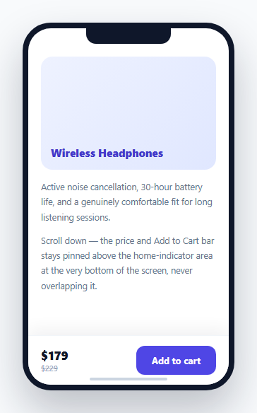
A sticky bottom action bar is one of the most common mobile e-commerce patterns — price on the left, "Add to cart" on the right, always visible while scrolling. But on modern phones with no physical home button, the operating system reserves a strip of space at the very bottom of the screen for its swipe-up home gesture — and a bar with ordinary fixed padding can render its button uncomfortably close to (or even overlapping) that gesture area. This snippet fixes it with a single CSS function: env(safe-area-inset-bottom).
What `env(safe-area-inset-bottom)` actually returns
On a device with a home-indicator gesture area (most modern iPhones, and many modern Android phones), the browser exposes the height of that reserved area through this environment variable — a real, device-reported pixel value. On a device *without* such a reserved area (an older phone, or a phone with a physical home button), the same environment variable simply evaluates to 0px. This is what makes it possible to write one CSS rule that's correct on every device, without any JavaScript device-detection or user-agent sniffing.
Why `calc(14px + env(...))` instead of `env()` alone
The bar's bottom padding is written as calc(14px + env(safe-area-inset-bottom, 0px)) — the base 14px is the bar's normal, intentional visual padding (present on every device, safe area or not), and the environment variable is *added* on top of that as extra device-specific clearance, not used as a replacement for it. Using env() alone would mean a device with a large safe-area inset gets *only* that inset as padding (potentially with no visual breathing room at all if the inset happens to be small), while a device with a zero inset would get literally zero padding around the button — neither is the intended design.
The fallback value inside `env()` matters for older browsers
env(safe-area-inset-bottom, 0px)'s second argument is a fallback used by browsers that don't recognize the safe-area-inset-bottom keyword at all (rather than recognizing it and returning zero) — without an explicit fallback, an unsupporting browser could treat the whole env() call as invalid, potentially breaking the calc() expression it's nested inside. Providing 0px explicitly keeps the calculation valid and predictable everywhere, supporting or not.
Why this requires the viewport meta tag's `viewport-fit=cover` in a real deployment
For env(safe-area-inset-*) values to be non-zero at all (rather than always reporting 0 even on a notched device), the page's <meta name="viewport"> tag needs viewport-fit=cover — this tells the browser the page wants to render edge-to-edge, including into the safe-area-adjacent regions, which is what makes the safe-area inset values become meaningful and non-zero in the first place. Without it, the page renders letterboxed within the safe area automatically, making the env() values simply always zero since there'd be nothing to inset around.
Build with AI
Build, Understand, Optimize, and Extend It With AI
Ask an AI assistant to explain exactly what viewport-fit=cover changes about how a page renders on a notched device, and why it's a prerequisite for env(safe-area-inset-*) values to become non-zero. It's also worth asking for a version that applies the same safe-area-aware padding pattern to a fixed top header (using safe-area-inset-top) and a fixed side element on a landscape-oriented notched device (using safe-area-inset-left/right), covering all four possible inset directions.
Prompt to recreate it
Copy this into your AI assistant of choice to build the effect from scratch, or as a jumping-off point for your own variant:
Build a sticky bottom call-to-action bar for a mobile product page in HTML and CSS, correctly handling device safe-area insets — minimal or no JavaScript needed beyond a small interactive demo touch.

Requirements:
- A mobile page layout with a scrollable content area and a sticky bar fixed to the bottom of the screen, containing a price display and an "Add to cart" button.
- The bar's bottom padding must use CSS's env(safe-area-inset-bottom) environment variable, added on top of a normal intentional base padding value via calc() — not used as a replacement for that base padding, so the bar has sensible visual spacing on every device regardless of whether it has a safe-area inset or not.
- Provide an explicit fallback value (0px) as the second argument to env(), so the calc() expression remains valid on browsers that don't recognize the safe-area-inset-bottom keyword at all.
- Include a comment or visual note explaining that a real deployment of this pattern requires <meta name="viewport" content="width=device-width, initial-scale=1, viewport-fit=cover"> in the page head for the safe-area inset values to report non-zero on supporting devices.
- Include a small visual mock of a device home-indicator pill near the bottom of the screen so the safe-area clearance concept is visually demonstrated even in a browser preview without a real device inset.
- Make the Add to cart button show a brief success confirmation state when clicked, to demonstrate the bar remains fully interactive.
Want to tighten it up first? Run this prompt through the AI Prompt Studio to score it across 8 quality dimensions, catch anti-patterns, and tune the wording for Claude, ChatGPT, or Gemini before you paste it in.
Step by step
How to Use
- 1Scroll the product screenThe price-and-action bar stays pinned to the bottom of the screen at all times, positioned above a simulated home-indicator pill.
- 2Notice the extra bottom paddingThe bar's padding-bottom is calc(14px + env(safe-area-inset-bottom, 0px)) — on a real notched device this adds genuine extra clearance; in this browser preview it still shows the base 14px.
- 3Click "Add to cart"A small success state confirms the bar's content remains fully interactive and unobstructed regardless of the extra safe-area padding.
- 4Deploy with viewport-fit=coverAdd <meta name="viewport" content="width=device-width, initial-scale=1, viewport-fit=cover"> to your real page's <head> — this is required for env(safe-area-inset-*) to report non-zero values on supporting devices.
- 5Reuse the calc() pattern on other fixed elementsAny element pinned to the bottom (a fixed nav bar, a cookie banner, a floating action button) can use the same calc(base + env(safe-area-inset-bottom, 0px)) pattern for its bottom spacing.
Real-world uses
Common Use Cases
Got questions?
Frequently Asked Questions
On a device with a reserved home-indicator gesture area (most modern iPhones and many modern Android phones), it returns the real height of that area in pixels. On a device without one, it evaluates to 0px — the same CSS works correctly on both without any device detection.
Using it alone would mean the bar's padding is ENTIRELY determined by the device's inset — a device with no inset (evaluating to 0px) would get zero visual padding around the button at all. Adding it on top of an intentional base padding value (via calc()) preserves normal visual breathing room on every device while adding device-specific extra clearance only where actually needed.
It's an explicit fallback value used by browsers that don't recognize the safe-area-inset-bottom environment variable at all. Without it, an unsupporting browser could treat the entire env() call as invalid, which would break the surrounding calc() expression rather than gracefully falling back to zero.
A browser preview (like an iframe embedded in a desktop page) typically isn't running as a true full-screen mobile context with a real safe-area inset, so env(safe-area-inset-bottom) evaluates to 0px here — on an actual notched device rendered full-screen with the correct viewport meta tag, the same CSS produces genuinely extra bottom padding.
It's a value for the viewport meta tag's content attribute that tells the browser the page wants to render edge-to-edge into the safe-area-adjacent regions of the screen. Without it, most browsers render the page letterboxed within the safe area automatically, which makes every env(safe-area-inset-*) value simply report zero since there'd be no inset region to account for.
Yes — env(safe-area-inset-top) works identically for elements fixed to the top of the screen, using the same calc(base + env(safe-area-inset-top, 0px)) pattern for top padding instead of bottom.