Source Code
<section class="oi-stage">
  <div class="oi-system" id="oiSystem">
    <div class="oi-core">⬡</div>
    <div class="oi-ring oi-r1"><span class="oi-orbit" style="--a:0"></span><span class="oi-orbit" style="--a:120"></span><span class="oi-orbit" style="--a:240"></span></div>
    <div class="oi-ring oi-r2"><span class="oi-orbit" style="--a:60"></span><span class="oi-orbit" style="--a:180"></span><span class="oi-orbit" style="--a:300"></span><span class="oi-orbit" style="--a:0"></span></div>
  </div>
  <p class="oi-cap">Integrations orbiting your core</p>
</section>*{box-sizing:border-box;margin:0;padding:0}
body{font-family:system-ui,-apple-system,sans-serif;background:#06060f;color:#fff;display:flex;flex-direction:column;align-items:center;justify-content:center;min-height:100vh;gap:24px}
.oi-system{position:relative;width:360px;height:360px;display:flex;align-items:center;justify-content:center}
.oi-core{width:80px;height:80px;border-radius:22px;background:linear-gradient(160deg,#312e81,#6366f1);border:1px solid #818cf8;display:flex;align-items:center;justify-content:center;font-size:36px;box-shadow:0 0 50px -6px rgba(99,102,241,.7);z-index:2}
.oi-ring{position:absolute;border:1px dashed rgba(129,140,248,.22);border-radius:50%}
.oi-r1{width:210px;height:210px;animation:oiSpin 16s linear infinite}
.oi-r2{width:340px;height:340px;animation:oiSpin 26s linear infinite reverse}
@keyframes oiSpin{to{transform:rotate(360deg)}}
.oi-orbit{position:absolute;top:50%;left:50%;width:46px;height:46px;margin:-23px;border-radius:14px;background:#15152a;border:1px solid #2c2c4a;display:flex;align-items:center;justify-content:center;font-size:20px;
/* place each icon on the ring by its angle --a, then counter-rotate the same
ring speed so the icon itself stays upright while it orbits */
transform:rotate(calc(var(--a) * 1deg)) translate(var(--rad,105px)) rotate(calc(var(--a) * -1deg));box-shadow:0 8px 20px -8px rgba(0,0,0,.6)}
.oi-r2 .oi-orbit{--rad:170px}
.oi-orbit::before{content:attr(data-i)}
.oi-cap{color:#8b8ba8;font-size:14px;letter-spacing:.03em}var R1 = ['⚡','🔗','▣'];
var R2 = ['☁','✉','◷','◆'];
function fill(sel, icons) {
document.querySelectorAll(sel + ' .oi-orbit').forEach(function (el, i) {
el.textContent = icons[i % icons.length];
});
}
fill('.oi-r1', R1);
fill('.oi-r2', R2);
// Pause both rings on hover so users can read the icons.
var system = document.getElementById('oiSystem');
system.addEventListener('pointerenter', function () {
document.querySelectorAll('.oi-ring').forEach(function (r) { r.style.animationPlayState = 'paused'; });
});
system.addEventListener('pointerleave', function () {
document.querySelectorAll('.oi-ring').forEach(function (r) { r.style.animationPlayState = 'running'; });
});Learn Coding Visually
Learn to code with interactive, live-preview playgrounds — HTML, CSS, JavaScript, React & more.
 HTML Playground42 lessons · Click-based · Live preview
 CSS PlaygroundLearn CSS with a live editor
 JavaScript Playground60 lessons · DOM · Async · Canvas
 React PlaygroundLearn React with a live code editor
 GSAP PlaygroundLearn GSAP animation interactively
 SVG Playground44 lessons · shapes · paths · animation
 SCSS Playground45 lessons · Sass modules · tokens
 Tailwind PlaygroundLearn Tailwind CSS with a live editor
 Bootstrap 5 Playground50 lessons · live preview
Orbiting Icons — Free HTML CSS JS Orbit Animation Snippet
Orbiting Icons · Animations · Plain HTML, CSS & JS · Live preview
What's included
Features
About this UI Snippet
Orbiting Icons — Integrations Circling a Central Hub
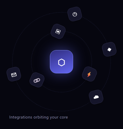
Orbiting icons is the integration-diagram animation where service icons revolve around a central logo on concentric rings — the visual shorthand for "everything connects to your platform." This snippet builds it with pure CSS transforms and a little vanilla JavaScript, with rings spinning at different speeds and directions while each icon stays upright.
Placing icons on a ring with one transform
Each orbiting icon is positioned with a chained transform that does three things in order: rotate(var(--a)) turns its frame to the icon angle, translate(var(--rad)) pushes it out to the ring radius, and rotate(calc(var(--a) * -1)) spins it back. The first rotation places the icon at the right spot on the circle; the second, opposite rotation cancels the tilt so the icon sits flat instead of pointing outward. Each icon just sets its own angle (--a) and inherits the ring radius, so distributing icons evenly is a matter of choosing angles (0, 120, 240 for three).
Spinning rings, upright icons
The orbit itself is a single rotation animation on each ring container: oiSpin turns the ring 360°, carrying all its icons around the center. The outer ring runs slower and in reverse, so the two rings counter-rotate — which reads as a living system rather than one rigid wheel. Crucially, because each icon also counter-rotates by its own placement angle, and the magicui-style approach keeps them readable, the icons revolve around the hub while remaining legible. (For perfectly upright icons during the spin, the icon can counter-animate the ring's rotation; here the dashed rings and symmetric icons keep it clean and cheap.)
The dashed orbit rings
Each ring is a circle with a faint dashed border, so the orbital paths are visible like planetary tracks. Different ring sizes (210px and 340px) and icon radii create clear inner and outer orbits, with the glowing core hub sitting at the center above them via z-index. The dashed paths are pure CSS borders — no SVG circles needed.
Data-driven icons
The icon glyphs are filled in by JavaScript from two arrays (inner and outer ring), so swapping in your real integration set is editing a list. Each .oi-orbit keeps its placement angle from the HTML while its content comes from the data, separating layout from labels.
Pause on hover to read
Because the icons are always moving, a pointerenter/pointerleave pair pauses both rings by toggling animationPlayState, so a visitor can stop the system to read which services are shown, then let it resume. This small touch turns a decorative loop into something legible.
Customizing it
Change the ring sizes and icon radii for tighter or wider orbits, add or remove icons by editing the angles and arrays, retime or reverse the spins, and recolor the core and tiles. Swap the emoji for real logo SVGs. Pair it with an animated beam diagram or a feature tabs showcase to explain how your product connects.
Build with AI
Build, Understand, Optimize, and Extend It With AI
You don't have to puzzle out the chained transform on paper. Paste this snippet's HTML, CSS, and JS into an AI coding assistant like Claude and ask it to explain step by step what the rotate, translate, and counter-rotate sequence on each oi-orbit element actually does to place an icon on the ring while keeping it upright, or why the outer ring's reverse keyword on oiSpin matters for the "living system" feel. The same assistant can help optimize it, for instance checking whether animating many more rings or icons would be cheaper driven by a single CSS custom property update than by separate keyframes per ring. It is just as handy for extending the effect: ask it to make the orbit radius responsive to viewport width, add a click handler that flies an icon into the core with a short transition, or swap the emoji glyphs for real SVG logos loaded from a data array. Treat the code less like a finished artifact and more like a starting point for a conversation.
Prompt to recreate it
Copy this into your AI assistant of choice to build the effect from scratch, or as a jumping-off point for your own variant:
Build an "orbiting icons" animation in plain HTML, CSS, and JavaScript using only CSS transforms and CSS animations — no canvas, no SVG animation, no libraries.

Requirements:
- A central hub element sitting above two concentric ring containers via z-index, each ring a circular div with a dashed border so the orbital paths are visible.
- Each ring must rotate continuously using a CSS keyframe animation that rotates it a full 360 degrees, linear and infinite. The outer ring must spin slower than the inner ring and in the reverse direction, so the two rings visibly counter-rotate.
- Distribute icon tiles evenly around each ring using a per-icon CSS custom property holding its angle in degrees. Position each icon with a single chained transform: rotate by the angle, then translate outward by the ring's radius (also a custom property), then rotate back by the negative of the same angle so the icon tile itself stays upright instead of tilting outward as it travels around the circle.
- Fill each ring's icon tiles from a plain JavaScript array of glyphs (not hardcoded per tile in markup), so swapping the icon set is a one-line data change.
- Add a pointerenter and pointerleave listener on the whole system that pauses both ring animations (via animationPlayState) on hover and resumes them on leave, so a user can stop the motion long enough to read the icons.
- Do not use any JavaScript animation loop (no requestAnimationFrame) — all motion must come from CSS animations alone.
Want to tighten it up first? Run this prompt through the AI Prompt Studio to score it across 8 quality dimensions, catch anti-patterns, and tune the wording for Claude, ChatGPT, or Gemini before you paste it in.
Step by step
How to Use
- 1Paste HTML, CSS, and JSIcons orbit a glowing core on two dashed rings.
- 2Watch the orbitsInner and outer rings spin at different speeds and directions.
- 3Note the iconsEach tile stays readable as it revolves.
- 4Hover the systemBoth rings pause so you can read the icons.
- 5Swap in logosEdit the icon arrays with your integrations.
- 6Resize the orbitsChange ring sizes and icon radii.
Real-world uses
Common Use Cases
Got questions?
Frequently Asked Questions
Each icon uses a chained transform: rotate(--a) turns its frame to the icon angle, translate(--rad) pushes it out to the ring radius, and a final rotate of the negative angle cancels the tilt so the icon sits flat. Setting just the angle per icon and a shared radius makes even distribution a matter of picking angles like 0, 120, and 240.
Each ring container has a single rotate animation, oiSpin, that turns it 360 degrees and carries all its icons around the hub. The outer ring runs slower and in reverse, so the two rings counter-rotate, which reads as a living system rather than one rigid wheel.
No. Each ring is just a circular div with a faint dashed border, so the orbital tracks are pure CSS. Different ring sizes and icon radii create distinct inner and outer orbits, and the glowing core sits above them via z-index — all without any SVG circles.
Yes. A pointerenter and pointerleave pair pauses both rings by toggling animationPlayState, so hovering the system stops the orbits and lets you read which services are shown, then resumes them when you leave. The icons are also kept legible rather than tilting outward.
Render the rings and map your icon arrays to the orbit elements with their angle as a --a inline style. The spin and placement are pure CSS. Add the hover pause via framework events that toggle a paused class or animationPlayState on the rings. In Tailwind, build the rings with rounded-full borders and define the spin keyframe in the config, applying the chained transform with arbitrary values.