Source Code
<div class="demo">
  <p class="hint">Resize the preview narrower — tabs that no longer fit collapse into "More"</p>
  <nav class="tabnav" id="tabnav">
    <div class="tabs" id="tabs" role="tablist">
      <button class="tab active" role="tab" aria-selected="true">Overview</button>
      <button class="tab" role="tab" aria-selected="false">Analytics</button>
      <button class="tab" role="tab" aria-selected="false">Reports</button>
      <button class="tab" role="tab" aria-selected="false">Team members</button>
      <button class="tab" role="tab" aria-selected="false">Integrations</button>
      <button class="tab" role="tab" aria-selected="false">Billing history</button>
      <button class="tab" role="tab" aria-selected="false">API keys</button>
      <button class="tab" role="tab" aria-selected="false">Audit log</button>
      <button class="tab" role="tab" aria-selected="false">Settings</button>
    </div>
    <div class="more-wrap">
      <button class="more-btn" id="moreBtn" aria-haspopup="true" aria-expanded="false" hidden>
        More <span class="more-count" id="moreCount"></span>
        <svg width="11" height="11" viewBox="0 0 24 24" fill="none" stroke="currentColor" stroke-width="2.6" stroke-linecap="round"><path d="m6 9 6 6 6-6"/></svg>
      </button>
      <div class="more-menu" id="moreMenu" role="menu"></div>
    </div>
  </nav>
</div>
* { box-sizing: border-box; margin: 0; padding: 0; }
body { font-family: system-ui, sans-serif; background: #f8fafc; display: flex; align-items: center; justify-content: center; min-height: 100vh; padding: 24px; }
.demo { width: 100%; max-width: 620px; resize: horizontal; overflow: auto; min-width: 220px; border: 1px dashed #cbd5e1; border-radius: 12px; padding: 16px; }
.hint { font-size: 11.5px; color: #94a3b8; margin-bottom: 12px; }
.tabnav { display: flex; align-items: center; gap: 4px; background: #fff; border: 1px solid #e2e8f0; border-radius: 12px; padding: 6px; position: relative; }
.tabs { display: flex; align-items: center; gap: 2px; overflow: hidden; flex: 1; min-width: 0; }
.tab { flex-shrink: 0; background: none; border: none; padding: 8px 12px; font-size: 12.5px; font-weight: 600; color: #64748b; border-radius: 8px; cursor: pointer; white-space: nowrap; font-family: inherit; transition: background 0.15s, color 0.15s; }
.tab:hover { background: #f1f5f9; color: #334155; }
.tab.active { background: #eef2ff; color: #4338ca; }
.tab.overflow-hidden { display: none; }
.more-wrap { position: relative; flex-shrink: 0; }
.more-btn { display: flex; align-items: center; gap: 5px; background: #f8fafc; border: 1px solid #e2e8f0; padding: 7px 11px; border-radius: 8px; font-size: 12.5px; font-weight: 600; color: #475569; cursor: pointer; font-family: inherit; }
.more-btn:hover { background: #f1f5f9; }
.more-count { background: #6366f1; color: #fff; font-size: 10px; font-weight: 800; border-radius: 999px; padding: 1px 6px; }
.more-menu { position: absolute; top: calc(100% + 6px); right: 0; background: #fff; border: 1px solid #e2e8f0; border-radius: 12px; box-shadow: 0 12px 28px rgba(15,23,42,0.12); padding: 6px; min-width: 180px; display: none; flex-direction: column; gap: 1px; z-index: 10; }
.more-menu.open { display: flex; }
.more-menu button { text-align: left; background: none; border: none; padding: 8px 10px; font-size: 12.5px; font-weight: 600; color: #334155; border-radius: 7px; cursor: pointer; font-family: inherit; }
.more-menu button:hover { background: #f1f5f9; }
.more-menu button.active { color: #4338ca; background: #eef2ff; }const tabnav = document.getElementById('tabnav');
const tabsEl = document.getElementById('tabs');
const moreBtn = document.getElementById('moreBtn');
const moreMenu = document.getElementById('moreMenu');
const moreCount = document.getElementById('moreCount');
const allTabs = Array.from(tabsEl.querySelectorAll('.tab'));
function setActive(label) {
allTabs.forEach((t) => {
const isActive = t.textContent === label;
t.classList.toggle('active', isActive);
t.setAttribute('aria-selected', String(isActive));
});
moreMenu.querySelectorAll('button').forEach((b) => b.classList.toggle('active', b.textContent === label));
}
function rebuildOverflow() {
// Reset so we can measure natural widths
allTabs.forEach((t) => { t.classList.remove('overflow-hidden'); });
moreBtn.hidden = true;
moreMenu.innerHTML = '';
const available = tabsEl.clientWidth;
let used = 0;
const hidden = [];
allTabs.forEach((t) => {
const w = t.offsetWidth + 2;
if (used + w > available) {
hidden.push(t);
} else {
used += w;
}
});
if (hidden.length > 0) {
// Reserve space for the More button itself by re-checking with a margin
const reserve = 96;
used = 0;
hidden.length = 0;
allTabs.forEach((t) => {
const w = t.offsetWidth + 2;
if (used + w > available - reserve) {
hidden.push(t);
} else {
used += w;
}
});
}
hidden.forEach((t) => {
t.classList.add('overflow-hidden');
const btn = document.createElement('button');
btn.setAttribute('role', 'menuitem');
btn.textContent = t.textContent;
if (t.classList.contains('active')) btn.classList.add('active');
btn.addEventListener('click', () => {
setActive(t.textContent);
moreMenu.classList.remove('open');
moreBtn.setAttribute('aria-expanded', 'false');
rebuildOverflow();
});
moreMenu.appendChild(btn);
});
moreBtn.hidden = hidden.length === 0;
moreCount.textContent = hidden.length || '';
}
allTabs.forEach((t) => {
t.addEventListener('click', () => { setActive(t.textContent); });
});
moreBtn.addEventListener('click', () => {
const open = moreMenu.classList.toggle('open');
moreBtn.setAttribute('aria-expanded', String(open));
});
document.addEventListener('click', (e) => {
if (!e.target.closest('.more-wrap')) {
moreMenu.classList.remove('open');
moreBtn.setAttribute('aria-expanded', 'false');
}
});
new ResizeObserver(rebuildOverflow).observe(tabnav);
rebuildOverflow();Learn Coding Visually
Learn to code with interactive, live-preview playgrounds — HTML, CSS, JavaScript, React & more.
 HTML Playground42 lessons · Click-based · Live preview
 CSS PlaygroundLearn CSS with a live editor
 JavaScript Playground60 lessons · DOM · Async · Canvas
 React PlaygroundLearn React with a live code editor
 GSAP PlaygroundLearn GSAP animation interactively
 SVG Playground44 lessons · shapes · paths · animation
 SCSS Playground45 lessons · Sass modules · tokens
 Tailwind PlaygroundLearn Tailwind CSS with a live editor
 Bootstrap 5 Playground50 lessons · live preview
Overflow Nav Tabs — Auto-Collapse Extra Tabs into a "More" Dropdown
Nav Tabs — Overflow Collapse to "More" Menu · Navigation · Plain HTML, CSS & JS · Live preview
What's included
Features
About this UI Snippet
Overflow-Collapsing Tab Bar — Measured, Not Media-Queried
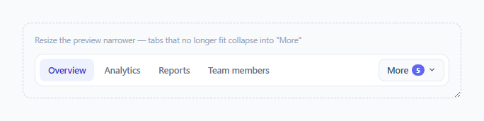
A row of navigation tabs looks fine with five items on a wide screen, but add a few more tabs, or shrink the container, and they either wrap awkwardly onto a second line or get clipped off-screen. This snippet solves that with runtime width measurement rather than fixed CSS breakpoints: it actually measures how many tabs fit in the available space and moves the rest into a "More ▾" dropdown, recalculating live as the container resizes.
Why ResizeObserver instead of a media query
A media query only knows the viewport width, but this component needs to know the *container's* width, which can change independently of the viewport — a tab bar next to a resizable sidebar, inside a modal, or inside a CSS Grid area that reflows for unrelated reasons. new ResizeObserver(rebuildOverflow).observe(tabnav) calls rebuildOverflow() every time the tab bar's own box actually changes size, for any reason, which a CSS breakpoint keyed to window.innerWidth cannot reliably do.
The two-pass width calculation
rebuildOverflow() first resets every tab to visible so it can measure natural widths via offsetWidth, then walks the list accumulating a running used total against the container's clientWidth. The first pass ignores the "More" button's own width; if *any* tabs would overflow, a second pass re-runs the same accumulation but reserves 96px of space up front for the "More" button itself — otherwise the button could appear at the same moment it pushes one additional, previously-fitting tab into overflow, undercounting by one.
Moving tabs into the dropdown, not hiding them entirely
Each tab that doesn't fit gets .overflow-hidden (a plain display: none) on its original button, and a matching role="menuitem" button is generated inside #moreMenu with the same label. Clicking either the visible tab or its "More" menu counterpart calls the same setActive() function, so the active-tab state stays correctly synced regardless of which copy the user clicked, and the overflow set is recalculated immediately afterward in case the newly active tab's label width changes what fits.
Where this pattern matters most
Overflow tab collapsing is common in dashboard product settings pages, project navigation bars, and any UI where the number of tabs is data-driven (e.g. one tab per integration a user has connected) rather than fixed at design time — exactly the cases where a hardcoded breakpoint can't anticipate how many tabs will actually need to fit.
Build with AI
Build, Understand, Optimize, and Extend It With AI
Ask an AI assistant to explain why a ResizeObserver on the container is more robust here than a window resize listener or CSS media queries, and to walk through why the overflow calculation needs a second pass once the More button itself takes up space. It's also worth asking for a version that persists the currently active tab across page reloads via localStorage, or one that supports reordering tabs by drag-and-drop while keeping the overflow logic correct.
Prompt to recreate it
Copy this into your AI assistant of choice to build the effect from scratch, or as a jumping-off point for your own variant:
Build a horizontal tab navigation bar in HTML, CSS and vanilla JavaScript that automatically collapses whichever tabs don't fit into a "More" dropdown menu, recalculating live as the container is resized — no external libraries.

Requirements:
- A row of tab buttons inside a flex container that truncates (not wraps) when tabs don't fit, using role="tablist" and role="tab" for accessibility.
- Use a ResizeObserver on the tab bar's own container (not a window resize listener or media query) to detect size changes and re-run the overflow calculation whenever it fires.
- The overflow calculation must measure each tab's real rendered width and determine which tabs fit within the available space, reserving enough room for the "More" button itself so the button's own appearance doesn't cause an extra tab to be miscounted.
- Tabs that don't fit must be hidden from the main row and mirrored as items inside a dropdown menu triggered by the "More" button, using role="menu" and role="menuitem".
- Clicking a tab in either the main row or the dropdown must mark that tab active and keep the active state synchronized between both representations of it.
- The dropdown must close when clicking outside of it, and the "More" button should show a small badge with the current count of overflowed tabs.
Want to tighten it up first? Run this prompt through the AI Prompt Studio to score it across 8 quality dimensions, catch anti-patterns, and tune the wording for Claude, ChatGPT, or Gemini before you paste it in.
Step by step
How to Use
- 1Add or remove .tab buttons freelyEach button inside #tabs role="tablist" is picked up automatically — no manual list of labels to maintain elsewhere.
- 2Resize the container to see it reactDrag the dashed demo container's resize handle (bottom-right) narrower to watch tabs move into the More menu live.
- 3Adjust the reserved space constantThe reserve variable (96px) in rebuildOverflow approximates the More button's width — increase it if your button styling is wider.
- 4Style the active stateBoth .tab.active and .more-menu button.active are kept in sync by setActive() — restyle either selector to change the active look.
- 5Hook up real navigationReplace the plain setActive(label) calls with your router's navigation call, keeping the same active-tab bookkeeping.
Real-world uses
Common Use Cases
Got questions?
Frequently Asked Questions
A horizontally scrolling tab bar hides how many more tabs exist and requires horizontal scrolling to discover them; collapsing overflow into a labeled "More" dropdown keeps every tab discoverable and countable at a glance.
The first pass measures which tabs fit assuming no More button is needed. If any tabs overflow, the More button itself will take up space, so a second pass re-measures with that space reserved — without this, the last "fitting" tab could visually collide with the newly appearing button.
Yes — the measurement is based on each tab's actual rendered offsetWidth, not a hardcoded character count, so it correctly adapts to longer translated strings or dynamically inserted tab labels.
The ResizeObserver is attached to the tab bar container itself, so any change to its box size — a sidebar toggling, a parent flex/grid reflow, a font loading and changing text width — triggers rebuildOverflow(), not just a browser window resize.
Both the visible .tab buttons and the generated .more-menu items call the same setActive(label) function on click, which updates aria-selected and the .active class on every matching element by label text, whichever version was clicked.
Yes — as long as each tab button's total rendered width (text plus icon) is accurately reflected in offsetWidth, which it will be for normal inline content; just make sure setActive's text-matching logic accounts for icon markup if you add icons inside the button.