Learn Coding Visually
Learn to code with interactive, live-preview playgrounds — HTML, CSS, JavaScript, React & more.
 HTML Playground42 lessons · Click-based · Live preview
 CSS PlaygroundLearn CSS with a live editor
 JavaScript Playground60 lessons · DOM · Async · Canvas
 React PlaygroundLearn React with a live code editor
 GSAP PlaygroundLearn GSAP animation interactively
 SVG Playground44 lessons · shapes · paths · animation
 SCSS Playground45 lessons · Sass modules · tokens
 Tailwind PlaygroundLearn Tailwind CSS with a live editor
 Bootstrap 5 Playground50 lessons · live preview
Leaflet Heatmap Density Layer — Free HTML CSS JS Snippet
Leaflet Heatmap Density Layer · Charts · Plain HTML, CSS & JS · Live preview
What's included
Features
About this UI Snippet
Leaflet Heatmap Density Layer — Weighted Points, Not Just Counted Ones
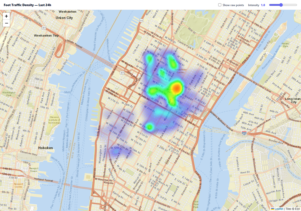
A density heatmap is more informative than a cluster of markers when the question is "where is activity concentrated" rather than "exactly how many things are at each point." The leaflet.heat plugin renders that as a smooth, blurred intensity surface computed from a set of weighted points — and the weighting is what separates a real heatmap from just a blurry marker cluster.
Each point carries its own weight, not just a position
leaflet.heat's point format is [lat, lng, intensity] — a third value per point beyond the coordinate pair. This snippet generates points around four hotspots with different base weights (Times Square contributes more total points *and* a higher per-point base intensity than Chelsea), so the resulting heat surface reflects genuine relative activity levels, not just how many dots happen to be nearby.
radius and blur are re-applied live, not just at creation
The intensity slider calls heat.setOptions({ radius, blur }) on every input event — both scaled by the same slider value — which re-renders the existing heat layer's visual parameters without touching the underlying point data at all. That's meaningfully cheaper than removing and recreating the whole layer on every slider tick, and it's why the intensity change feels instant even while dragging.
The raw-points toggle is a real credibility check, not a gimmick
Heatmaps can visually oversell sparse data — a handful of points with a large blur radius can look like a solid hot region. Toggling "Show raw points" overlays the actual underlying circleMarker dots, letting a viewer verify that the smooth heat surface really does correspond to real point density and isn't an artifact of an overly generous blur setting.
The raw layer is a genuine LayerGroup, added and removed cleanly
Rather than toggling each dot's visibility individually, all the raw point markers are pre-built into one L.layerGroup(), and the checkbox simply calls rawLayer.addTo(map) or map.removeLayer(rawLayer) — adding or removing the whole group as one unit, which is both simpler code and cheaper than hundreds of individual show/hide operations.
Reusing it
Swap the generated hotspot points for real event data — check-ins, sensor pings, incident reports, delivery stops — keeping the same [lat, lng, weight] shape, and the intensity control and raw-points comparison view keep working unchanged.
Build with AI
Build, Understand, Optimize, and Extend It With AI
You don't have to work out heat-surface rendering yourself. Paste this snippet's HTML, CSS, and JS into an AI coding assistant like Claude and ask it to explain exactly how leaflet.heat uses each point's third weight value to compute the blended intensity surface, and why calling setOptions to adjust radius and blur is cheaper than recreating the whole heat layer on every slider change. The same assistant can help optimize it — ask whether generating and holding hundreds of raw-point circle markers up front (even while hidden) has a meaningful memory cost worth avoiding for a much larger dataset. It's also useful for extending the effect: ask it to add a time-of-day slider that filters which points are included in the heat calculation, a second heat layer for a comparison time period rendered side by side, or a gradient color scheme picker. Treat the code less like a finished artifact and more like a starting point for a conversation.
Prompt to recreate it
Copy this into your AI assistant of choice to build the effect from scratch, or as a jumping-off point for your own variant:
Build a weighted density heatmap on an interactive map using Leaflet.js with the leaflet.heat plugin (load Leaflet's CSS/JS and the leaflet.heat plugin's JS from a CDN, no other library), in plain HTML, CSS, and JavaScript.

Requirements:
- Generate a set of sample points clustered around several distinct hotspot locations with different relative importance (some hotspots should be busier than others), where each point carries its own coordinate pair plus a numeric weight/intensity value — not just a plain coordinate list.
- Render the points as a heatmap layer where the visual intensity reflects each point's individual weight in addition to how many nearby points there are, using the heatmap plugin's weighted-point format.
- Add an intensity slider that live-adjusts the heatmap's visual radius and blur settings by updating the existing heat layer's rendering options directly, without rebuilding or reprocessing the underlying point data on every slider change.
- Add a checkbox that toggles a raw-points overlay showing the actual individual data points as small markers on top of the heatmap, so a viewer can visually verify that the smooth heat surface accurately reflects the real underlying point density rather than being an artifact of the blur settings. Implement toggling this overlay efficiently as one grouped operation rather than showing/hiding many individual markers separately.
- Use free OpenStreetMap tile layers so the demo requires no API key.
Want to tighten it up first? Run this prompt through the AI Prompt Studio to score it across 8 quality dimensions, catch anti-patterns, and tune the wording for Claude, ChatGPT, or Gemini before you paste it in.
Source Code
<div class="hd-wrap">
  <div class="hd-bar">
    <div class="hd-title">Foot Traffic Density — Last 24h</div>
    <label class="hd-toggle"><input type="checkbox" id="hdPoints"> Show raw points</label>
    <label class="hd-slider">
      Intensity <output id="hdOut">1.0</output>
      <input type="range" id="hdIntensity" min="0.3" max="2" step="0.1" value="1">
    </label>
  </div>
  <div class="hd-map" id="hdMap"></div>
</div>*{box-sizing:border-box;margin:0;padding:0}
body{font-family:system-ui,-apple-system,sans-serif}
.hd-wrap{height:100vh;min-height:480px;display:flex;flex-direction:column}
.hd-bar{padding:12px 16px;background:#fff;border-bottom:1px solid #e2e8f0;display:flex;align-items:center;gap:18px;flex-wrap:wrap}
.hd-title{font-size:13px;font-weight:800;color:#0f172a;flex:1;min-width:160px}
.hd-toggle{display:flex;align-items:center;gap:6px;font-size:12px;font-weight:600;color:#334155}
.hd-slider{display:flex;align-items:center;gap:8px;font-size:12px;font-weight:600;color:#334155}
.hd-slider output{font-weight:800;color:#6366f1;min-width:26px}
.hd-slider input{width:120px;accent-color:#6366f1}
.hd-map{flex:1}
.hd-raw-pt{width:5px;height:5px;border-radius:50%;background:#0f172a;opacity:.5}var map = L.map('hdMap').setView([40.748, -73.99], 14);
L.tileLayer('https://server.arcgisonline.com/ArcGIS/rest/services/World_Street_Map/MapServer/tile/{z}/{y}/{x}', {
attribution: 'Tiles © Esri',
maxZoom: 19,
}).addTo(map);
// Deterministic clustered points around 4 hotspots, each with a weight --
// leaflet.heat's third array value per point, which is what makes some
// points contribute more "heat" than others, not just their raw count.
function seededRandom(seed) { var x = Math.sin(seed) * 10000; return x - Math.floor(x); }
var HOTSPOTS = [
{ lat: 40.7580, lng: -73.9855, weight: 1.0 }, // Times Square -- busiest
{ lat: 40.7484, lng: -73.9857, weight: 0.7 }, // Empire State
{ lat: 40.7527, lng: -73.9772, weight: 0.5 }, // Grand Central
{ lat: 40.7411, lng: -74.0031, weight: 0.3 }, // Chelsea
];
var points = [];
for (var h = 0; h < HOTSPOTS.length; h++) {
var hs = HOTSPOTS[h];
var count = Math.round(150 * hs.weight);
for (var i = 0; i < count; i++) {
var lat = hs.lat + (seededRandom(h * 97 + i * 3.1) - 0.5) * 0.012;
var lng = hs.lng + (seededRandom(h * 61 + i * 2.7 + 1) - 0.5) * 0.012;
points.push([lat, lng, 0.4 + seededRandom(i * 1.9) * 0.6]);
}
}
var heat = L.heatLayer(points, { radius: 22, blur: 18, maxZoom: 17, max: 1.0 }).addTo(map);
var intensitySlider = document.getElementById('hdIntensity');
var intensityOut = document.getElementById('hdOut');
intensitySlider.addEventListener('input', function () {
var v = Number(intensitySlider.value);
intensityOut.textContent = v.toFixed(1);
// setOptions on a live heat layer re-renders with new radius/blur without
// rebuilding the underlying point data -- cheap enough to run on every
// slider tick.
heat.setOptions({ radius: 22 * v, blur: 18 * v });
});
var rawLayer = L.layerGroup();
points.forEach(function (p) {
L.circleMarker([p[0], p[1]], { radius: 2.5, color: '#0f172a', opacity: 0.5, fillOpacity: 0.5 }).addTo(rawLayer);
});
document.getElementById('hdPoints').addEventListener('change', function (e) {
if (e.target.checked) {
rawLayer.addTo(map);
} else {
map.removeLayer(rawLayer);
}
});Step by step
How to Use
- 1Add the Leaflet and leaflet.heat CDNsleaflet.css, leaflet.js, then leaflet-heat.js.
- 2Paste HTML, CSS, and JSA weighted heatmap renders over four density hotspots.
- 3Adjust the intensity sliderThe heat surface's radius and blur update live.
- 4Check "Show raw points"The actual underlying data points overlay the heat surface.
- 5Compare the two viewsVerify the smooth heat matches the real point density.
- 6Zoom and panThe heat layer re-renders to match the new viewport.
Real-world uses
Common Use Cases
Got questions?
Frequently Asked Questions
leaflet.heat expects points in the form [latitude, longitude, intensity], where the third value is that specific point's weight or contribution to the overall heat surface. Two points at similar locations but different weights will contribute different amounts of "heat" — this is what lets a heatmap represent genuine relative intensity rather than treating every point as equally significant.
The slider's handler calls heat.setOptions({ radius, blur }), which re-renders the existing heat layer's visual appearance using its already-computed point data — it does not rebuild or reprocess the underlying points array at all. Removing and recreating the entire heat layer with a new radius on every slider input event would be considerably more expensive and would visibly lag during a drag.
A heatmap's smooth, blurred visual can make sparse data look artificially concentrated if the blur radius is generous relative to how few real points exist. Overlaying the actual data points as small markers lets a viewer directly verify that the heat surface's apparent hot regions correspond to real point density, rather than being purely a visual effect of the blur and radius settings.
All the raw-point markers are created once and added to a single L.layerGroup() up front. The checkbox handler then adds or removes that whole group from the map in one call (rawLayer.addTo(map) or map.removeLayer(rawLayer)), which is both simpler to write and cheaper to execute than looping through potentially hundreds of individual markers to show or hide each one separately.
Replace the generated points loop with your own array of [latitude, longitude, weight] triples built from real data — check-in timestamps, sensor readings, incident reports. If your data doesn't have a natural weight value, a constant weight of 1 for every point still produces a valid, purely count-based heatmap; the intensity slider and raw-points toggle work unchanged either way.