
Learn Coding Visually
Learn to code with interactive, live-preview playgrounds — HTML, CSS, JavaScript, React & more.
 HTML Playground42 lessons · Click-based · Live preview
 CSS PlaygroundLearn CSS with a live editor
 JavaScript Playground60 lessons · DOM · Async · Canvas
 React PlaygroundLearn React with a live code editor
 GSAP PlaygroundLearn GSAP animation interactively
 SVG Playground44 lessons · shapes · paths · animation
 SCSS Playground45 lessons · Sass modules · tokens
 Tailwind PlaygroundLearn Tailwind CSS with a live editor
 Bootstrap 5 Playground50 lessons · live preview
FLIP Technique Row Expand — Vanilla JS Detail View
Inbox Row Expand — Vanilla FLIP Detail View · Animations · Plain HTML, CSS & JS · Live preview
What's included
Features
About this UI Snippet
Vanilla FLIP Row Expand — Growing an Inbox Row Into a Detail Pane With getBoundingClientRect
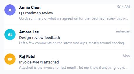
FLIP — First, Last, Invert, Play — is the standard technique for animating an element between two layout states that CSS alone cannot interpolate, most often because the element is changing size, position, or even parent in a way that would otherwise just snap. This snippet applies FLIP by hand, with no library, to a very common real-world case: an inbox row that expands in place into a full-size detail reading pane.
Why this needs FLIP instead of a plain CSS transition
The detail pane is not simply a bigger version of the row sitting in the same spot — it is a *new* element, appended fresh to the DOM with different content (a back button, an expanded body, more padding) and a different natural size. CSS cannot transition between "an element that does not exist yet" and "an element at its full size", so the four FLIP steps bridge that gap manually.
First — measure where the row already is
Before anything changes, openDetail(row) calls row.getBoundingClientRect() and stores the result as first — the row's exact position and size, in viewport pixels, at the instant the user clicked it.
Last — measure where the new detail pane wants to be
The detail element is built, filled with content, and appended to .wrap (which fills the container, since nothing constrains its size yet). detail.getBoundingClientRect() is then called again and stored as last — its natural, full, "resting" position and size.
Invert — make the new element look like the old one
This is the crucial trick: rather than trying to animate *from* the row's size *to* the detail's size directly, the code computes the delta between first and last — dx/dy for position, scaleX/scaleY for size — and applies that delta as a transform on the *already full-size* detail element. A scaled-down, repositioned detail pane sitting exactly on top of where the row used to be is visually indistinguishable from the row itself, even though under the hood it is already the full-size element in disguise.
Play — animate back to identity
One requestAnimationFrame later (giving the browser one paint to commit the inverted starting transform), the code sets transform: translate(0px, 0px) scale(1, 1) — the identity transform — and lets the CSS transition: transform 0.4s on .detail animate the "shrunk-down clone of the row" smoothly growing into "the real, full-size detail pane". Because scaling a large element down and growing it back up is a transform-only animation, it stays on the compositor thread and runs smoothly even though the actual underlying box is much larger than the row it started as.
Reversing the animation to close
closeDetail() recomputes the exact same inverted transform and re-applies it, animating the still-full-size detail pane visually back down to the row's rect, then removes it from the DOM and un-hides the original row only once transitionend fires — so the two elements swap seamlessly with no visible gap or flash.
Why the original row is hidden, not removed, during the transition
row.classList.add('source-hidden') sets visibility: hidden on the row (not display: none), so it keeps its layout space and does not cause the rest of the inbox to reflow while the detail overlay sits visually on top of it — the row reappears the instant the detail pane finishes closing.
Where else FLIP matters
Any time you need to animate an element into or out of a fundamentally different size or DOM position — a grid item becoming a lightbox, a form field growing into a modal, a card reordering into a completely different slot — the same First/Last/Invert/Play sequence applies, whether you write it by hand as shown here or reach for a small FLIP-focused library.
Build with AI
Build, Understand, Optimize, and Extend It With AI
Paste this snippet into an AI coding assistant like Claude and ask it to trace through the First/Last/Invert/Play sequence step by step against the actual getBoundingClientRect calls in openDetail() — seeing exactly which measurement produces which transform value is the fastest way to really internalize FLIP. From there, ask the assistant to help you adapt the same technique to a grid-of-cards-to-lightbox layout instead of a list-to-detail-pane layout, or to add a prefers-reduced-motion branch that skips straight to the final state.
Prompt to recreate it
Copy this into your AI assistant of choice to build the effect from scratch, or as a jumping-off point for your own variant:
Build an inbox list in plain HTML, CSS, and JavaScript where clicking a row expands it in place into a full detail reading pane, using the FLIP (First-Last-Invert-Play) technique implemented by hand with getBoundingClientRect — no animation library.

Requirements:
- A list of inbox rows, each with an avatar, sender name, subject, and a truncated preview snippet.
- When a row is clicked: measure its bounding rect (First), hide it with visibility: hidden (not display: none, so the list does not reflow), build and append a new full-size detail panel element containing a back button, the same avatar/sender, the full subject, and an expanded body, then measure that new element's bounding rect (Last).
- Compute the position and scale delta between the row's rect and the detail panel's rect, and apply that delta as a CSS transform on the detail panel so it initially looks exactly like the row it replaced (Invert).
- On the next animation frame, animate the transform back to its identity value (translate 0, scale 1) using a CSS transition, so the detail panel visibly grows from the row's position and size into its own full size (Play).
- Clicking a back button inside the detail panel must reverse the exact same transform math, animating the panel back down to the row's original rect, then remove the panel and restore the row's visibility once the transition finishes.
- The detail panel's extra body text should fade in with a short transition-delay so it does not visibly clip against the still-growing panel.
Want to tighten it up first? Run this prompt through the AI Prompt Studio to score it across 8 quality dimensions, catch anti-patterns, and tune the wording for Claude, ChatGPT, or Gemini before you paste it in.
Source Code
<div class="wrap">
  <div class="inbox" id="inbox">
    <div class="row" data-id="1">
      <div class="avatar" style="background:linear-gradient(140deg,#6366f1,#818cf8)">JC</div>
      <div class="meta">
        <div class="top-line"><span class="sender">Jamie Chen</span><span class="time">9:14 AM</span></div>
        <div class="subject">Q3 roadmap review</div>
        <div class="snippet">Quick summary of what we agreed on for the roadmap review this week...</div>
      </div>
    </div>
    <div class="row" data-id="2">
      <div class="avatar" style="background:linear-gradient(140deg,#06b6d4,#22d3ee)">AL</div>
      <div class="meta">
        <div class="top-line"><span class="sender">Amara Lee</span><span class="time">Yesterday</span></div>
        <div class="subject">Design review feedback</div>
        <div class="snippet">Left a few comments on the latest mockups, mostly around spacing...</div>
      </div>
    </div>
    <div class="row" data-id="3">
      <div class="avatar" style="background:linear-gradient(140deg,#f59e0b,#fbbf24)">RP</div>
      <div class="meta">
        <div class="top-line"><span class="sender">Raj Patel</span><span class="time">Mon</span></div>
        <div class="subject">Invoice #4471 attached</div>
        <div class="snippet">Attached is the invoice for last month, let me know if anything looks off...</div>
      </div>
    </div>
  </div>
</div>
* { box-sizing: border-box; }
body { font-family: system-ui, sans-serif; background: #f8fafc; display: flex; justify-content: center; padding: 40px 20px; }
.wrap { width: 100%; max-width: 460px; position: relative; }
.inbox { background: #fff; border: 1px solid #e2e8f0; border-radius: 14px; overflow: hidden; }
.row {
display: flex; gap: 12px; padding: 14px 16px; cursor: pointer;
border-bottom: 1px solid #f1f5f9; background: #fff;
}
.row:last-child { border-bottom: none; }
.row:hover { background: #f8fafc; }
.avatar {
flex-shrink: 0; width: 38px; height: 38px; border-radius: 50%;
color: #fff; font-size: 12px; font-weight: 800;
display: flex; align-items: center; justify-content: center;
}
.meta { flex: 1; min-width: 0; }
.top-line { display: flex; justify-content: space-between; gap: 8px; margin-bottom: 2px; }
.sender { font-size: 13.5px; font-weight: 700; color: #0f172a; }
.time { font-size: 11.5px; color: #94a3b8; flex-shrink: 0; }
.subject { font-size: 13px; font-weight: 600; color: #334155; margin-bottom: 2px; white-space: nowrap; overflow: hidden; text-overflow: ellipsis; }
.snippet { font-size: 12px; color: #94a3b8; white-space: nowrap; overflow: hidden; text-overflow: ellipsis; }
/* The detail overlay is an absolutely-positioned clone of the row, so it
can be given the row's exact FLIP starting rect (via inline transform)
and then transitioned to fill the inbox, with the extra body content
fading in once the box has grown. */
.detail {
position: absolute; left: 0; top: 0; width: 100%;
background: #fff; border: 1px solid #e2e8f0; border-radius: 14px;
overflow: hidden; z-index: 10; box-shadow: 0 20px 45px rgba(15,23,42,0.18);
transform-origin: top left;
transition: transform 0.4s cubic-bezier(0.4,0,0.2,1);
}
.detail-head {
display: flex; align-items: center; gap: 12px; padding: 16px 18px;
border-bottom: 1px solid #f1f5f9;
}
.detail-head .avatar { width: 42px; height: 42px; font-size: 13px; }
.detail-head .sender { font-size: 14.5px; }
.back-btn {
border: none; background: #f1f5f9; color: #6366f1; width: 30px; height: 30px;
border-radius: 8px; cursor: pointer; font-size: 15px; font-weight: 800; flex-shrink: 0;
}
.detail-subject { padding: 16px 20px 4px; font-size: 16px; font-weight: 800; color: #0f172a; }
.detail-body {
padding: 6px 20px 22px; font-size: 13.5px; line-height: 1.8; color: #475569;
opacity: 0; transition: opacity 0.2s ease 0.18s;
}
.detail.open .detail-body { opacity: 1; }
.row.source-hidden { visibility: hidden; }const inbox = document.getElementById('inbox');
const wrap = document.querySelector('.wrap');
const BODIES = {
1: 'Hi team, sharing a recap of the Q3 roadmap review. We agreed to prioritize the onboarding revamp and push the billing migration to Q4. Full notes are linked in the doc below. Let me know if I missed anything from the discussion.',
2: 'Left a handful of comments on the latest mockups, mostly around spacing in the sidebar and contrast on the secondary buttons. Nothing blocking — happy to hop on a call if easier to walk through live.',
3: 'Attached is the invoice for last month covering the annual plan renewal. Let me know if anything looks off and I will get a corrected copy over right away. Thanks for the quick turnaround as always.',
};
function openDetail(row) {
// FLIP: First — measure the row's current rect before anything changes.
const first = row.getBoundingClientRect();
const wrapRect = wrap.getBoundingClientRect();
const id = row.dataset.id;
const sender = row.querySelector('.sender').textContent;
const subject = row.querySelector('.subject').textContent;
const avatarBg = row.querySelector('.avatar').style.background;
const initials = row.querySelector('.avatar').textContent;
row.classList.add('source-hidden');
const detail = document.createElement('div');
detail.className = 'detail';
detail.innerHTML =
'<div class="detail-head">' +
'<button class="back-btn" aria-label="Back">←</button>' +
'<div class="avatar" style="background:' + avatarBg + '">' + initials + '</div>' +
'<span class="sender">' + sender + '</span>' +
'</div>' +
'<div class="detail-subject">' + subject + '</div>' +
'<div class="detail-body">' + (BODIES[id] || '') + '</div>';
wrap.appendChild(detail);
// Last — measure where the full-size detail panel will land (it fills
// the .wrap container at its natural size).
const last = detail.getBoundingClientRect();
// Invert — position the new element exactly over the old row using a
// transform, so it starts looking identical to the row it replaced.
const scaleX = first.width / last.width;
const scaleY = first.height / last.height;
const dx = first.left - last.left;
const dy = first.top - last.top;
detail.style.transform = 'translate(' + dx + 'px, ' + dy + 'px) scale(' + scaleX + ', ' + scaleY + ')';
detail.getBoundingClientRect(); // force layout so the next line transitions
// Play — animate to the identity transform, growing into the full panel.
requestAnimationFrame(() => {
detail.classList.add('open');
detail.style.transform = 'translate(0px, 0px) scale(1, 1)';
});
detail.querySelector('.back-btn').addEventListener('click', () => closeDetail(detail, row, first, last));
}
function closeDetail(detail, row, first, last) {
const scaleX = first.width / last.width;
const scaleY = first.height / last.height;
const dx = first.left - last.left;
const dy = first.top - last.top;
detail.classList.remove('open');
detail.style.transform = 'translate(' + dx + 'px, ' + dy + 'px) scale(' + scaleX + ', ' + scaleY + ')';
detail.addEventListener('transitionend', () => {
detail.remove();
row.classList.remove('source-hidden');
}, { once: true });
}
inbox.addEventListener('click', (e) => {
const row = e.target.closest('.row');
if (row) openDetail(row);
});Step by step
How to Use
- 1Click any inbox rowIt expands in place into a full detail pane, growing from the row's exact position and size.
- 2Click the back arrowThe detail pane shrinks back down into the row it came from, then the row reappears.
- 3Add more inbox rowsAdd more .row elements with a unique data-id, and a matching entry in the BODIES object for the detail content.
- 4Adjust the morph speedChange the 0.4s transition duration on .detail in the CSS panel.
- 5Retime the content revealAdjust the 0.18s transition-delay on .detail-body so the text fades in earlier or later relative to the box growth.
- 6Export in your formatClick "HTML" for a standalone file, "JSX" for a React component, or "Tailwind" for a React + Tailwind version.
Real-world uses
Common Use Cases
Got questions?
Frequently Asked Questions
First: measure the element's starting rect. Last: measure its ending rect (often after appending a differently-sized new element). Invert: apply a transform to the new element so it looks identical to the starting element. Play: animate that transform back to identity, so the element visibly grows or moves from its old rect to its new one.
Animating width/height forces layout recalculation on every frame (a much more expensive operation than compositing), and it does not work at all when the element you are animating to did not exist yet. FLIP sidesteps both problems by animating only a transform on an element that is already at its full final size.
It gives the browser one frame to paint the inverted (disguised-as-the-row) starting state before the identity transform is applied. Without that frame, the browser could combine both states into a single paint and the growth animation would never become visible.
Keeping its layout space with visibility: hidden prevents the rest of the inbox list from reflowing while the detail overlay sits on top of it. The row becomes visible again only once the detail pane has fully animated back down and is removed.
Yes — the same First/Last/Invert/Play sequence works for any element switching size or position, including a grid tile expanding into a full-page or full-modal detail view. Only the specific rect math (position and scale deltas) needs adjusting for a 2D grid instead of a stacked list.
The native document.startViewTransition API automates a similar screenshot-and-transform approach at the browser level but currently only works in Chromium browsers. This hand-written FLIP technique runs in every browser with getBoundingClientRect and CSS transforms, which is effectively all of them, at the cost of writing the measurement and transform math yourself.