Learn Coding Visually
Learn to code with interactive, live-preview playgrounds — HTML, CSS, JavaScript, React & more.
 HTML Playground42 lessons · Click-based · Live preview
 CSS PlaygroundLearn CSS with a live editor
 JavaScript Playground60 lessons · DOM · Async · Canvas
 React PlaygroundLearn React with a live code editor
 GSAP PlaygroundLearn GSAP animation interactively
 SVG Playground44 lessons · shapes · paths · animation
 SCSS Playground45 lessons · Sass modules · tokens
 Tailwind PlaygroundLearn Tailwind CSS with a live editor
 Bootstrap 5 Playground50 lessons · live preview
Image Comparison Slider — Free HTML CSS JS Snippet
Before / After Slider · Layouts · Plain HTML, CSS & JS · Live preview
What's included
Features
About this UI Snippet
Image Comparison Slider — clip-path Reveal, Drag Handle & Touch Events
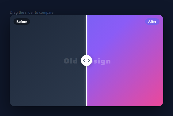
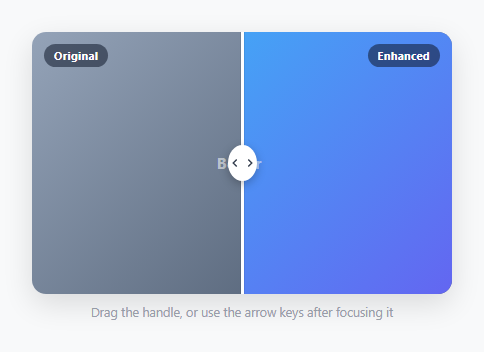
A before/after image comparison slider lets users drag a handle to reveal two different versions of the same image side by side — a before and after of a photo edit (as from the image filter editor), an AI enhancement, a design change, or a product transformation. This snippet implements the complete interaction: drag handle, clip-path reveal, mouse and touch events, and percentage clamping.
The clip-path reveal technique
Both images are absolutely positioned to fill the same container. The .before image (left side) is always fully visible as the background. The .after image (right side) has clip-path: inset(0 X% 0 0) — this clips its right edge by a percentage. As the handle moves left, X% increases (more of the after image is revealed from the left); as the handle moves right, X% decreases.
The setPos function
setPos(x) converts an absolute clientX position to a percentage of the container width: pct = ((x - rect.left) / rect.width) * 100. The percentage is clamped between 5% and 95% to prevent the handle from reaching the extreme edges. after.style.clipPath = "inset(0 ${100-pct}% 0 0)" and handle.style.left = pct + '%' update both the reveal and the handle position.
Mouse and touch support
mousedown sets dragging = true. mousemove calls setPos(e.clientX) while dragging is true. mouseup and mouseleave set dragging = false. touchstart and touchmove mirror this with e.touches[0].clientX.
The clip-path reveal technique
The "after" image sits directly on top of the "before" image using position: absolute; inset: 0. clip-path: inset(0 X% 0 0) clips the right portion of the after image — X% is the drag position as a percentage of the container width. When X is 50%, the left half shows "after" and the right half shows "before". When X is 0%, the full before image is visible; at 100%, the full after image is visible. Both images have the same dimensions, so the clip reveals exactly the correct portion.
Mouse and touch drag handling
The drag handle tracks three events: mousedown (start drag), mousemove (update position), mouseup (stop drag). Touch events use touchstart, touchmove, touchend. The position is computed as (e.clientX - rect.left) / rect.width * 100, clamped between 2 and 98 to prevent the images from fully disappearing. During drag, iframes have pointer-events: none applied to prevent them from intercepting mouse events.
Customising with real images
Replace the gradient placeholder divs with real img elements or background-image CSS, as you would in a photo gallery or image lightbox. Ensure both images have the same dimensions for the comparison to work correctly. Add an alt attribute to each image for accessibility.
Build with AI
Build, Understand, Optimize, and Extend It With AI
You don't have to work out the clip-path math by hand. Paste this snippet's HTML, CSS, and JS into an AI coding assistant like Claude and ask it to explain exactly how inset(0 X% 0 0) on the after layer reveals it from the left as the percentage changes, or why setPos clamps the percentage between 5 and 95 rather than 0 and 100. The same assistant is useful for optimizing it — ask whether attaching mousemove and touchmove listeners to the whole window (rather than just the compare container) has any performance or event-conflict implications on a page with many sliders. It's just as handy for extending the slider: ask it to add a vertical orientation mode, snap the handle to specific percentages like 25/50/75 with a light magnetic pull, or add keyboard arrow-key support for accessibility so the slider can be operated without a mouse. Treat the code less like a finished artifact and more like a starting point for a conversation.
Prompt to recreate it
Copy this into your AI assistant of choice to build the effect from scratch, or as a jumping-off point for your own variant:
Build a before/after image comparison slider in plain HTML, CSS, and JavaScript using clip-path — no canvas, no library.

Requirements:
- Two full-size layers stacked in the same container: a "before" layer as the base and an "after" layer directly on top, both absolutely positioned to fill the same box.
- Clip the after layer using the CSS clip-path inset() function so that only the portion from the left edge up to a percentage is visible, with the clip updating as a percentage of the container's width.
- A visible draggable handle (a vertical line plus a circular knob) positioned at that same percentage from the left, so it always lines up exactly with the clip boundary.
- Write a single function that converts a clientX coordinate into a percentage of the container's width using the container's bounding rect, clamps that percentage to a safe range (not flush against 0 or 100) so the handle never becomes impossible to grab at the edges, and applies both the clip-path and the handle's left position from that one clamped value.
- Support both mouse and touch dragging: starting a drag on mousedown or touchstart, updating position on mousemove or touchmove while dragging is active, and ending the drag on mouseup or touchend, with the move and end listeners attached broadly enough (e.g. on the window) that dragging continues smoothly even if the pointer moves faster than the cursor can stay inside the slider's bounds.
- Disable text selection and use a col-resize cursor over the slider area so it's visually clear the whole region is draggable, not just the handle itself.
Want to tighten it up first? Run this prompt through the AI Prompt Studio to score it across 8 quality dimensions, catch anti-patterns, and tune the wording for Claude, ChatGPT, or Gemini before you paste it in.
Source Code
<div class="scene">
  <p class="label-top">Drag the slider to compare</p>
  <div class="compare" id="compare">
    <div class="side before">
      <div class="img-sim before-sim"></div>
      <span class="tag">Before</span>
    </div>
    <div class="side after" id="after">
      <div class="img-sim after-sim"></div>
      <span class="tag">After</span>
    </div>
    <div class="handle" id="handle">
      <div class="line"></div>
      <div class="knob">
        <svg width="16" height="16" viewBox="0 0 24 24" fill="none" stroke="currentColor" stroke-width="2.5" stroke-linecap="round"><polyline points="15 18 9 12 15 6"/></svg>
        <svg width="16" height="16" viewBox="0 0 24 24" fill="none" stroke="currentColor" stroke-width="2.5" stroke-linecap="round"><polyline points="9 18 15 12 9 6"/></svg>
      </div>
    </div>
  </div>
</div>
* { box-sizing: border-box; margin: 0; padding: 0; }
body { font-family: system-ui, sans-serif; background: #0f172a; display: flex; flex-direction: column; align-items: center; justify-content: center; min-height: 100vh; gap: 14px; padding: 20px; }
.label-top { font-size: 12px; color: #475569; }
.compare {
position: relative; width: min(500px, 90vw); height: 300px;
border-radius: 16px; overflow: hidden;
box-shadow: 0 20px 60px rgba(0,0,0,0.5);
user-select: none; cursor: col-resize;
}
.side { position: absolute; inset: 0; overflow: hidden; }
.after { clip-path: inset(0 0 0 50%); }
.img-sim { width: 100%; height: 100%; }
.before-sim { background: linear-gradient(135deg, #1e293b 0%, #334155 100%); }
.after-sim { background: linear-gradient(135deg, #6366f1 0%, #8b5cf6 50%, #ec4899 100%); }
/* Add some visual content to show difference */
.before-sim::after { content: 'Old Design'; position: absolute; inset: 0; display: flex; align-items: center; justify-content: center; font-size: 24px; font-weight: 800; color: rgba(255,255,255,0.15); letter-spacing: 2px; }
.after-sim::after { content: 'New Design'; position: absolute; inset: 0; display: flex; align-items: center; justify-content: center; font-size: 24px; font-weight: 800; color: rgba(255,255,255,0.25); letter-spacing: 2px; }
.tag { position: absolute; top: 12px; font-size: 11px; font-weight: 700; padding: 3px 10px; border-radius: 20px; color: #fff; backdrop-filter: blur(8px); }
.before .tag { left: 12px; background: rgba(0,0,0,0.4); }
.after .tag { right: 12px; background: rgba(99,102,241,0.6); }
.handle { position: absolute; top: 0; bottom: 0; left: 50%; transform: translateX(-50%); width: 40px; display: flex; flex-direction: column; align-items: center; }
.line { position: absolute; top: 0; bottom: 0; width: 2px; background: #fff; box-shadow: 0 0 8px rgba(255,255,255,0.5); }
.knob { position: absolute; top: 50%; transform: translateY(-50%); width: 36px; height: 36px; border-radius: 50%; background: #fff; display: flex; align-items: center; justify-content: center; box-shadow: 0 2px 12px rgba(0,0,0,0.3); gap: 0; z-index: 1; color: #475569; }const compare = document.getElementById('compare');
const after = document.getElementById('after');
const handle = document.getElementById('handle');
let dragging = false;
function setPos(x) {
const rect = compare.getBoundingClientRect();
const pct = Math.min(95, Math.max(5, ((x - rect.left) / rect.width) * 100));
after.style.clipPath = `inset(0 0 0 ${pct}%)`;
handle.style.left = pct + '%';
}
compare.addEventListener('mousedown', e => { dragging = true; setPos(e.clientX); });
compare.addEventListener('touchstart', e => { dragging = true; setPos(e.touches[0].clientX); }, { passive: true });
window.addEventListener('mousemove', e => { if (dragging) setPos(e.clientX); });
window.addEventListener('touchmove', e => { if (dragging) setPos(e.touches[0].clientX); }, { passive: true });
window.addEventListener('mouseup', () => dragging = false);
window.addEventListener('touchend', () => dragging = false);Step by step
How to Use
- 1Drag the handleClick and drag the centre handle left and right to reveal the before (dark) and after (coloured) images.
- 2Replace with real imagesIn the HTML panel, replace the .before and .after div backgrounds with <img> tags or CSS background-image URLs.
- 3Change the initial splitIn the JS panel, call setPos(rect.left + rect.width * 0.5) on load to set any starting position.
- 4Change the handle styleUpdate .handle CSS: width, border colour, and the arrow icon SVG.
- 5Change the clamp rangeUpdate the Math.min(95, Math.max(5, ...)) values to allow a wider or narrower drag range.
- 6Export in your formatClick "HTML" for a standalone file, "JSX" for a React component, or "Tailwind" for a React + Tailwind version.
Real-world uses
Common Use Cases
Got questions?
Frequently Asked Questions
The .after image has clip-path: inset(0 X% 0 0). The inset values are top, right, bottom, left. Increasing right X% clips more of the right side, hiding the after image. Decreasing it reveals more. Moving the handle left increases the right clip; moving right decreases it.
setPos(x) computes pct = ((x - rect.left) / rect.width) * 100. rect.left is the container left edge. Dividing by rect.width normalises to 0-100. The result is clamped between 5 and 95 to keep the handle inside the container.
touchstart sets dragging = true. touchmove calls setPos(e.touches[0].clientX) — touches[0] is the first finger contact. This mirrors the mouse drag logic exactly.
Replace the .before and .after gradient backgrounds with background-image: url("your-before.jpg") and background-image: url("your-after.jpg") in the CSS. Or use <img> tags inside each div with position: absolute; inset: 0; width: 100%; height: 100%; object-fit: cover.
After the event listeners, call: const rect = compare.getBoundingClientRect(); setPos(rect.left + rect.width * 0.5); to start at 50%. Use 0.3 for 30% or 0.7 for 70%.
Yes. Click "JSX" for a React component. In React, use useRef on the container, after, and handle elements. Attach onMouseDown, onMouseMove, onMouseUp, onTouchStart, and onTouchMove to the container. Manage the dragging state in useRef (not useState) to avoid rerenders.