Learn Coding Visually
Learn to code with interactive, live-preview playgrounds — HTML, CSS, JavaScript, React & more.
 HTML Playground42 lessons · Click-based · Live preview
 CSS PlaygroundLearn CSS with a live editor
 JavaScript Playground60 lessons · DOM · Async · Canvas
 React PlaygroundLearn React with a live code editor
 GSAP PlaygroundLearn GSAP animation interactively
 SVG Playground44 lessons · shapes · paths · animation
 SCSS Playground45 lessons · Sass modules · tokens
 Tailwind PlaygroundLearn Tailwind CSS with a live editor
 Bootstrap 5 Playground50 lessons · live preview
Smartwatch Mockup — Free CSS Watch Face Device Snippet
Smartwatch Mockup · Layouts · Plain HTML, CSS & JS · Live preview
What's included
Features
About this UI Snippet
Smartwatch Mockup — CSS Watch Frame with Activity Rings
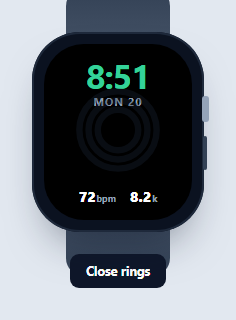
A smartwatch mockup presents a watch face design inside a wearable device frame — for fitness apps, complications, and wearable concepts. This snippet builds an Apple-Watch-style one in pure HTML and CSS (bands, digital crown, side button, rounded screen) with a live clock and animated activity rings, in vanilla JavaScript with no dependency.
The watch body and bands
The case is a rounded square with a heavily-curved border-radius, an inset box-shadow edge, and a soft drop shadow. The two bands are gradient <span>s positioned above and below the case with z-index:-1 so they tuck behind it, and the digital crown and side button are slivers on the right edge — all CSS, no image, so it scales cleanly and recolors at will.
A live OLED-style face
The screen is pure black (like an always-on OLED), with a green digital time that updates live, an abbreviated date built from a DAYS array, and two complications (heart rate, steps) at the bottom. The bright monospace-numeral time over black is the classic smartwatch look, achieved with font weight and letter-spacing rather than a custom font.
Activity rings with stroke-dasharray
The three concentric rings are the centerpiece. Each is an SVG <circle> whose stroke-dasharray equals its circumference (2πr) and whose stroke-dashoffset starts at full (empty). Animating the offset toward circumference × (1 - percent) fills the ring proportionally, and a 1s transition makes them sweep closed — exactly the technique behind real activity rings. A -90° rotation starts each ring at the top, and stroke-linecap: round gives the soft ends.
Interactive "close your rings"
A toggle animates all three rings from empty to their targets (86%, 72%, 95%) and brightens them, then resets — a satisfying demo of the fill animation and a stand-in for live fitness data. Because each ring's geometry is precomputed, setting a new percentage is a single offset assignment.
Reusing it
Swap the complications, recolor the rings, or replace the face entirely — the frame is a reusable wrapper. Feed real heart-rate or step data into setRings() and the time from a device, and pair it with a phone mockup to present a companion app.
Build with AI
Build, Understand, Optimize, and Extend It With AI
You don't have to work out the ring-fill geometry by hand. Paste this snippet's HTML, CSS, and JS into an AI coding assistant like Claude and ask it to explain exactly why each ring's stroke-dasharray is set to its own circumference (2 times pi times r) and why stroke-dashoffset at that same value hides the entire stroke, or why the whole SVG is rotated -90 degrees so the fill animation starts at 12 o'clock instead of 3 o'clock. The same assistant can help optimize it, for instance checking whether the setInterval clock tick at 5 seconds is the right tradeoff between accuracy and unnecessary re-renders for a watch face that only displays minutes. It is just as useful for extending the mockup: ask it to add a fourth outer ring for a custom metric, make the complications tappable to cycle through different data views, or drive the rings from a real fitness API response instead of the hardcoded target percentages. Treat the code less like a finished artifact and more like a starting point for a conversation.
Prompt to recreate it
Copy this into your AI assistant of choice to build the effect from scratch, or as a jumping-off point for your own variant:
Build a CSS-and-SVG "smartwatch mockup" with animated activity rings in plain HTML, CSS, and JavaScript — no images, no canvas, no libraries.

Requirements:
- A watch case built entirely from CSS shapes: a heavily rounded rectangular body, two band segments (top and bottom) positioned behind the case using a negative z-index so they appear to pass under it, a thin digital crown sliver, and a side button sliver — all using gradients and border-radius, no bitmap images.
- Inside the case, a rounded rectangular screen rendering a black watch face containing: a live-updating digital time display and abbreviated day/date label driven by JavaScript's Date object on a repeating interval, and two or more small "complications" (e.g. heart rate, step count) as text.
- Three concentric SVG circles as activity rings. For each ring, set its stroke-dasharray to its own circumference (2 * PI * radius) and its initial stroke-dashoffset to that same full circumference so it renders fully hidden. Rotate the whole ring SVG group -90 degrees around its center so ring fills begin at the 12 o'clock position, and use round line caps on the ring strokes.
- A function that accepts a percentage per ring and sets each ring's stroke-dashoffset to circumference times (1 minus that percentage), animated with a CSS transition on stroke-dashoffset (around 1 second, ease timing) so the ring visibly sweeps to its new fill level.
- A toggle control that calls this fill function with a set of target percentages to demonstrate the rings animating from empty to filled, and back to empty when toggled again, also adjusting the ring group's opacity between a dim "inactive" state and a bright "active" state.
Want to tighten it up first? Run this prompt through the AI Prompt Studio to score it across 8 quality dimensions, catch anti-patterns, and tune the wording for Claude, ChatGPT, or Gemini before you paste it in.
Step by step
How to Use
- 1Paste HTML, CSS, and JSA CSS smartwatch renders with a live face and dim activity rings.
- 2Watch the clockThe time and date update live on the watch face.
- 3Press close ringsThe three rings sweep from empty to their targets.
- 4Reset themToggle again to animate the rings back to empty.
- 5Recolor the ringsChange the stroke colors for your own metrics.
- 6Feed real dataDrive setRings() from live fitness values.
Real-world uses
Common Use Cases
Got questions?
Frequently Asked Questions
Each ring is an SVG circle whose stroke-dasharray equals its circumference (2πr) and whose stroke-dashoffset starts at the full circumference, hiding the stroke. Setting the offset to circumference × (1 - percent) reveals that fraction, and a 1-second CSS transition makes it sweep. A -90° rotation starts the fill at the top and round line caps soften the ends.
No, it's pure CSS. The case is a heavily-rounded square with an inset edge shadow, the bands are gradient spans tucked behind it with negative z-index, and the crown and button are slivers on the edge. Because there's no photo, the watch stays sharp at any size and every part can be recolored.
Yes. A tick function reads the current Date, formats a 12-hour time, and builds an abbreviated day-and-date label from a day-name array, updating on an interval. The bright green numerals over the black face mimic an always-on OLED display.
Yes. Each ring's circumference is precomputed, so setting a new fill is a single stroke-dashoffset assignment via the setRings() function with three percentages. Pass live move, exercise, and stand values (0 to 1) and the rings animate to match; feed device time into the clock the same way.
Make the watch a component and bind each ring's strokeDashoffset to a percent in state, updating it from your data. Put the clock interval in a mount effect with cleanup. Expose a slot to swap the whole face. In Tailwind, build the case and bands with rounded utilities and gradients, and keep the rings as an inline SVG with bound offsets.