You Might Also Like
Learn Coding Visually
Learn to code with interactive, live-preview playgrounds — HTML, CSS, JavaScript, React & more.
 HTML Playground42 lessons · Click-based · Live preview
 CSS PlaygroundLearn CSS with a live editor
 JavaScript Playground60 lessons · DOM · Async · Canvas
 React PlaygroundLearn React with a live code editor
 GSAP PlaygroundLearn GSAP animation interactively
 SVG Playground44 lessons · shapes · paths · animation
 SCSS Playground45 lessons · Sass modules · tokens
 Tailwind PlaygroundLearn Tailwind CSS with a live editor
 Bootstrap 5 Playground50 lessons · live preview
Laptop Mockup — Free CSS MacBook Device Frame Snippet
Laptop Mockup · Layouts · Plain HTML, CSS & JS · Live preview
What's included
Features
About this UI Snippet
Laptop Mockup — Pure-CSS MacBook-Style Frame
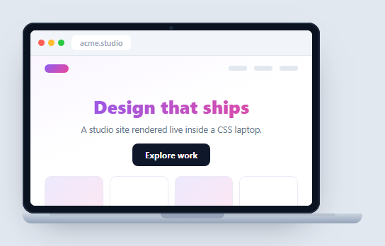
A laptop mockup presents a website or app inside a MacBook-style frame — the standard device shot for landing pages, portfolios, and case studies. This one is built entirely in HTML and CSS: a lid with a 16:10 screen, a hinge base with a notch, and a live web page inside, plus a gentle pointer-driven parallax tilt in vanilla JavaScript. No device photo, no dependency.
Lid, screen, and base in three pieces
The structure mirrors a real laptop: a dark .lm-lid (the bezel) wrapping the .lm-screen, and a separate .lm-base wedge below it for the deck. The base uses a vertical gradient to suggest the aluminium taper, a ::before strip for the keyboard-edge highlight, and a centered .lm-notch for the thumb cutout — together they read as the bottom half of an open laptop without a single image.
Aspect-ratio screen
The screen uses aspect-ratio: 16/10 so it keeps authentic laptop proportions at any width, and max-width with a viewport unit lets the whole device shrink responsively on small screens. Inside, a mini browser bar (traffic lights plus an address) and a sample studio page demonstrate that the screen holds real, styled content — including a gradient background-clip: text headline — rather than a flat screenshot.
Subtle parallax for life
A pointer-move handler reads the cursor's horizontal position over the stage, normalizes it to roughly −0.5…0.5, and applies a small rotateY within a perspective so the laptop appears to turn slightly toward the cursor. The rotation is gentle (a few degrees) and resets on pointerleave, adding a premium, interactive feel that a static mockup can't — and it degrades gracefully since the frame is fully styled without it.
Why CSS over an image
A CSS device frame is resolution-independent, recolorable, and — crucially — can contain live, scrolling, interactive UI. You can drop an actual running component into the screen, switch its theme, or animate it, which is exactly what you want when demonstrating a product rather than just illustrating one.
Reusing it
Replace the .lm-page contents with your site or an <img>, and keep the device as a wrapper component. Pair it with a browser window mockup or a phone mockup to present a responsive design across form factors.
Build with AI
Build, Understand, Optimize, and Extend It With AI
You do not have to puzzle out every gradient layer that fakes the aluminium base on your own. Paste this snippet's HTML, CSS, and JS into an AI coding assistant like Claude and ask it to explain precisely how the lm-base wedge, its ::before edge strip, and the lm-notch combine with the lid's inset box-shadow to read as a real laptop deck without any image. The same assistant can help optimize it, for instance checking whether recalculating the rotateY string with toFixed on every single pointermove event is worth throttling with requestAnimationFrame for smoother tilting on lower-end devices. It is also useful for extending the mockup: ask it to add a matching rotateX tilt for vertical pointer movement, animate the screen brightness up on load like a boot sequence, or make the lm-page content swappable with a live iframe of a real URL. Treat the code less like a finished artifact and more like a starting point for a conversation.
Prompt to recreate it
Copy this into your AI assistant of choice to build the effect from scratch, or as a jumping-off point for your own variant:
Build a pure-CSS "laptop mockup" in plain HTML, CSS, and JavaScript with no device images, using only divs, gradients, and a pointermove-driven tilt.

Requirements:
- A lid element styled as a dark bezel with a small circular camera dot near its top edge, wrapping a screen element that uses CSS aspect-ratio: 16/10 so it keeps correct laptop proportions at any width.
- Inside the screen, a mini browser chrome bar with three colored traffic-light dots and a fake address pill, above a scrollable page area containing real styled content (a nav bar, a hero heading using a gradient background-clip: text effect, and a small thumbnail grid) rather than a screenshot image.
- A separate base wedge element below the lid, built only from CSS gradients: a vertical gradient suggesting the aluminium taper, a thin ::before pseudo-element strip near its top edge for the keyboard-deck highlight, and a centered notch cutout shape for the thumb opening.
- The whole device must shrink responsively using max-width and viewport units so it fits on narrow screens without breaking its proportions.
- A pointermove listener on the outer stage must compute the cursor's horizontal position relative to the stage's bounding rect, normalize it to roughly -0.5 to 0.5, and apply a small rotateY (a few degrees at most) inside a CSS perspective on the lid only, resetting the transform on pointerleave.
- The frame must remain fully legible and correctly styled with JavaScript disabled entirely, since the tilt is a pure enhancement layered on top of a static CSS mockup.
Want to tighten it up first? Run this prompt through the AI Prompt Studio to score it across 8 quality dimensions, catch anti-patterns, and tune the wording for Claude, ChatGPT, or Gemini before you paste it in.
Step by step
How to Use
- 1Paste HTML, CSS, and JSA CSS laptop renders with a sample studio site on its screen.
- 2Move your pointerThe laptop tilts subtly toward the cursor with parallax.
- 3Note the proportionsThe screen keeps a 16:10 aspect ratio at any width.
- 4Resize the pageThe device shrinks responsively on narrow viewports.
- 5Drop in your siteReplace the page content with your own UI or screenshot.
- 6Reuse as a wrapperKeep the frame as a component with a screen slot.
Real-world uses
Common Use Cases
Got questions?
Frequently Asked Questions
Pure CSS. It's three pieces — a dark lid wrapping the screen, and a separate base wedge with a gradient, an edge highlight pseudo-element, and a center notch. There's no device image, so it scales without blurring and every part can be recolored or resized through CSS.
The screen uses the CSS aspect-ratio property set to 16/10, so it maintains laptop proportions automatically regardless of the device's width. Combined with a max-width in viewport units on the lid, the whole laptop scales down responsively while keeping its shape on small screens.
A pointermove listener on the stage reads the cursor's horizontal position, normalizes it to about minus a half to plus a half, and applies a small rotateY inside a CSS perspective so the laptop turns slightly toward the pointer. It resets on pointerleave, and because the frame is fully styled without it, the effect is purely an enhancement.
Yes — that's the benefit of a CSS frame. The screen is live DOM, so you can place a running component, a scrolling page, or any other snippet inside and it will function normally. Replace the .lm-page contents with your UI, or drop in an <img> if you only need a static shot.
Make the device a component that renders a screen slot for children, so any page can be wrapped. Put the pointer parallax in a mount effect with cleanup, or omit it. In Tailwind, build the lid and base with rounded utilities and gradients, set the screen with aspect-[16/10], and add a perspective wrapper for the tilt.