Learn Coding Visually
Learn to code with interactive, live-preview playgrounds — HTML, CSS, JavaScript, React & more.
 HTML Playground42 lessons · Click-based · Live preview
 CSS PlaygroundLearn CSS with a live editor
 JavaScript Playground60 lessons · DOM · Async · Canvas
 React PlaygroundLearn React with a live code editor
 GSAP PlaygroundLearn GSAP animation interactively
 SVG Playground44 lessons · shapes · paths · animation
 SCSS Playground45 lessons · Sass modules · tokens
 Tailwind PlaygroundLearn Tailwind CSS with a live editor
 Bootstrap 5 Playground50 lessons · live preview
Breakout Grid Article Layout — CSS Named Grid Columns
Breakout Grid Article Layout · Layouts · Plain HTML, CSS & JS · Live preview
What's included
Features
About this UI Snippet
Breakout Grid Article Layout — Named Grid Lines for Content, Popout & Full-Bleed Regions
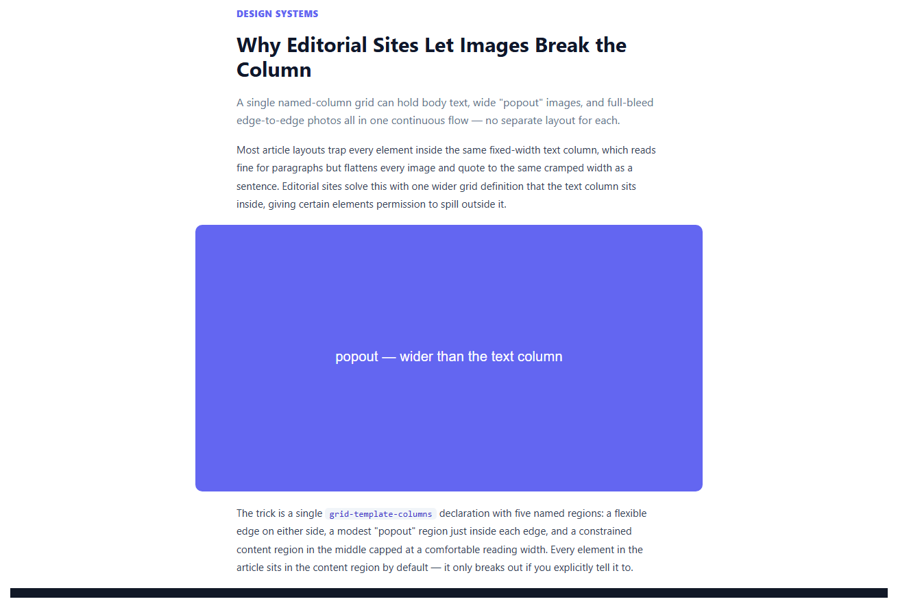
Long-form articles usually need three different widths in the same page: body text capped at a comfortable reading measure, occasional images that deserve to be noticeably wider than the text, and rare hero images that should run edge-to-edge of the viewport. Building each of those as a separately-calculated wrapper is how most hand-rolled article templates end up with three slightly-inconsistent width systems. This snippet solves it with one grid-template-columns declaration and named grid lines, so every element in the article picks its width by naming a target region rather than computing one.
Five named regions in one line
The article container declares grid-template-columns: [full-start] minmax(16px, 1fr) [popout-start] minmax(0, 60px) [content-start] min(620px, 100% - 152px) [content-end] minmax(0, 60px) [popout-end] minmax(16px, 1fr) [full-end]. Read left to right, that is: a flexible edge margin, a modest popout allowance, the capped-width content column, a mirrored popout allowance, and a mirrored flexible edge margin. Every bracketed name — full-start, popout-start, content-start, and their -end counterparts — is a real named grid line the browser understands, not a class name or a comment.
Elements opt into a wider region by name, not by value
By default, every direct child of .bo-grid gets grid-column: content, which CSS Grid resolves by finding the line pair named content-start / content-end — this is what keeps ordinary paragraphs capped at a comfortable reading width automatically. An image that should run wider only needs grid-column: popout, resolving to the popout-start/popout-end line pair, or grid-column: full to span all the way to full-start/full-end for an edge-to-edge hero image. No element ever needs to know a pixel value — it just names the region it wants to occupy, and the grid definition is the single source of truth for what that region actually measures.
Why this beats negative margins or calc() hacks
The older technique for "break an image out of a centered text column" involves giving the image a negative margin equal to the difference between the column width and the desired wider width, calculated by hand and re-derived any time either width changes. That approach also breaks the moment the surrounding container's own width changes, since the negative margin was computed against one specific column width. Named grid lines are resolved live by the browser on every layout pass, so resizing the viewport, changing min(620px, 100% - 152px), or adjusting the popout allowance all stay correct automatically, with zero recalculation anywhere else in the CSS.
Live region switching to see the mechanism
The interactive demo image at the bottom of the article lets you toggle the exact same element between content, popout, and full grid-column values, with a CSS transition on grid-column so the resize itself is visible rather than an instant jump — a direct, hands-on way to see how little code separates "normal text-width image" from "edge-to-edge hero image" once the named grid exists.
A mobile collapse that keeps the same names
Below the small-viewport breakpoint, the same five names are simply redefined to all point at the same single line pair ([full-start popout-start content-start] minmax(0, 1fr) [content-end popout-end full-end]), collapsing every region to one full-width column without touching a single element's grid-column value — because elements reference names, not raw track positions, the whole responsive behavior lives in exactly one place.
Build with AI
Build, Understand, Optimize, and Extend It With AI
Paste this snippet's HTML and CSS into an AI coding assistant like Claude and ask it to explain exactly how the named grid lines in grid-template-columns let an element choose its width by name instead of by calculated value, and why that is more robust than a negative-margin breakout technique as the surrounding page width changes. It is also a good candidate for extension — ask it to add a fourth named region between popout and full for an intermediate "wide" size, wire the content-region max-width into a CSS custom property so it can be themed per-site, or add a print stylesheet variant where the full-bleed region collapses back to the content width since a printed page has no viewport to bleed into.
Prompt to recreate it
Copy this into your AI assistant of choice to build the effect from scratch, or as a jumping-off point for your own variant:
Build an editorial article layout in plain HTML and CSS using a single named-line CSS Grid definition — no JavaScript required for the core layout, no library.

Requirements:
- One grid-template-columns declaration on the article container defining five named regions in this order: a flexible full-bleed edge, a modest popout allowance, a width-capped content region using a min() function so it never overflows a narrow viewport, a mirrored popout allowance, and a mirrored flexible full-bleed edge — using real bracketed named grid lines (e.g. [content-start], [content-end]), not just comments.
- By default, every direct child of the article container should be placed in the named content region, so ordinary paragraphs are automatically capped at a comfortable reading width without any class needed.
- Provide two utility classes: one that places an element in the named popout region (noticeably wider than the content column but still inset from the viewport edge) and one that places an element in the named full region (spanning edge-to-edge of the viewport, ignoring any page padding).
- Include a small interactive demo where clicking one of three buttons (Inline width / Popout / Full-bleed) toggles a single demo image between the content, popout, and full grid-column values live, with a CSS transition on grid-column so the width change is visibly animated rather than an instant jump.
- At a mobile breakpoint, redefine the same five named line pairs so they all collapse onto a single full-width track — the responsive collapse must be a single change to the grid-template-columns definition, not a change to any individual element's grid-column value.
Want to tighten it up first? Run this prompt through the AI Prompt Studio to score it across 8 quality dimensions, catch anti-patterns, and tune the wording for Claude, ChatGPT, or Gemini before you paste it in.
Source Code
<div class="bo-page">
  <article class="bo-grid">
    <p class="bo-kicker">Design Systems</p>
    <h1>Why Editorial Sites Let Images Break the Column</h1>
    <p class="bo-lede">A single named-column grid can hold body text, wide "popout" images, and full-bleed edge-to-edge photos all in one continuous flow — no separate layout for each.</p>

    <p>Most article layouts trap every element inside the same fixed-width text column, which reads fine for paragraphs but flattens every image and quote to the same cramped width as a sentence. Editorial sites solve this with one wider grid definition that the text column sits inside, giving certain elements permission to spill outside it.</p>

    <img class="bo-media bo-popout" src="data:image/svg+xml,%3Csvg xmlns='http://www.w3.org/2000/svg' width='800' height='420'%3E%3Crect width='800' height='420' fill='%236366f1'/%3E%3Ctext x='400' y='215' fill='white' font-family='sans-serif' font-size='22' text-anchor='middle'%3Epopout — wider than the text column%3C/text%3E%3C/svg%3E" alt="Popout example image">

    <p>The trick is a single <code>grid-template-columns</code> declaration with five named regions: a flexible edge on either side, a modest "popout" region just inside each edge, and a constrained content region in the middle capped at a comfortable reading width. Every element in the article sits in the content region by default — it only breaks out if you explicitly tell it to.</p>

    <img class="bo-media bo-full" src="data:image/svg+xml,%3Csvg xmlns='http://www.w3.org/2000/svg' width='1600' height='500'%3E%3Crect width='1600' height='500' fill='%23111827'/%3E%3Ctext x='800' y='255' fill='white' font-family='sans-serif' font-size='26' text-anchor='middle'%3Efull-bleed — edge to edge of the viewport%3C/text%3E%3C/svg%3E" alt="Full-bleed example image">

    <p>Because every region is a named grid line rather than a manually calculated width, an element only needs one class — <code>.bo-popout</code> or <code>.bo-full</code> — to span from one named line to another. No negative margins, no viewport-width calc() hacks, and no separate "wide image" wrapper component with its own layout math duplicated from the article's own grid.</p>

    <div class="bo-demo-controls">
      <span>Try it:</span>
      <button type="button" data-mode="content" class="active">Inline width</button>
      <button type="button" data-mode="popout">Popout</button>
      <button type="button" data-mode="full">Full-bleed</button>
    </div>
    <img class="bo-media bo-demo" id="boDemoImg" src="data:image/svg+xml,%3Csvg xmlns='http://www.w3.org/2000/svg' width='680' height='320'%3E%3Crect width='680' height='320' fill='%23f97316'/%3E%3Ctext x='340' y='165' fill='white' font-family='sans-serif' font-size='20' text-anchor='middle'%3Etoggle my width above%3C/text%3E%3C/svg%3E" alt="Toggleable demo image">

    <p>This is the same grid backbone used across most modern editorial CMS themes, whether or not the underlying page framework calls it a "breakout grid" by name.</p>
  </article>
</div>
* { box-sizing: border-box; margin: 0; padding: 0; }
body { font-family: system-ui, sans-serif; background: #fff; }
.bo-page { padding: 0 0 60px; }
.bo-grid {
display: grid;
grid-template-columns:
[full-start] minmax(16px, 1fr)
[popout-start] minmax(0, 60px)
[content-start] min(620px, 100% - 152px)
[content-end] minmax(0, 60px)
[popout-end] minmax(16px, 1fr)
[full-end];
row-gap: 18px;
padding: 40px 0 0;
}
.bo-grid > * { grid-column: content; }
.bo-kicker { font-size: 12.5px; font-weight: 800; text-transform: uppercase; letter-spacing: .07em; color: #6366f1; }
.bo-grid h1 { font-size: 30px; line-height: 1.2; color: #0f172a; }
.bo-lede { font-size: 16px; color: #64748b; line-height: 1.6; }
.bo-grid p:not(.bo-kicker):not(.bo-lede) { font-size: 15px; line-height: 1.75; color: #334155; }
.bo-grid code { font-family: ui-monospace, Menlo, monospace; background: #f1f5f9; padding: 1px 6px; border-radius: 5px; font-size: 13px; color: #4338ca; }
.bo-media { width: 100%; height: auto; display: block; border-radius: 10px; }
.bo-popout { grid-column: popout; }
.bo-full { grid-column: full; border-radius: 0; }
.bo-demo-controls { grid-column: content; display: flex; align-items: center; gap: 8px; font-size: 12.5px; color: #64748b; font-family: system-ui, sans-serif; }
.bo-demo-controls button { border: 1px solid #e2e8f0; background: #f8fafc; color: #475569; font-size: 12px; font-weight: 700; padding: 6px 12px; border-radius: 999px; cursor: pointer; font-family: inherit; transition: background .12s, color .12s; }
.bo-demo-controls button:hover { background: #eef2ff; }
.bo-demo-controls button.active { background: #4f46e5; color: #fff; border-color: #4f46e5; }
.bo-demo { grid-column: content; transition: grid-column .25s ease; background: #f97316; }
.bo-demo.mode-popout { grid-column: popout; }
.bo-demo.mode-full { grid-column: full; border-radius: 0; }
@media (max-width: 700px) {
.bo-grid { grid-template-columns: [full-start popout-start content-start] minmax(0, 1fr) [content-end popout-end full-end]; padding: 28px 16px 0; }
.bo-grid h1 { font-size: 24px; }
}var buttons = document.querySelectorAll('.bo-demo-controls button');
var demoImg = document.getElementById('boDemoImg');
buttons.forEach(function (btn) {
btn.addEventListener('click', function () {
buttons.forEach(function (b) { b.classList.remove('active'); });
btn.classList.add('active');
demoImg.classList.remove('mode-popout', 'mode-full');
if (btn.dataset.mode === 'popout') demoImg.classList.add('mode-popout');
if (btn.dataset.mode === 'full') demoImg.classList.add('mode-full');
});
});Step by step
How to Use
- 1Add elements to the content flowAnything placed directly inside .bo-grid defaults to grid-column: content, automatically capped at the comfortable reading width.
- 2Break an image out to popout widthAdd class .bo-popout to any element to span the wider popout region, noticeably beyond the text column but still inset from the viewport edge.
- 3Break an image out to full-bleedAdd class .bo-full to run an element edge-to-edge of the viewport, ignoring the article's own padding entirely.
- 4Try the live toggleUse the Inline width / Popout / Full-bleed buttons on the demo image to watch the same element move between all three named regions with a CSS transition.
- 5Tune the popout allowanceAdjust the 60px value in minmax(0, 60px) to make the popout region proportionally wider or narrower relative to the content column.
- 6Adjust the content capChange 620px in min(620px, 100% - 152px) to widen or narrow the comfortable reading measure the content region targets.
Real-world uses
Common Use Cases
Got questions?
Frequently Asked Questions
A breakout grid is a single grid-template-columns definition with named regions of increasing width — typically content, popout, and full — so that ordinary elements stay at a comfortable reading width while specific elements can opt into a wider or edge-to-edge width using the same grid, without a separate layout system or manually calculated offsets.
Each bracketed name in grid-template-columns — like [content-start] and [content-end] — creates a real named line the browser tracks. Setting grid-column: content on an element tells the grid to place it between the lines named content-start and content-end; the browser resolves the actual pixel positions from the grid definition, so the element itself never needs to know or compute a width.
A negative margin has to be manually calculated as the difference between the container's fixed width and the desired wider width, and that calculation silently breaks if either width later changes. Named grid lines are resolved fresh by the browser on every layout pass, so the same grid-column: popout value stays correct automatically through any resize or content-width change.
The media query redefines all five named line pairs to collapse onto one single track, so grid-column: content, popout, and full all resolve to the same full-width column — no element's CSS needs to change, only the grid definition itself, which is the entire responsive behavior in one place.
Yes — insert another bracketed name and minmax() track between the existing ones (e.g. a [wide-start] / [wide-end] pair between popout and full), then use grid-column: wide on any element that should use it, following the exact same pattern as popout and full.
Yes. The grid CSS is entirely framework-agnostic; render your article content as children of the grid container and apply the .bo-popout or .bo-full class (or an equivalent prop-driven class binding) to any component that should break out of the content column.