Learn Coding Visually
Learn to code with interactive, live-preview playgrounds — HTML, CSS, JavaScript, React & more.
 HTML Playground42 lessons · Click-based · Live preview
 CSS PlaygroundLearn CSS with a live editor
 JavaScript Playground60 lessons · DOM · Async · Canvas
 React PlaygroundLearn React with a live code editor
 GSAP PlaygroundLearn GSAP animation interactively
 SVG Playground44 lessons · shapes · paths · animation
 SCSS Playground45 lessons · Sass modules · tokens
 Tailwind PlaygroundLearn Tailwind CSS with a live editor
 Bootstrap 5 Playground50 lessons · live preview
Magazine Asymmetric Grid Layout — CSS Grid Editorial Article Layout
Magazine Asymmetric Grid Layout · Layouts · Plain HTML & CSS · Live preview
What's included
Features
About this UI Snippet
Magazine Asymmetric Grid Layout — Building an Editorial Feel with CSS Grid Spans
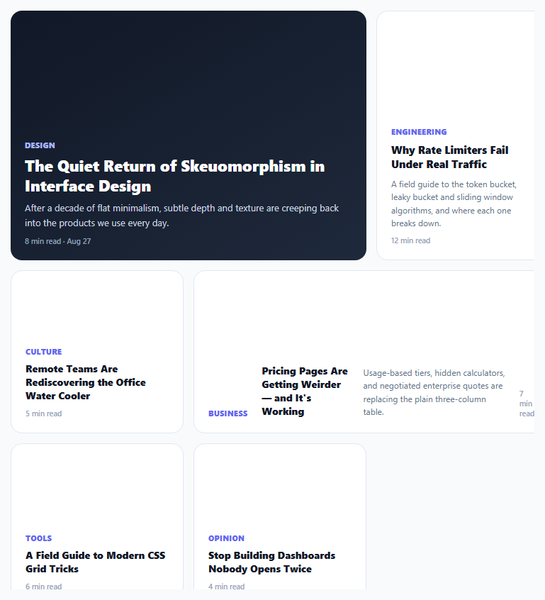
Most content grids repeat the same card shape over and over — a uniform 3-up or 4-up grid of identically sized tiles. Print magazines almost never do this: a lead story gets a large block, a sidebar gets a tall narrow column, a banner story spans wide but short. This layout recreates that editorial hierarchy on the web using CSS Grid's grid-column/grid-row span properties on top of a shared 6-column, fixed-row-height base grid.
Why a shared column/row unit makes irregular spans possible
The whole grid is built on grid-template-columns: repeat(6, 1fr) combined with grid-auto-rows: 108px — a fine-grained 6-column, fixed-height-row base unit that every tile then spans across in different amounts. .feature spans 4 columns and 3 rows (a big square-ish block), .tall spans 2 columns and 3 rows (a narrow tall column), .wide spans 4 columns and 2 rows (a short wide banner), and ordinary tiles default to 2 columns and 2 rows. Because every span is expressed in the *same* underlying unit grid, the browser's grid auto-placement algorithm can still pack everything together without gaps or manual positioning — the irregularity comes entirely from varying span sizes, not from absolute positioning or manual row/column line numbers.
Content adapts its own layout per tile type, not just its size
.wide doesn't just get a different size — it also switches its internal flex-direction to row so its heading and meta text sit side-by-side rather than stacked, matching how a banner-shaped tile actually reads best. .feature gets a dark gradient background and a larger heading size, visually functioning as the clear "lead story" the way a magazine's front-page anchor piece would. Each modifier class changes both geometry and internal composition together, rather than treating card content as a single interchangeable template stretched to different container shapes.
Collapsing gracefully at narrow widths
At the 620px breakpoint, every span modifier — .feature, .tall, .wide, and the default 2×2 — is forced back to grid-column: span 2 with grid-row: auto, and .wide's row-flex layout reverts to a column, collapsing the whole asymmetric composition into a simple, readable two-column stack. This avoids the common failure mode of editorial grids on mobile, where a tile designed to be short-and-wide on desktop becomes unreadably squeezed if its span ratio is preserved at a much narrower viewport.
Where this earns its complexity over a uniform grid
A magazine-style asymmetric grid works best for content that genuinely has a hierarchy — a blog or news homepage with one lead story and several secondary ones, a portfolio with one hero project, a dashboard summary page with one primary metric and several supporting ones — rather than a flat listing of equally-important items, where a uniform grid remains the clearer, more honest layout choice.
Build with AI
Build, Understand, Optimize, and Extend It With AI
Ask an AI assistant to explain why building irregular tile sizes as spans on one shared fine-grained base grid (rather than several separately-sized grid containers) is what lets CSS Grid's auto-placement algorithm pack everything without gaps, and to suggest which combinations of span sizes tile together cleanly versus which leave awkward empty cells. It's also worth asking for a version driven by a JavaScript array of {size, content} objects that renders the right modifier class dynamically, or one that lets an editor manually reassign which article gets the "feature" treatment.
Prompt to recreate it
Copy this into your AI assistant of choice to build the effect from scratch, or as a jumping-off point for your own variant:
Build a magazine-style asymmetric content grid in HTML and CSS using CSS Grid — no JavaScript, no external layout library.

Requirements:
- A shared base grid of at least 6 columns with a fixed grid-auto-rows height, so every tile's size is expressed as a span of that same underlying unit grid.
- At least four distinct tile size variants: one large "feature" tile spanning several columns and rows for a lead item, one "tall" narrow tile spanning fewer columns but multiple rows, one "wide" short tile spanning several columns but fewer rows, and a default standard tile size for everything else.
- The "wide" tile's internal layout should switch to a horizontal (row) flex arrangement instead of the vertical stack used by other tile types, since its shape suits side-by-side content better.
- The "feature" tile should be visually distinguished (e.g. a different background treatment and larger heading) to clearly read as the primary/lead item in the grid.
- Rely on CSS Grid's automatic placement (no explicit grid-column-start/row-start line numbers) so tiles pack together compactly based purely on their span sizes.
- At a mobile breakpoint, collapse every tile size variant down to a uniform two-column (or single-column) stacked layout so the composition remains readable on narrow screens.
Want to tighten it up first? Run this prompt through the AI Prompt Studio to score it across 8 quality dimensions, catch anti-patterns, and tune the wording for Claude, ChatGPT, or Gemini before you paste it in.
Source Code
<div class="demo">
  <div class="mag-grid">
    <article class="mag-item feature">
      <span class="mag-cat">Design</span>
      <h2>The Quiet Return of Skeuomorphism in Interface Design</h2>
      <p>After a decade of flat minimalism, subtle depth and texture are creeping back into the products we use every day.</p>
      <span class="mag-meta">8 min read · Aug 27</span>
    </article>

    <article class="mag-item tall">
      <span class="mag-cat">Engineering</span>
      <h3>Why Rate Limiters Fail Under Real Traffic</h3>
      <p>A field guide to the token bucket, leaky bucket and sliding window algorithms, and where each one breaks down.</p>
      <span class="mag-meta">12 min read</span>
    </article>

    <article class="mag-item">
      <span class="mag-cat">Culture</span>
      <h3>Remote Teams Are Rediscovering the Office Water Cooler</h3>
      <span class="mag-meta">5 min read</span>
    </article>

    <article class="mag-item wide">
      <span class="mag-cat">Business</span>
      <h3>Pricing Pages Are Getting Weirder — and It's Working</h3>
      <p>Usage-based tiers, hidden calculators, and negotiated enterprise quotes are replacing the plain three-column table.</p>
      <span class="mag-meta">7 min read</span>
    </article>

    <article class="mag-item">
      <span class="mag-cat">Tools</span>
      <h3>A Field Guide to Modern CSS Grid Tricks</h3>
      <span class="mag-meta">6 min read</span>
    </article>

    <article class="mag-item">
      <span class="mag-cat">Opinion</span>
      <h3>Stop Building Dashboards Nobody Opens Twice</h3>
      <span class="mag-meta">4 min read</span>
    </article>
  </div>
</div>
* { box-sizing: border-box; margin: 0; padding: 0; }
body { font-family: system-ui, sans-serif; background: #f8fafc; padding: 24px; }
.mag-grid {
max-width: 760px; margin: 0 auto;
display: grid;
grid-template-columns: repeat(6, 1fr);
grid-auto-rows: 108px;
gap: 14px;
}
.mag-item { background: #fff; border: 1px solid #e2e8f0; border-radius: 16px; padding: 20px; display: flex; flex-direction: column; justify-content: flex-end; gap: 8px; overflow: hidden; transition: border-color 0.15s, transform 0.15s; }
.mag-item:hover { border-color: #c7d2fe; transform: translateY(-2px); }
.mag-item.feature { grid-column: span 4; grid-row: span 3; background: linear-gradient(150deg,#111827,#1e293b); border: none; }
.mag-item.feature h2 { font-size: 22px; font-weight: 800; color: #fff; line-height: 1.25; }
.mag-item.feature p { color: #cbd5e1; font-size: 13px; line-height: 1.6; }
.mag-item.feature .mag-cat { color: #a5b4fc; }
.mag-item.feature .mag-meta { color: #94a3b8; }
.mag-item.tall { grid-column: span 2; grid-row: span 3; }
.mag-item.tall h3 { font-size: 15px; }
.mag-item.wide { grid-column: span 4; grid-row: span 2; flex-direction: row; align-items: flex-end; justify-content: space-between; gap: 20px; }
.mag-item.wide > div, .mag-item.wide h3 { max-width: 70%; }
.mag-item:not(.feature):not(.tall):not(.wide) { grid-column: span 2; grid-row: span 2; }
.mag-cat { font-size: 10.5px; font-weight: 800; text-transform: uppercase; letter-spacing: 0.05em; color: #6366f1; }
.mag-item h2, .mag-item h3 { font-weight: 800; color: #111827; line-height: 1.35; }
.mag-item h3 { font-size: 14px; }
.mag-item p { font-size: 12px; color: #64748b; line-height: 1.55; }
.mag-meta { font-size: 10.5px; color: #94a3b8; font-weight: 600; }
@media (max-width: 620px) {
.mag-grid { grid-template-columns: repeat(2, 1fr); grid-auto-rows: auto; }
.mag-item, .mag-item.feature, .mag-item.tall, .mag-item.wide { grid-column: span 2 !important; grid-row: auto !important; flex-direction: column !important; }
.mag-item.wide > div, .mag-item.wide h3 { max-width: 100%; }
}Step by step
How to Use
- 1Assign a size modifier class per itemUse .feature for the lead story, .tall for a narrow tall column, .wide for a short wide banner, or leave the class off for a standard 2×2 tile.
- 2Keep the total column spans balanced per "row group"The 6-column base grid packs tiles by their spans — group combinations that sum to 6 columns (e.g. feature + tall) to avoid uneven gaps.
- 3Adjust grid-auto-rows for a different base unit heightChange the 108px value to scale every tile's height proportionally, since all row spans are multiples of this unit.
- 4Add more standard tiles freelyAny .mag-item without a size modifier automatically becomes a 2-column, 2-row tile and packs into remaining grid space.
- 5Test the mobile breakpointResize the preview below 620px to confirm every tile correctly collapses to a uniform two-column stacked layout.
Real-world uses
Common Use Cases
Got questions?
Frequently Asked Questions
Because every tile's span is expressed against the same 6-column, fixed-row-height base grid, the browser's default grid auto-placement algorithm can still fit tiles together in the available cells automatically, without needing explicit grid-column-start/grid-row-start line numbers on each item.
The auto-placement algorithm will still place tiles as compactly as possible, but you may end up with uneven visual gaps or a tile appearing further down than expected — grouping combinations that sum to 6 columns (e.g. a 4-span feature next to a 2-span tall tile) keeps the composition tidiest.
Add a new modifier class with its own grid-column: span N and grid-row: span M values (using the same 6-column, 108px-row base unit), plus any content-composition changes (like .wide's row flex-direction) that size warrants.
Yes — CSS Grid auto-placement will keep filling in either the next explicit spot or the next available cell as items are added or removed; just be aware that removing a large-span tile can leave more irregular gaps than removing a standard one.
A wide, short tile has more horizontal than vertical space, so laying its heading and meta text side-by-side (row direction) uses that shape more effectively than stacking them vertically the way a tall or standard tile would.
The DOM order in this snippet places .feature first and other tiles in a sensible reading sequence, but with CSS Grid it's possible for visual position to diverge from source order if you add explicit line-based placement — keep source order matching intended reading order for the best screen reader and keyboard navigation experience.