Learn Coding Visually
Learn to code with interactive, live-preview playgrounds — HTML, CSS, JavaScript, React & more.
 HTML Playground42 lessons · Click-based · Live preview
 CSS PlaygroundLearn CSS with a live editor
 JavaScript Playground60 lessons · DOM · Async · Canvas
 React PlaygroundLearn React with a live code editor
 GSAP PlaygroundLearn GSAP animation interactively
 SVG Playground44 lessons · shapes · paths · animation
 SCSS Playground45 lessons · Sass modules · tokens
 Tailwind PlaygroundLearn Tailwind CSS with a live editor
 Bootstrap 5 Playground50 lessons · live preview
Split Screen Layout — Hover-Expand Split HTML CSS
Split Screen Layout · Layouts · Plain HTML, CSS & JS · Live preview
What's included
Features
About this UI Snippet
Split Screen Layout — A 50/50 Hero Where Hovering a Panel Expands It
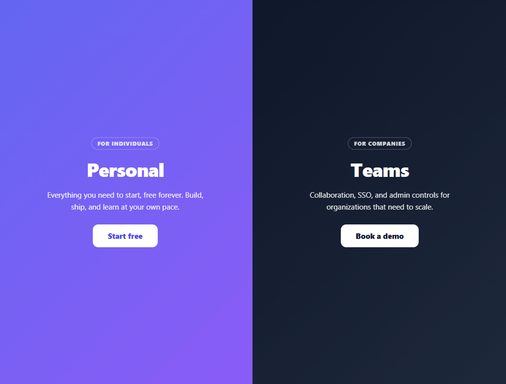
The split-screen layout — two full-height panels dividing the viewport, often used to present two audiences or two choices (personal vs. teams, men vs. women, login vs. sign-up) — is a striking landing-page pattern. This snippet builds it with a satisfying interaction: hovering either half expands it and shrinks the other, drawing the eye to the panel you're considering. It's pure HTML and CSS for the layout and effect, with a touch of JavaScript only as a tap fallback, and no library.
Two flex panels sharing the viewport
The container is a flex row at height: 100vh, with each half set to flex: 1 so they split the width evenly. Making the split with flex rather than fixed widths is what enables the whole effect: changing a panel's flex-grow value smoothly reallocates the available space between the two, and the browser animates the resize via a transition on the flex property.
Hover-expand with a CSS-only technique
The expand effect uses a neat selector trick: when the *container* is hovered, both halves shrink to flex: 0.7, and then the specific half being hovered grows to flex: 1.6. Because the container-hover rule fires for either child, this creates the "focused panel grows, other recedes" behaviour with no JavaScript — the hovered half wins because its rule is more specific. An ease curve on the flex transition makes the reallocation glide rather than snap. This is the canonical pure-CSS way to build the interactive split screen.
Content that stays centred and legible
Each half centres a content block — tag, heading, copy, and CTA — with align-items/justify-content, so the text stays put and readable as the panel resizes around it. overflow: hidden clips the gradient backgrounds during the resize so nothing spills, and the two halves use contrasting gradients so the division reads instantly.
A touch fallback, because :hover doesn't tap
Hover effects don't exist on touch devices, so the snippet detects (hover: none) and, only there, makes tapping a half toggle an expanded state instead — while letting taps on the actual CTA buttons through so they still work. This progressive enhancement means the layout is fully usable on phones (where it also restacks vertically) without forcing the hover interaction where it can't apply.
Responsive restack
Below the breakpoint the panels stack vertically into two stacked sections, each a half-viewport tall, and the hover-expand is disabled — the right call, since two side-by-side panels don't fit a narrow screen. The result is a bold split-screen hero on desktop that degrades to a clean stacked layout on mobile, a drop-in for any "two paths" landing page.
Build with AI
Build, Understand, Optimize, and Extend It With AI
You don't need to work out the container-hover selector trick by hand. Paste this snippet's HTML, CSS, and JS into an AI coding assistant like Claude and ask it to explain exactly why the container-level hover rule combined with the more specific per-half hover rule produces the "focused panel grows, other recedes" behavior with zero JavaScript, or why animating flex-grow is a better fit here than animating width directly. The same assistant can help optimize it, for example checking whether the matchMedia(hover: none) check correctly covers hybrid devices that support both touch and a mouse. It's also useful for extending the feature: ask it to support three or more panels instead of exactly two, add a subtle background parallax as a panel expands, or persist the last-expanded panel's state across a page reload. Treat the code less like a finished artifact and more like a starting point for a conversation.
Prompt to recreate it
Copy this into your AI assistant of choice to build the effect from scratch, or as a jumping-off point for your own variant:
Build a two-panel hover-expand split-screen layout in plain HTML and CSS, with only a small JavaScript touch fallback.

Requirements:
- A flex container at full viewport height holding exactly two panels, both starting at an equal flex-grow value so they split the width evenly.
- Using only CSS selectors (no JavaScript for the hover behavior itself), make hovering anywhere over the container shrink both panels to a smaller flex-grow value, while the specific panel currently under the cursor grows to a larger flex-grow value than its resting state — the more specific selector must win over the container-wide one.
- Animate the flex-grow changes with a CSS transition on the flex property (not width or flex-basis directly) so the reallocation glides smoothly between states.
- Each panel must center its own content block (a small label tag, a heading, descriptive text, and a call-to-action button) regardless of how wide or narrow the panel currently is, and use overflow hidden so a background gradient never spills during the resize.
- Add a JavaScript fallback that runs only when window.matchMedia detects no hover support: tapping a panel should toggle an "expanded" state by directly setting its flex style, while taps specifically on the call-to-action button must be excluded from triggering that toggle so the button still works normally.
- Add a mobile breakpoint that stacks the two panels vertically (each roughly half the viewport height) and disables the hover-expand rules entirely below that width.
Want to tighten it up first? Run this prompt through the AI Prompt Studio to score it across 8 quality dimensions, catch anti-patterns, and tune the wording for Claude, ChatGPT, or Gemini before you paste it in.
Source Code
<div class="sps" id="sps">
  <section class="sps-half sps-a">
    <div class="sps-inner">
      <span class="sps-tag">For individuals</span>
      <h2>Personal</h2>
      <p>Everything you need to start, free forever. Build, ship, and learn at your own pace.</p>
      <button type="button" class="sps-btn">Start free</button>
    </div>
  </section>
  <section class="sps-half sps-b">
    <div class="sps-inner">
      <span class="sps-tag">For companies</span>
      <h2>Teams</h2>
      <p>Collaboration, SSO, and admin controls for organizations that need to scale.</p>
      <button type="button" class="sps-btn sps-btn-light">Book a demo</button>
    </div>
  </section>
</div>*{box-sizing:border-box;margin:0;padding:0}
body{font-family:system-ui,-apple-system,sans-serif}
/* Two halves share the viewport; hovering a half lets it grow via flex-grow. */
.sps{display:flex;height:100vh;overflow:hidden}
.sps-half{flex:1;position:relative;display:flex;align-items:center;justify-content:center;padding:40px;color:#fff;overflow:hidden;
transition:flex .5s cubic-bezier(.7,0,.2,1)}
.sps-a{background:linear-gradient(135deg,#6366f1,#8b5cf6)}
.sps-b{background:linear-gradient(135deg,#0f172a,#1e293b)}
/* Desktop: the hovered half expands and the other shrinks. */
@media (min-width:721px){
.sps:hover .sps-half{flex:0.7}
.sps:hover .sps-half:hover{flex:1.6}
}
.sps-inner{max-width:340px;text-align:center;transition:transform .5s}
.sps-tag{display:inline-block;font-size:11px;font-weight:800;text-transform:uppercase;letter-spacing:.08em;opacity:.8;margin-bottom:14px;padding:4px 12px;border:1px solid rgba(255,255,255,.35);border-radius:999px}
.sps-half h2{font-size:38px;font-weight:800;margin-bottom:14px;letter-spacing:-.02em}
.sps-half p{font-size:15px;line-height:1.6;opacity:.9;margin-bottom:24px}
.sps-btn{background:#fff;color:#4f46e5;border:none;border-radius:11px;padding:13px 30px;font-size:15px;font-weight:800;cursor:pointer;font-family:inherit;transition:transform .15s,box-shadow .2s}
.sps-btn:hover{transform:translateY(-2px);box-shadow:0 12px 28px rgba(0,0,0,.25)}
.sps-btn-light{background:#fff;color:#0f172a}
/* Mobile: stack the halves vertically, no hover-expand. */
@media (max-width:720px){
.sps{flex-direction:column;height:auto}
.sps-half{min-height:50vh}
.sps-half h2{font-size:30px}
}// The hover-expand is pure CSS. JS adds a touch fallback: tapping a half on a
// touch device toggles an expanded state (since :hover doesn't apply on tap).
var sps = document.getElementById('sps');
var halves = Array.prototype.slice.call(sps.querySelectorAll('.sps-half'));
if (window.matchMedia('(hover: none)').matches) {
halves.forEach(function (half) {
half.style.cursor = 'pointer';
half.addEventListener('click', function (e) {
if (e.target.tagName === 'BUTTON') return; // let CTAs work normally
var already = half.classList.contains('sps-open');
halves.forEach(function (h) { h.classList.remove('sps-open'); h.style.flex = ''; });
if (!already) { half.classList.add('sps-open'); half.style.flex = '2'; }
});
});
}Step by step
How to Use
- 1Paste HTML, CSS, and JSA full-height split screen renders with two gradient panels (Personal and Teams).
- 2Hover a panelOn desktop, hovering either half expands it and shrinks the other with a smooth glide.
- 3Tap on mobileOn touch devices, tapping a half expands it (CTAs still tap through normally).
- 4Resize narrowBelow the breakpoint the panels stack vertically and the hover-expand turns off.
- 5Swap in your contentReplace each half's tag, heading, copy, and CTA with your two options or audiences.
- 6Tune the expansionAdjust the flex values (0.7 / 1.6) to make the hovered panel grow more or less.
Real-world uses
Common Use Cases
Got questions?
Frequently Asked Questions
When the container is hovered, a rule shrinks both halves to flex: 0.7. A second, more specific rule (.sps:hover .sps-half:hover) grows the actually-hovered half to flex: 1.6. Since the container-hover fires for either child, hovering either half triggers the shrink, and the specific :hover wins for the one under the cursor — producing the focus-and-recede effect entirely in CSS. A transition on flex animates it.
Animating between two layouts requires a property the browser can interpolate. flex-grow is perfect: both halves start at flex: 1 (even split), and changing the grow values reallocates the shared space proportionally, which transitions smoothly. Fixed widths would require animating two width values in sync and don't express "share the remaining space" as cleanly.
The snippet checks window.matchMedia('(hover: none)'). On touch devices it attaches a tap handler that toggles an expanded state on the tapped half instead of relying on :hover — and it ignores taps on the CTA buttons so those still work. On phones the layout also restacks vertically and disables the expand, since two side-by-side panels don't suit a narrow screen.
Set different base flex values on the halves — e.g. flex: 1.4 on one and flex: 1 on the other — to start with an uneven split. The hover rules will still expand whichever is hovered. You can also change the 0.7 / 1.6 values in the hover rules to make the focused panel dominate more or less aggressively.
The layout and hover-expand are pure CSS, so they port as-is. For the touch fallback, run the (hover: none) check in a useEffect (React), onMounted (Vue), or ngAfterViewInit (Angular) and toggle an expanded class in state. The flex CSS and selector technique are framework-agnostic — only the tap-to-expand state moves into the framework.