

Learn Coding Visually
Learn to code with interactive, live-preview playgrounds — HTML, CSS, JavaScript, React & more.
 HTML Playground42 lessons · Click-based · Live preview
 CSS PlaygroundLearn CSS with a live editor
 JavaScript Playground60 lessons · DOM · Async · Canvas
 React PlaygroundLearn React with a live code editor
 GSAP PlaygroundLearn GSAP animation interactively
 SVG Playground44 lessons · shapes · paths · animation
 SCSS Playground45 lessons · Sass modules · tokens
 Tailwind PlaygroundLearn Tailwind CSS with a live editor
 Bootstrap 5 Playground50 lessons · live preview
Scroll Magazine Layout Shift — CSS Grid Recomposition Effect
Scroll Magazine Layout Shift · Scroll · Plain HTML, CSS & JS · Live preview
What's included
Features
About this UI Snippet
How to Build a Scroll-Driven Magazine Layout Shift With GSAP and CSS Grid
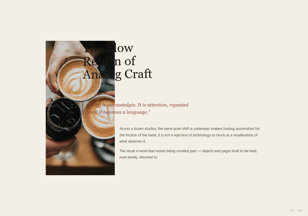
The Scroll Magazine Layout Shift snippet takes four separate DOM elements — a headline, an image, a pull quote, and a body paragraph block — and visibly recomposes their positions through four distinct editorial-page layouts as the visitor scrolls through one pinned section, by directly tweening CSS Grid placement properties.
Grid placement as the animated property, not transforms alone
Most scroll-triggered layout effects move elements with transform: translate, but that only works well when elements keep the same size and relationship to each other. This snippet instead tweens each element's grid-column and grid-row string values directly — GSAP can animate CSS Grid line-range strings like "5 / 13" to "1 / 7" the same way it animates numbers, so elements genuinely reflow, resize, and change proportion between layouts rather than just sliding around on a fixed-size canvas.
Four layouts as data, one timeline as the driver
Each layout is a plain object describing where the headline, image, quote, and body should sit on a 12-column, 6-row grid. A single gsap.timeline() steps through the layouts array, adding four tweens per transition (one per element) positioned at the same timeline label ('<') so they animate together as one cohesive page turn rather than one element visibly lagging behind another.
One ScrollTrigger scrubs the whole sequence
The timeline is attached to one ScrollTrigger on the pinned #magStage section with a numeric scrub, so the entire multi-layout sequence's playhead is under direct scroll control — scrolling slowly moves through the recomposition slowly, scrolling fast jumps ahead fast, and scrolling backward reverses cleanly through every intermediate layout, since a GSAP timeline's playhead is fully seekable both ways.
A page-number readout tied to timeline progress
The pinned stage's onUpdate callback reads self.progress (0 to 1 across the whole scrub range) and maps it to a page index for a small "01 / 04"-style label — a lightweight way to give the reader an explicit sense of position within the spread, similar in spirit to the percentage readouts used across the galaxy formation and coral reef grow 3D snippets, here applied to a 2D editorial layout instead.
Why this beats four separate sections
Splitting four layouts across four separate stacked sections would mean the headline, image, quote, and body reset and re-enter for each one — costing continuity. Keeping the same four DOM elements alive throughout and only changing their grid placement means the reader's eye can track a single image or headline as it visibly relocates and resizes, which is what makes the effect read as "the same spread being redesigned" rather than four separate pages.
Build with AI
Build, Understand, Optimize, and Extend It With AI
You do not need a dedicated layout-animation library to understand how this editorial spread redesigns itself on scroll. Paste this snippet's HTML, CSS, and JS into an AI assistant like Claude and ask it to explain why grid-column/grid-row are tweened directly rather than using transforms, or how timeline labels keep four separate element tweens synchronized per layout transition. The same assistant can help you extend it — ask it to add a fifth layout, vary font-size or letter-spacing alongside grid placement for more editorial contrast between pages, or add a subtle crossfade on the pull quote's color between layouts. It can also help optimize further, for instance splitting the layouts array into a JSON file if the number of pages grows large. Treat the code as a conversation starter, not a finished artifact.
Prompt to recreate it
Copy this into your AI assistant of choice to build the effect from scratch, or as a jumping-off point for your own variant:
Build a "scroll-scrubbed magazine layout shift" in plain HTML, CSS, and JavaScript using CSS Grid, GSAP, and GSAP's ScrollTrigger plugin, all loaded from a CDN (no bundler, no build step).

Requirements:
- A pinned section containing one CSS Grid container (e.g. 12 columns) with four child elements inside it: a headline, an image, a pull quote/blockquote, and a body text block.
- Describe 3-4 distinct "magazine page" layouts as plain JavaScript objects, each specifying a grid-column and grid-row value (as CSS Grid line-range strings) for all four elements, so each layout represents a different editorial arrangement (e.g. text-left/image-right, image-left/text-right, full-width headline with an inset image, etc).
- Build a single gsap.timeline() that, for each layout after the first, adds four tweens (one per element) animating gridColumn/gridRow (and optionally a small rotate) to that layout's values, all positioned at the same point in the timeline using a "<" position parameter so the four elements transition together as one synchronized page turn.
- Attach the timeline to one ScrollTrigger on the pinned section, with pin: true, start at top top, a numeric scrub, and a multi-hundred-percent end, so scroll position directly and smoothly controls progress through the entire multi-layout sequence in both directions.
- Add a small page-number readout (e.g. "01 / 04") that updates based on the ScrollTrigger's progress value, mapped to the current layout index, inside the onUpdate callback.
- Confirm scrolling back up recomposes the layout backward through each earlier arrangement exactly in reverse, since the timeline's playhead is directly scrubbed by scroll position.
Want to tighten it up first? Run this prompt through the AI Prompt Studio to score it across 8 quality dimensions, catch anti-patterns, and tune the wording for Claude, ChatGPT, or Gemini before you paste it in.
Source Code
<section class="mag-lead"><p>Scroll ↓ through one pinned editorial spread</p></section>
<section class="mag-stage" id="magStage">
<div class="mag-grid" id="magGrid">
<h1 class="mag-headline" id="magHeadline">The Slow<br>Return of<br>Analog Craft</h1>
<img class="mag-image" id="magImage" src="https://images.unsplash.com/photo-1495474472287-4d71bcdd2085?w=800&q=60" alt="Editorial feature image" />
<blockquote class="mag-quote" id="magQuote">"Craft is not nostalgia. It is attention, repeated until it becomes a language."</blockquote>
<div class="mag-body" id="magBody">
<p>Across a dozen studios, the same quiet shift is underway: makers trading automation for the friction of the hand. It is not a rejection of technology so much as a recalibration of what deserves it.</p>
<p>The result is work that resists being scrolled past — objects and pages built to be held, read slowly, returned to.</p>
</div>
</div>
<div class="mag-page-label"><span id="magPageNum">01</span> / 04</div>
</section>
<section class="mag-bottom"><p>End of spread.</p></section>*{box-sizing:border-box;margin:0;padding:0}
html,body{background:#f4efe6;color:#1c1712;font-family:Georgia,'Times New Roman',serif}
.mag-lead,.mag-bottom{min-height:60vh;display:flex;justify-content:center;align-items:center;color:#8a7d68;font-size:14px;letter-spacing:.1em;text-transform:uppercase;text-align:center;padding:0 24px;font-family:system-ui,sans-serif}
.mag-stage{min-height:100vh;position:relative;display:flex;align-items:center;justify-content:center;padding:40px 24px;overflow:hidden}
.mag-grid{position:relative;width:100%;max-width:900px;min-height:560px;display:grid;grid-template-columns:repeat(12,1fr);grid-template-rows:repeat(6,auto);gap:16px 20px;}
.mag-headline{grid-column:1/7;grid-row:1/3;font-size:clamp(28px,5vw,52px);line-height:1.05;font-weight:400;align-self:start;}
.mag-image{grid-column:7/13;grid-row:1/5;width:100%;height:100%;object-fit:cover;border-radius:2px;min-height:220px;}
.mag-quote{grid-column:1/6;grid-row:3/5;font-size:20px;line-height:1.5;font-style:italic;color:#8a3b2e;border-left:3px solid #8a3b2e;padding-left:18px;align-self:center;}
.mag-body{grid-column:1/13;grid-row:5/7;font-family:system-ui,sans-serif;font-size:15px;line-height:1.75;color:#3a332a;max-width:640px;}
.mag-body p{margin-bottom:14px}
.mag-page-label{position:absolute;right:24px;bottom:16px;font-family:system-ui,sans-serif;font-size:12px;letter-spacing:.14em;color:#a89a80;text-transform:uppercase}gsap.registerPlugin(ScrollTrigger);
var headline = document.getElementById('magHeadline');
var image = document.getElementById('magImage');
var quote = document.getElementById('magQuote');
var body = document.getElementById('magBody');
var pageNum = document.getElementById('magPageNum');
// Four distinct magazine-page layouts, described purely as CSS grid
// placements plus a light transform. Each "page" is a snapshot of where
// every element should sit; the timeline tweens grid-column/row (which
// GSAP can animate directly as strings) and small transforms between them.
var layouts = [
{ headline: '1 / 7', headlineRow: '1 / 3', image: '7 / 13', imageRow: '1 / 5', quote: '1 / 6', quoteRow: '3 / 5', body: '1 / 13', bodyRow: '5 / 7', rot: 0 },
{ headline: '5 / 13', headlineRow: '1 / 3', image: '1 / 5', imageRow: '1 / 7', quote: '5 / 13', quoteRow: '3 / 5', body: '5 / 13', bodyRow: '5 / 7', rot: 0 },
{ headline: '1 / 13', headlineRow: '1 / 2', image: '8 / 13', imageRow: '2 / 6', quote: '1 / 5', quoteRow: '2 / 4', body: '1 / 8', bodyRow: '4 / 6', rot: -1 },
{ headline: '3 / 11', headlineRow: '1 / 3', image: '1 / 13', imageRow: '3 / 5', quote: '1 / 5', quoteRow: '5 / 7', body: '5 / 13', bodyRow: '5 / 7', rot: 0 },
];
var pageLabels = ['01', '02', '03', '04'];
var tl = gsap.timeline({
scrollTrigger: {
trigger: '#magStage',
start: 'top top',
end: '+=300%',
scrub: 0.7,
pin: true,
onUpdate: function (self) {
var idx = Math.min(layouts.length - 1, Math.floor(self.progress * layouts.length));
pageNum.textContent = pageLabels[idx];
},
},
});
for (var i = 1; i < layouts.length; i++) {
var l = layouts[i];
tl.to(headline, { gridColumn: l.headline, gridRow: l.headlineRow, rotate: l.rot, duration: 1, ease: 'power2.inOut' }, '>')
.to(image, { gridColumn: l.image, gridRow: l.imageRow, duration: 1, ease: 'power2.inOut' }, '<')
.to(quote, { gridColumn: l.quote, gridRow: l.quoteRow, duration: 1, ease: 'power2.inOut' }, '<')
.to(body, { gridColumn: l.body, gridRow: l.bodyRow, duration: 1, ease: 'power2.inOut' }, '<');
}Step by step
How to Use
- 1Load the two GSAP CDN scriptsAdd gsap.min.js and ScrollTrigger.min.js from the CDN panel, in that order.
- 2Paste HTML, CSS, and JSAn editorial spread appears inside a pinned section with a "01 / 04" page counter.
- 3Scroll downThe headline, image, pull quote, and body block reflow through three further magazine-page layouts in sequence.
- 4Scroll back upThe spread recomposes back through each earlier layout exactly in reverse, since the timeline is fully scrubbed.
- 5Add your own layoutPush a new object into the layouts array with grid-column/row values for all four elements, plus an optional rotate.
- 6Adjust the pacingChange the ScrollTrigger end value (+=300%) for a slower or faster page-turn sequence.
Real-world uses
Common Use Cases
Got questions?
Frequently Asked Questions
Yes. GSAP's CSS plugin (bundled in gsap.min.js) can tween many CSS properties that take string values, including CSS Grid line-range strings like "5 / 13". It parses and interpolates the numeric line positions under the hood, so the browser lays out a genuinely new grid position on every tick rather than GSAP faking it with a transform.
Transforms move and resize an element visually without changing how it participates in layout, which works for simple slides but breaks down when an element needs to reflow relative to its siblings — for example the image growing to fill more columns while text reflows around the new space. Animating the actual grid placement lets the browser's layout engine handle that reflow correctly at every step.
Each layout transition moves four different elements (headline, image, quote, body) at once. Adding all four tweens at the same timeline label ("<") makes them start together and share the same duration and easing, so the whole page visibly turns as one cohesive unit instead of one element noticeably lagging behind the others.
The ScrollTrigger's onUpdate callback receives the trigger instance and reads its progress property, a 0-to-1 value representing position within the whole pinned scroll range. Multiplying that by the number of layouts and flooring the result gives a page index that updates continuously as the user scrolls in either direction.
Yes. Click JSX for a React component, Vue for a Vue 3 SFC, Angular for a standalone component, or Tailwind for a React + Tailwind version. Build the timeline inside a mount effect keyed to refs on the four elements, and on unmount kill the ScrollTrigger instance (or revert a gsap.context) so the pin does not leak between route changes.