


Learn Coding Visually
Learn to code with interactive, live-preview playgrounds — HTML, CSS, JavaScript, React & more.
 HTML Playground42 lessons · Click-based · Live preview
 CSS PlaygroundLearn CSS with a live editor
 JavaScript Playground60 lessons · DOM · Async · Canvas
 React PlaygroundLearn React with a live code editor
 GSAP PlaygroundLearn GSAP animation interactively
 SVG Playground44 lessons · shapes · paths · animation
 SCSS Playground45 lessons · Sass modules · tokens
 Tailwind PlaygroundLearn Tailwind CSS with a live editor
 Bootstrap 5 Playground50 lessons · live preview
Velocity.js Elastic Menu — Spring Dropdown Snippet
Velocity.js Elastic Menu · Navigation · Plain HTML, CSS & JS · Live preview
What's included
Features
About this UI Snippet
Velocity.js Elastic Menu — Spring Easing and Per-Item Stagger Explained
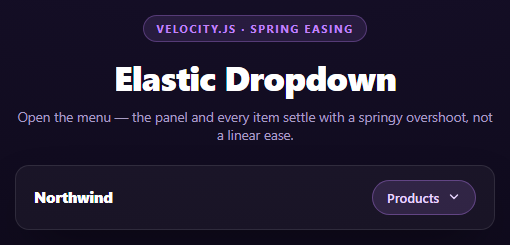
Most dropdown menus ease open with a plain ease-out curve — quick then slow, never past the target. That reads as "software animating a box." A menu that feels physical needs to overshoot slightly and settle, the way a real hinge or spring would. Velocity.js ships a physics-based spring easing curve out of the box, and this snippet uses it to make a plain dropdown feel tactile without pulling in a full physics library.
Why Velocity instead of CSS transitions
Velocity.js's core API, Velocity(element, properties, options), is a drop-in replacement for jQuery's .animate() that runs on the native DOM and batches style writes so animating dozens of elements doesn't thrash layout. It also exposes easing curves CSS transition-timing-function can't express cleanly — most importantly easing: 'spring', which is not a Bézier curve at all but a physics simulation (tension/friction) that Velocity samples every frame.
The spring easing on the panel
js
Velocity(panel, { opacity: 1, translateY: [0, -10], scaleY: [1, 0.85] }, { duration: 600, easing: 'spring' })
Each property array is [endValue, startValue] in Velocity's shorthand — so translateY: [0, -10] explicitly starts the panel 10px above its resting position and animates to 0, while scaleY: [1, 0.85] starts it compressed to 85% height and grows to full scale. With easing: 'spring', that growth doesn't stop cleanly at 1 — it overshoots past 1 by a small margin and oscillates back, which is what makes the panel feel like it's unfolding under tension rather than just fading up.
Per-item stagger without a loop
js
Velocity(items, { opacity: 1, translateY: [0, -8] }, { stagger: 60, duration: 500, easing: [220, 16] })
Velocity accepts a NodeList directly as the target and a stagger option in the options object — no manual forEach loop needed. Passing 60 means each subsequent item's animation start is delayed 60ms after the previous one, so the four menu items cascade in visibly rather than popping together. The easing here, [220, 16], is Velocity's shorthand for a custom spring — the first number is tension, the second is friction. Higher tension means a snappier spring; lower friction means more visible overshoot/wobble before it settles. Tuning these two numbers is how you dial the "bounciness" without touching a single keyframe.
Closing is deliberately not the mirror of opening
The close animation uses easing: 'easeOutQuad' and a short 160ms duration for the items, then easeInQuad for the panel with a complete callback that sets visibility: hidden only after the fade finishes. Springs look great appearing but feel sluggish disappearing — nobody wants to wait for an overshoot on the way out — so closing uses fast, no-overshoot easing while opening keeps the spring. The complete callback matters because opacity: 0 alone leaves the panel invisible but still hoverable/tabbable; hiding it after the animation keeps it out of the accessibility tree.
Reusing it
Swap the menu items for a real product catalog or account switcher, or attach the same openMenu/closeMenu pair to a mobile hamburger panel. The spring numbers [220, 16] are worth exposing as a settings control — see how a stiffer [400, 20] feels versus a looser [160, 10].
Build with AI
Build, Understand, Optimize, and Extend It With AI
This snippet is a good vehicle for understanding easing curves that go beyond CSS. Paste the code into an AI assistant like Claude and ask it to explain the mathematical difference between a spring simulation and a cubic-bezier curve, and why only the former can overshoot past its target value. Then ask what happens if you swap easing: 'spring' for a plain 'ease-out' on the panel — the overshoot disappears and it starts to feel mechanical rather than physical, which is worth seeing side by side. For extension, ask it to add a second custom spring for a "wobble on hover" micro-interaction on each item, make the stagger direction reverse on close (last item closes first), or convert the dropdown into a full mega-menu with multiple columns that each stagger independently.
Prompt to recreate it
Copy this into your AI assistant of choice to build the effect from scratch, or as a jumping-off point for your own variant:
Build an "elastic dropdown menu" using Velocity.js (v2, from a CDN, no jQuery) in plain HTML, CSS, and JavaScript.

Requirements:
- A nav bar with a logo and a single trigger button labeled "Products" with a chevron icon that rotates 180deg via CSS transition when open.
- A dropdown panel, absolutely positioned below the trigger, containing 4 menu items each with an icon, a bold title, and a small description line.
- On open: animate the panel with Velocity(panel, { opacity: 1, translateY: [0,-10], scaleY: [1,0.85] }, { duration: 600, easing: 'spring' }) so it uses Velocity's built-in physics-based spring easing (not a Bézier curve) and visibly overshoots slightly before settling.
- Animate the menu items with a single Velocity call targeting the NodeList directly (not a forEach loop) using the built-in stagger option (around 60ms) and a custom spring easing array like [220, 16] (tension, friction) so each item cascades in with its own slight bounce.
- On close: use fast, non-bouncy easing (easeOutQuad/easeInQuad) with a much shorter duration than the open animation — springs should only be used for appearing, not disappearing — and set the panel's visibility to hidden only inside Velocity's complete callback, after the fade finishes, so it leaves the tab order without an abrupt cut.
- Toggle aria-expanded on the trigger and close the menu when a click lands outside the nav element.
- Style it as a dark, premium nav bar with a translucent panel, soft border, and a large soft outer shadow beneath both the bar and the dropdown.
Want to tighten it up first? Run this prompt through the AI Prompt Studio to score it across 8 quality dimensions, catch anti-patterns, and tune the wording for Claude, ChatGPT, or Gemini before you paste it in.
Source Code
<div class="vem-stage">
  <div class="vem-head">
    <span class="vem-tag">velocity.js · spring easing</span>
    <h2>Elastic Dropdown</h2>
    <p>Open the menu — the panel and every item settle with a springy overshoot, not a linear ease.</p>
  </div>
  <nav class="vem-nav">
    <div class="vem-bar">
      <span class="vem-logo">Northwind</span>
      <button class="vem-trigger" id="vemTrigger" aria-expanded="false">
        <span>Products</span>
        <svg viewBox="0 0 20 20" width="14" height="14"><path d="M5 7l5 5 5-5" stroke="currentColor" stroke-width="2" fill="none" stroke-linecap="round" stroke-linejoin="round"/></svg>
      </button>
    </div>
    <div class="vem-panel" id="vemPanel">
      <a class="vem-item" href="#"><span class="vem-ico">📊</span><div><strong>Analytics</strong><small>Track every metric that matters</small></div></a>
      <a class="vem-item" href="#"><span class="vem-ico">🧩</span><div><strong>Integrations</strong><small>Connect the tools you already use</small></div></a>
      <a class="vem-item" href="#"><span class="vem-ico">🛡️</span><div><strong>Security</strong><small>SOC2-ready from day one</small></div></a>
      <a class="vem-item" href="#"><span class="vem-ico">⚡</span><div><strong>Automations</strong><small>Ship rules without writing code</small></div></a>
    </div>
  </nav>
</div>*{box-sizing:border-box;margin:0;padding:0}
body{font-family:system-ui,-apple-system,sans-serif;background:radial-gradient(120% 100% at 50% 0%,#1a1230,#0a0713);color:#fff;min-height:100vh;display:flex;align-items:center;justify-content:center;padding:24px}
.vem-stage{width:min(480px,94vw);display:flex;flex-direction:column;align-items:center;gap:22px}
.vem-head{text-align:center}
.vem-tag{display:inline-block;font-size:11px;font-weight:700;letter-spacing:.14em;text-transform:uppercase;color:#c084fc;background:rgba(192,132,252,.12);border:1px solid rgba(192,132,252,.3);padding:5px 12px;border-radius:99px;margin-bottom:12px}
.vem-head h2{font-size:clamp(24px,5vw,34px);font-weight:800;letter-spacing:-.02em}
.vem-head p{font-size:13.5px;color:#a89cc4;margin-top:7px}
.vem-nav{width:100%;position:relative}
.vem-bar{display:flex;align-items:center;justify-content:space-between;background:rgba(255,255,255,.04);border:1px solid rgba(255,255,255,.1);border-radius:14px;padding:14px 18px;box-shadow:0 20px 50px -20px rgba(0,0,0,.7)}
.vem-logo{font-weight:800;font-size:15px;letter-spacing:-.01em}
.vem-trigger{display:flex;align-items:center;gap:8px;background:rgba(192,132,252,.14);border:1px solid rgba(192,132,252,.35);color:#e9d5ff;font:600 13px system-ui;padding:8px 14px;border-radius:99px;cursor:pointer}
.vem-trigger svg{transition:transform .2s}
.vem-trigger[aria-expanded="true"] svg{transform:rotate(180deg)}
.vem-panel{position:absolute;top:calc(100% + 10px);left:0;right:0;background:#150f24;border:1px solid rgba(255,255,255,.1);border-radius:14px;padding:10px;box-shadow:0 30px 70px -20px rgba(0,0,0,.85);display:flex;flex-direction:column;gap:4px;transform-origin:top center;opacity:0;visibility:hidden}
.vem-item{display:flex;align-items:center;gap:12px;padding:10px 12px;border-radius:10px;text-decoration:none;color:#fff;opacity:0;transform:translateY(-8px)}
.vem-item:hover{background:rgba(192,132,252,.12)}
.vem-ico{font-size:18px;width:30px;text-align:center}
.vem-item strong{display:block;font-size:13.5px}
.vem-item small{display:block;font-size:11.5px;color:#a89cc4;margin-top:1px}var trigger = document.getElementById('vemTrigger');
var panel = document.getElementById('vemPanel');
var items = panel.querySelectorAll('.vem-item');
var open = false;
function openMenu() {
open = true;
trigger.setAttribute('aria-expanded', 'true');
Velocity(panel, { opacity: 1, translateY: [0, -10], scaleY: [1, 0.85] }, { display: 'flex', visibility: 'visible', duration: 600, easing: 'spring' });
Velocity(items, { opacity: 1, translateY: [0, -8] }, { stagger: 60, duration: 500, easing: [220, 16] });
}
function closeMenu() {
open = false;
trigger.setAttribute('aria-expanded', 'false');
Velocity(items, { opacity: 0, translateY: -8 }, { duration: 160, easing: 'easeOutQuad' });
Velocity(panel, { opacity: 0, scaleY: 0.85 }, { duration: 220, easing: 'easeInQuad', complete: function () { panel.style.visibility = 'hidden'; } });
}
trigger.addEventListener('click', function () {
if (open) { closeMenu(); } else { openMenu(); }
});
document.addEventListener('click', function (e) {
if (open && !e.target.closest('.vem-nav')) closeMenu();
});Step by step
How to Use
- 1Add the Velocity.js CDNInclude velocity-animate from the CDN panel — one script tag, no jQuery required.
- 2Paste HTML, CSS, and JSA nav bar with a Products trigger and a hidden dropdown panel renders closed.
- 3Click the triggerThe panel scales and translates in with spring easing while items stagger in below it.
- 4Click outside or the trigger againThe menu closes fast with no overshoot, then hides visibility so it leaves the tab order.
- 5Tune the springAdjust the [tension, friction] pair in the items easing array to change how bouncy the settle feels.
- 6Wire real linksReplace the four vem-item anchors with your actual navigation destinations.
Real-world uses
Common Use Cases
Got questions?
Frequently Asked Questions
It is not a Bézier curve — Velocity runs a damped harmonic oscillator simulation (tension and friction) and samples its position every frame. That's why the panel visibly overshoots past its target scale before settling, something a CSS cubic-bezier can't express because those curves are monotonic between 0 and 1 by convention.
They are a custom spring definition: the first number is tension (higher = snappier, faster settle) and the second is friction (lower = more visible bounce/oscillation before settling). This is Velocity-specific shorthand, separate from the named "spring" preset used on the panel.
That's Velocity's shorthand for explicitly setting the start value: the first item in the array is the value to animate TO, the second is the value to animate FROM. It lets you force a starting position (like -10px above rest) without a separate CSS class or a Velocity('scroll') style setup call.
A spring overshoot looks delightful when something appears but feels laggy when dismissing it — you're waiting for a wobble on your way out. Closing uses easeOutQuad/easeInQuad with a short duration so the menu disappears immediately and predictably, while opening keeps the spring for personality.
opacity: 0 makes an element invisible but it is still in the layout and still focusable/tabbable, so keyboard users could tab into a menu they can't see. Setting visibility: hidden after the fade completes removes it from the accessibility tree and tab order without an abrupt visual cut.
Keep a ref to the panel and item elements, call Velocity() imperatively inside a click handler exactly as shown — Velocity works directly on real DOM nodes, so it does not need special framework bindings. Toggle a boolean in state for aria-expanded and initial render visibility, and run the closing Velocity call in a cleanup function if the component can unmount while open.