Learn Coding Visually
Learn to code with interactive, live-preview playgrounds — HTML, CSS, JavaScript, React & more.
 HTML Playground42 lessons · Click-based · Live preview
 CSS PlaygroundLearn CSS with a live editor
 JavaScript Playground60 lessons · DOM · Async · Canvas
 React PlaygroundLearn React with a live code editor
 GSAP PlaygroundLearn GSAP animation interactively
 SVG Playground44 lessons · shapes · paths · animation
 SCSS Playground45 lessons · Sass modules · tokens
 Tailwind PlaygroundLearn Tailwind CSS with a live editor
 Bootstrap 5 Playground50 lessons · live preview
PhotoSwipe Gallery with Captions — Free JS Snippet
PhotoSwipe Full-Screen Gallery with Captions · Media · Plain HTML, CSS & JS · Live preview
What's included
Features
About this UI Snippet
PhotoSwipe Full-Screen Gallery with Captions — HTML, CSS & JavaScript
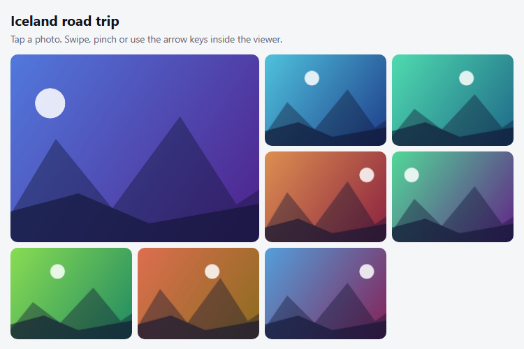
A lightbox has three jobs: show the picture large, let people move between pictures without thinking, and get out of the way on a phone. PhotoSwipe is built around the mobile case. It handles swipe between slides, pinch-to-zoom, double-tap to zoom, vertical drag to close and pan when zoomed, using the same gestures people already know from their phone's photo app, and it also supports keyboard arrows, Escape, the mouse wheel and browser history.
Version 5 splits the library in two: a small lightbox module that lives on the page and finds your thumbnails, and the core viewer, loaded only when someone actually opens a photo. Both are passed to the constructor — gallery is a selector for the container, children finds the links inside it, and pswpModule supplies the viewer. In this snippet both UMD scripts are loaded from a CDN so the globals PhotoSwipeLightbox and PhotoSwipe exist; in a bundler setup the core is usually a dynamic import so it stays out of the initial page weight.
The requirement people trip over is size. PhotoSwipe needs each image's real pixel dimensions before it opens, supplied as data-pswp-width and data-pswp-height on the link, because it uses them to lay out the slide and compute the thumbnail-to-fullscreen zoom animation. Without them the viewer cannot animate, or the image renders at the wrong size. showHideAnimationType: 'zoom' is the effect where the thumbnail visibly grows into the viewer, and it depends on that data being right.
Captions are not built in; they are added by registering a custom UI element. On the uiRegister event, pswp.ui.registerElement creates a caption container appended to the viewer's root, and its onInit hook listens for the change event to update the text from the current slide's source link. Because it belongs to PhotoSwipe's UI layer, the caption fades with the other controls when the user is idle. The gradient background keeps white text readable on both light and dark photos. The images here are generated on a canvas so the demo is self-contained; in a real gallery they are ordinary image URLs.
Build with AI
Build, Understand, Optimize, and Extend It With AI
Ask an AI assistant like Claude to add a download button in the viewer toolbar, share links using registerElement, or lazy-load the PhotoSwipe core with a dynamic import.
Prompt to recreate it
Copy this into your AI assistant of choice to build the effect from scratch, or as a jumping-off point for your own variant:
Build a thumbnail gallery with PhotoSwipe 5 loaded from a CDN (photoswipe.css plus the UMD lightbox and core scripts).

Requirements:
- Render eight links with data-pswp-width and data-pswp-height, each containing an <img> thumbnail; the first spans two grid cells.
- Create new PhotoSwipeLightbox({ gallery, children: 'a', pswpModule: PhotoSwipe, showHideAnimationType: 'zoom', wheelToZoom: true }) and call init().
- Add a caption bar by registering a custom UI element on the 'uiRegister' event, updating it on the 'change' event with the current slide title, description and "n of total".
- Give every thumbnail an aria-label and a visible focus outline.
- Generate the images on canvases so the demo needs no files.
Want to tighten it up first? Run this prompt through the AI Prompt Studio to score it across 8 quality dimensions, catch anti-patterns, and tune the wording for Claude, ChatGPT, or Gemini before you paste it in.
Source Code
<div class="ps-wrap">
  <h3 class="ps-title">Iceland road trip</h3>
  <p class="ps-sub">Tap a photo. Swipe, pinch or use the arrow keys inside the viewer.</p>
  <div class="ps-grid" id="psGallery"></div>
</div>
body { background: #f5f6f8; padding: 22px; font-family: system-ui, sans-serif; }
.ps-wrap { max-width: 720px; margin: 0 auto; }
.ps-title { margin: 0; font-size: 20px; color: #12161f; }
.ps-sub { margin: 4px 0 14px; font-size: 13.5px; color: #5d6577; }
.ps-grid { display: grid; grid-template-columns: repeat(4, 1fr); gap: 8px; }
@media (max-width: 560px) { .ps-grid { grid-template-columns: repeat(2, 1fr); } }
.ps-grid a { position: relative; display: block; aspect-ratio: 4 / 3; border-radius: 10px; overflow: hidden; background: #dfe3ea; }
.ps-grid a:nth-child(1) { grid-column: span 2; grid-row: span 2; aspect-ratio: auto; }
.ps-grid img { width: 100%; height: 100%; object-fit: cover; display: block; transition: transform .35s; }
.ps-grid a:hover img, .ps-grid a:focus-visible img { transform: scale(1.06); }
.ps-grid a:focus-visible { outline: 3px solid #4f46e5; outline-offset: 2px; }
.ps-cap { position: absolute; left: 0; right: 0; bottom: 0; padding: 22px 10px 8px; font-size: 12px; font-weight: 600; color: #fff; background: linear-gradient(transparent, rgba(0,0,0,.6)); opacity: 0; transition: opacity .2s; }
.ps-grid a:hover .ps-cap, .ps-grid a:focus-visible .ps-cap { opacity: 1; }
/* caption bar inside the open viewer */
.pswp__custom-caption { position: absolute; left: 0; right: 0; bottom: 0; padding: 18px 20px 22px; text-align: center; color: #fff; font: 500 15px/1.4 system-ui, sans-serif; background: linear-gradient(transparent, rgba(0,0,0,.65)); pointer-events: none; }
.pswp__custom-caption b { display: block; font-size: 16px; margin-bottom: 2px; }
.pswp__custom-caption span { opacity: .8; font-size: 13px; }const SHOTS = [
{ t: 'Black sand beach at dawn', d: 'Reynisfjara, south coast', h: [222, 268] },
{ t: 'Glacier lagoon', d: 'Jokulsarlon, ice drifting to the sea', h: [190, 225] },
{ t: 'Waterfall in the mist', d: 'Seljalandsfoss', h: [160, 200] },
{ t: 'Highland road', d: 'F208, Landmannalaugar', h: [28, 340] },
{ t: 'Northern lights', d: 'Near Vik, 11 pm', h: [150, 280] },
{ t: 'Turf-roofed church', d: 'Hofskirkja, Skaftafell', h: [95, 160] },
{ t: 'Geothermal valley', d: 'Hverir, steaming vents', h: [12, 45] },
{ t: 'Puffin cliff', d: 'Latrabjarg, westfjords', h: [205, 330] },
];
// Draw each "photo" once, at the full size the viewer will show.
function art(i, w, h, hues) {
const c = document.createElement('canvas'); c.width = w; c.height = h;
const x = c.getContext('2d');
const g = x.createLinearGradient(0, 0, w, h);
g.addColorStop(0, 'hsl(' + hues[0] + ',70%,60%)'); g.addColorStop(1, 'hsl(' + hues[1] + ',65%,32%)');
x.fillStyle = g; x.fillRect(0, 0, w, h);
x.fillStyle = 'rgba(255,255,255,.85)'; x.beginPath(); x.arc(w * (0.2 + (i % 4) * 0.2), h * 0.26, h * 0.08, 0, 7); x.fill();
const k = 0.75 + (i % 3) * 0.12;
x.fillStyle = 'rgba(15,20,50,.4)';
x.beginPath(); x.moveTo(0, h); x.lineTo(w * 0.22, h * 0.6 * k); x.lineTo(w * 0.42, h * 0.82); x.lineTo(w * 0.66, h * 0.44 * k); x.lineTo(w * 0.86, h * 0.8); x.lineTo(w, h * 0.66); x.lineTo(w, h); x.fill();
x.fillStyle = 'rgba(15,20,50,.6)';
x.beginPath(); x.moveTo(0, h); x.lineTo(0, h * 0.86); x.lineTo(w * 0.3, h * 0.74); x.lineTo(w * 0.55, h * 0.9); x.lineTo(w, h * 0.78); x.lineTo(w, h); x.fill();
return c.toDataURL('image/jpeg', 0.85);
}
const W = 1600, H = 1067;
const gallery = document.getElementById('psGallery');
gallery.innerHTML = SHOTS.map(function (s, i) {
const url = art(i, W, H, s.h);
// PhotoSwipe needs the real pixel size up front so it can lay out the zoom animation.
return '<a href="' + url + '" data-pswp-width="' + W + '" data-pswp-height="' + H + '" data-title="' + s.t + '" data-desc="' + s.d + '" aria-label="Open photo: ' + s.t + '">' +
'<img src="' + url + '" alt="' + s.t + '"><span class="ps-cap">' + s.t + '</span></a>';
}).join('');
const lightbox = new PhotoSwipeLightbox({
gallery: '#psGallery',
children: 'a',
pswpModule: PhotoSwipe,
bgOpacity: 0.92,
wheelToZoom: true,
showHideAnimationType: 'zoom', // the thumbnail visibly grows into the viewer
});
// Caption element, registered on PhotoSwipe's own UI so it shows/hides with the controls.
lightbox.on('uiRegister', function () {
lightbox.pswp.ui.registerElement({
name: 'custom-caption',
order: 9,
isButton: false,
appendTo: 'root',
onInit: function (el, pswp) {
pswp.on('change', function () {
const a = pswp.currSlide.data.element;
const n = pswp.currIndex + 1;
el.innerHTML = '<b>' + a.dataset.title + '</b><span>' + a.dataset.desc + ' · ' + n + ' of ' + pswp.getNumItems() + '</span>';
});
},
});
});
lightbox.init();Step by step
How to Use
- 1Open a photoClick any thumbnail. It zooms smoothly into a full-screen viewer with a caption at the bottom.
- 2Move between photosSwipe, use the arrow keys, or click the arrow buttons. The caption and counter update.
- 3Zoom inDouble-click or pinch to zoom, use the mouse wheel on desktop, then drag to pan the image.
- 4Close the viewerPress Escape, click the × button, or drag the image vertically on a touch screen.
- 5Check the gridHover a thumbnail to see its caption preview; the first image spans two rows and columns.
Real-world uses
Common Use Cases
Got questions?
Frequently Asked Questions
It needs the real pixel dimensions to lay out the slide and compute the zoom animation from the thumbnail before the full image has loaded.
Register a custom element with pswp.ui.registerElement on the uiRegister event, and update its content on the change event from the current slide's source element.
The lightbox is a small helper that finds your thumbnails and opens the viewer; pswpModule is the larger core viewer, which can be loaded lazily.
Yes. Import PhotoSwipeLightbox and pass pswpModule: () => import("photoswipe") so the viewer is code-split.
Yes. Provide a srcset or use the dataSource option to give different image URLs per screen size.
It supports keyboard navigation and returns focus on close, but you should still provide meaningful alt text and aria-labels on the thumbnail links.
Yes. Use the JSX, Vue, Angular or Tailwind export buttons on this page to convert the markup and styles. The behaviour comes from PhotoSwipe, so in a framework project install it with npm install photoswipe instead of the CDN tag, create the lightbox in useEffect / onMounted / ngAfterViewInit and import the core module lazily, and release it with lightbox.destroy() when the component unmounts.