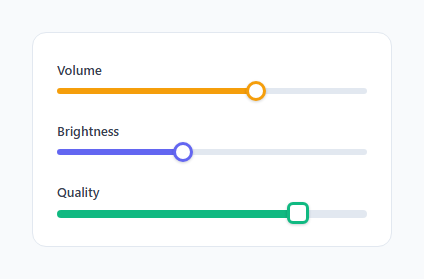
Styled Range Slider — CSS Only Vendor Pseudo-Elements (No JavaScript)

Plan Comparison Slider — Drag to Reveal Basic vs Pro Features
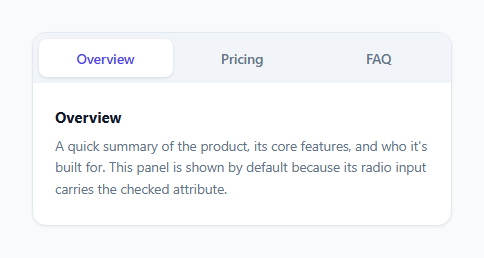
Tab Switcher — CSS Only Radio Hack (No JavaScript)

Styled Radio Buttons — CSS Only Plan Selector (No JavaScript)

Star Rating — CSS Only Radio Hack (No JavaScript)

Simple Hover Tooltip — CSS Only, Truly Zero JavaScript
Learn Coding Visually
Learn to code with interactive, live-preview playgrounds — HTML, CSS, JavaScript, React & more.
 HTML Playground42 lessons · Click-based · Live preview
 CSS PlaygroundLearn CSS with a live editor
 JavaScript Playground60 lessons · DOM · Async · Canvas
 React PlaygroundLearn React with a live code editor
 GSAP PlaygroundLearn GSAP animation interactively
 SVG Playground44 lessons · shapes · paths · animation
 SCSS Playground45 lessons · Sass modules · tokens
 Tailwind PlaygroundLearn Tailwind CSS with a live editor
 Bootstrap 5 Playground50 lessons · live preview
CSS Only Before/After Image Slider — Stepped Radio Positions, No JS
Before/After Image Slider — CSS Only Radio Steps (No JavaScript) · Misc · Plain HTML & CSS · Live preview
What's included
Features
About this UI Snippet
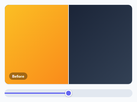
Before/After Comparison Slider — Pure CSS Stepped Positions via Radio Inputs and clip-path
A true drag-anywhere before/after slider reads the pointer's continuous X position and feeds it into a clip-path percentage every frame — that is fundamentally a JavaScript problem, because CSS has no mechanism to read an arbitrary pointer coordinate and convert it into a style value. This snippet is transparent about that limitation and solves a close, genuinely useful approximation instead: a five-position stepped slider, using the same radio-hack state machine as this batch's star rating and tab switcher.
The real limitation, stated plainly
There is no pure-CSS way to implement true continuous drag-to-reveal comparison. The common workaround people reach for — layering a native <input type="range"> on top and trying to read its value into clip-path — doesn't work either, because attr() only reads static HTML attributes, and a range input's live value while dragging is a DOM property, not an attribute CSS can observe. Any implementation claiming continuous CSS-only drag is either quietly using a few lines of JavaScript or not actually continuous. This snippet picks five fixed stop positions instead — 0%, 25%, 50%, 75%, 100% — and is upfront that this is a stepped approximation, not true pixel-level dragging.
How the split itself works: clip-path on the top layer
Two full-size image layers are stacked with position: absolute; inset: 0 — .layer-after underneath, .layer-before on top. .layer-before is clipped with clip-path: inset(0 <right> 0 0), which cuts away everything past a given distance from the left edge, revealing the .layer-after layer beneath through the clipped-away region. Each of the five radio :checked states sets a different inset() right-offset — checking #split75 sets clip-path: inset(0 25% 0 0), showing 75% of the "before" layer from the left. clip-path transitions smoothly between values, so even though the *positions* are discrete stops, the *motion* between them is a smooth animated slide, not an instant jump.
Why radios, not checkboxes
Exactly one stop can be "current" at a time — the same mutual-exclusivity requirement as the tab switcher and star rating elsewhere in this batch — so the five stop inputs share name="split", guaranteeing the browser enforces single selection with no extra logic.
Two independent visual consumers of one state
The five radios drive two separate sibling subtrees simultaneously: the actual image comparison (.divider position and .layer-before clip) and a separate slider-track UI (.stops-fill width and .stops-handle position) that visually resembles a draggable range control, built from styled <label> stop markers. Both respond to the same five :checked states through independent sibling-selector rule blocks — a single state, multiple styled consumers, which is a recurring pattern across every checkbox/radio-hack snippet in this batch.
Honest comparison to a JS-powered version
A JavaScript implementation reading pointermove events can update clip-path continuously to any arbitrary percentage as the user drags, producing a true 1:1 drag feel. This version snaps to the nearest of five preset positions and animates the transition between them — a meaningfully different, coarser interaction. It is the right choice when "compare roughly how much changed" is enough and zero JavaScript is a hard requirement; it is the wrong choice when users need to precisely land on an arbitrary position, which genuinely requires a few lines of script listening to pointer or range-input events.
Build with AI
Build, Understand, Optimize, and Extend It With AI
Ask an AI assistant to explain precisely why attr() cannot be used to read a range input's live value for driving clip-path — this is a common point of confusion, and understanding it clarifies why the stepped-radio approach here is a deliberate, honest choice rather than an oversight. It's also worth asking for a version with more stop positions for finer granularity, or for the minimal JavaScript addition (a single input-event listener updating a CSS custom property) that would upgrade this into a true continuous-drag slider while keeping the rest of the CSS unchanged.
Prompt to recreate it
Copy this into your AI assistant of choice to build the effect from scratch, or as a jumping-off point for your own variant:
Build a before/after image comparison slider using only HTML and CSS — no JavaScript, no onclick/oninput attributes, no <script> tags — using a stepped rather than continuous drag interaction, and be explicit in code comments about why continuous drag is not achievable without JavaScript.

Requirements:
- Two full-frame stacked image layers, where the top layer is clipped using clip-path: inset() to reveal varying amounts of the layer beneath it.
- Five mutually-exclusive radio inputs sharing one name attribute represent five fixed comparison positions (0%, 25%, 50%, 75%, 100%), each setting a different clip-path inset value on the top layer with a smooth CSS transition between positions.
- Build a separate slider-track UI element (styled labels acting as stop markers, a fill bar, and a handle indicator) that visually resembles a draggable slider and stays in sync with the same five radio states, driven purely by CSS sibling selectors from the same inputs.
- One radio should be checked by default, showing a 50/50 split on initial render.
- Ensure the control is operable via keyboard using only the radio group's native Tab and Arrow-key behavior.
- Do not attempt to fake continuous dragging with attr() or any other CSS-only trick reading a live range input value — use the fixed-stop approach and document the tradeoff clearly.
Want to tighten it up first? Run this prompt through the AI Prompt Studio to score it across 8 quality dimensions, catch anti-patterns, and tune the wording for Claude, ChatGPT, or Gemini before you paste it in.
Source Code
<div class="demo">
  <div class="compare">
    <input type="radio" name="split" id="split0" class="split-input" />
    <input type="radio" name="split" id="split25" class="split-input" />
    <input type="radio" name="split" id="split50" class="split-input" checked />
    <input type="radio" name="split" id="split75" class="split-input" />
    <input type="radio" name="split" id="split100" class="split-input" />

    <div class="compare-frame">
      <div class="layer layer-after">
        <span class="layer-tag tag-after">After</span>
      </div>
      <div class="layer layer-before">
        <span class="layer-tag tag-before">Before</span>
      </div>
      <div class="divider"></div>
    </div>

    <div class="stops" role="group" aria-label="Comparison slider position">
      <div class="stops-track">
        <label for="split0" class="stop" aria-label="Show all before"></label>
        <label for="split25" class="stop" aria-label="25 percent"></label>
        <label for="split50" class="stop" aria-label="50 percent"></label>
        <label for="split75" class="stop" aria-label="75 percent"></label>
        <label for="split100" class="stop" aria-label="Show all after"></label>
        <div class="stops-fill"></div>
        <div class="stops-handle"></div>
      </div>
    </div>
  </div>
</div>
* { box-sizing: border-box; margin: 0; padding: 0; }
body { font-family: system-ui, sans-serif; background: #f8fafc; display: flex; align-items: center; justify-content: center; min-height: 100vh; padding: 24px; }
.compare { width: 420px; max-width: 100%; display: flex; flex-direction: column; gap: 16px; }
.compare-frame { position: relative; width: 100%; aspect-ratio: 16 / 10; border-radius: 14px; overflow: hidden; border: 1px solid #e2e8f0; box-shadow: 0 1px 3px rgba(15,23,42,0.08); }
.layer { position: absolute; inset: 0; display: flex; align-items: flex-end; padding: 14px; }
.layer-after { background: linear-gradient(135deg, #0f172a, #334155); }
.layer-before { background: linear-gradient(135deg, #fbbf24, #f97316); }
.layer-tag { font-size: 12px; font-weight: 700; color: #fff; background: rgba(0,0,0,0.35); padding: 4px 10px; border-radius: 999px; letter-spacing: 0.03em; }
/* The "before" layer is clipped from the right; its visible width is set
per radio-checked state below, which is what creates the split effect */
.layer-before { clip-path: inset(0 50% 0 0); transition: clip-path 0.35s cubic-bezier(0.4, 0, 0.2, 1); }
.divider { position: absolute; top: 0; bottom: 0; left: 50%; width: 2px; background: #fff; box-shadow: 0 0 0 1px rgba(0,0,0,0.15); transform: translateX(-1px); transition: left 0.35s cubic-bezier(0.4, 0, 0.2, 1); pointer-events: none; }
.split-input { position: absolute; opacity: 0; pointer-events: none; }
/* The five radios are direct children of .compare, placed before both
.compare-frame and .stops, so the ~ general sibling combinator reaches
into each of those two subtrees independently from the same state */
#split0:checked ~ .compare-frame .layer-before { clip-path: inset(0 100% 0 0); }
#split0:checked ~ .compare-frame .divider { left: 0%; }
#split25:checked ~ .compare-frame .layer-before { clip-path: inset(0 75% 0 0); }
#split25:checked ~ .compare-frame .divider { left: 25%; }
#split50:checked ~ .compare-frame .layer-before { clip-path: inset(0 50% 0 0); }
#split50:checked ~ .compare-frame .divider { left: 50%; }
#split75:checked ~ .compare-frame .layer-before { clip-path: inset(0 25% 0 0); }
#split75:checked ~ .compare-frame .divider { left: 75%; }
#split100:checked ~ .compare-frame .layer-before { clip-path: inset(0 0% 0 0); }
#split100:checked ~ .compare-frame .divider { left: 100%; }
.stops-track { position: relative; height: 26px; border-radius: 999px; background: #e2e8f0; display: flex; align-items: center; justify-content: space-between; padding: 0 2px; }
.stop { position: relative; z-index: 3; width: 22px; height: 22px; border-radius: 50%; cursor: pointer; }
.split-input:focus-visible ~ .stops .stops-track .stop:hover { outline: 2px solid #6366f1; }
.stop:hover { outline: 2px solid #a5b4fc; }
.stops-fill { position: absolute; top: 50%; left: 0; height: 4px; background: #6366f1; border-radius: 999px; transform: translateY(-50%); transition: width 0.35s cubic-bezier(0.4, 0, 0.2, 1); z-index: 1; }
.stops-handle { position: absolute; top: 50%; width: 22px; height: 22px; border-radius: 50%; background: #6366f1; border: 3px solid #fff; box-shadow: 0 1px 4px rgba(15,23,42,0.3); transform: translate(-50%, -50%); transition: left 0.35s cubic-bezier(0.4, 0, 0.2, 1); z-index: 2; pointer-events: none; }
#split0:checked ~ .stops .stops-track .stops-fill { width: 0%; }
#split0:checked ~ .stops .stops-track .stops-handle { left: 0%; }
#split25:checked ~ .stops .stops-track .stops-fill { width: 25%; }
#split25:checked ~ .stops .stops-track .stops-handle { left: 25%; }
#split50:checked ~ .stops .stops-track .stops-fill { width: 50%; }
#split50:checked ~ .stops .stops-track .stops-handle { left: 50%; }
#split75:checked ~ .stops .stops-track .stops-fill { width: 75%; }
#split75:checked ~ .stops .stops-track .stops-handle { left: 75%; }
#split100:checked ~ .stops .stops-track .stops-fill { width: 100%; }
#split100:checked ~ .stops .stops-track .stops-handle { left: 100%; }
Step by step
How to Use
- 1Replace the two gradient layers with real imagesSwap .layer-after and .layer-before's backgrounds for background-image or nested <img> elements sized to fill the frame identically.
- 2Keep radios before both consumer blocks in markupThe five .split-input radios must appear before both .compare-frame and .stops in the DOM for the ~ sibling selectors on both to match.
- 3Add or remove stop positionsEach stop needs a radio, a label in .stops-track, and a matching pair of #splitN:checked rules for the frame and the track visuals — five is a good default, more gives finer steps.
- 4Set a default positionThe checked attribute on one radio (50% by default here) determines the initial comparison split shown on page load.
- 5Decide if stepped motion is acceptableIf true continuous drag is required, this pattern is the wrong tool — use a JS pointermove-driven clip-path update instead.
Real-world uses
Common Use Cases
Got questions?
Frequently Asked Questions
attr() can only read static HTML attributes present in the markup, not a form control's live value property, which is what changes as a user drags a range input. There is no CSS-only way to observe that live value, which is exactly why this snippet uses discrete radio stops instead of attempting (and failing at) true continuous drag.
A JS version listens for pointermove or an input event and sets clip-path to the exact live percentage, giving true 1:1 drag. This version snaps between five preset positions with an animated transition — visually similar at rest, but coarser and non-continuous during interaction.
Yes — add more radio/label pairs with evenly-spaced percentage values and matching #splitN:checked rules for both the image clip-path and the track fill/handle position. More stops narrow the gap toward (but never reach) continuous dragging.
Yes — because the stops are real radio inputs sharing one name, Tab moves focus into the group and Arrow keys move the checked stop using native browser radio-group behavior, with no custom key handling required.
clip-path and the divider's left offset are both CSS properties with a transition applied, so even though only five discrete values are ever set, the browser animates smoothly between whichever two values change when a different radio becomes checked.