


Learn Coding Visually
Learn to code with interactive, live-preview playgrounds — HTML, CSS, JavaScript, React & more.
 HTML Playground42 lessons · Click-based · Live preview
 CSS PlaygroundLearn CSS with a live editor
 JavaScript Playground60 lessons · DOM · Async · Canvas
 React PlaygroundLearn React with a live code editor
 GSAP PlaygroundLearn GSAP animation interactively
 SVG Playground44 lessons · shapes · paths · animation
 SCSS Playground45 lessons · Sass modules · tokens
 Tailwind PlaygroundLearn Tailwind CSS with a live editor
 Bootstrap 5 Playground50 lessons · live preview
CountUp.js Dashboard KPI Row — Staggered Start Delays Snippet
CountUp.js Dashboard KPI Row · Dashboards · Plain HTML, CSS & JS · Live preview
What's included
Features
About this UI Snippet
CountUp.js Dashboard KPI Row — Staggered Delays and Mixed Formatting, Explained
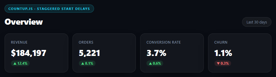
A dashboard's KPI row is usually the first thing a user reads, in a specific priority order — revenue matters more than churn, at a glance. Four numbers animating in simultaneously on load reads as a generic loading flourish; four numbers starting in the same left-to-right order the eye naturally reads reinforces that priority instead of fighting it. This snippet builds that with a plain setTimeout stagger and CountUp's per-instance formatting options.
Staggering starts, not durations
js
kpis.forEach(function (kpi) {
  setTimeout(function () {
    var counter = new countUp.CountUp(kpi.id, kpi.end, Object.assign({ duration: 1.6 }, kpi.options));
    if (!counter.error) counter.start();
  }, kpi.delay);
});
Each KPI carries its own delay value (0, 150, 300, 450ms) that controls when its count-up begins, not how long it takes — every counter still runs the same 1.6s duration once started. This is a deliberately different mechanism from CountUp's own useEasing/duration options, which only control a single counter's internal pacing; staggering the *start* across four independent counters needs the same kind of external timer this library reaches for whenever the effect spans multiple instances (compare with the IntersectionObserver-per-card approach in the stat-cards snippet, which staggers via scroll position instead of a fixed timer — appropriate here because a dashboard KPI row is typically already in view on load, with nothing to scroll to first).
Why plain setTimeout instead of a heavier scheduling utility
Four short, one-time delays with no need to cancel or reschedule them is exactly the case setTimeout is for — reaching for anime.js/Velocity stagger helpers or a full animation timeline library here would be solving a problem this simple case doesn't have. Each KPI's Object.assign({ duration: 1.6 }, kpi.options) pattern also keeps the shared default (duration) and the per-KPI overrides (formatting) cleanly separated in one line, rather than repeating duration: 1.6 in every config object.
Two distinct formatting styles in one row
kpiRevenue uses prefix: '$' with separator: ',' for a currency figure; kpiConversion and kpiChurn use decimalPlaces: 1 with suffix: '%' for percentages. Mixing formatting strategies within one visually uniform row is common on real dashboards — the tiles need to look identical structurally while the numbers themselves demand different precision and units — and CountUp's options object is what makes that possible without any manual string formatting per tile.
Reusing it
Feed kpis from a real analytics API response (fetching the current period's actual figures) and the stagger, formatting, and error-guard logic all keep working unchanged. Reorder the array to change both the visual left-to-right order and the animation stagger order together, since both are driven by the same array.
Build with AI
Build, Understand, Optimize, and Extend It With AI
This snippet demonstrates a small but real UX decision: staggering by start time versus staggering by duration. Paste it into an AI assistant like Claude and ask it to explain why changing each KPI's duration instead of its delay would produce a worse effect (tiles finishing at wildly different speeds rather than starting in sequence and running identically). Then ask it to compare this setTimeout-based stagger against the IntersectionObserver-based trigger used in the companion stat-cards snippet, and when each approach is the right one (visible-on-load dashboard vs. scroll-revealed marketing stats). For extension, ask it to wire the kpis array to a real fetch() call with a loading skeleton state before the numbers appear, add a subtle scale/fade entrance to each tile synced with its count starting, or make the delta badges themselves count up from 0 to their percentage value alongside the main number.
Prompt to recreate it
Copy this into your AI assistant of choice to build the effect from scratch, or as a jumping-off point for your own variant:
Build a "dashboard KPI row" using CountUp.js (v2, from a CDN, global countUp.CountUp) in plain HTML, CSS, and JavaScript.

Requirements:
- A header row with a section title and a "Last 30 days" period pill, above a responsive 4-column grid (collapsing to 2 columns on narrow screens) of KPI tiles: Revenue, Orders, Conversion Rate, and Churn — each tile shows a label, a large number, and a small colored up/down delta badge.
- Define the 4 KPIs as a JavaScript array of config objects, each with a target element id, an end value, a start delay in milliseconds (0, 150, 300, 450 — staggered by 150ms increments), and a CountUp options object. Revenue uses prefix: '$' with a thousands separator; Orders uses just a thousands separator; Conversion Rate and Churn both use decimalPlaces: 1 with a '%' suffix.
- Use plain setTimeout to stagger when each counter STARTS (not its duration) — all four counters should share the same duration (e.g. 1.6s) once started, so only the start time differs between them. Add a code comment explaining that staggering start time (not duration) is what makes the row read left-to-right in priority order while keeping every counter's motion visually consistent.
- Check counter.error before calling .start() on each instance.
- Style it as a dark theme with a cyan accent color, rounded bordered tiles with soft shadows, and green/red pill-shaped delta badges.
Want to tighten it up first? Run this prompt through the AI Prompt Studio to score it across 8 quality dimensions, catch anti-patterns, and tune the wording for Claude, ChatGPT, or Gemini before you paste it in.
Source Code
<div class="dkr-stage">
  <div class="dkr-head">
    <div><span class="dkr-tag">countup.js · staggered start delays</span><h2>Overview</h2></div>
    <span class="dkr-period">Last 30 days</span>
  </div>
  <div class="dkr-row">
    <div class="dkr-tile">
      <span class="dkr-lbl">Revenue</span>
      <span class="dkr-val" id="kpiRevenue">$0</span>
      <span class="dkr-delta dkr-up">▲ 12.4%</span>
    </div>
    <div class="dkr-tile">
      <span class="dkr-lbl">Orders</span>
      <span class="dkr-val" id="kpiOrders">0</span>
      <span class="dkr-delta dkr-up">▲ 8.1%</span>
    </div>
    <div class="dkr-tile">
      <span class="dkr-lbl">Conversion Rate</span>
      <span class="dkr-val" id="kpiConversion">0%</span>
      <span class="dkr-delta dkr-up">▲ 0.6%</span>
    </div>
    <div class="dkr-tile">
      <span class="dkr-lbl">Churn</span>
      <span class="dkr-val" id="kpiChurn">0%</span>
      <span class="dkr-delta dkr-down">▼ 0.3%</span>
    </div>
  </div>
</div>*{box-sizing:border-box;margin:0;padding:0}
body{font-family:system-ui,-apple-system,sans-serif;background:#0a0d14;color:#fff;min-height:100vh;padding:40px 24px;display:flex;align-items:center;justify-content:center}
.dkr-stage{width:min(880px,96vw);display:flex;flex-direction:column;gap:22px}
.dkr-head{display:flex;align-items:flex-end;justify-content:space-between;flex-wrap:wrap;gap:10px}
.dkr-tag{display:inline-block;font-size:11px;font-weight:700;letter-spacing:.14em;text-transform:uppercase;color:#22d3ee;background:rgba(34,211,238,.12);border:1px solid rgba(34,211,238,.3);padding:5px 12px;border-radius:99px;margin-bottom:10px}
.dkr-head h2{font-size:clamp(22px,4vw,28px);font-weight:800;letter-spacing:-.02em}
.dkr-period{font-size:12.5px;color:#7a869e;background:rgba(255,255,255,.05);border:1px solid rgba(255,255,255,.09);padding:7px 14px;border-radius:99px}
.dkr-row{display:grid;grid-template-columns:repeat(4,1fr);gap:14px}
@media (max-width:720px){.dkr-row{grid-template-columns:repeat(2,1fr)}}
.dkr-tile{background:rgba(255,255,255,.04);border:1px solid rgba(255,255,255,.09);border-radius:16px;padding:20px;display:flex;flex-direction:column;gap:8px;box-shadow:0 18px 44px -20px rgba(0,0,0,.7)}
.dkr-lbl{font-size:12px;color:#7a869e;font-weight:600;text-transform:uppercase;letter-spacing:.04em}
.dkr-val{font-size:clamp(22px,3.4vw,28px);font-weight:800;letter-spacing:-.02em}
.dkr-delta{font-size:11.5px;font-weight:700;width:fit-content;padding:2px 8px;border-radius:99px}
.dkr-up{color:#4ade80;background:rgba(74,222,128,.12)}
.dkr-down{color:#f87171;background:rgba(248,113,113,.12)}var kpis = [
{ id: 'kpiRevenue', end: 184230, delay: 0, options: { prefix: '$', separator: ',' } },
{ id: 'kpiOrders', end: 5342, delay: 150, options: { separator: ',' } },
{ id: 'kpiConversion', end: 3.8, delay: 300, options: { decimalPlaces: 1, suffix: '%' } },
{ id: 'kpiChurn', end: 1.2, delay: 450, options: { decimalPlaces: 1, suffix: '%' } },
];
// Staggering the START of each tile's count (rather than animating them
// simultaneously) draws the eye across the row left to right, the same
// order the tiles carry priority (revenue first, churn last) — the
// stagger reinforces reading order instead of just looking decorative.
kpis.forEach(function (kpi) {
setTimeout(function () {
var counter = new countUp.CountUp(kpi.id, kpi.end, Object.assign({ duration: 1.6 }, kpi.options));
if (!counter.error) counter.start();
}, kpi.delay);
});Step by step
How to Use
- 1Add the CountUp.js CDNInclude the countUp.umd.js build from the CDN panel.
- 2Paste HTML, CSS, and JSFour KPI tiles render at 0/0%, then count up on load in staggered order.
- 3Watch the staggerRevenue starts immediately; orders, conversion, and churn each start 150ms later than the previous.
- 4Compare formattingRevenue shows a $ prefix with thousands separators; the rate tiles show one decimal place and a % suffix.
- 5Wire real dataReplace the end values in the kpis array with figures from your analytics API.
- 6Reorder priorityReordering the kpis array changes both the tile layout and the stagger sequence together.
Real-world uses
Common Use Cases
Got questions?
Frequently Asked Questions
Staggering duration would make later tiles animate slower or faster, which has nothing to do with visual priority. Staggering the START time keeps every counter's motion identical (same 1.6s duration) while controlling WHEN each one begins, so the eye is drawn across the row in sequence without the individual animations looking different from each other.
This is four one-time, non-cancelable delays — exactly the case setTimeout handles cleanly. Reaching for a full animation library's stagger helper (like anime.stagger or Velocity's stagger option) would add a dependency and API surface for a problem four lines of setTimeout already solves.
Each KPI's config object carries its own options (prefix, separator, decimalPlaces, suffix) that get merged with a shared duration via Object.assign and passed directly to that tile's CountUp constructor. CountUp applies whichever formatting options it was given per instance — there's no shared formatting logic across tiles to conflict.
delay is consumed entirely by the outer setTimeout, before the CountUp instance is even constructed — it has nothing to do with CountUp's own timing. By the time .start() is called, that particular counter runs its full independent 1.6s animation exactly as configured, unaffected by how long the setTimeout waited beforehand.
A dashboard KPI row is exactly the kind of component that gets wired to real, sometimes-missing API data — a metric that fails to load might leave its target element absent or its numeric value NaN. Checking .error before calling .start() on every one of the four independently-configured counters prevents one bad tile from throwing and breaking the rest.
Replace the end value in each kpis array entry with a value read from your API response, and either move the counter-creation loop inside your data-fetch success handler or keep it as-is and populate the kpis array before the forEach runs — the stagger and formatting logic need no changes either way.