Learn Coding Visually
Learn to code with interactive, live-preview playgrounds — HTML, CSS, JavaScript, React & more.
 HTML Playground42 lessons · Click-based · Live preview
 CSS PlaygroundLearn CSS with a live editor
 JavaScript Playground60 lessons · DOM · Async · Canvas
 React PlaygroundLearn React with a live code editor
 GSAP PlaygroundLearn GSAP animation interactively
 SVG Playground44 lessons · shapes · paths · animation
 SCSS Playground45 lessons · Sass modules · tokens
 Tailwind PlaygroundLearn Tailwind CSS with a live editor
 Bootstrap 5 Playground50 lessons · live preview
What's included
Features
About this UI Snippet
Mobile Fitness Screen — Activity Rings UI
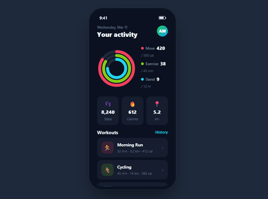
A fitness home screen leads with the activity rings — concentric progress arcs for move, exercise, and stand — then backs them with daily stats and a workout list. This snippet builds a complete one inside a CSS phone frame on a dark theme: three SVG rings that animate from empty to their day's progress on load, a three-up stat grid, and a tappable workout history — in HTML, CSS, and vanilla JavaScript with no charting dependency.
The three concentric rings
Each ring is an SVG <circle> with a grey track behind it and a colored arc on top. Progress is drawn with the classic stroke-dasharray / stroke-dashoffset technique: the dash length is set to the circle's full circumference (2πr), and the offset is reduced toward zero to reveal more of the arc. Each ring is rotated -90 degrees around its center so the arc starts at twelve o'clock, exactly like the rings you know from wearables.
Animating from empty on load
The rings start fully offset (empty), then a double requestAnimationFrame sets the target offset on the next frame so the browser registers a transition from empty to filled rather than jumping straight to the final state. The stroke-dashoffset transition uses a smooth easing curve over just over a second, so all three rings sweep up together when the screen appears — the satisfying "closing your rings" moment.
Per-ring circumference math
Because the three rings have different radii, each needs its own circumference for the dash math. The code stores each radius, computes 2πr per ring, and drives the fill from a percentage, so a ring at 84% lands at the right visual arc regardless of its size. This is the correct way to build nested progress rings — sharing one circumference would misalign the inner arcs.
Stats and workouts on a dark canvas
Below the rings, three stat tiles show steps, calories, and distance, and a workout list pairs a tinted activity icon with duration and calorie details. The dark theme uses near-black cards on a deep navy background so the vivid ring colors and stat numbers pop, which is the standard look for fitness apps.
Accessibility and performance
The rings are decorative SVG, so their meaning must live in text for non-visual users: the legend beside them already spells out each metric with its current and goal value, which is what a screen reader should read rather than the arcs themselves. When you adapt this, mark the SVG aria-hidden and expose the same numbers through the legend, or give each ring an aria-label describing its progress. The workout rows are real buttons, so the history is keyboard-operable. Performance is a highlight of the dash-offset technique: each ring animates a single stroke-dashoffset value that the browser can composite smoothly, with no per-frame JavaScript and no canvas redraws, so all three rings sweep up together without touching the main thread after the initial set. Because the fill is driven by CSS transition rather than a timer, it respects the user's reduced-motion preference if you gate it behind a media query. Feeding real percentages is a single style write per ring, so live updates stay cheap.
Reusing it
Feed each ring a real percentage from your health data, update the stats and workouts from your API, and wire the workout rows to detail screens. Lift the rings out of the phone frame for a responsive web dashboard, or keep them framed beside a set of activity rings to present a full tracker.
Build with AI
Build, Understand, Optimize, and Extend It With AI
You do not have to work out the dash-offset math in your head to trust it. Paste this snippet's HTML, CSS, and JS into an AI coding assistant like Claude and ask it to explain exactly why each ring needs its own circumference computed from 2 times pi times its own radius rather than sharing one value across all three, or why the code sets the dashoffset inside a double nested requestAnimationFrame instead of a single one. The same assistant can help optimize it — ask whether the stroke-dashoffset transition could stutter on lower-end devices with many rings, or how you would gate the fill-on-load animation behind a prefers-reduced-motion check. It is just as useful for extending the effect: have it add a fourth ring for a custom metric, make the rings tappable to reveal a detail sheet, or animate a ring update live when new activity data arrives instead of only on page load. Treat the code less like a finished artifact and more like a starting point for a conversation.
Prompt to recreate it
Copy this into your AI assistant of choice to build the effect from scratch, or as a jumping-off point for your own variant:
Build a mobile fitness/activity screen with concentric SVG progress rings in plain HTML, CSS, and JavaScript inside a phone-frame container — no charting library, no canvas.

Requirements:
- Three nested SVG circles as background tracks plus three matching colored circles as progress rings, each ring rotated -90 degrees around its own center so its arc begins at the twelve o'clock position.
- Each ring's fill must be computed independently: for a given radius, its own circumference is 2 times pi times that radius, its stroke-dasharray must equal that circumference, and its stroke-dashoffset must equal circumference times (1 minus the ring's percent complete), so rings of different sizes at the same percentage look visually correct relative to each other.
- On page load, every ring must start fully offset (visually empty) and then animate to its target offset using a CSS transition on stroke-dashoffset, triggered from JavaScript by setting the starting offset, then inside two nested requestAnimationFrame calls setting the final target offset, so the browser reliably registers and plays the transition instead of skipping straight to the end state.
- A legend beside the rings listing each metric's label, current value, and goal value, plus a row of stat tiles below (for example steps, calories, distance) and a tappable list of workout entries, each giving brief press feedback by flashing its background color for under 200ms on click.
- All colors must be shared correctly between each ring and its corresponding legend dot so the mapping between ring and metric is unambiguous.
Want to tighten it up first? Run this prompt through the AI Prompt Studio to score it across 8 quality dimensions, catch anti-patterns, and tune the wording for Claude, ChatGPT, or Gemini before you paste it in.
Source Code
<div class="mft-phone">
<div class="mft-screen">
<div class="mft-status"><span>9:41</span><span class="mft-batt"><i></i></span></div>
<header class="mft-head">
<div><small>Wednesday, Mar 11</small><h1>Your activity</h1></div>
<div class="mft-ava">AM</div>
</header>
<div class="mft-rings">
<svg viewBox="0 0 120 120" class="mft-svg">
<circle class="mft-bg" cx="60" cy="60" r="52"/>
<circle class="mft-bg" cx="60" cy="60" r="40"/>
<circle class="mft-bg" cx="60" cy="60" r="28"/>
<circle class="mft-ring r1" id="mftR1" cx="60" cy="60" r="52"/>
<circle class="mft-ring r2" id="mftR2" cx="60" cy="60" r="40"/>
<circle class="mft-ring r3" id="mftR3" cx="60" cy="60" r="28"/>
</svg>
<div class="mft-legend">
<div class="mft-lg"><span class="mft-ld l1"></span>Move <b>420</b><small>/ 500 cal</small></div>
<div class="mft-lg"><span class="mft-ld l2"></span>Exercise <b>38</b><small>/ 45 min</small></div>
<div class="mft-lg"><span class="mft-ld l3"></span>Stand <b>9</b><small>/ 12 hr</small></div>
</div>
</div>
<div class="mft-stats">
<div class="mft-stat"><span class="mft-sic s1">👣</span><b>8,240</b><small>Steps</small></div>
<div class="mft-stat"><span class="mft-sic s2">🔥</span><b>612</b><small>Calories</small></div>
<div class="mft-stat"><span class="mft-sic s3">📍</span><b>5.2</b><small>km</small></div>
</div>
<div class="mft-wk">
<div class="mft-wkhd"><b>Workouts</b><button class="mft-see">History</button></div>
<div class="mft-wo"><span class="mft-wic w1">🏃</span><div class="mft-wm"><b>Morning Run</b><small>32 min · 5.2 km · 412 cal</small></div><em>›</em></div>
<div class="mft-wo"><span class="mft-wic w2">🚴</span><div class="mft-wm"><b>Cycling</b><small>45 min · 14 km · 380 cal</small></div><em>›</em></div>
<div class="mft-wo"><span class="mft-wic w3">🧘</span><div class="mft-wm"><b>Yoga Flow</b><small>20 min · 95 cal</small></div><em>›</em></div>
</div>
</div>
</div>*{box-sizing:border-box;margin:0;padding:0}
html{scrollbar-width:none;-ms-overflow-style:none}
html::-webkit-scrollbar{display:none}
body{font-family:system-ui,-apple-system,sans-serif;background:#1e293b;display:flex;justify-content:center;align-items:center;min-height:100vh;padding:24px;scrollbar-width:none;-ms-overflow-style:none}
body::-webkit-scrollbar{display:none}
.mft-phone{width:288px;height:600px;background:#0b1220;border-radius:46px;padding:12px;box-shadow:0 30px 60px -20px rgba(0,0,0,.6),inset 0 0 0 2px #1e293b}
.mft-screen{width:100%;height:100%;border-radius:34px;overflow-y:auto;background:#0b1120;color:#e2e8f0;display:flex;flex-direction:column;scrollbar-width:none;-ms-overflow-style:none}
.mft-screen::-webkit-scrollbar{display:none}
.mft-status{display:flex;justify-content:space-between;align-items:center;padding:13px 24px 0;font-size:13px;font-weight:700}
.mft-batt{width:22px;height:11px;border:1.4px solid currentColor;border-radius:3px;position:relative;display:inline-block}
.mft-batt::after{content:'';position:absolute;right:-3px;top:3px;width:2px;height:5px;background:currentColor;border-radius:0 1px 1px 0}
.mft-batt i{position:absolute;left:1.4px;top:1.4px;bottom:1.4px;width:70%;background:currentColor;border-radius:1px}
.mft-head{display:flex;align-items:center;justify-content:space-between;padding:10px 16px 6px}
.mft-head small{font-size:11.5px;color:#64748b;font-weight:600}
.mft-head h1{font-size:21px;font-weight:800;color:#f1f5f9}
.mft-ava{width:36px;height:36px;border-radius:50%;background:linear-gradient(135deg,#22c55e,#0ea5e9);color:#fff;font-weight:800;font-size:13px;display:flex;align-items:center;justify-content:center}
.mft-rings{display:flex;align-items:center;gap:16px;padding:16px}
.mft-svg{width:128px;height:128px;flex-shrink:0}
.mft-bg{fill:none;stroke:#1e293b;stroke-width:9}
.mft-ring{fill:none;stroke-width:9;stroke-linecap:round;transform:rotate(-90deg);transform-origin:60px 60px;transition:stroke-dashoffset 1.1s cubic-bezier(.4,0,.2,1)}
.r1{stroke:#f43f5e}.r2{stroke:#84cc16}.r3{stroke:#22d3ee}
.mft-legend{flex:1}
.mft-lg{font-size:12px;color:#94a3b8;margin-bottom:10px;display:flex;align-items:center;gap:6px;flex-wrap:wrap}
.mft-ld{width:9px;height:9px;border-radius:50%}
.l1{background:#f43f5e}.l2{background:#84cc16}.l3{background:#22d3ee}
.mft-lg b{color:#f1f5f9;font-size:15px;font-weight:800}
.mft-lg small{color:#64748b;font-size:11px}
.mft-stats{display:flex;gap:9px;padding:0 16px 14px}
.mft-stat{flex:1;background:#151d2e;border-radius:14px;padding:12px 8px;text-align:center}
.mft-sic{font-size:18px;display:block;margin-bottom:4px}
.mft-stat b{font-size:16px;font-weight:800;color:#f1f5f9;display:block}
.mft-stat small{font-size:10.5px;color:#64748b}
.mft-wk{padding:0 16px 18px}
.mft-wkhd{display:flex;align-items:center;justify-content:space-between;margin-bottom:8px}
.mft-wkhd b{font-size:15px;color:#f1f5f9}
.mft-see{background:none;border:none;color:#22d3ee;font-size:12px;font-weight:700;cursor:pointer}
.mft-wo{display:flex;align-items:center;gap:12px;background:#151d2e;border-radius:14px;padding:12px 14px;margin-bottom:9px;cursor:pointer;transition:transform .15s}
.mft-wo:active{transform:scale(.98)}
.mft-wic{width:40px;height:40px;border-radius:12px;display:flex;align-items:center;justify-content:center;font-size:19px;flex-shrink:0}
.w1{background:rgba(244,63,94,.16)}.w2{background:rgba(132,204,22,.16)}.w3{background:rgba(34,211,238,.16)}
.mft-wm{flex:1}
.mft-wm b{font-size:13.5px;color:#f1f5f9;display:block}
.mft-wm small{font-size:11px;color:#64748b}
.mft-wo em{font-style:normal;color:#475569;font-size:18px}var C = 2 * Math.PI;
var rings = [
{ el: document.getElementById('mftR1'), r: 52, pct: 0.84 },
{ el: document.getElementById('mftR2'), r: 40, pct: 0.84 },
{ el: document.getElementById('mftR3'), r: 28, pct: 0.75 }
];
rings.forEach(function(ring){
var len = C * ring.r;
ring.el.style.strokeDasharray = len;
ring.el.style.strokeDashoffset = len;
});
function animate(){
rings.forEach(function(ring){
var len = C * ring.r;
requestAnimationFrame(function(){
requestAnimationFrame(function(){
ring.el.style.strokeDashoffset = len * (1 - ring.pct);
});
});
});
}
animate();
document.querySelectorAll('.mft-wo').forEach(function(wo){
wo.addEventListener('click', function(){
wo.style.background = '#1c2740';
setTimeout(function(){ wo.style.background = ''; }, 180);
});
});Step by step
How to Use
- 1Paste HTML, CSS, and JSA dark fitness screen renders and the three activity rings animate up from empty.
- 2Watch the rings fillMove, exercise, and stand arcs sweep to their day's progress together on load.
- 3Read the legendEach ring's current and goal values sit beside a matching color dot.
- 4Scan the stat gridSteps, calories, and distance tiles summarize the day.
- 5Tap a workoutRows in the history list flash to acknowledge the tap.
- 6Bind your health dataSet each ring's percentage and update stats from your API.
Real-world uses
Common Use Cases
Got questions?
Frequently Asked Questions
Each ring is an SVG circle with a grey track behind it. The colored arc uses stroke-dasharray set to the circle's circumference (2 times pi times the radius) and stroke-dashoffset to hide part of it. Reducing the offset toward zero reveals more of the arc, and a -90 degree rotation makes it start at the top.
The rings start fully offset, then a double requestAnimationFrame sets the target offset on a later frame. That two-frame delay lets the browser register a transition between the empty and filled states rather than painting the final value immediately, so the CSS transition on stroke-dashoffset animates the sweep on load.
The three rings have different radii, so their circumferences differ. The dash math must use each ring's own 2-pi-r value; sharing one circumference would make the inner rings land at the wrong arc length for the same percentage. The code stores each radius and computes the length per ring.
Each ring is driven by a pct value between 0 and 1. The final offset is circumference times (1 minus pct), so 0.84 fills 84 percent of the arc. Replace the hard-coded percentages with values derived from your health data and the rings will fill to match.
Hold each ring's percentage in state and bind stroke-dashoffset to a computed offset. Trigger the fill-on-mount in a useEffect (React), onMounted (Vue), or ngAfterViewInit (Angular), setting the target after the first paint. Render stats and workouts from your data. Tailwind expresses the dark cards and layout with utilities while the SVG stays as-is.