
Learn Coding Visually
Learn to code with interactive, live-preview playgrounds — HTML, CSS, JavaScript, React & more.
 HTML Playground42 lessons · Click-based · Live preview
 CSS PlaygroundLearn CSS with a live editor
 JavaScript Playground60 lessons · DOM · Async · Canvas
 React PlaygroundLearn React with a live code editor
 GSAP PlaygroundLearn GSAP animation interactively
 SVG Playground44 lessons · shapes · paths · animation
 SCSS Playground45 lessons · Sass modules · tokens
 Tailwind PlaygroundLearn Tailwind CSS with a live editor
 Bootstrap 5 Playground50 lessons · live preview
Mobile Banking Screen — Free HTML CSS JS Snippet
Mobile Banking Screen · Mobile · Plain HTML, CSS & JS · Live preview
What's included
Features
About this UI Snippet
Mobile Banking Screen — Account Dashboard UI
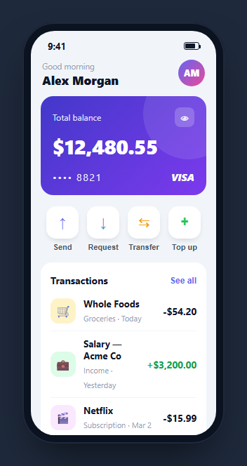
A banking home screen has to make one number the hero — the balance — then surround it with quick actions and a readable transaction history. This snippet builds a complete, interactive one inside a CSS phone frame: a gradient balance card styled like a physical card, a privacy toggle that hides every monetary amount at once, an action grid with tap feedback, and a color-coded transaction list — in HTML, CSS, and vanilla JavaScript with no dependency.
The balance card as a physical card
The balance sits on a gradient card with a large faded circle bleeding off the corner (a pure-CSS ::after pseudo-element) and a masked card number with a VISA brand mark, so it reads as an actual payment card rather than a plain panel. The layering uses position: relative with z-index so the content stays above the decorative circle.
A privacy toggle that hides real money
Tapping the eye button flips a hidden class on the balance and every .mbk-amt in the transaction list. Rather than replacing the text with dots — which would lose the value — the class sets the color to transparent and adds a soft text-shadow blur, so the digits become an unreadable smudge you can instantly reveal again. The incoming (green) and outgoing amounts get tinted blur shadows so the redaction still hints at the row's type. The eye glyph itself swaps to a "see-no-evil" icon while hidden.
The quick-action grid
Four actions — Send, Request, Transfer, Top up — are laid out as equal flex columns with rounded icon tiles in distinct accent colors. Tapping one runs a quick scale pulse via the Web Animations API (element.animate()), giving tactile feedback without permanently changing state, which is right for buttons that would navigate away in a real app.
The transaction list
Each row pairs a colored category icon with a merchant, a category-and-date subtitle, and a signed amount — green with a plus for income, dark for spending. Rows share hairline separators and flash on tap. This is the scannable ledger pattern every banking and wallet app uses.
Accessibility and performance
The privacy toggle, quick actions, and each transaction row are real buttons with aria-labels, so the whole screen can be operated from the keyboard and screen readers announce every control. One accessibility caveat worth handling when you adapt this: the hidden balance only blurs visually, so for assistive tech you should also swap the accessible text — for example set an aria-label like "balance hidden" on the balance element while it is redacted — so a screen reader does not still read the exact figure aloud. Performance is minimal: hiding amounts toggles a single class on a shared selector rather than rewriting any numbers, the pulse uses the Web Animations API which runs off the main layout, and the transaction list is static markup with no scroll listeners. Because the redaction keeps the real digits in the DOM and only changes how they paint, revealing is instant with no re-fetch or re-render. When you wire real data, format currency once and store the raw value separately so the visible and accessible representations can diverge cleanly.
Reusing it
Feed the balance and transactions from your API, wire the action buttons to their flows, and persist the hide-balance preference. Lift the content out of the phone frame for a responsive web dashboard, or keep it framed beside a wallet card to present a full finance app.
Build with AI
Build, Understand, Optimize, and Extend It With AI
You don't need to trace the redaction trick from memory to know it's clever. Paste this snippet's HTML, CSS, and JS into an AI coding assistant like Claude and ask it to explain exactly why the hidden class sets color to transparent plus a text-shadow blur instead of swapping the digits for dots, or how one class toggled on the balance and every mbk-amt element keeps all the figures in sync from a single click handler. The same assistant is useful for optimizing it — asking whether the transaction list should be rendered from a data array instead of hardcoded markup once real accounts are wired in, or how to keep the Web Animations API pulse from stacking up if a user taps an action rapidly. It's just as useful for extending the screen: ask it to add an aria-label swap so screen readers announce "balance hidden" rather than the real figure, wire the quick actions to real navigation, or persist the hide-balance preference across sessions. Treat the code less like a finished artifact and more like a starting point for a conversation.
Prompt to recreate it
Copy this into your AI assistant of choice to build the effect from scratch, or as a jumping-off point for your own variant:
Build a "mobile banking home screen" inside a CSS phone frame, in plain HTML, CSS, and vanilla JavaScript — no frameworks, no camera or real financial APIs.

Requirements:
- A phone-shaped outer frame (fixed width and height, rounded corners, dark bezel) containing a scrollable screen with a fake status bar (time plus a battery icon built from a bordered div and pseudo-element, no image).
- A gradient balance card styled to look like a physical payment card: a large faded decorative circle bleeding off one corner via a ::after pseudo-element positioned behind the content with a lower z-index, a masked card number, and a brand mark, with the balance itself displayed prominently.
- An eye-icon button that toggles a single "hidden" class shared by the balance element and every transaction amount element on the page. That class must not delete or replace the digit text — it must set the text color to transparent and apply a text-shadow blur so the real value stays in the DOM but reads as an unreadable smudge, instantly reversible by toggling the class again. Give income and expense amounts different tinted shadow colors while hidden so the row's type is still hinted.
- A row of four quick-action buttons (e.g. Send, Request, Transfer, Top up), each with a distinct accent-colored icon tile, where tapping any button plays a brief scale-up-then-back pulse using the element.animate Web Animations API method (not a CSS class toggle) as pure tap feedback with no state change.
- A transaction list where each row shows a colored category icon, a merchat name and category/date subtitle, and a right-aligned signed amount (green for incoming, dark for outgoing), with each row briefly flashing a background tint on click/tap.
- Every interactive element must be a real button with an appropriate aria-label so the whole screen is keyboard-operable and screen-reader friendly.
Want to tighten it up first? Run this prompt through the AI Prompt Studio to score it across 8 quality dimensions, catch anti-patterns, and tune the wording for Claude, ChatGPT, or Gemini before you paste it in.
Source Code
<div class="mbk-phone">
<div class="mbk-screen">
<div class="mbk-status"><span>9:41</span><span class="mbk-batt"><i></i></span></div>
<header class="mbk-head">
<div class="mbk-hi"><small>Good morning</small><b>Alex Morgan</b></div>
<div class="mbk-ava">AM</div>
</header>
<div class="mbk-scroll">
<div class="mbk-card">
<div class="mbk-crow"><span class="mbk-clabel">Total balance</span><button class="mbk-eye" id="mbkEye" aria-label="Toggle balance">👁</button></div>
<div class="mbk-bal" id="mbkBal">$12,480.55</div>
<div class="mbk-cchip">
<span class="mbk-cnum">•••• 8821</span>
<span class="mbk-cbrand">VISA</span>
</div>
</div>
<div class="mbk-actions">
<button class="mbk-act"><span class="mbk-aic a1">↑</span><small>Send</small></button>
<button class="mbk-act"><span class="mbk-aic a2">↓</span><small>Request</small></button>
<button class="mbk-act"><span class="mbk-aic a3">⇆</span><small>Transfer</small></button>
<button class="mbk-act"><span class="mbk-aic a4">+</span><small>Top up</small></button>
</div>
<div class="mbk-tx">
<div class="mbk-txhd"><b>Transactions</b><button class="mbk-see">See all</button></div>
<div class="mbk-item"><span class="mbk-tic t1">🛒</span><div class="mbk-tmeta"><b>Whole Foods</b><small>Groceries · Today</small></div><span class="mbk-amt out">-$54.20</span></div>
<div class="mbk-item"><span class="mbk-tic t2">💼</span><div class="mbk-tmeta"><b>Salary — Acme Co</b><small>Income · Yesterday</small></div><span class="mbk-amt in">+$3,200.00</span></div>
<div class="mbk-item"><span class="mbk-tic t3">🎬</span><div class="mbk-tmeta"><b>Netflix</b><small>Subscription · Mar 2</small></div><span class="mbk-amt out">-$15.99</span></div>
<div class="mbk-item"><span class="mbk-tic t4">☕</span><div class="mbk-tmeta"><b>Blue Bottle</b><small>Coffee · Mar 1</small></div><span class="mbk-amt out">-$6.75</span></div>
<div class="mbk-item"><span class="mbk-tic t5">💸</span><div class="mbk-tmeta"><b>From Jordan L.</b><small>Transfer · Mar 1</small></div><span class="mbk-amt in">+$40.00</span></div>
</div>
</div>
</div>
</div>*{box-sizing:border-box;margin:0;padding:0}
html{scrollbar-width:none;-ms-overflow-style:none}
html::-webkit-scrollbar{display:none}
body{font-family:system-ui,-apple-system,sans-serif;background:#1e293b;display:flex;justify-content:center;align-items:center;min-height:100vh;padding:24px;scrollbar-width:none;-ms-overflow-style:none}
body::-webkit-scrollbar{display:none}
.mbk-phone{width:288px;height:600px;background:#0b1220;border-radius:46px;padding:12px;box-shadow:0 30px 60px -20px rgba(0,0,0,.6),inset 0 0 0 2px #1e293b}
.mbk-screen{width:100%;height:100%;border-radius:34px;overflow:hidden;background:#f1f5f9;color:#0f172a;display:flex;flex-direction:column}
.mbk-status{display:flex;justify-content:space-between;align-items:center;padding:13px 24px 0;font-size:13px;font-weight:700}
.mbk-batt{width:22px;height:11px;border:1.4px solid currentColor;border-radius:3px;position:relative;display:inline-block}
.mbk-batt::after{content:'';position:absolute;right:-3px;top:3px;width:2px;height:5px;background:currentColor;border-radius:0 1px 1px 0}
.mbk-batt i{position:absolute;left:1.4px;top:1.4px;bottom:1.4px;width:70%;background:currentColor;border-radius:1px}
.mbk-head{display:flex;align-items:center;justify-content:space-between;padding:8px 16px 12px}
.mbk-hi small{font-size:11.5px;color:#94a3b8}
.mbk-hi b{font-size:17px;font-weight:800;display:block}
.mbk-ava{width:38px;height:38px;border-radius:50%;background:linear-gradient(135deg,#6366f1,#ec4899);color:#fff;font-weight:800;font-size:13px;display:flex;align-items:center;justify-content:center}
.mbk-scroll{flex:1;overflow-y:auto;padding:0 14px 16px;scrollbar-width:none;-ms-overflow-style:none}
.mbk-scroll::-webkit-scrollbar{display:none}
.mbk-card{background:linear-gradient(135deg,#4338ca,#7c3aed);color:#fff;border-radius:18px;padding:16px 17px;position:relative;overflow:hidden}
.mbk-card::after{content:'';position:absolute;right:-40px;top:-40px;width:130px;height:130px;border-radius:50%;background:rgba(255,255,255,.1)}
.mbk-crow{display:flex;align-items:center;justify-content:space-between;position:relative;z-index:1}
.mbk-clabel{font-size:12px;opacity:.85}
.mbk-eye{background:rgba(255,255,255,.2);border:none;color:#fff;width:28px;height:28px;border-radius:8px;cursor:pointer;font-size:13px}
.mbk-bal{font-size:29px;font-weight:800;margin:8px 0 16px;letter-spacing:-.5px;position:relative;z-index:1}
.mbk-cchip{display:flex;align-items:center;justify-content:space-between;position:relative;z-index:1}
.mbk-cnum{font-size:14px;letter-spacing:1.5px;opacity:.9}
.mbk-cbrand{font-size:14px;font-weight:800;font-style:italic}
.mbk-actions{display:flex;justify-content:space-between;margin:16px 2px}
.mbk-act{flex:1;background:none;border:none;cursor:pointer;display:flex;flex-direction:column;align-items:center;gap:6px}
.mbk-aic{width:46px;height:46px;border-radius:14px;background:#fff;display:flex;align-items:center;justify-content:center;font-size:19px;font-weight:700;box-shadow:0 4px 10px -4px rgba(15,23,42,.2);transition:transform .15s}
.mbk-act:active .mbk-aic{transform:scale(.9)}
.a1{color:#6366f1}.a2{color:#0ea5e9}.a3{color:#f59e0b}.a4{color:#22c55e}
.mbk-act small{font-size:11px;color:#475569;font-weight:600}
.mbk-tx{background:#fff;border-radius:16px;padding:6px 14px 8px}
.mbk-txhd{display:flex;align-items:center;justify-content:space-between;padding:10px 0 6px}
.mbk-txhd b{font-size:14px}
.mbk-see{background:none;border:none;color:#6366f1;font-size:12px;font-weight:700;cursor:pointer}
.mbk-item{display:flex;align-items:center;gap:11px;padding:9px 0;border-top:1px solid #f1f5f9}
.mbk-txhd + .mbk-item{border-top:none}
.mbk-tic{width:36px;height:36px;border-radius:11px;display:flex;align-items:center;justify-content:center;font-size:17px;flex-shrink:0}
.t1{background:#fef3c7}.t2{background:#dcfce7}.t3{background:#fae8ff}.t4{background:#ffe4e6}.t5{background:#dbeafe}
.mbk-tmeta{flex:1}
.mbk-tmeta b{font-size:13px;display:block}
.mbk-tmeta small{font-size:11px;color:#94a3b8}
.mbk-amt{font-size:13.5px;font-weight:700}
.mbk-amt.in{color:#16a34a}
.mbk-amt.out{color:#0f172a}
.mbk-bal.hidden,.mbk-amt.hidden{color:transparent;text-shadow:0 0 10px rgba(255,255,255,.7)}
.mbk-amt.out.hidden{text-shadow:0 0 9px rgba(15,23,42,.5)}
.mbk-amt.in.hidden{text-shadow:0 0 9px rgba(22,163,74,.6)}var eye = document.getElementById('mbkEye');
var bal = document.getElementById('mbkBal');
var amounts = document.querySelectorAll('.mbk-amt');
var hidden = false;
eye.addEventListener('click', function(){
hidden = !hidden;
bal.classList.toggle('hidden', hidden);
amounts.forEach(function(a){ a.classList.toggle('hidden', hidden); });
eye.innerHTML = hidden ? '🙈' : '👁';
});
document.querySelectorAll('.mbk-act').forEach(function(btn){
btn.addEventListener('click', function(){
var ic = btn.querySelector('.mbk-aic');
ic.animate([{transform:'scale(1)'},{transform:'scale(1.15)'},{transform:'scale(1)'}], {duration:220});
});
});
document.querySelectorAll('.mbk-item').forEach(function(item){
item.addEventListener('click', function(){
item.style.background = 'rgba(99,102,241,.08)';
setTimeout(function(){ item.style.background = ''; }, 160);
});
});Step by step
How to Use
- 1Paste HTML, CSS, and JSA banking home screen renders with a gradient balance card, action grid, and transactions.
- 2Hide the balanceTap the eye icon and the balance plus every transaction amount blur into an unreadable smudge.
- 3Reveal it againTap once more and every figure snaps back; the eye glyph changes to reflect the state.
- 4Tap a quick actionSend, Request, Transfer, or Top up pulse with a scale animation on tap.
- 5Tap a transactionRows flash to acknowledge the tap.
- 6Bind your dataFeed the balance and transactions from your API and persist the privacy toggle.
Real-world uses
Common Use Cases
Got questions?
Frequently Asked Questions
Tapping the eye flips a hidden class on both the balance element and every element with the mbk-amt class in the transaction list. The class sets color to transparent and adds a soft text-shadow, turning the digits into a smudge. Because it targets a shared class, one tap redacts the whole screen and one more reveals it.
Replacing text with dots discards the real value, so you would need to re-render on reveal. The transparent-color-plus-blur approach keeps the true digits in the DOM and only changes how they render, which makes the reveal instant and avoids storing the value separately. Income and spending rows use tinted blur shadows so the row type is still hinted.
It uses a gradient background with a large faded circle created by an ::after pseudo-element that bleeds off the corner, plus a masked card number and a VISA brand mark. The content sits above the circle via position relative and z-index, giving the layered look of an actual payment card.
Each action button calls the Web Animations API — element.animate() with a short scale keyframe sequence — on tap. This gives tactile feedback without permanently changing any state, which suits buttons that would navigate to another flow in a real app rather than toggling something on the screen.
Render the transactions from an array and the balance from state. Track the hidden flag in state and bind the hidden class to it rather than toggling classList. Replace element.animate with a CSS transition keyed off a state flag if you prefer. Feed all figures from your API and persist the privacy preference. The CSS and Tailwind utilities port directly.