Learn Coding Visually
Learn to code with interactive, live-preview playgrounds — HTML, CSS, JavaScript, React & more.
 HTML Playground42 lessons · Click-based · Live preview
 CSS PlaygroundLearn CSS with a live editor
 JavaScript Playground60 lessons · DOM · Async · Canvas
 React PlaygroundLearn React with a live code editor
 GSAP PlaygroundLearn GSAP animation interactively
 SVG Playground44 lessons · shapes · paths · animation
 SCSS Playground45 lessons · Sass modules · tokens
 Tailwind PlaygroundLearn Tailwind CSS with a live editor
 Bootstrap 5 Playground50 lessons · live preview
App Store Card — Free App Listing UI HTML CSS Snippet
App Store Card · Mobile · Plain HTML, CSS & JS · Live preview
What's included
Features
About this UI Snippet
App Store Card — App Listing with Install Progress
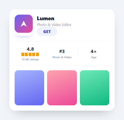
An app store card is the listing tile you see in the App Store or Play Store — app icon, name, category, a GET/install button, ratings, rank, and screenshots. This snippet recreates one in HTML and CSS with an animated install button that fills with progress and settles to OPEN, in vanilla JavaScript with no dependency. It's a polished, reusable component for app directories and marketing pages.
The GET button that installs
The standout is the button. Tapping it switches from idle to an installing state: the label clears and an absolutely-positioned .as-bar grows from 0 to 100% width behind the text, driven by a setInterval that adds a random increment each tick (so progress looks organic, not linear). At 100% it flips to a green .done state reading OPEN. The three states (idle → installing → done) are tracked in one variable, mirroring the real store interaction where GET becomes a progress indicator then OPEN.
A CSS star rating with no images
The rating stars are a clever single element: a solid amber bar with a mask of repeating-linear-gradient that punches transparent gaps between fixed-width segments, leaving five star-width blocks. It's drawn with pure CSS — no SVG, no five separate icons — and the amber shows through only in the star areas. (For a precise fractional rating you'd overlay a clipped copy; here it reads as a clean five-star strip.)
The stats strip
Rating, chart rank, and age sit in a flex row separated by thin 1px dividers (flex: 0 0 1px), each a centered number with a small label — the compact metadata layout the stores use. It's all flexbox, so it stays evenly spaced at any card width.
Gradient screenshots and icon
The app icon is an inline SVG with a gradient and a glyph, rounded and shadowed like a real app icon, and the screenshot thumbnails are gradient placeholders you'd swap for real images. Using gradients keeps the demo self-contained and shows where your assets go.
Reusing it
Replace the icon, copy, stats, and screenshots with real data, and wire the install button to a real download or a store deep-link. Drop several into a grid for an app gallery, or feature one beside a phone mockup on a landing page.
Build with AI
Build, Understand, Optimize, and Extend It With AI
Rather than tracing the three-state button by eye, paste this snippet's HTML, CSS, and JS into an AI coding assistant like Claude and ask it to explain exactly how the as-bar element's width animation is driven by the setInterval in the click handler, or how the repeating-linear-gradient mask on as-stars produces five discrete star blocks from one solid-colored div. The same assistant can help optimize it — ask whether the random-increment progress loop could overshoot visually if the tick rate and increment range aren't tuned together, or whether clearInterval is reliably called in every exit path so a second click during installing can't start a competing timer. It's also useful for extending the card: ask it to show a real fractional star rating instead of a full five-star strip, add a second tap state that resets back to GET, or turn the screenshot placeholders into a small swipeable gallery. Treat the code less like a finished artifact and more like a starting point for a conversation.
Prompt to recreate it
Copy this into your AI assistant of choice to build the effect from scratch, or as a jumping-off point for your own variant:
Build an "app store listing card" in plain HTML, CSS, and JavaScript — no libraries, no images for the star rating.

Requirements:
- A card with an icon, app name and subtitle, and a GET button, followed by a stats strip (rating, chart rank, age rating) separated by thin 1px vertical dividers, and a row of screenshot placeholders.
- The star rating must be drawn without any SVG star icons or image files: use a single solid-colored block with a CSS mask built from a repeating-linear-gradient that alternates opaque and transparent segments at a fixed width, so the underlying color only shows through in evenly spaced star-width blocks.
- The GET button must move through exactly three states tracked in one JavaScript variable: idle, installing, and done. Clicking while idle must clear the button's label and start a setInterval that increases a progress value by a random amount each tick (not a fixed increment, so the fill looks organic rather than mechanical) and updates an absolutely positioned bar's width behind the label to match.
- When progress reaches or exceeds 100, clamp it to 100, clear the interval, swap the button's visual state to a done style (different background/text color), and change the label text to OPEN.
- The bar element must sit behind the button's label text (correct z-index/stacking) so the label stays legible as the fill grows underneath it.
- Clicking the button again after it reaches the done state should do nothing destructive — it should just re-affirm the OPEN label rather than restarting the install animation.
Want to tighten it up first? Run this prompt through the AI Prompt Studio to score it across 8 quality dimensions, catch anti-patterns, and tune the wording for Claude, ChatGPT, or Gemini before you paste it in.
Source Code
<div class="as-card">
<div class="as-head">
<div class="as-icon"><svg viewBox="0 0 48 48" width="62"><defs><linearGradient id="asg" x1="0" y1="0" x2="1" y2="1"><stop offset="0" stop-color="#6366f1"/><stop offset="1" stop-color="#ec4899"/></linearGradient></defs><rect width="48" height="48" rx="12" fill="url(#asg)"/><path d="M16 32l8-16 8 16-8-5z" fill="#fff"/></svg></div>
<div class="as-meta">
<h3>Lumen</h3>
<p>Photo & Video Editor</p>
<button type="button" class="as-get" id="asGet"><span class="as-bar"></span><b>GET</b></button>
</div>
</div>
<div class="as-stats">
<div><b>4.8</b><div class="as-stars" aria-label="4.8 stars"></div><small>12.4K ratings</small></div>
<div class="as-sep"></div>
<div><b>#3</b><small>Photo & Video</small></div>
<div class="as-sep"></div>
<div><b>4+</b><small>Age</small></div>
</div>
<div class="as-shots">
<span class="s1"></span><span class="s2"></span><span class="s3"></span>
</div>
</div>*{box-sizing:border-box;margin:0;padding:0}
body{font-family:system-ui,-apple-system,sans-serif;background:#f1f5f9;color:#0f172a;display:flex;justify-content:center;align-items:center;min-height:100vh;padding:24px}
.as-card{background:#fff;border-radius:20px;width:100%;max-width:360px;padding:18px;box-shadow:0 18px 40px -22px rgba(0,0,0,.35)}
.as-head{display:flex;gap:14px;margin-bottom:18px}
.as-icon{flex-shrink:0;line-height:0;border-radius:14px;overflow:hidden;box-shadow:0 6px 16px -8px rgba(99,102,241,.6)}
.as-meta{flex:1;min-width:0;display:flex;flex-direction:column}
.as-meta h3{font-size:18px;font-weight:800}
.as-meta p{font-size:12.5px;color:#94a3b8;margin-top:2px}
.as-get{margin-top:auto;align-self:flex-start;position:relative;overflow:hidden;background:#eef2ff;color:#4338ca;border:none;border-radius:99px;padding:7px 22px;font-size:13px;font-weight:800;cursor:pointer;font-family:inherit;letter-spacing:.5px}
.as-get b{position:relative;z-index:2}
.as-bar{position:absolute;left:0;top:0;bottom:0;width:0;background:#c7d2fe;z-index:1}
.as-get.installing{color:#4338ca}
.as-get.done{background:#dcfce7;color:#16a34a}
.as-stats{display:flex;align-items:center;justify-content:space-between;padding:14px 0;border-top:1px solid #f1f5f9;border-bottom:1px solid #f1f5f9}
.as-stats>div{text-align:center;flex:1}
.as-stats b{font-size:16px;font-weight:800;color:#334155}
.as-stats small{display:block;font-size:10px;color:#94a3b8;margin-top:3px;font-weight:600}
.as-sep{flex:0 0 1px!important;height:30px;background:#f1f5f9}
.as-stars{height:12px;margin:3px auto 0;width:62px;background:#f59e0b;-webkit-mask:repeating-linear-gradient(90deg,#000 0 10px,transparent 10px 12.4px);mask:repeating-linear-gradient(90deg,#000 0 10px,transparent 10px 12.4px)}
.as-shots{display:flex;gap:10px;margin-top:16px}
.as-shots span{flex:1;height:120px;border-radius:12px}
.as-shots .s1{background:linear-gradient(160deg,#a5b4fc,#6366f1)}
.as-shots .s2{background:linear-gradient(160deg,#fda4af,#ec4899)}
.as-shots .s3{background:linear-gradient(160deg,#6ee7b7,#10b981)}var get = document.getElementById('asGet');
var bar = get.querySelector('.as-bar');
var label = get.querySelector('b');
var state = 'idle';
get.addEventListener('click', function () {
if (state === 'idle') {
state = 'installing';
label.textContent = '';
get.classList.add('installing');
var p = 0;
var timer = setInterval(function () {
p += Math.random() * 18 + 6;
if (p >= 100) {
p = 100; clearInterval(timer);
get.classList.remove('installing'); get.classList.add('done');
label.textContent = 'OPEN'; state = 'done';
}
bar.style.width = p + '%';
}, 240);
// Show a thin progress ring effect by animating the label dots.
label.textContent = '·';
} else if (state === 'done') {
label.textContent = 'OPEN';
}
});Step by step
How to Use
- 1Paste HTML, CSS, and JSAn app store card renders with an icon, stats, and screenshots.
- 2Tap GETThe button fills with install progress behind the label.
- 3Wait for installAt 100% it turns green and reads OPEN.
- 4Read the statsRating, rank, and age sit in a divided strip.
- 5Swap the assetsReplace the icon and screenshot gradients with images.
- 6Wire the buttonPoint install at a real download or store link.
Real-world uses
Common Use Cases
Got questions?
Frequently Asked Questions
Tapping GET moves through three states held in one variable: idle, installing, done. In installing, an absolutely-positioned bar grows from 0 to 100% width behind the label, driven by a setInterval that adds a random increment each tick so it looks organic. At 100% it switches to a green done state labeled OPEN.
The stars are a single amber bar with a CSS mask made from a repeating-linear-gradient that alternates solid and transparent segments. The amber shows through only in the star-shaped blocks, producing a five-star strip with no SVG or separate icons. For a precise fractional value you'd overlay a clipped second copy.
Yes. The icon is an inline SVG with a gradient and the screenshots are gradient placeholders — both are just markup you replace. Swap the icon for your <img> or SVG and the screenshot spans for real images; the layout, shadows, and rounded corners stay the same.
It's a flex row where each stat is a flex:1 centered block and the dividers are flex:0 0 1px elements. Flexbox distributes the space evenly regardless of card width, and the fixed-width dividers keep their hairline thickness, so the strip stays balanced as the card resizes.
Render the icon, copy, stats, and screenshots from props, and hold the install state (idle/installing/done) in component state. Put the progress interval in the click handler and clear it on completion or unmount. Bind the bar width and label to state. In Tailwind, build the stats strip with flex and the star mask with an arbitrary mask utility or a small style block.