


Learn Coding Visually
Learn to code with interactive, live-preview playgrounds — HTML, CSS, JavaScript, React & more.
 HTML Playground42 lessons · Click-based · Live preview
 CSS PlaygroundLearn CSS with a live editor
 JavaScript Playground60 lessons · DOM · Async · Canvas
 React PlaygroundLearn React with a live code editor
 GSAP PlaygroundLearn GSAP animation interactively
 SVG Playground44 lessons · shapes · paths · animation
 SCSS Playground45 lessons · Sass modules · tokens
 Tailwind PlaygroundLearn Tailwind CSS with a live editor
 Bootstrap 5 Playground50 lessons · live preview
Popmotion Spring Toggle Switch — Spring vs Ease Comparison Snippet
Popmotion Spring Toggle Switch · Buttons · Plain HTML, CSS & JS · Live preview
What's included
Features
About this UI Snippet
Popmotion Spring Toggle Switch — Why Springs Feel Different From Easing
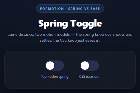
Put a spring-animated toggle next to a CSS transition: ease-out toggle and the difference is immediately visible, even though both move the knob the same 30px. The spring knob overshoots slightly past its target and wobbles back before settling; the CSS knob glides in and simply stops. That difference isn't cosmetic — it comes from two fundamentally different models of motion.
A CSS transition is a position-over-time curve
transition: transform .28s ease-out works by sampling a fixed easing function — a cubic Bézier curve, in this case one that starts fast and decelerates — at every point between 0% and 100% of a fixed duration. Position at any moment is purely a function of *elapsed time*. It has no concept of velocity, momentum, or how the animation was triggered. Because the curve is defined to go from 0 to 1 and never above 1, the knob can never overshoot its target — it approaches asymptotically and stops. This is deterministic and cheap, which is exactly why CSS transitions are the right default for most UI motion.
A spring is a physics simulation, not a curve
popmotion.animate({ type: 'spring', stiffness: 380, damping: 12, mass: 1, from: springX, to: on ? TRAVEL : 0 }) works completely differently. Every frame, Popmotion numerically integrates the equations of a mass-spring-damper system:
- stiffness is the spring constant — how hard it pulls the knob toward the target.
- damping is the resistance that opposes velocity — how much energy is removed each step.
- mass is the simulated inertia of the moving object.
With stiffness: 380 and a comparatively low damping: 12, the spring is underdamped: it doesn't have enough resistance to stop exactly at the target on the first pass. Like a real spring, it overshoots, reverses, and oscillates with decreasing amplitude until it settles — you can see this as the knob briefly passing 30px before easing back. Position here is a function of the *current simulated velocity and force*, not of elapsed time, which is precisely why the same 30px travel produces visibly different motion: the spring onUpdate gets called every frame with a value derived from ongoing physics, not a lookup on a fixed curve.
Why interruption behaves differently too
Click the spring toggle rapidly and setSpring() calls springAnim.stop() before starting a new spring from the current springX — the *current position*, not the previous target. Because the spring model is driven by position and (implicitly) the velocity it's still carrying, restarting it from mid-motion looks continuous; the new spring just has a different effective starting energy. A CSS transition retargeted mid-flight also restarts from its current computed position, but since it has no velocity to preserve, the direction change looks comparatively mechanical — it has no "memory" of how fast it was moving.
Tuning the feel
Raise damping toward stiffness and the oscillation shrinks — at damping: 2 * sqrt(stiffness * mass) (critical damping) the spring approaches the target with no overshoot at all, converging on the same visual result as an ease curve, just via different math. Lower stiffness and the whole motion slows down and feels heavier.
Reusing it
Any toggle, checkbox, or draggable handle benefits from a spring when you want it to feel touched by a real force rather than mechanically eased. Pair it with a Popmotion Drag Inertia Card to see the same spring model used for an out-of-bounds correction instead of a toggle.
Build with AI
Build, Understand, Optimize, and Extend It With AI
This snippet is built specifically to make an abstract distinction concrete, so it is a good target for a deeper conversation with an AI assistant. Paste the code into Claude and ask it to derive, from the stiffness/damping/mass values used here, whether the spring is underdamped, critically damped, or overdamped, and to explain the math of the damping ratio (damping / (2 * sqrt(stiffness * mass))) that determines which regime it's in. Then ask it to predict what visual change would result from doubling mass while holding stiffness and damping constant (slower response, same relative overshoot shape) versus doubling stiffness alone (faster response, more overshoot). To extend it: ask it to add a third toggle using Popmotion's tween/duration-based type with a custom easing function so all three motion models are compared side by side, expose live sliders for stiffness/damping/mass so the effect can be tuned interactively, or apply the same spring to a draggable range slider handle instead of a binary toggle.
Prompt to recreate it
Copy this into your AI assistant of choice to build the effect from scratch, or as a jumping-off point for your own variant:
Build two toggle switches side by side, one animated with Popmotion spring physics and one with a plain CSS transition, using Popmotion v8 (from a CDN, global object popmotion) in plain HTML, CSS, and JavaScript.

Requirements:
- Both switches are visually identical pill-shaped toggles with a circular knob, moving the same fixed horizontal distance (e.g. 30px) when switched on.
- The first switch's knob position is driven entirely by popmotion.animate({ type: 'spring', from, to, stiffness, damping, mass, onUpdate }), writing to the knob's CSS transform: translateX() on every onUpdate call. Choose stiffness and damping values (e.g. stiffness around 380, damping around 12) that are clearly underdamped, so the knob visibly overshoots its target and settles back before coming to rest.
- The second switch's knob position is driven by a plain CSS transition: transform .28s ease-out with no JavaScript animation loop, toggled purely by changing the transform value on click.
- Both switches must update aria-checked and toggle a visual "on" background color change on the track.
- Clicking a switch while its own animation is still in flight must restart the animation from its current live position, not jump or restart from the previous target -- for the spring switch, pass the current interpolated value as the new 'from'.
- Add a short code comment directly above the spring animate() call explaining, in your own words, why a spring can overshoot its target and a CSS transition cannot.
- Style it as a dark themed panel with both switches centered side by side, each labeled underneath ("Popmotion spring" / "CSS ease-out").
Want to tighten it up first? Run this prompt through the AI Prompt Studio to score it across 8 quality dimensions, catch anti-patterns, and tune the wording for Claude, ChatGPT, or Gemini before you paste it in.
Source Code
<div class="pst-stage">
  <div class="pst-head">
    <span class="pst-tag">Popmotion · spring vs ease</span>
    <h2>Spring Toggle</h2>
    <p>Same distance, two motion models — the spring knob overshoots and settles, the CSS knob just eases in.</p>
  </div>

  <div class="pst-row">
    <div class="pst-block">
      <button class="pst-switch" id="pstSpring" role="switch" aria-checked="false">
        <span class="pst-knob" id="pstSpringKnob"></span>
      </button>
      <span class="pst-caption">Popmotion spring</span>
    </div>
    <div class="pst-block">
      <button class="pst-switch" id="pstCss" role="switch" aria-checked="false">
        <span class="pst-knob pst-knob-css" id="pstCssKnob"></span>
      </button>
      <span class="pst-caption">CSS ease-out</span>
    </div>
  </div>
</div>*{box-sizing:border-box;margin:0;padding:0}
body{font-family:system-ui,-apple-system,sans-serif;background:radial-gradient(120% 100% at 50% 0%,#151c30,#0a0d16);color:#fff;min-height:100vh;display:flex;align-items:center;justify-content:center;padding:24px}
.pst-stage{width:min(440px,94vw);display:flex;flex-direction:column;align-items:center;gap:26px}
.pst-head{text-align:center}
.pst-tag{display:inline-block;font-size:11px;font-weight:700;letter-spacing:.14em;text-transform:uppercase;color:#60a5fa;background:rgba(96,165,250,.12);border:1px solid rgba(96,165,250,.3);padding:5px 12px;border-radius:99px;margin-bottom:12px}
.pst-head h2{font-size:clamp(24px,5vw,32px);font-weight:800;letter-spacing:-.02em}
.pst-head p{font-size:13.5px;color:#8e97b8;margin-top:7px;line-height:1.5}
.pst-row{display:flex;gap:36px;align-items:center;justify-content:center;background:rgba(255,255,255,.03);border:1px solid rgba(255,255,255,.08);border-radius:18px;padding:32px 26px;width:100%;box-shadow:0 24px 60px -24px rgba(0,0,0,.8)}
.pst-block{display:flex;flex-direction:column;align-items:center;gap:12px}
.pst-caption{font-size:11.5px;font-weight:600;color:#8e97b8}
.pst-switch{position:relative;width:64px;height:34px;border-radius:99px;border:none;background:#2a3150;cursor:pointer;padding:0;transition:background .25s ease}
.pst-switch[aria-checked="true"]{background:#60a5fa}
.pst-knob{position:absolute;top:3px;left:3px;width:28px;height:28px;border-radius:50%;background:#fff;box-shadow:0 3px 8px rgba(0,0,0,.35);display:block}
.pst-knob-css{transition:transform .28s ease-out}var springSwitch = document.getElementById('pstSpring');
var springKnob = document.getElementById('pstSpringKnob');
var cssSwitch = document.getElementById('pstCss');
var cssKnob = document.getElementById('pstCssKnob');
var TRAVEL = 30; // px, distance the knob moves when toggled on
var springOn = false;
var springAnim = null;
var springX = 0;
function setSpring(on) {
springOn = on;
springSwitch.setAttribute('aria-checked', String(on));
if (springAnim) springAnim.stop();
// type: 'spring' models a mass-spring-damper system: it does not animate
// over a fixed duration toward a target, it simulates a spring pulling the
// value toward the target with the given stiffness and damping. Lower
// damping relative to stiffness lets it overshoot the target and oscillate
// before settling -- a fixed-duration ease curve can never do this because
// it has no concept of velocity, only a position-over-time function.
springAnim = popmotion.animate({
from: springX,
to: on ? TRAVEL : 0,
type: 'spring',
stiffness: 380,
damping: 12,
mass: 1,
onUpdate: function (x) {
springX = x;
springKnob.style.transform = 'translateX(' + x + 'px)';
},
});
}
springSwitch.addEventListener('click', function () { setSpring(!springOn); });
var cssOn = false;
function setCss(on) {
cssOn = on;
cssSwitch.setAttribute('aria-checked', String(on));
// Plain CSS transition: ease-out, fixed duration. It interpolates position
// along a predetermined curve from 0% to 100% of the transition -- it has
// no velocity carried in from anywhere and it can never exceed its target,
// so it always arrives and stops, never overshoots.
cssKnob.style.transform = 'translateX(' + (on ? TRAVEL : 0) + 'px)';
}
cssSwitch.addEventListener('click', function () { setCss(!cssOn); });Step by step
How to Use
- 1Add the Popmotion CDNInclude the popmotion UMD build for the global popmotion.animate function.
- 2Paste HTML, CSS, and JSTwo toggle switches render side by side — one spring, one CSS ease.
- 3Click the spring togglepopmotion.animate({ type: "spring" }) drives the knob with visible overshoot and settle.
- 4Click the CSS toggleA plain transition eases the knob to its target with no overshoot, for comparison.
- 5Toggle rapidlyNotice the spring restarts smoothly from its current position; the CSS toggle reverses more mechanically.
- 6Tune stiffness/dampingRaise damping toward stiffness to remove the overshoot; lower stiffness for a slower, heavier feel.
Real-world uses
Common Use Cases
Got questions?
Frequently Asked Questions
The spring is a physics simulation: with low damping relative to stiffness it is underdamped, meaning the simulated spring has enough energy to carry the knob past the target before the damping force pulls it back. A CSS transition is a position-over-time curve normalized between 0 and 1 -- it has no velocity or energy concept, so it can only approach the target asymptotically and stop, never exceed it.
stiffness is how strongly the spring pulls toward the target -- higher means faster, snappier motion. damping is the resistance that removes energy from the system each frame -- higher damping reduces or eliminates overshoot. mass is the simulated inertia of the moving object -- higher mass makes the same stiffness/damping feel slower and heavier, since more force is needed to accelerate it.
Set damping to (or above) the critical damping value, roughly 2 * Math.sqrt(stiffness * mass). At that point the system is critically or over-damped and approaches the target without oscillating, similar in shape to an ease-out curve but still computed from physics rather than a fixed curve.
The spring restarts from from: springX, its actual current position, each time setSpring() runs, and the simulation continues integrating forces from there. The CSS transition also restarts from its current computed position, but because it carries no velocity information into the reversed curve, the direction change reads more abruptly -- there is no simulated momentum to carry through the reversal.
No -- a spring animation has no duration parameter at all. It runs until the simulated velocity and displacement from the target both fall under Popmotion's rest thresholds, at which point it calls onComplete and stops. How long that takes falls out of the stiffness/damping/mass values rather than being specified directly.
Keep the animation instance and current value in a ref, start/stop it in a click handler exactly as this snippet does, and write to a DOM ref's style.transform inside onUpdate rather than to component state -- updating React/Vue state on every animation frame would cause a re-render per frame, which is unnecessary since the animation only needs to touch the DOM directly.