Source Code
<div class="tgg-group" id="tggGroup" role="tablist" aria-label="View">
  <span class="tgg-pill" id="tggPill"></span>
  <button type="button" class="tgg-opt is-active" role="tab" aria-selected="true">Day</button>
  <button type="button" class="tgg-opt" role="tab" aria-selected="false">Week</button>
  <button type="button" class="tgg-opt" role="tab" aria-selected="false">Month</button>
  <button type="button" class="tgg-opt" role="tab" aria-selected="false">Year</button>
</div>
<p class="tgg-out" id="tggOut">Showing: <strong>Day</strong></p>*{box-sizing:border-box;margin:0;padding:0}
body{font-family:system-ui,-apple-system,sans-serif;background:#0c0f1a;display:flex;flex-direction:column;justify-content:center;align-items:center;min-height:100vh;gap:18px;padding:24px}
.tgg-group{position:relative;display:inline-flex;background:#161b29;border:1px solid #28304300;border-radius:12px;padding:5px;gap:2px;box-shadow:inset 0 0 0 1px #232b3d}
.tgg-pill{position:absolute;top:5px;left:5px;height:calc(100% - 10px);border-radius:9px;background:linear-gradient(120deg,#6366f1,#8b5cf6);box-shadow:0 6px 18px rgba(99,102,241,.4);transition:transform .32s cubic-bezier(.34,1.4,.5,1),width .32s cubic-bezier(.34,1.4,.5,1);z-index:0}
.tgg-opt{position:relative;z-index:1;background:none;border:0;font-family:inherit;font-size:14px;font-weight:600;color:#9aa1b8;padding:9px 18px;border-radius:9px;cursor:pointer;transition:color .2s;white-space:nowrap}
.tgg-opt.is-active{color:#fff}
.tgg-out{color:#8a92aa;font-size:14px}
.tgg-out strong{color:#c7b4ff}var group = document.getElementById('tggGroup');
var pill = document.getElementById('tggPill');
var out = document.getElementById('tggOut');
var opts = Array.prototype.slice.call(group.querySelectorAll('.tgg-opt'));
// Slide and resize the pill to sit exactly behind the active button.
function movePill(btn) {
pill.style.width = btn.offsetWidth + 'px';
pill.style.transform = 'translateX(' + (btn.offsetLeft - pill.offsetLeft) + 'px)';
}
function select(btn) {
opts.forEach(function (o) {
o.classList.toggle('is-active', o === btn);
o.setAttribute('aria-selected', o === btn ? 'true' : 'false');
});
movePill(btn);
out.innerHTML = 'Showing: <strong>' + btn.textContent + '</strong>';
}
opts.forEach(function (btn) {
btn.addEventListener('click', function () { select(btn); });
});
// Arrow-key navigation between options.
group.addEventListener('keydown', function (e) {
var i = opts.indexOf(document.activeElement);
if (i < 0) return;
if (e.key === 'ArrowRight') { var n = opts[(i + 1) % opts.length]; n.focus(); select(n); }
if (e.key === 'ArrowLeft') { var p = opts[(i - 1 + opts.length) % opts.length]; p.focus(); select(p); }
});
// Position the pill under the initially active option (and keep it correct on resize).
function init() { movePill(group.querySelector('.tgg-opt.is-active')); }
window.addEventListener('resize', init);
init();Learn Coding Visually
Learn to code with interactive, live-preview playgrounds — HTML, CSS, JavaScript, React & more.
 HTML Playground42 lessons · Click-based · Live preview
 CSS PlaygroundLearn CSS with a live editor
 JavaScript Playground60 lessons · DOM · Async · Canvas
 React PlaygroundLearn React with a live code editor
 GSAP PlaygroundLearn GSAP animation interactively
 SVG Playground44 lessons · shapes · paths · animation
 SCSS Playground45 lessons · Sass modules · tokens
 Tailwind PlaygroundLearn Tailwind CSS with a live editor
 Bootstrap 5 Playground50 lessons · live preview
Animated Toggle Group — Free HTML CSS JS Segmented Control
Animated Toggle Group · Forms · Plain HTML, CSS & JS · Live preview
What's included
Features
About this UI Snippet
Animated Toggle Group — A Sliding-Pill Segmented Control
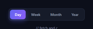
The animated toggle group is the segmented control where a highlighted pill glides smoothly from one option to the next instead of snapping — the time-range and view switchers you see in dashboards and settings. This snippet builds it with plain HTML, CSS, and vanilla JavaScript, including a springy slide, keyboard support, and proper tab roles.
The sliding pill technique
Rather than moving a background between buttons, a single absolutely-positioned .tgg-pill sits behind all the options at z-index: 0, with the button labels above it. When you select an option, JavaScript measures that button's offsetWidth and offsetLeft and sets the pill's width and translateX to match exactly. Because both properties are transitioned, the pill slides and resizes in one motion to wrap whichever option is active — even when the options have different widths.
Springy easing
The transition uses a custom cubic-bezier(.34, 1.4, .5, 1) whose control point above 1 produces a slight overshoot, so the pill arrives with a gentle spring rather than a flat stop. That tiny bounce is what makes the control feel responsive and physical. The active label colour also crossfades to white so the text contrast follows the pill.
Measuring, not hard-coding
Positions are read from the live layout every time, so the control adapts to any number of options and any label lengths without per-option constants. A resize listener re-measures and repositions the pill so it stays aligned when the viewport — and therefore the button widths — change. This is the key to a segmented control that doesn't drift on responsive layouts.
Keyboard and ARIA
The group uses role="tablist" with each option as a role="tab" carrying aria-selected, and a keydown handler moves the selection with the Left and Right arrow keys, wrapping around the ends. Selecting via keyboard moves focus and the pill together, so the control is fully operable without a mouse and announces its state to assistive tech.
Why a pill behind text beats swapping backgrounds
Animating one shared element is both smoother and simpler than fading a background in and out on each button: there's a single thing to move, it can morph its width, and the transition is continuous across the whole control. The labels never reflow because only the pill's transform and width animate.
Customizing it
Change the gradient, the overshoot in the bezier, or the padding to restyle the control; add or remove options freely and the measurement logic adapts. Wire select() to filter data or switch views. Pair it with a segmented control variant, a chip filter, or a dynamic tabs panel.
Build with AI
Build, Understand, Optimize, and Extend It With AI
You don't have to work out the overshoot easing or the measurement logic by hand — paste this snippet's HTML, CSS, and JS into an AI coding assistant like Claude and ask it to explain exactly why movePill sets a translateX offset computed from btn.offsetLeft minus pill.offsetLeft rather than setting left directly, and how the cubic-bezier control point above 1 in the transition produces the spring overshoot. The same assistant is useful for optimizing it — asking whether recalculating the pill's position on every window resize event should be debounced, and whether the arrow-key handler's use of document.activeElement is reliable if the toggle group is nested inside other focusable elements. It's just as good for extending it: ask it to persist the selected option to the URL query string or localStorage, animate the output text with a crossfade instead of an instant swap, or support a vertical orientation where the pill slides top-to-bottom instead of left-to-right. Treat the code less like a finished artifact and more like a starting point for a conversation.
Prompt to recreate it
Copy this into your AI assistant of choice to build the effect from scratch, or as a jumping-off point for your own variant:
Build an "animated toggle group" (segmented control) in plain HTML, CSS, and JavaScript — no libraries, with a sliding gradient pill that morphs to fit differently-sized options and full keyboard support.

Requirements:
- A row of option buttons inside a role="tablist" container, each marked role="tab" with aria-selected, plus one absolutely-positioned pill element sitting behind all the buttons at a lower z-index, sized and colored distinctly from the button labels.
- Clicking any option must: toggle an active class and aria-selected across all options so only the clicked one is marked active, reposition the pill to match that option, and update some piece of visible output text to reflect the new selection.
- Reposition the pill by reading the clicked button's real offsetWidth and offsetLeft from the live layout (not fixed percentages) and setting the pill's width in pixels plus a CSS transform: translateX computed as the difference between the button's offsetLeft and the pill's own resting offsetLeft — so the same translate-based approach works regardless of how many options exist or how wide their labels are.
- The pill's width and transform must share one CSS transition using a custom cubic-bezier with a control point greater than 1, so the pill visibly overshoots its target size and position slightly before settling, giving a springy rather than a flat mechanical slide.
- Support keyboard navigation: listen for keydown on the group and, when the currently focused element is one of the options, move focus to the next or previous option on ArrowRight/ArrowLeft (wrapping around at both ends) and immediately select that option too, keeping focus and the visual selection in sync.
- On page load, position the pill under whichever option starts marked active without requiring an initial click, and add a window resize listener that re-measures and repositions the pill under the currently active option whenever the layout changes.
Want to tighten it up first? Run this prompt through the AI Prompt Studio to score it across 8 quality dimensions, catch anti-patterns, and tune the wording for Claude, ChatGPT, or Gemini before you paste it in.
Step by step
How to Use
- 1Paste HTML, CSS, and JSA four-option toggle renders with Day active.
- 2Click an optionThe gradient pill slides and resizes to it.
- 3Use arrow keysLeft and Right move the selection and pill.
- 4Watch the outputThe line below updates to the active label.
- 5Resize the windowThe pill re-aligns to the active option.
- 6Add an optionDrop in another button — no constants to edit.
Real-world uses
Common Use Cases
Got questions?
Frequently Asked Questions
On each selection JavaScript reads the active button's offsetWidth and offsetLeft from the live layout and sets the pill's width and translateX to match. Because both are measured rather than hard-coded, the pill resizes to fit whichever option is active, even when labels have different lengths.
The transition uses cubic-bezier(.34, 1.4, .5, 1). The second control value above 1 makes the pill overshoot slightly and settle back, producing a gentle spring instead of a flat stop. Both width and transform share this easing so the resize and slide move together.
Yes. A resize listener re-measures the active option and repositions the pill, so it stays aligned when button widths change with the viewport. The same init function runs on load to place the pill under the initially active option.
The group is a role=tablist with each option a role=tab carrying aria-selected. A keydown handler moves the selection with Left and Right arrows, wrapping at the ends, and moves focus and the pill together. So the control is fully operable without a mouse and reports its state to screen readers.
Keep the active index in state and render the buttons from an array. After the active index changes, measure the active button via a ref in a layout effect (useLayoutEffect / watch + nextTick / ngAfterViewChecked) and set the pill's width and transform, so the measurement runs after the DOM updates. The springy CSS ports unchanged.