You Might Also Like
Learn Coding Visually
Learn to code with interactive, live-preview playgrounds — HTML, CSS, JavaScript, React & more.
 HTML Playground42 lessons · Click-based · Live preview
 CSS PlaygroundLearn CSS with a live editor
 JavaScript Playground60 lessons · DOM · Async · Canvas
 React PlaygroundLearn React with a live code editor
 GSAP PlaygroundLearn GSAP animation interactively
 SVG Playground44 lessons · shapes · paths · animation
 SCSS Playground45 lessons · Sass modules · tokens
 Tailwind PlaygroundLearn Tailwind CSS with a live editor
 Bootstrap 5 Playground50 lessons · live preview
Tooltip — CSS Hover Snippet with 4-Way Positioning
CSS Tooltip with Smart Positioning · Modals · Plain HTML, CSS & JS · Live preview
What's included
Features
About this UI Snippet
Tooltip with Smart 4-Way Positioning — Pure CSS, No JavaScript Runtime
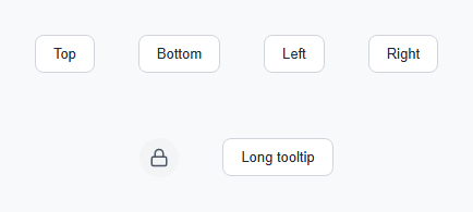
A tooltip is the small label that appears next to an element on hover or focus, used to explain an icon-only button, define a term, or add context without permanently occupying screen space. This snippet builds a reusable tooltip system driven entirely by a data-tip attribute and a data-pos attribute, so adding a new tooltip anywhere on a page requires zero additional CSS or JavaScript.
Data-attribute-driven content
Rather than hardcoding four separate tooltip markups, every trigger element carries data-tip="..." with its message and data-pos="top|bottom|left|right" for its side. A tiny JS loop on page load reads data-tip and writes it into a child .tip span's textContent — using textContent, not innerHTML, so the tooltip text can never be interpreted as markup, which matters if the message ever comes from user data. The positioning itself needs no JavaScript at all: CSS attribute selectors like [data-pos="top"] .tip place the tooltip and its arrow relative to the trigger using position: absolute and the corresponding bottom/top/left/right offset.
The arrow
The small triangle pointing from the tooltip to its trigger is a single 8×8px square rotated 45 degrees (.tip::after { transform: rotate(45deg) }) and positioned so exactly half of it peeks out from behind the tooltip's rounded rectangle. This is simpler and more reliable across browsers than the classic CSS border-triangle trick, and it inherits the tooltip's background color automatically since it shares the same background: #111827.
Hover-intent delay
Tooltips that appear the instant the cursor crosses an element create visual noise as a user's mouse passes over several triggers on its way somewhere else. The transition-delay: 0.35s on the hover/focus rule means the tooltip only appears if the cursor lingers for over a third of a second — long enough to filter out incidental passes, short enough to feel responsive to a deliberate hover. The delay applies only to the *appearing* transition; disappearing is instant, because a laggy exit reads as sluggish in a way a laggy entrance does not.
Positioning math
Each position uses calc(100% + 9px) to place the tooltip 9px past the trigger's edge, then centers it on the perpendicular axis with left: 50%; transform: translateX(-50%) (for top/bottom) or the vertical equivalent (for left/right). The scale(0.92) to scale(1) transform on entry, combined with a transform-origin set to the edge nearest the trigger, makes the tooltip grow out of the element it describes rather than simply fading in place.
Keyboard accessibility
The :focus-visible selector triggers the same reveal as :hover, so keyboard users tabbing through the page see the same tooltips sighted mouse users get — a common accessibility gap in tooltip implementations that rely on :hover alone. The icon-only trigger additionally carries role="img" and aria-label so screen readers announce its purpose even before any tooltip is triggered.
Long-content wrapping
By default .tip uses white-space: nowrap so short labels never awkwardly break. The .tip-wide modifier switches to white-space: normal with a fixed width: 220px, which is what the long-form tooltip in the demo uses — a rule of thumb worth following: keep short tooltips on one line, and give longer explanatory text an explicit wrap width rather than letting it stretch to the viewport edge.
Viewport-edge behavior
This snippet positions tooltips relative to their trigger only — it does not flip a tooltip to the opposite side if it would overflow the viewport. For triggers near a screen edge, pick the data-pos value that points inward, or add a ResizeObserver/getBoundingClientRect check that swaps the data-pos attribute dynamically when an overflow is detected.
See also the popover snippet for click-triggered (rather than hover-triggered) floating panels with richer content, and the avatar stack with tooltip for a specific applied example of this same positioning technique.
Build with AI
Build, Understand, Optimize, and Extend It With AI
Paste this tooltip's HTML, CSS, and JS into an AI coding assistant like Claude and ask it to explain how the four data-pos variants each calculate their offset and center themselves on the perpendicular axis, and why the CSS arrow is a rotated square rather than the older border-triangle trick. This snippet deliberately does not handle viewport-edge overflow, so it's a good one to hand to an assistant and ask for a getBoundingClientRect-based fix that automatically flips a tooltip from, say, right to left when it would run off the screen. It's also worth asking the assistant to add a touch-friendly tap-to-toggle mode, since the current implementation relies on :hover and :focus-visible, neither of which fires on a touchscreen tap.
Prompt to recreate it
Copy this into your AI assistant of choice to build the effect from scratch, or as a jumping-off point for your own variant:
Build a reusable CSS tooltip system in plain HTML, CSS, and JavaScript, no framework, no libraries.

Requirements:
- Any element should become a tooltip trigger by adding a data-tip attribute containing the message text and a data-pos attribute set to one of four values: top, bottom, left, or right.
- Inside each trigger, include an empty child span that a single JavaScript loop fills with the data-tip text using textContent (not innerHTML) when the page loads, so no markup injection is possible.
- CSS attribute selectors keyed on data-pos must position the tooltip absolutely on the correct side of its trigger with a small gap, centered on the perpendicular axis, with no per-tooltip custom CSS required.
- Each tooltip must have a small triangular arrow pointing at its trigger, built from a single rotated square element rather than a border-based CSS triangle, and it must automatically match the tooltip's background color.
- The tooltip must reveal on both mouse hover and keyboard focus (using :focus-visible, not plain :focus), with a deliberate delay of at least 300ms before it appears so that a cursor briefly passing over the trigger does not flash it, while disappearing instantly with no delay.
- Include a modifier variant for long tooltip text that switches from single-line nowrap text to a wrapped paragraph with a fixed maximum width, and demonstrate both a text-button trigger and an icon-only trigger with an appropriate ARIA label.
Want to tighten it up first? Run this prompt through the AI Prompt Studio to score it across 8 quality dimensions, catch anti-patterns, and tune the wording for Claude, ChatGPT, or Gemini before you paste it in.
Step by step
How to Use
- 1Add data-tip and data-pos to any elementWrap the trigger element and add data-tip="your message" plus data-pos="top|bottom|left|right" to choose which side the tooltip appears on.
- 2Add the .tip spanInside the trigger, add <span class="tip"></span> as the last child — the JS fills its text and the CSS positions it relative to the trigger.
- 3Paste the CSS onceThe attribute selectors and animation rules apply to every tooltip on the page automatically — no per-tooltip CSS needed.
- 4Include the JS loopOne querySelectorAll loop reads every data-tip on page load and writes it into its .tip span using textContent for safety.
- 5Use .tip-wide for longer messagesAdd class="tip-wide" alongside tip-trigger for explanatory tooltips over a few words — it switches from nowrap to a fixed-width wrapped paragraph.
Real-world uses
Common Use Cases
Got questions?
Frequently Asked Questions
Use the data-pos value that points inward for triggers near an edge (e.g. "left" instead of "right" for the rightmost item in a toolbar), or add a small JS check with getBoundingClientRect() that swaps data-pos when the tooltip would overflow window.innerWidth.
An instant tooltip flashes on screen every time the cursor passes over a trigger on its way elsewhere, which reads as noisy. A 300–400ms delay only reveals the tooltip when the user actually pauses on the element, which is what real hover intent looks like.
Touch devices have no hover state, so :hover-only tooltips never appear on tap. Add a click handler that toggles a .tip-visible class matching the same CSS the :hover rule uses, and close it on an outside click or a second tap.
Wrap the trigger in a component that renders the .tip span with the message as a prop, e.g. <Tooltip text="..." pos="top"><button>...</button></Tooltip>. The CSS positioning logic needs no changes since it depends only on data-pos and the DOM structure, not on React state.
Yes — the Export menu on the snippet page generates a React component, a React + Tailwind version with the positioning offsets expressed as arbitrary-value utility classes, a Vue 3 SFC accepting text and pos as props, and an Angular standalone component with @Input() bindings for the same two values.