You Might Also Like
Learn Coding Visually
Learn to code with interactive, live-preview playgrounds — HTML, CSS, JavaScript, React & more.
 HTML Playground42 lessons · Click-based · Live preview
 CSS PlaygroundLearn CSS with a live editor
 JavaScript Playground60 lessons · DOM · Async · Canvas
 React PlaygroundLearn React with a live code editor
 GSAP PlaygroundLearn GSAP animation interactively
 SVG Playground44 lessons · shapes · paths · animation
 SCSS Playground45 lessons · Sass modules · tokens
 Tailwind PlaygroundLearn Tailwind CSS with a live editor
 Bootstrap 5 Playground50 lessons · live preview
Native HTML <dialog> Element Showcase — Free Snippet
Native <dialog> Element Showcase · Modals · Plain HTML, CSS & JS · Live preview
What's included
Features
About this UI Snippet
Native HTML <dialog> Element — showModal(), show(), ::backdrop, and returnValue Explained
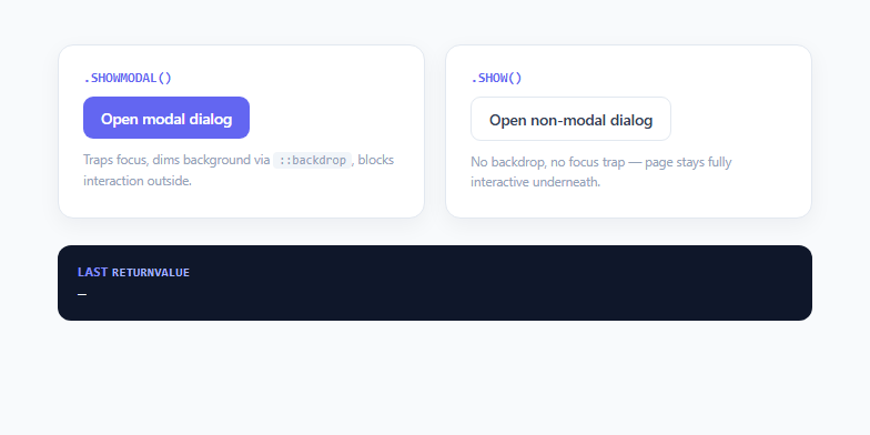
Modal dialogs are one of the most re-implemented components on the web, and for years nearly every one of those implementations was custom: a fixed-position overlay div, a manually managed focus trap, a keydown listener for Escape, and careful aria-modal/role="dialog" wiring to make it accessible. The <dialog> element, standardized and well-supported since 2022 in every evergreen browser, replaces almost all of that boilerplate with a native HTML element that has real browser-implemented modal semantics.
`.showModal()` vs `.show()`: the core distinction
A <dialog> element can be opened two different ways, and this snippet demonstrates both. Calling .showModal() opens it as a true modal: the browser automatically traps keyboard focus inside the dialog, disables interaction with the rest of the page (clicking or tabbing to background content is blocked), renders it in the top layer above everything else, and — critically — gives you a free ::backdrop pseudo-element to style the dimming layer behind it. Calling .show() instead opens it as a non-modal dialog: it still floats above normal document flow, but the rest of the page remains fully interactive, there's no focus trap, and there's no ::backdrop. This snippet's "notice" dialog uses .show() to demonstrate a toast-like, non-blocking notification that the user can ignore while continuing to interact with the page.
`form method="dialog"` and `returnValue`
The confirm dialog wraps its content in <form method="dialog">. This is a purpose-built HTML feature: when any submit button inside that form is activated, the browser closes the enclosing dialog automatically and sets dialog.returnValue to the activated button's value attribute — no JavaScript preventDefault() or manual .close() call required for the basic case. In this demo, the Cancel button submits value="cancel" and Delete submits value="confirm"; both trigger the same native close mechanism, and a single close event listener reads dialog.returnValue afterward to determine which one the user picked, exactly the pattern you'd use to branch your actual delete logic.
The `close` event and backdrop-click dismissal
Every <dialog> fires a close event when it transitions from open to closed, regardless of whether the close happened via form method="dialog", a manual .close() call, or the Escape key (which the browser handles automatically for modal dialogs). This snippet's click handler on the modal dialog checks event.target === confirmDialog — because the <dialog> element's padding box technically covers the entire viewport when open as a modal, a click that lands exactly on the <dialog> itself (rather than bubbling up from a child inside .dialog-form) means the user clicked the backdrop area, which this demo treats as a cancel.
`::backdrop` styling and why it only exists for `showModal()`
The ::backdrop pseudo-element is generated automatically by the browser only for dialogs opened with .showModal() — it does not exist for .show() or for dialogs opened by simply adding the open attribute in HTML. This is why the non-modal notice dialog in this demo has no dimming behind it: there is no backdrop to style. ::backdrop accepts most standard CSS properties, so animating its opacity on open (as this demo does with animation: backdrop-in) is a common way to make the dim-in feel less abrupt than the instant default.
Why this matters for 2025/2026 UI work
Focus trapping, top-layer rendering, and Escape-to-close used to be exactly the kind of accessibility-critical logic that justified pulling in a modal library. Native <dialog> now provides all three for free, correctly implemented by the browser vendor rather than by an application developer, which meaningfully reduces both bundle size and the surface area for subtle focus-management bugs in your own modal code.
Build with AI
Build, Understand, Optimize, and Extend It With AI
Paste this snippet's HTML, CSS, and JS into an AI coding assistant like Claude and ask it to explain step by step what happens internally between clicking the Delete button and the dark result panel updating — specifically how form method="dialog" avoids needing a submit event handler, and how that connects to the shared close listener reading returnValue. It's also worth asking the assistant why the non-modal notice dialog has no ::backdrop and cannot be dismissed by clicking outside it, since that's a common point of confusion between showModal() and show(). You could ask it to extend the demo with a third dialog demonstrating nested/stacked dialogs (opening a second showModal() dialog from within the first) to see how the browser's top-layer stacking order handles that case.
Prompt to recreate it
Copy this into your AI assistant of choice to build the effect from scratch, or as a jumping-off point for your own variant:
Build a showcase of the native HTML <dialog> element in plain HTML, CSS, and JavaScript demonstrating both modal and non-modal usage.

Requirements:
- A modal dialog opened via dialog.showModal(), containing a <form method="dialog"> with two type="submit" buttons that each set a distinct value attribute (e.g. "cancel" and "confirm"), relying entirely on the browser's native form-dialog submission to close the dialog and set its returnValue — no manual .close() call inside the button click handlers themselves.
- Custom ::backdrop styling on the modal dialog (a semi-transparent dark background, optionally with backdrop-filter blur) plus a subtle CSS entrance animation on both the dialog and its backdrop.
- Backdrop-click-to-dismiss on the modal dialog implemented with a click listener that checks event.target === dialogElement to distinguish a genuine backdrop click from a click bubbling up from content inside the dialog, calling .close() with a distinguishing value when it matches.
- A second, non-modal dialog opened via dialog.show() instead of showModal(), positioned in a corner of the viewport, with no backdrop, that leaves the rest of the page fully interactive and includes its own explicit close button calling dialog.close() with a value string.
- A shared UI element (like a status panel) that listens for the close event on both dialogs and displays the current dialog.returnValue after each close, working identically whether the dialog closed via form submission or a manual .close() call.
- Comments explaining which behaviors (focus trapping, Escape-to-close, top-layer rendering, ::backdrop existence) are automatic browser behavior exclusive to showModal(), versus what still requires explicit code for both modal and non-modal dialogs.
Want to tighten it up first? Run this prompt through the AI Prompt Studio to score it across 8 quality dimensions, catch anti-patterns, and tune the wording for Claude, ChatGPT, or Gemini before you paste it in.
Step by step
How to Use
- 1Open the modal dialogClick "Open modal dialog" to call confirmDialog.showModal(). Notice that background content becomes unreachable by click or Tab key — the browser automatically traps focus inside the dialog and dims the page behind it using the ::backdrop pseudo-element, all without any custom JavaScript focus-trap code.
- 2Submit the form to see returnValue set automaticallyClick Cancel or Delete inside the modal. Both buttons are type="submit" inside a <form method="dialog">, so activating either one closes the dialog automatically and sets dialog.returnValue to that button's value attribute ("cancel" or "confirm") with zero manual .close() calls in the click handlers.
- 3Click the dimmed backdrop area to cancelReopen the modal and click on the dark dimmed area outside the white panel. The click listener checks event.target === confirmDialog (true only when the click lands on the dialog element itself, not a child inside .dialog-form) and calls confirmDialog.close("backdrop-click") to dismiss it as a cancel.
- 4Open the non-modal dialogClick "Open non-modal dialog" to call noticeDialog.show() instead of showModal(). Notice there is no dimmed backdrop and the page underneath remains fully interactive — you can still click the modal-dialog button while the notice is open, which is impossible with a showModal() dialog.
- 5Check the returnValue readoutAfter closing either dialog, the dark panel above updates to show the exact string stored in dialog.returnValue, read inside a shared close event listener pattern that works identically for both the form-submitted modal and the manually-closed non-modal dialog.
- 6Reuse the pattern for confirmations and notificationsFor blocking confirmations (delete, discard changes, sign-out), use showModal() with a form method="dialog" and distinct button values. For non-blocking notices (new message, background task complete), use show() and a plain close button calling dialog.close() with your own value string.
Real-world uses
Common Use Cases
Got questions?
Frequently Asked Questions
.showModal() opens the dialog as a true modal: focus is trapped inside it, the rest of the page becomes inert to clicks and Tab navigation, it renders in the top layer, and a ::backdrop pseudo-element is generated for styling a dimmed background. .show() opens it as a non-modal floating element with none of that — no focus trap, no backdrop, and the rest of the page stays fully interactive, which suits toast-style notifications rather than confirmations.
When a <form method="dialog"> is submitted (by clicking any type="submit" button inside it, or pressing Enter in a text field), the browser intercepts the submission, closes the nearest ancestor <dialog>, and sets that dialog's returnValue property to the value attribute of whichever submit button triggered it. No JavaScript submit handler or preventDefault() call is needed — you only need a close event listener afterward to read the resulting returnValue.
A <dialog> element's box, when open as a modal, effectively covers the full viewport (the visible white panel is its padding/content area, but the element itself extends further). A click that bubbles up with event.target equal to the dialog element itself (rather than a descendant like a button or paragraph inside it) means the click landed outside the visible content — i.e. on the backdrop — so calling dialog.close() at that point implements click-outside-to-dismiss correctly.
Yes, but only for dialogs opened with .showModal() — pressing Escape fires a cancel event and then closes the dialog automatically with no keydown listener required in your code. Dialogs opened with .show() (non-modal) or via the open attribute do not get this automatic Escape handling, since they aren't modal in the first place.
Yes — ::backdrop accepts most standard CSS properties including background (solid colors or gradients), backdrop-filter (e.g. blur(2px) as used in this demo), and even its own opacity animation via @keyframes, since it is a real, generated pseudo-element rather than a static browser default. Remember it only exists while the dialog is open via showModal(), and only for that specific dialog instance — you cannot select all backdrops globally with a single ::backdrop rule outside a dialog selector.