You Might Also Like
Learn Coding Visually
Learn to code with interactive, live-preview playgrounds — HTML, CSS, JavaScript, React & more.
 HTML Playground42 lessons · Click-based · Live preview
 CSS PlaygroundLearn CSS with a live editor
 JavaScript Playground60 lessons · DOM · Async · Canvas
 React PlaygroundLearn React with a live code editor
 GSAP PlaygroundLearn GSAP animation interactively
 SVG Playground44 lessons · shapes · paths · animation
 SCSS Playground45 lessons · Sass modules · tokens
 Tailwind PlaygroundLearn Tailwind CSS with a live editor
 Bootstrap 5 Playground50 lessons · live preview
Native HTML Popover API Demo (popovertarget) — Free Snippet
Native HTML Popover API Demo · Modals · Plain HTML, CSS & JS · Live preview
What's included
Features
About this UI Snippet
Native HTML Popover API — popover, popovertarget, the Top Layer, and toggle Events Explained
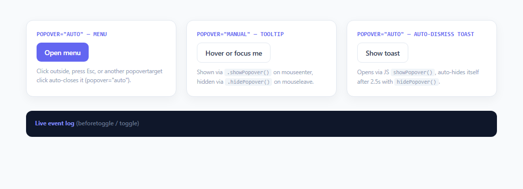
Building a dropdown menu, tooltip, or toast notification used to require a surprising amount of custom JavaScript: manual z-index management, a click-outside listener attached to document, an Escape-key handler, and careful DOM placement to avoid the panel being clipped by a parent's overflow: hidden. The HTML Popover API, standardized across Chrome 114+, Safari 17+, and Firefox 125+, replaces all of that with two plain HTML attributes: popover on the panel itself, and popovertarget on the button that controls it.
The `popover` attribute and the top layer
Adding popover="auto" (or the bare popover attribute, which defaults to "auto") to any element promotes it to the browser's top layer — the same rendering layer used natively by <dialog> and fullscreen elements, sitting visually above everything else in the document regardless of z-index or any ancestor's overflow/transform/position stacking context. This is the single biggest practical win over a hand-rolled position: absolute dropdown: no more z-index wars, no more panels getting clipped inside a scrollable card, no more manually portaling the element to document.body with a framework.
Declarative wiring with `popovertarget`
The menu example in this demo uses <button popovertarget="menu-popover"> with zero JavaScript required to open it — clicking the button toggles the element whose id matches popovertarget. The popovertargetaction attribute (set to "hide" on each menu item here) explicitly closes the popover when an action is chosen, rather than the default toggle behavior. This declarative HTML-only wiring is a meaningful shift: a working dropdown menu needs no addEventListener calls at all for the open/close mechanics.
`auto` vs `manual`: the light-dismiss behavior
The popover attribute's value controls dismiss behavior. popover="auto" (used by the menu and the toast in this demo) gets automatic light-dismiss: clicking anywhere outside the panel, pressing Escape, or opening another auto popover closes it automatically, and only one auto popover can be open at a time by default. popover="manual" (used by the tooltip) opts out of all of that — it will not close on outside click or Escape, and you are fully responsible for calling .showPopover() and .hidePopover() yourself, which is exactly what this demo's tooltip does on mouseenter/mouseleave and focus/blur.
The `:popover-open` pseudo-class and `beforetoggle`/`toggle` events
While a popover is showing, it matches the :popover-open CSS pseudo-class, which this demo uses to trigger an entrance animation (animation: pop-in 0.16s) — no JavaScript class-toggling needed to drive the transition. On the JavaScript side, every popover fires a beforetoggle event just before its state changes and a toggle event immediately after, both carrying an event.newState property ("open" or "closed") so you can hook cleanup logic, analytics, or animation coordination into the exact moment a popover opens or closes — this demo's event log panel is wired entirely from these two events across all three popovers.
Why this matters for 2025/2026 UI work
Before this API, every component library (Radix, Headless UI, Floating UI) shipped its own JavaScript reimplementation of focus trapping, outside-click detection, and top-layer portaling for popovers and menus. The native API doesn't replace advanced positioning logic (you'll still often pair it with the CSS Anchor Positioning API or a library like Floating UI for smart placement), but it does replace the dismiss-behavior and stacking-context plumbing that used to be boilerplate in every single implementation, shipped and maintained by the browser instead of your bundle.
Build with AI
Build, Understand, Optimize, and Extend It With AI
Paste this snippet into an AI coding assistant like Claude and ask it to walk through exactly what happens, event by event, when you click the menu button — specifically the order in which beforetoggle and toggle fire relative to the DOM update, since that ordering matters if you want to run an exit animation before a popover actually leaves the top layer. It's also worth asking the assistant to explain why the tooltip uses popover="manual" with explicit showPopover()/hidePopover() calls while the menu uses purely declarative popovertarget with no JS at all, and when you'd choose one wiring style over the other. You could also ask it to add CSS Anchor Positioning (anchor-name and position-anchor) to automatically place the tooltip relative to its trigger instead of the manual getBoundingClientRect() calculation currently used in positionTip().
Prompt to recreate it
Copy this into your AI assistant of choice to build the effect from scratch, or as a jumping-off point for your own variant:
Build a demo of the native HTML Popover API in plain HTML, CSS, and JavaScript that teaches popover="auto" vs popover="manual", declarative popovertarget wiring, and the beforetoggle/toggle events.

Requirements:
- A menu-style popover opened by a button using the declarative popovertarget attribute (no JavaScript for open/close), with popover="auto" on the panel and menu items that use popovertargetaction="hide" to close it after a choice, plus automatic light-dismiss on outside click and Escape.
- A tooltip-style popover using popover="manual", shown and hidden entirely via JavaScript .showPopover()/.hidePopover() calls triggered by mouseenter/mouseleave and focus/blur on its trigger button, explicitly not dismissing on an unrelated outside click.
- A toast-style popover using popover="auto" that opens via a JavaScript .showPopover() call on a button click and automatically calls .hidePopover() after a short timeout (roughly 2-3 seconds), while still supporting manual dismissal by clicking outside it before the timer fires.
- Visual styling that relies on the :popover-open CSS pseudo-class to trigger an entrance animation, and the ::backdrop pseudo-element for a dimmed background behind the auto popovers, with no manual z-index values needed anywhere since [popover] elements render in the browser's top layer.
- A live event log panel that attaches beforetoggle and toggle listeners to every popover element and prints a timestamped line reporting the element's id and the event.newState value ("open" or "closed") each time it fires.
- Clear inline comments distinguishing which behaviors come for free from the browser (light-dismiss, top-layer stacking, Escape-to-close) versus which require explicit JavaScript (manual show/hide, auto-dismiss timers).
Want to tighten it up first? Run this prompt through the AI Prompt Studio to score it across 8 quality dimensions, catch anti-patterns, and tune the wording for Claude, ChatGPT, or Gemini before you paste it in.
Step by step
How to Use
- 1Open the auto menu popoverClick "Open menu" — this button has popovertarget="menu-popover" pointing at the panel's id, so the browser opens it with zero JavaScript. Click any menu item (each has popovertargetaction="hide") or click anywhere outside the panel to close it via automatic light-dismiss, since the panel uses popover="auto".
- 2Hover the manual tooltip triggerHover or keyboard-focus "Hover or focus me" — JavaScript calls tipPopover.showPopover() on mouseenter/focus and tipPopover.hidePopover() on mouseleave/blur. Because this panel uses popover="manual", clicking elsewhere on the page will not dismiss it automatically; only the explicit hidePopover() call does.
- 3Trigger the auto-dismissing toastClick "Show toast" to call toastPopover.showPopover() programmatically, then a setTimeout calls hidePopover() after 2.5 seconds. Even though it opens via JavaScript rather than a popovertarget attribute, it still uses popover="auto" so it also light-dismisses immediately if you click outside it before the timer fires.
- 4Watch the live event logEvery popover in this demo has beforetoggle and toggle listeners attached that read event.newState ("open" or "closed") and print a timestamped line to the dark log panel, showing exactly when each lifecycle event fires relative to your interaction, including the brief beforetoggle-then-toggle sequence on every open and close.
- 5Inspect the top-layer stackingOpen your browser devtools and note that none of the three popover panels have an explicit high z-index in the CSS — they render above the rest of the page purely because [popover] promotes them to the browser's top layer, the same rendering layer used by <dialog> and the Fullscreen API.
- 6Reuse the pattern for your own menus and tooltipsFor a simple toggle, add popover="auto" to any panel and popovertarget="that-panels-id" to its trigger button — no JavaScript required. For hover-driven or programmatically-timed popovers like the tooltip and toast here, call .showPopover() and .hidePopover() directly from your own event listeners instead.
Real-world uses
Common Use Cases
Got questions?
Frequently Asked Questions
popover="auto" gets automatic light-dismiss: clicking outside the panel, pressing Escape, or opening another auto popover closes it, and only one auto popover is typically open at a time. popover="manual" disables all of that — outside clicks and Escape do nothing, and you must call .hidePopover() yourself. Use auto for menus and toasts, manual for hover tooltips or UI you need to keep open during unrelated page interactions.
Popover elements render in the browser's top layer, the same stacking mechanism used by <dialog> and the Fullscreen API, so they ignore ancestor z-index, overflow, and transform stacking contexts entirely. A popover opened while a <dialog> is showModal()-open will actually stack above the dialog by default, since top-layer elements are ordered by most-recently-added, which is worth testing explicitly if your app combines both.
Every popover fires beforetoggle just before its open/closed state changes and toggle immediately after, both with an event.newState property equal to the string "open" or "closed" (and event.oldState for the previous value). This lets you run cleanup, fire analytics, or coordinate an animation exactly when a popover's visibility actually changes, rather than inferring state from a class name or attribute check.
The Popover API itself does not include smart positioning — by default a popover opens at its normal document position (or wherever CSS places it) rather than automatically anchored next to the trigger. For automatic placement that avoids viewport edges, pair popover with the newer CSS Anchor Positioning API (anchor-name / position-anchor) or a JS positioning library like Floating UI, as this demo does manually for its tooltip via getBoundingClientRect().
The browser automatically manages some accessibility semantics — popover panels get an implicit role and are exposed correctly to the top layer for assistive tech, and Escape-to-close is handled natively for auto popovers. However you should still add appropriate ARIA attributes like aria-haspopup or aria-expanded on the trigger button and aria-describedby (as this demo's tooltip trigger does) to fully communicate the relationship, since the API handles rendering and dismiss mechanics but not the full semantic relationship between trigger and content.