You Might Also Like
Learn Coding Visually
Learn to code with interactive, live-preview playgrounds — HTML, CSS, JavaScript, React & more.
 HTML Playground42 lessons · Click-based · Live preview
 CSS PlaygroundLearn CSS with a live editor
 JavaScript Playground60 lessons · DOM · Async · Canvas
 React PlaygroundLearn React with a live code editor
 GSAP PlaygroundLearn GSAP animation interactively
 SVG Playground44 lessons · shapes · paths · animation
 SCSS Playground45 lessons · Sass modules · tokens
 Tailwind PlaygroundLearn Tailwind CSS with a live editor
 Bootstrap 5 Playground50 lessons · live preview
Avatar Stack with Tooltip — Team Avatars HTML CSS
Avatar Stack with Tooltip · Cards · Plain HTML, CSS & JS · Live preview
What's included
Features
About this UI Snippet
Avatar Stack with Tooltip — Overlapping Team Avatars with Hover Cards
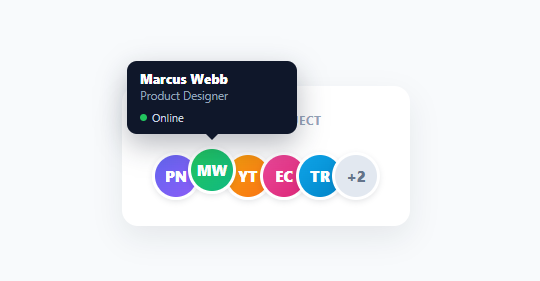
The overlapping row of avatars — used to show who's on a project, in a call, or assigned to a task — is everywhere, but the polished version does more than stack faces: each avatar lifts on hover and reveals a small card with the person's name, role, and status. This animated-tooltip avatar stack (popularized by Aceternity and seen across modern apps) is built here in plain HTML, CSS, and vanilla JavaScript, with a "+N more" overflow bubble for large groups.
Overlapping avatars with a lift on hover
The avatars overlap via a negative left margin so a group reads as a compact cluster rather than a long row — the standard "these people are together" motif. On hover, the hovered avatar lifts up (translateY(-6px)) and raises its z-index so it comes forward above its neighbors, giving a tactile sense of picking one out of the stack. Each avatar is an initials-on-gradient circle with a white ring, so no profile images are needed and the cluster stays visually distinct.
A hover card, not a bare tooltip
Instead of a one-line title attribute, each avatar reveals a styled tooltip card above it on hover — name in bold, role beneath, and a status line with a colored presence dot (online/away/offline). This richer hover content is what makes the pattern useful beyond decoration: hovering a face answers "who is this and are they around?" without leaving the page. The card animates in with opacity and transform (a slight rise and scale from its bottom origin) and has a little pointer arrow aimed at its avatar, so it reads as attached to the face it describes.
The "+N more" overflow
Showing twenty overlapping avatars is a mess, so the stack caps at a configurable MAX and collapses the rest into a gray "+N" bubble at the end — the universal overflow affordance. Hovering *that* bubble reveals a tooltip listing the names of everyone not shown, so the hidden members are still discoverable. This cap-and-overflow keeps the cluster compact for any group size while never fully hiding who's included.
Pure CSS hover, no JavaScript for the interaction
The lift and the tooltip reveal are entirely CSS :hover — the JavaScript only renders the stack from data. This means the interaction is instant, has no event-listener overhead, and degrades gracefully. The tooltip is positioned absolutely relative to each avatar and centered with a transform, so it stays anchored above its face regardless of the avatar's position in the row.
Data-driven and reusable
The stack renders from a PEOPLE array (name, role, status, gradient colors), with MAX controlling how many show before overflow — so it adapts to any group with a data edit. Swap the initials-gradient avatars for real photos by replacing the avatar background with an <img>, and the same component works for project members, call participants, task assignees, or any "these people are involved" display. The presence dot makes it double as a lightweight team-status indicator.
Build with AI
Build, Understand, Optimize, and Extend It With AI
Rather than tracing the string-building by eye, paste this snippet's HTML, CSS, and JS into an AI coding assistant like Claude and ask it to explain exactly how the MAX slice and the extra-count bubble are generated from the same PEOPLE array, or why the tooltip's transform-origin is set to bottom center rather than center. The same assistant can help optimize it — ask whether building the entire stack's HTML as one big joined string and setting it via innerHTML is the best approach compared to creating DOM nodes individually, especially if the stack needs to update frequently from live presence data. It's also useful for extending the component: ask it to add click-to-toggle tooltips for touch devices, animate new people fading into the stack as they join a call, or wire the status dots to a real presence websocket instead of static data. Treat the code less like a finished artifact and more like a starting point for a conversation.
Prompt to recreate it
Copy this into your AI assistant of choice to build the effect from scratch, or as a jumping-off point for your own variant:
Build an "avatar stack with hover tooltip cards" component in plain HTML, CSS, and JavaScript — no framework, no library.

Requirements:
- Render a row of overlapping circular avatars (initials on a gradient background) from a JavaScript array of person objects, where each object has a name, role, presence status, and two gradient colors, capping the visible avatars at a configurable maximum and collapsing everyone else into a single "+N" overflow avatar at the end of the row.
- Each avatar must overlap the previous one using a negative left margin, and must lift upward and rise above its neighbors (via CSS transform and z-index) on hover.
- Each avatar (including the overflow bubble) must reveal an absolutely positioned card above it on hover, showing the person's name, role, and a status line with a colored dot (a distinct color for online, away, and offline) — with a small triangular pointer connecting the card visually to the avatar below it.
- The overflow "+N" avatar's hover card must list the names of everyone not individually shown, not just a repeat of the count.
- The hover card's reveal animation must use only opacity and transform (translate plus a slight scale from the bottom edge), driven purely by a CSS :hover selector on the avatar's container — no JavaScript mouseenter/mouseleave listeners for showing or hiding the card.
- Compute each person's two-letter initials from their full name in JavaScript rather than hardcoding them in the data.
Want to tighten it up first? Run this prompt through the AI Prompt Studio to score it across 8 quality dimensions, catch anti-patterns, and tune the wording for Claude, ChatGPT, or Gemini before you paste it in.
Step by step
How to Use
- 1Paste HTML, CSS, and JSA row of overlapping team avatars renders with a "+N more" bubble at the end.
- 2Hover an avatarThe avatar lifts and a tooltip card appears with the person's name, role, and presence status.
- 3Hover the overflow bubbleHovering "+N" reveals a tooltip listing everyone not shown in the stack.
- 4Change the capAdjust MAX to show more or fewer avatars before the overflow bubble.
- 5Edit the peopleReplace the PEOPLE array (name, role, status, colors) with your team or participants.
- 6Use real photosSwap the initials-gradient avatar for an <img> with the person's profile picture.
Real-world uses
Common Use Cases
Got questions?
Frequently Asked Questions
Replace the avatar div's gradient background with an <img src="..." class="ast-avatar"> (object-fit: cover), keeping the white ring and overflow behavior. Keep the initials version as a fallback for people without a photo — render the <img> when a photo URL exists, otherwise the initials circle, so the cluster degrades gracefully for missing images.
Adjust the MAX constant — the stack slices PEOPLE to that many and collapses the remainder into the "+N" bubble, whose tooltip lists the hidden names. Pick a MAX that fits your layout width (3–5 is common); the overflow handles any group size beyond it without breaking the compact cluster.
The lift and tooltip reveal are presentational hover effects, which CSS :hover handles instantly with zero event-listener overhead and no risk of the tooltip getting stuck open from a missed mouseout. JavaScript only renders the markup from data. This keeps the component lightweight and the interaction snappy; you'd only add JS interaction for click-to-open behavior on touch devices.
Touch devices don't hover, so the tooltips won't appear on tap by default — the avatars still render as a clean stack. To support touch, add a click/tap handler that toggles a tooltip's visibility (and closes others), since tap is the touch equivalent of hover. Keep the stack itself useful without tooltips, treating the hover cards as a desktop enhancement.
In React, render the sliced PEOPLE array with .map() plus the overflow bubble, computing initials inline; in Vue, use v-for with a computed shown/extra split; in Angular, use *ngFor with a getter. The overlap, lift, and tooltip are pure CSS that ports unchanged — only the data rendering and the MAX-based overflow split move into the framework's templating.