More Cards Snippets
Front-End Coding Playgrounds
Learn to code with interactive, live-preview playgrounds — HTML, CSS, JavaScript, React & more.
 HTML Playground42 lessons · Click-based · Live preview
 CSS PlaygroundLearn CSS with a live editor
 JavaScript Playground60 lessons · DOM · Async · Canvas
 React PlaygroundLearn React with a live code editor
 GSAP PlaygroundLearn GSAP animation interactively
 SVG Playground44 lessons · shapes · paths · animation
 SCSS Playground45 lessons · Sass modules · tokens
 Tailwind PlaygroundLearn Tailwind CSS with a live editor
 Bootstrap 5 Playground50 lessons · live preview
Hover Card — Profile Preview Popover on Hover
Hover Card · Cards · Plain HTML, CSS & JS · Live preview
What's included
Features
About this UI Snippet
Hover Card — Intent-Delayed Profile Preview Popover
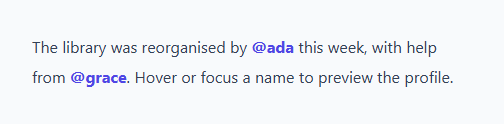
A hover card — the profile preview that appears when you hover a username, like on GitHub or X — gives a rich glimpse without a click. The hard parts aren't the visuals; they're the timing and positioning that stop it flickering or appearing off-screen. This snippet builds a polished hovercard with intent delays, edge-aware placement, and keyboard support, in plain HTML, CSS, and vanilla JavaScript.
Open and close intent
Showing the card the instant the pointer touches a trigger makes it flicker as the cursor passes over names. Instead, this uses intent delays: hovering schedules an open after ~220ms, and leaving schedules a close after ~180ms. Moving the pointer from the trigger onto the card cancels the close, so you can interact with the card's Follow button — the cooperative behaviour that makes hovercards usable rather than fiddly.
A single reusable card
Rather than a card per trigger, there's one card element that's filled from the hovered trigger's data- attributes (name, handle, bio, follower counts) and repositioned. This keeps the DOM light no matter how many usernames appear in the text, and means a long article with dozens of mentions costs one popover, not dozens.
Edge-aware positioning
When the card opens it's measured and placed centred under the trigger, then clamped so it never spills past the left or right edge of the viewport, and flipped above the trigger when there isn't room below. This fixed-positioned, collision-aware placement is what separates a real popover from one that gets cut off at the bottom of the screen.
Keyboard and screen-reader friendly
Each trigger is focusable (tabindex="0"), and focusing one opens the card immediately while blurring closes it — so keyboard users get the same preview without a mouse. The card is a role="dialog" with aria-hidden toggled as it shows and hides, and an interactive Follow button inside demonstrates that the card is fully usable, not just decorative.
Drop-in and themeable
The whole thing is one card, a fill function, and a positioner, with no dependencies. Point the data attributes at your real users (or fetch on open), restyle the card, and you have production-ready hovercards — a clean reference for the intent-timed preview-popover pattern.
Build with AI
Build, Understand, Optimize, and Extend It With AI
You don't have to trace the timer choreography by hand. Paste this snippet's HTML, CSS, and JS into an AI coding assistant like Claude and ask it to explain exactly why moving the pointer from a trigger onto the card itself must cancel the scheduled close timer, or how the position function's clamping and flip-above logic keeps the card fully inside the viewport. The same assistant is useful for optimizing it — ask whether reusing a single shared card element (rather than one per trigger) could cause a visible flash of stale content if a user hovers quickly between two different triggers, and how the fill function's ordering prevents that. It's just as handy for extending the card: ask it to fetch profile data lazily on first hover instead of reading it from data attributes, add a small loading skeleton while that fetch resolves, or support an arrow/caret element that points back at whichever trigger opened it. Treat the code less like a finished artifact and more like a starting point for a conversation.
Prompt to recreate it
Copy this into your AI assistant of choice to build the effect from scratch, or as a jumping-off point for your own variant:
Build a hover card (profile preview popover) in plain HTML, CSS, and JavaScript — no popover or tooltip library.

Requirements:
- Several inline trigger elements (e.g. spans styled as mentions) inside a paragraph, each carrying its profile data as data attributes (name, handle, bio, follower and following counts), and each focusable via tabindex.
- A single shared card element reused across all triggers (not one card per trigger), filled dynamically from whichever trigger's data attributes triggered it.
- On mouseenter of a trigger, schedule opening the card after a short delay (roughly 200ms) rather than instantly, and on mouseleave schedule closing after a shorter delay (roughly 150-200ms); moving the pointer onto the card itself must cancel the pending close so the user can interact with content inside the card (like a follow button) without it disappearing.
- Also support keyboard users: focusing a trigger must open the card immediately with no delay, and blurring it must schedule the close.
- When opening, measure the card's own rendered width and height, center it horizontally under the trigger's bounding rect, then clamp its horizontal position so it never overflows the left or right edge of the viewport, and flip it to render above the trigger instead of below if there isn't enough vertical room beneath.
- Give the card proper dialog semantics (role="dialog", aria-hidden toggled true/false as it closes and opens) and include at least one real interactive control inside it (e.g. a toggle button) to prove the card is fully usable, not just a decorative tooltip.
Step by step
How to Use
- 1Paste HTML, CSS, and JSText renders with @mention triggers and a hidden preview card.
- 2Hover a nameAfter a short delay the profile card appears below it.
- 3Move onto the cardThe card stays open so you can click Follow.
- 4Use the keyboardTab to a mention and it opens on focus, closes on blur.
- 5Set the dataFill each trigger's data- attributes, or fetch on open.
- 6RestyleTheme the card; the timing and positioning are unaffected.
Real-world uses
Common Use Cases
Got questions?
Frequently Asked Questions
Without them the card flickers on and off as the pointer sweeps across triggers, and it closes the instant you try to move onto it. A short open delay (~220ms) means the card only appears when you actually pause on a name, and a short close delay (~180ms) plus cancelling the close when you enter the card lets you move onto it and click inside. These intent delays are what make hovercards feel deliberate.
On open the card is measured and centred under the trigger, then its left is clamped between the viewport edges and, if there is not enough room below, it flips to sit above the trigger. Because it is position: fixed and placed from the trigger's bounding rect, it stays correctly anchored even as the page scrolls.
Yes. Each trigger has tabindex=0, so it is focusable; focusing opens the card and blurring closes it, giving keyboard users the same preview. The card is a role=dialog with aria-hidden toggled, and its contents (like the Follow button) are real focusable controls, so the preview is operable without a mouse.
Yes. The fill function currently reads data- attributes, but you can replace it with a fetch keyed by the trigger's data-user, showing a brief loading state in the card while the request resolves. Cache results so re-hovering the same user is instant. The timing and positioning logic stays the same.
Render one popover component controlled by state (the active trigger and open flag), and attach mouseenter/mouseleave/focus/blur handlers to each trigger that schedule open/close with timers stored in refs. Position it in an effect after it renders. Libraries like Floating UI can handle the collision logic. Tailwind users swap the classes for utilities; the intent timing is unchanged.