
Learn Coding Visually
Learn to code with interactive, live-preview playgrounds — HTML, CSS, JavaScript, React & more.
 HTML Playground42 lessons · Click-based · Live preview
 CSS PlaygroundLearn CSS with a live editor
 JavaScript Playground60 lessons · DOM · Async · Canvas
 React PlaygroundLearn React with a live code editor
 GSAP PlaygroundLearn GSAP animation interactively
 SVG Playground44 lessons · shapes · paths · animation
 SCSS Playground45 lessons · Sass modules · tokens
 Tailwind PlaygroundLearn Tailwind CSS with a live editor
 Bootstrap 5 Playground50 lessons · live preview
Split-Panel Comparison Carousel — HTML CSS JS Snippet
Split-Panel Comparison Carousel · Cards · Plain HTML, CSS & JS · Live preview
What's included
Features
About this UI Snippet
Split-Panel Comparison Carousel — Two Tracks, One Shared Index
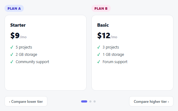
A visitor comparing two things — two pricing plans, two products, two time periods — usually has to page each carousel separately and hold the other one in their head. This snippet removes that step: a *single* current index drives two independent slide tracks at once, so clicking "next" once advances both columns to their matching tier simultaneously. Comparing "Growth" against "Pro" is never more than one click away from comparing "Starter" against "Basic."
One render function, two tracks
render() loops over [slidesA, slidesB] and applies the exact same active/previous logic to both groups from the one current value — there's no risk of the two columns ever showing mismatched tiers, because there's only one variable deciding what "current" means for either of them.
Direction-aware exit, not just enter
Each slide tracks not just whether it's active, but whether it was the *previous* active slide (spc-prev), so the outgoing card can be given a distinct exit transform (translateX(-100%)) instead of just disappearing — while the incoming one enters from the opposite side (translateX(100%) → 0). That's what makes the transition read as "sliding to the next tier" rather than a flat crossfade.
Build with AI
Build, Understand, Optimize, and Extend It With AI
Paste this snippet's HTML, CSS, and JS into an AI coding assistant like Claude and ask it to explain why render() loops over an array of both slide groups instead of writing the active/previous logic twice — and what bug class that refactor prevents as more comparison columns get added later. It's also worth asking the assistant to add a "highlight the difference" feature that visually flags which line items differ between the two currently-visible tiers, or to make the whole thing swipeable for mobile.
Prompt to recreate it
Copy this into your AI assistant of choice to build the effect from scratch, or as a jumping-off point for your own variant:
Build a two-column comparison carousel in plain HTML, CSS, and vanilla JavaScript where both columns page through their own set of slides in perfect lockstep, driven by a single shared index — no library.

Requirements:
- Two side-by-side columns, each containing its own stack of absolutely-positioned slide cards (e.g. pricing tiers), where within each column only one slide is visible at a time via CSS transforms and transitions.
- Exactly one shared "current index" JavaScript variable controls which slide is active in BOTH columns simultaneously — there must be no way for the two columns to independently show slides at different index positions from each other.
- A single render function that loops over both columns' slide groups and applies the same active-state logic to each, rather than duplicating that logic once per column.
- Each slide must track two states, not just one: whether it is the currently active slide, and whether it was the previously active slide — so an outgoing slide can transform off in one direction (e.g. slide left and fade) while the newly active slide enters from the opposite direction, producing a genuine directional slide transition rather than an abrupt swap.
- Previous/next buttons (labeled for their actual comparison purpose, not generic arrows) that step the shared index within bounds, plus a row of dynamically generated indicator dots where clicking a dot jumps the shared index directly to that position.
- Left/Right arrow key support performing the same next/previous action as the buttons.
Want to tighten it up first? Run this prompt through the AI Prompt Studio to score it across 8 quality dimensions, catch anti-patterns, and tune the wording for Claude, ChatGPT, or Gemini before you paste it in.
Source Code
<div class="spc-wrap">
  <div class="spc-cols">
    <div class="spc-col">
      <div class="spc-badge spc-badge-a">Plan A</div>
      <div class="spc-track" id="spcTrackA">
        <div class="spc-slide"><h3>Starter</h3><div class="spc-price">$9<span>/mo</span></div><ul><li>5 projects</li><li>2 GB storage</li><li>Community support</li></ul></div>
        <div class="spc-slide"><h3>Growth</h3><div class="spc-price">$29<span>/mo</span></div><ul><li>25 projects</li><li>20 GB storage</li><li>Email support</li></ul></div>
        <div class="spc-slide"><h3>Scale</h3><div class="spc-price">$79<span>/mo</span></div><ul><li>Unlimited projects</li><li>200 GB storage</li><li>Priority support</li></ul></div>
      </div>
    </div>
    <div class="spc-col">
      <div class="spc-badge spc-badge-b">Plan B</div>
      <div class="spc-track" id="spcTrackB">
        <div class="spc-slide"><h3>Basic</h3><div class="spc-price">$12<span>/mo</span></div><ul><li>3 projects</li><li>1 GB storage</li><li>Forum support</li></ul></div>
        <div class="spc-slide"><h3>Pro</h3><div class="spc-price">$34<span>/mo</span></div><ul><li>15 projects</li><li>15 GB storage</li><li>Chat support</li></ul></div>
        <div class="spc-slide"><h3>Business</h3><div class="spc-price">$99<span>/mo</span></div><ul><li>Unlimited projects</li><li>500 GB storage</li><li>24/7 phone support</li></ul></div>
      </div>
    </div>
  </div>
  <div class="spc-controls">
    <button class="spc-btn" id="spcPrev" aria-label="Previous tier">‹ Compare lower tier</button>
    <div class="spc-dots" id="spcDots"></div>
    <button class="spc-btn" id="spcNext" aria-label="Next tier">Compare higher tier ›</button>
  </div>
</div>*{box-sizing:border-box;margin:0;padding:0}
body{font-family:system-ui,-apple-system,sans-serif;background:#f6f7f9;min-height:100vh;display:flex;align-items:center;justify-content:center;padding:24px}
.spc-wrap{width:100%;max-width:560px}
.spc-cols{display:grid;grid-template-columns:1fr 1fr;gap:16px}
.spc-col{position:relative}
.spc-badge{display:inline-block;font-size:11px;font-weight:800;letter-spacing:.04em;text-transform:uppercase;padding:4px 10px;border-radius:20px;margin-bottom:10px}
.spc-badge-a{background:#e0e7ff;color:#4338ca}
.spc-badge-b{background:#fce7f3;color:#9d174d}
.spc-track{position:relative;height:250px;overflow:hidden;border-radius:14px;border:1.5px solid #e3e5ea;background:#fff}
.spc-slide{position:absolute;inset:0;padding:22px 18px;display:flex;flex-direction:column;transform:translateX(100%);transition:transform .45s cubic-bezier(.4,0,.2,1);opacity:0}
.spc-slide.spc-active{transform:translateX(0);opacity:1;z-index:1}
.spc-slide.spc-prev{transform:translateX(-100%)}
.spc-slide h3{font-size:15px;font-weight:800;color:#1f2937;margin-bottom:6px}
.spc-price{font-size:26px;font-weight:800;color:#111827;margin-bottom:14px}
.spc-price span{font-size:12px;font-weight:600;color:#9ca3af}
.spc-slide ul{list-style:none;display:flex;flex-direction:column;gap:8px}
.spc-slide li{font-size:12.5px;color:#4b5563;padding-left:18px;position:relative}
.spc-slide li::before{content:'✓';position:absolute;left:0;color:#10b981;font-weight:800}
.spc-controls{display:flex;align-items:center;justify-content:space-between;gap:12px;margin-top:18px}
.spc-btn{font:600 12px system-ui,sans-serif;padding:8px 14px;border:1.5px solid #e3e5ea;border-radius:8px;background:#fff;color:#4b5563;cursor:pointer;transition:border-color .15s,color .15s}
.spc-btn:hover{border-color:#6366f1;color:#6366f1}
.spc-dots{display:flex;gap:7px}
.spc-dot{width:7px;height:7px;border-radius:50%;background:#d1d5db;border:none;cursor:pointer;transition:background .2s,width .2s}
.spc-dot.active{background:#6366f1;width:20px;border-radius:4px}
@media(max-width:480px){.spc-controls{flex-wrap:wrap;justify-content:center}}var slidesA = document.querySelectorAll('#spcTrackA .spc-slide');
var slidesB = document.querySelectorAll('#spcTrackB .spc-slide');
var current = 0;
function render(prevIndex) {
[slidesA, slidesB].forEach(function (group) {
group.forEach(function (s, i) {
s.classList.remove('spc-active', 'spc-prev');
if (i === current) s.classList.add('spc-active');
else if (i === prevIndex) s.classList.add('spc-prev');
});
});
document.querySelectorAll('.spc-dot').forEach(function (d, i) {
d.classList.toggle('active', i === current);
});
}
function goTo(i) {
var prevIndex = current;
current = i;
render(prevIndex);
}
function next() { if (current < slidesA.length - 1) goTo(current + 1); }
function prev() { if (current > 0) goTo(current - 1); }
document.getElementById('spcNext').addEventListener('click', next);
document.getElementById('spcPrev').addEventListener('click', prev);
var dotsWrap = document.getElementById('spcDots');
slidesA.forEach(function (s, i) {
var d = document.createElement('button');
d.className = 'spc-dot';
d.setAttribute('aria-label', 'Compare tier ' + (i + 1));
d.addEventListener('click', function () { goTo(i); });
dotsWrap.appendChild(d);
});
document.addEventListener('keydown', function (e) {
if (e.key === 'ArrowRight') next();
else if (e.key === 'ArrowLeft') prev();
});
render(-1);Step by step
How to Use
- 1Paste HTML, CSS, and JSTwo pricing columns appear side by side, both showing their entry-level tier.
- 2Click "Compare higher tier"Both columns slide to their next tier at the exact same moment.
- 3Click a dotJump both columns directly to a specific tier level in one click.
- 4Use arrow keysLeft/Right pages both tracks together without touching the buttons.
- 5Adapt the contentSwap in product specs, feature sets, or any two things worth comparing tier-by-tier.
Real-world uses
Common Use Cases
Got questions?
Frequently Asked Questions
Yes — add a third .spc-col with its own track and slide set, and include it in the [slidesA, slidesB] array in render() (renamed to include the third group) so all three advance together.
Keep them equal — next()/prev() bound their range using slidesA.length, so a shorter track B would run out of matching slides before track A. Pad the shorter one with a placeholder or empty tier if needed.
Attach a touchstart/touchend listener to .spc-cols, and call next()/prev() based on the horizontal drag delta — since both tracks share one render() call, a single swipe handler is enough to move both.
That would defeat the comparison purpose of this pattern — for independent tracks, use two separate plain Carousel snippets instead; this one is specifically built around one shared index.
Yes — the buttons carry descriptive aria-labels, dots are individually labeled by tier, and the whole comparison is operable via Left/Right arrow keys.