You Might Also Like
Learn Coding Visually
Learn to code with interactive, live-preview playgrounds — HTML, CSS, JavaScript, React & more.
 HTML Playground42 lessons · Click-based · Live preview
 CSS PlaygroundLearn CSS with a live editor
 JavaScript Playground60 lessons · DOM · Async · Canvas
 React PlaygroundLearn React with a live code editor
 GSAP PlaygroundLearn GSAP animation interactively
 SVG Playground44 lessons · shapes · paths · animation
 SCSS Playground45 lessons · Sass modules · tokens
 Tailwind PlaygroundLearn Tailwind CSS with a live editor
 Bootstrap 5 Playground50 lessons · live preview
AI Model Comparison Table — Free LLM Tier Comparison Snippet
AI Model Comparison Table · Tables · Plain HTML, CSS & JS · Live preview
What's included
Features
About this UI Snippet
AI Model Comparison Table — Speed, Cost, and Capability at a Glance
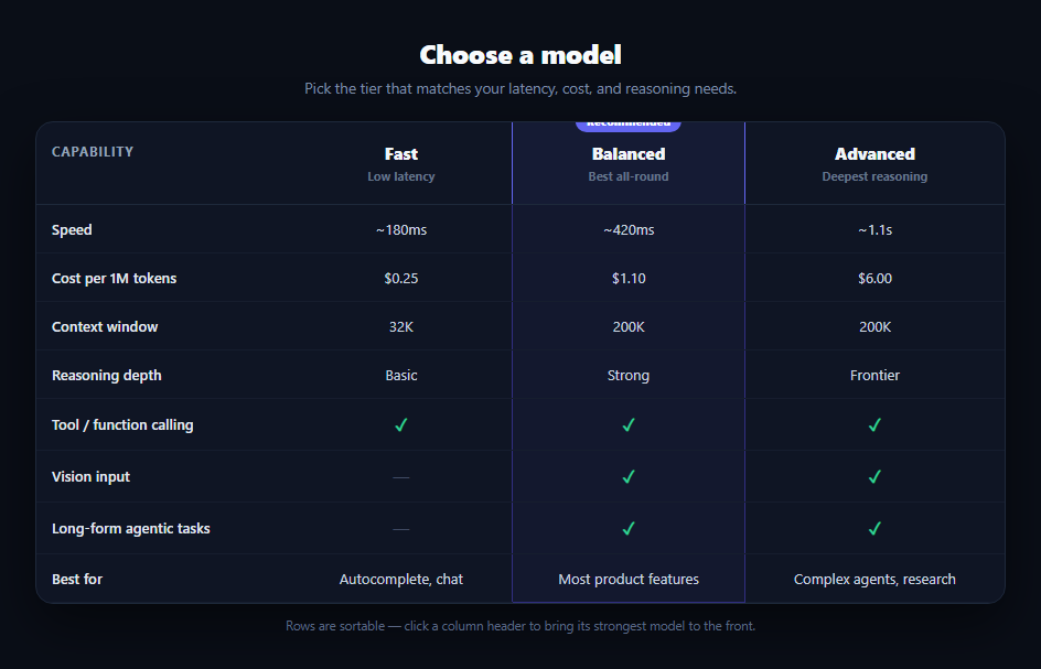
Every product that lets users (or developers) pick between model tiers eventually needs this table: a clear side-by-side of speed, cost, context window, and capability so the choice isn't guesswork. This snippet builds that comparison in plain HTML, CSS, and vanilla JavaScript — a dark, developer-console-styled table with a recommended column and checkmark/dash capability rows, no dependencies.
A recommended column that reads as a column, not a cell
The "Balanced" tier gets a .mct-featured class applied to its header and to every td in that column, the same continuous-border technique used in this library's comparison table. Because the class touches every cell rather than a wrapper div, the accent border runs unbroken from the header's "Recommended" badge down to the last row, and border-collapse keeps adjacent cell borders aligned so there's no gap between rows.
Mixed cell types from one data array
Each row in the ROWS array can hold a string (latency, price, context size), a boolean, or free text — cell() renders booleans as a green checkmark or a muted dash and everything else as plain text. This mirrors how model comparisons actually look in the wild: some facts are numeric, some are yes/no capability flags, and the table needs to handle both without separate markup paths.
Click-to-highlight sorting
Clicking any column header flashes every row briefly, a lightweight way to draw the eye down that model's whole column without actually reordering rows (reordering a comparison table is usually undesirable — rows have a natural reading order like speed → cost → capability). It's a deliberately subtle interaction that says "look here" rather than a full re-sort.
Where this fits in an AI product
Pair it with a pricing feature table on a billing page, or place it next to an AI persona selector so users pick both a model tier and an assistant style. It also pairs naturally with an AI token usage meter — show the comparison table to help someone choose a model, then show the meter to track what they actually spend on it.
Customizing it
Add or remove tiers by adding a header cell and a matching property on every row object. Add more rows for context window pricing tiers, rate limits, or fine-tuning support. Swap which column is featured by moving .mct-featured to a different column's cells and header.
Build with AI
Build, Understand, Optimize, and Extend It With AI
You don't have to work out the featured-column border trick by re-deriving it from the CSS. Paste this snippet's HTML, CSS, and JS into an AI coding assistant like Claude and ask it to explain why .mct-featured has to be applied to every td in the Balanced column individually rather than to a wrapper element, and how border-collapse keeps those borders continuous across rows. The same assistant can help optimize it — ask whether the click-to-highlight interaction should use a CSS animation class instead of a setTimeout-driven class removal, or whether a fourth tier would need the table to switch to a stacked mobile layout. It's also useful for extending the pattern: ask it to make the recommended column configurable via a data attribute, add per-row tooltips explaining technical terms like "context window," or wire the table to real pricing data from an API. Treat the code less like a finished artifact and more like a starting point for a conversation.
Prompt to recreate it
Copy this into your AI assistant of choice to build the effect from scratch, or as a jumping-off point for your own variant:
Build an "AI model comparison table" in plain HTML, CSS, and JavaScript with no framework or library.

Requirements:
- A table with three model tier columns (e.g. Fast, Balanced, Advanced) and a feature column listing capabilities: speed, cost per token, context window size, reasoning depth, tool/function calling support, vision input support, and a free-text "best for" summary.
- Render all rows from a single JavaScript data array of objects rather than hand-writing each table row, where a cell's value can be a string, a boolean, or free text, and a single render function maps booleans to a green checkmark or a muted gray dash (not red) and everything else to plain text.
- Visually highlight one column as "recommended": apply a distinct background and matching left/right borders to every cell in that column (header included, plus a bottom border on the last row) so the accent reads as one continuous unbroken box down the table, and add a small centered badge above that column's header.
- Add a click handler on each column header that briefly highlights (flashes) every row in the table to draw attention to that column, without reordering any rows.
- Wrap the table in a container with overflow-x: auto so it scrolls horizontally on narrow viewports without breaking column widths.
- Use a dark, developer-console-style color theme (dark background, muted borders, an indigo or violet accent color) with system-ui font.
Want to tighten it up first? Run this prompt through the AI Prompt Studio to score it across 8 quality dimensions, catch anti-patterns, and tune the wording for Claude, ChatGPT, or Gemini before you paste it in.
Step by step
How to Use
- 1Paste HTML, CSS, and JSA dark comparison table renders with Fast, Balanced (recommended), and Advanced columns.
- 2Read the capability rowsSpeed, cost, context window, reasoning depth render as text; tool calling, vision, and agentic support render as checkmarks or dashes.
- 3Click a column headerThe whole table flashes briefly, drawing focus to that model's column.
- 4Resize the windowThe table scrolls horizontally on narrow viewports without breaking column widths.
- 5Edit the ROWS arrayAdd, remove, or reorder capability rows — the table regenerates from data.
- 6Move the recommended columnShift .mct-featured to a different column's header and cells to highlight a different tier.
Real-world uses
Common Use Cases
Got questions?
Frequently Asked Questions
The .mct-featured class is applied to the header th and to every td in that column, each getting matching left and right borders. Because border-collapse aligns adjacent cell borders, the accent reads as one continuous box from the header badge to the last row, the same technique used in this library's plain comparison table.
Add a new th in the header with a .mct-head block, then add a matching property (e.g. frontier) to every object in the ROWS array and extend cell() calls in render() to include it. The table width and scroll wrapper handle the extra column automatically.
A comparison table with several "not included" cells reads as broken or alarming if every negative is red. A muted dash communicates "not supported at this tier" without negative connotation, keeping the focus on the tiers' actual differences rather than visual noise.
It briefly flashes every row's background to draw the eye down that model's column — a lightweight way to say "look here" without physically reordering rows, since a comparison table's rows usually follow a deliberate reading order (speed, then cost, then capability) that shouldn't change on click.
Turn ROWS and the column definitions into props or reactive data, map them to table rows with a v-for/*ngFor/.map(), and keep the cell() logic as a small render helper. The CSS, including the featured-column border technique, ports unchanged.