You Might Also Like
Learn Coding Visually
Learn to code with interactive, live-preview playgrounds — HTML, CSS, JavaScript, React & more.
 HTML Playground42 lessons · Click-based · Live preview
 CSS PlaygroundLearn CSS with a live editor
 JavaScript Playground60 lessons · DOM · Async · Canvas
 React PlaygroundLearn React with a live code editor
 GSAP PlaygroundLearn GSAP animation interactively
 SVG Playground44 lessons · shapes · paths · animation
 SCSS Playground45 lessons · Sass modules · tokens
 Tailwind PlaygroundLearn Tailwind CSS with a live editor
 Bootstrap 5 Playground50 lessons · live preview
Insurance Coverage Comparison Table — Free HTML CSS JS Snippet
Insurance Coverage Comparison Table · Tables · Plain HTML, CSS & JS · Live preview
What's included
Features
About this UI Snippet
Insurance Coverage Comparison Table — A Highlighted Plan Table for Coverage Decisions
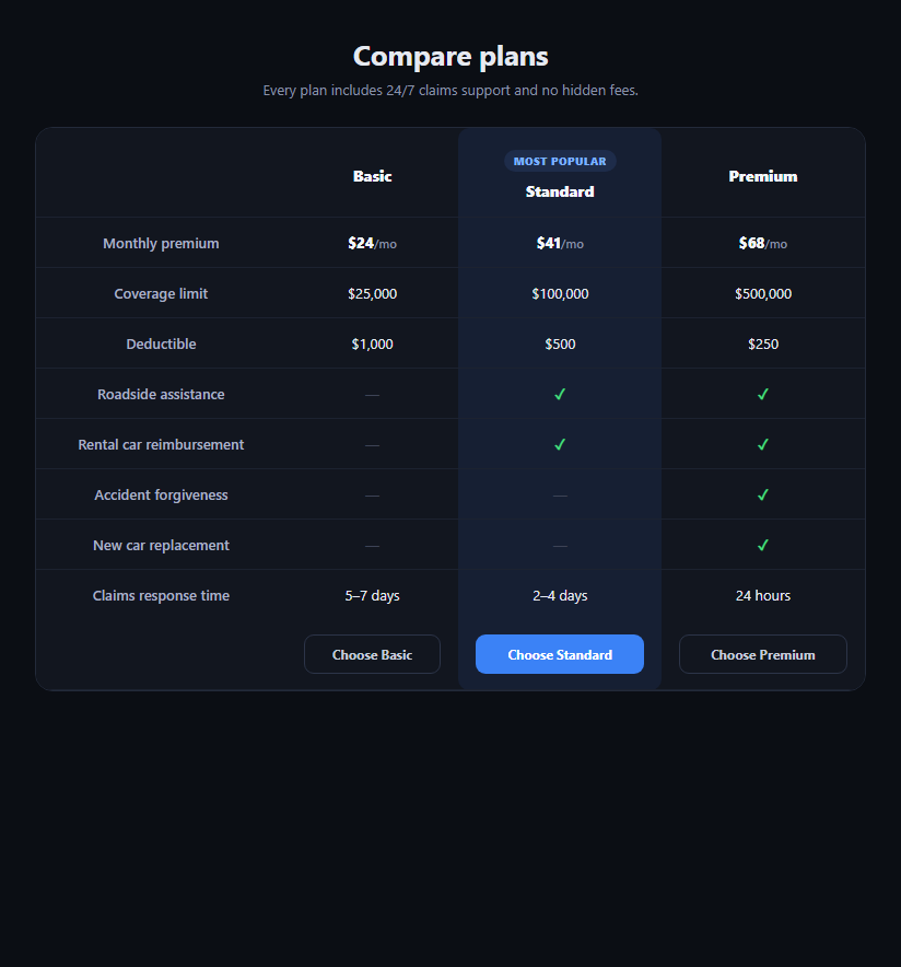
Buying insurance is a spreadsheet decision dressed up as a purchase — people want to line up deductibles, limits, and benefits side by side before they commit. This snippet is a three-plan comparison table (Basic, Standard, Premium) built in plain HTML, CSS, and a sprinkle of vanilla JavaScript, with a visually highlighted "Standard" column, checkmark and dash cells for included benefits, and a selection action per plan.
A semantic table, not a div grid
The comparison uses a real <table> with <thead>, <tbody>, and <tfoot> — row labels down the left, plans across the top. That's deliberate: a genuine table is navigable by screen readers with row/column context, reflows sensibly, and is the correct semantic element for tabular data, unlike a flexbox row of "cards" that only looks like a table.
The recommended column
The middle "Standard" column carries a .cc-recommended class that tints its background, rounds its corners at the top and bottom, and adds a small "Most popular" badge above its header. Because the highlight is applied per-cell via a shared class rather than a separate table, the recommended column's shading lines up perfectly with every row without any extra markup.
Checkmarks and dashes, not text
Benefit rows ("Roadside assistance," "Accident forgiveness") use a green ✓ for included and a muted — for excluded, rather than "Yes"/"No" text. This is a scanning optimization: eyes pick out the shape and color of a checkmark column far faster than reading repeated words, which matters when a shopper is comparing six or more benefit rows across three plans.
Selecting a plan
Each plan has a "Choose" button in the table footer. Clicking one calls selectPlan, which shows a confirmation message and disables that button (re-enabling any previously selected one) so only one plan can be "chosen" at a time in this demo — swap the confirmation for a real navigation to checkout in production.
Responsive without breaking the table
On narrow viewports, .cc-table-scroll lets the table scroll horizontally rather than squeezing three price columns into a phone width, which would make numbers unreadable. Padding and font-size shrink slightly under 640px, but the table itself never wraps into cards, keeping row-to-row comparison intact at every width.
Pair this with a pricing feature table for SaaS-style plans, an insurance quote calculator to estimate a premium before comparing, or a comparison table for a more general product comparison.
Build with AI
Build, Understand, Optimize, and Extend It With AI
You don't need to manually trace how the highlight lines up across every row. Paste this snippet's HTML, CSS, and JS into an AI coding assistant like Claude and ask it to explain why a real semantic table with thead/tbody/tfoot is the right choice here over a flexbox card row, and how applying the cc-recommended class per-cell (rather than wrapping one column in a separate container) keeps the shaded column's background and rounded corners aligned across every row automatically. The same assistant can help you optimize it — ask whether the horizontal-scroll fallback at 640px is the right breakpoint for your typical plan count, or whether the Choose button's disabled-toggle logic should instead drive a visually distinct "selected" row state. It's also useful for extending the effect: ask it to make the table data-driven from a JSON array of plans and benefits, add a toggle between monthly and annual pricing, or add a tooltip explaining each benefit row on hover. Treat the code less like a finished artifact and more like a starting point for a conversation.
Prompt to recreate it
Copy this into your AI assistant of choice to build the effect from scratch, or as a jumping-off point for your own variant:
Build an "insurance coverage comparison table" in plain HTML, CSS, and JavaScript with no framework.

Requirements:
- A real semantic HTML table (thead, tbody, tfoot) with row labels in the first column and three plan columns (e.g. Basic, Standard, Premium) as the remaining columns.
- Rows for monthly premium, coverage limit, deductible, and at least four yes/no benefit rows, using a checkmark character for included benefits and a dash character for excluded ones rather than "Yes"/"No" text.
- The middle plan column must be visually highlighted as the recommended option: a tinted background applied to every cell in that column (not just the header), rounded top corners on the header cell and rounded bottom corners on the footer cell of that column, and a small "Most popular" badge shown above that column's plan name.
- A footer row with a "Choose [Plan]" button under each plan column. Clicking a button must show a confirmation message elsewhere on the page naming the chosen plan, and must disable that specific button while re-enabling any other plan's button, so only one plan appears selected at a time.
- On narrow viewports the table must remain a real table (not collapse into stacked cards) — wrap it in a horizontally scrolling container so all three plan columns stay aligned and comparable even on a phone-width screen.
- Use a dark, insurance-dashboard-appropriate color palette with clear visual separation between rows via subtle borders.
Want to tighten it up first? Run this prompt through the AI Prompt Studio to score it across 8 quality dimensions, catch anti-patterns, and tune the wording for Claude, ChatGPT, or Gemini before you paste it in.
Step by step
How to Use
- 1Paste HTML, CSS, and JSA three-column plan table renders with Standard highlighted and badged "Most popular".
- 2Scan the benefit rowsGreen checkmarks and muted dashes show which benefits each plan includes at a glance.
- 3Compare pricingMonthly premium, coverage limit, and deductible are aligned in the top rows for quick comparison.
- 4Choose a planClick a "Choose" button — a confirmation message appears and that button disables.
- 5Resize the windowBelow 640px the table scrolls horizontally instead of squeezing columns unreadably.
- 6Swap in real plansReplace the row values and benefit checks with your own plan data.
Real-world uses
Common Use Cases
Got questions?
Frequently Asked Questions
A table gives screen readers native row and column relationships — a user can navigate by "monthly premium, Standard plan" cell by cell. A grid of divs styled to look like a table loses that structure entirely unless you manually add a large set of ARIA table roles, so starting with a real table is simpler and more robust.
Move the cc-recommended class from the Standard column's cells to whichever plan you want highlighted — each row's corresponding cell needs the class. Since the highlight is per-cell rather than a separate element, moving it is a find-and-replace on the class name, not a markup restructure.
Replace the confirmation message inside selectPlan with a redirect (window.location.href = '/checkout?plan=' + name) or a router push in your framework. Keep the disabled-button feedback if the button also needs to reflect a selection state before navigation completes.
Yes — each row is an independent tr, so add or remove rows freely. Just remember to add the cc-recommended class to that row's middle cell to keep the highlighted column's shading continuous down the table.
Map an array of plan objects into the table columns and an array of benefit rows into tbody rows, applying the recommended class conditionally based on a plan's "featured" flag. The CSS classes and table structure port unchanged; only the static markup becomes a loop.