You Might Also Like
Learn Coding Visually
Learn to code with interactive, live-preview playgrounds — HTML, CSS, JavaScript, React & more.
 HTML Playground42 lessons · Click-based · Live preview
 CSS PlaygroundLearn CSS with a live editor
 JavaScript Playground60 lessons · DOM · Async · Canvas
 React PlaygroundLearn React with a live code editor
 GSAP PlaygroundLearn GSAP animation interactively
 SVG Playground44 lessons · shapes · paths · animation
 SCSS Playground45 lessons · Sass modules · tokens
 Tailwind PlaygroundLearn Tailwind CSS with a live editor
 Bootstrap 5 Playground50 lessons · live preview
AI Persona Selector — Free Assistant Style Picker Card Grid Snippet
AI Persona Selector · Cards · Plain HTML, CSS & JS · Live preview
What's included
Features
About this UI Snippet
AI Persona Selector — Icon Cards with a Checkmark-Ring Selected State
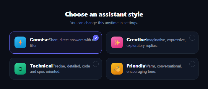
Letting users pick how an AI assistant talks to them — terse and direct versus warm and exploratory — is one of the highest-leverage personalization controls in an AI product, and it deserves better UI than a plain dropdown. This snippet builds a persona selector as a grid of selectable cards in plain HTML, CSS, and vanilla JavaScript: an icon, a name, a one-line description, and a checkmark-ring selected state, all driven from one data array.
One data array, one selected value
Every persona is an object with an id, name, icon, and desc in the PERSONAS array. A single selected string tracks which one is active, and render() rebuilds the whole grid from that state on every click — so there's no risk of two cards appearing selected at once, since the selected class is derived, never toggled independently per card.
A checkmark ring, not just a border
Each card gets a small circular ring in its top-right corner that fills solid and reveals a checkmark only when selected, in addition to the card's border and background shifting to an indigo accent. This double signal (border + explicit checkmark) makes the selected state readable even at a glance or on a low-contrast display, rather than relying on a subtle border-color change alone.
Color-coded icons per persona
Each persona's icon tile gets its own gradient — blue for Concise, pink for Creative, green for Technical, amber for Friendly — using an attribute selector keyed on data-id. This gives each option a distinct visual identity so the grid is scannable by color before a user even reads the labels, useful when personas are used repeatedly across a product.
Where this fits in an AI product
Place it in onboarding right before an AI chat interface so the first conversation already reflects the chosen tone, or in account settings next to an AI model comparison table so users configure both *how* the assistant sounds and *which* model powers it.
Customizing it
Add more personas by extending the PERSONAS array and adding a matching data-id color rule; swap single-select for multi-select by tracking an array instead of one string; or persist the choice to localStorage so it survives a reload.
Build with AI
Build, Understand, Optimize, and Extend It With AI
You don't have to work out the single-selection state logic by hand. Paste this snippet's HTML, CSS, and JS into an AI coding assistant like Claude and ask it to explain how storing selected as one value rather than a class toggled per card guarantees exactly one persona can ever be marked selected, and how the data-id attribute selector wires each persona to its own icon gradient without inline styles. The same assistant can help optimize it — ask whether re-rendering the entire grid on every click is worth simplifying to just toggling classes on two elements (the old and new selection) for a very large persona list. It's also useful for extending the picker: ask it to add persistence to localStorage or a backend call, support multi-select with an array of chosen ids, or add a live preview panel showing a sample response in the selected persona's tone. Treat the code less like a finished artifact and more like a starting point for a conversation.
Prompt to recreate it
Copy this into your AI assistant of choice to build the effect from scratch, or as a jumping-off point for your own variant:
Build an "AI persona selector" as a grid of selectable cards in plain HTML, CSS, and JavaScript with no framework or library.

Requirements:
- A responsive grid of persona cards (e.g. Concise, Creative, Technical, Friendly), each rendered from a single JavaScript data array of objects with an id, a display name, an icon, and a one-line description — no hand-written per-card markup.
- Track which persona is selected using exactly one piece of state (a single variable holding one id, not a class toggled independently on each card), and re-render the whole grid from that one value whenever the selection changes, so it is structurally impossible for two cards to appear selected simultaneously.
- Give each persona's icon a distinct color gradient so the grid is visually distinguishable by color before reading labels, using a data attribute selector rather than inline styles.
- The selected card must show two combined visual signals: an accented border/background on the whole card, and a small circular indicator in the corner that fills solid and reveals a checkmark icon only when that card is selected.
- Cards must be real, keyboard-accessible button elements (not divs with click handlers only), and should lift slightly on hover to signal interactivity.
- Use repeat(auto-fill, minmax(260px, 1fr)) or equivalent so the grid reflows responsively by viewport width.
- Use a dark theme with system-ui font and distinct accent colors per persona icon.
Want to tighten it up first? Run this prompt through the AI Prompt Studio to score it across 8 quality dimensions, catch anti-patterns, and tune the wording for Claude, ChatGPT, or Gemini before you paste it in.
Step by step
How to Use
- 1Paste HTML, CSS, and JSA grid of four persona cards renders with Concise selected by default.
- 2Click a different cardThe selection moves — the previous card's ring and accent clear, the new one fills in.
- 3Check the checkmark ringOnly the selected card shows a filled ring with a checkmark.
- 4Resize the windowThe grid reflows from one to several columns by width.
- 5Edit the PERSONAS arrayAdd, remove, or rename personas — the grid regenerates from data.
- 6Wire up persistenceSave the selected id to your backend or localStorage on change.
Real-world uses
Common Use Cases
Got questions?
Frequently Asked Questions
There's a single selected variable holding one persona id, and render() rebuilds every card's class from that one value on every click. Because the selected state lives in one place rather than being toggled on individual card elements, it's structurally impossible for two cards to end up marked selected at once.
Add one object with an id, name, icon, and desc to the PERSONAS array, then add a CSS rule targeting .pst-card[data-id="your-id"] .pst-icon with a background gradient for its icon tile color. The grid layout and selection logic need no changes.
Yes — change selected from a single string to an array, update the click handler to push/remove the clicked id instead of replacing the value, and update render()'s isSelected check to use array.includes(p.id) instead of equality.
In the click handler, after updating selected, write it to localStorage.setItem('persona', selected) (or send it to your backend). On load, read that value before the first render() call and use it as the initial selected state, falling back to a default if nothing is stored.
Track selected as component state (useState, a ref, or a signal), map PERSONAS to card elements with a key, and toggle a selected class based on comparing each persona's id to the current selected value. The click handler becomes a simple state setter.